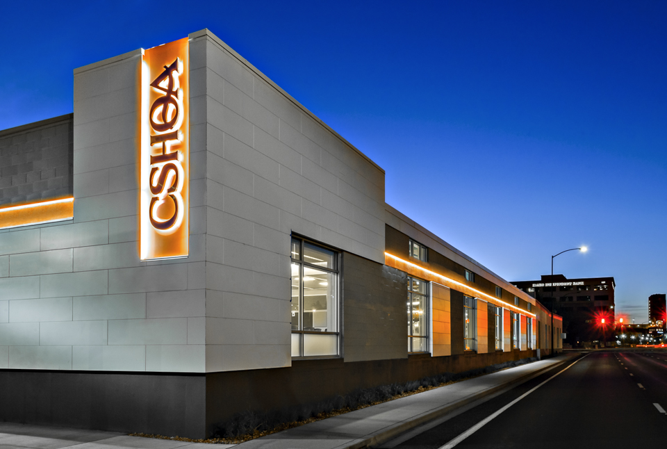
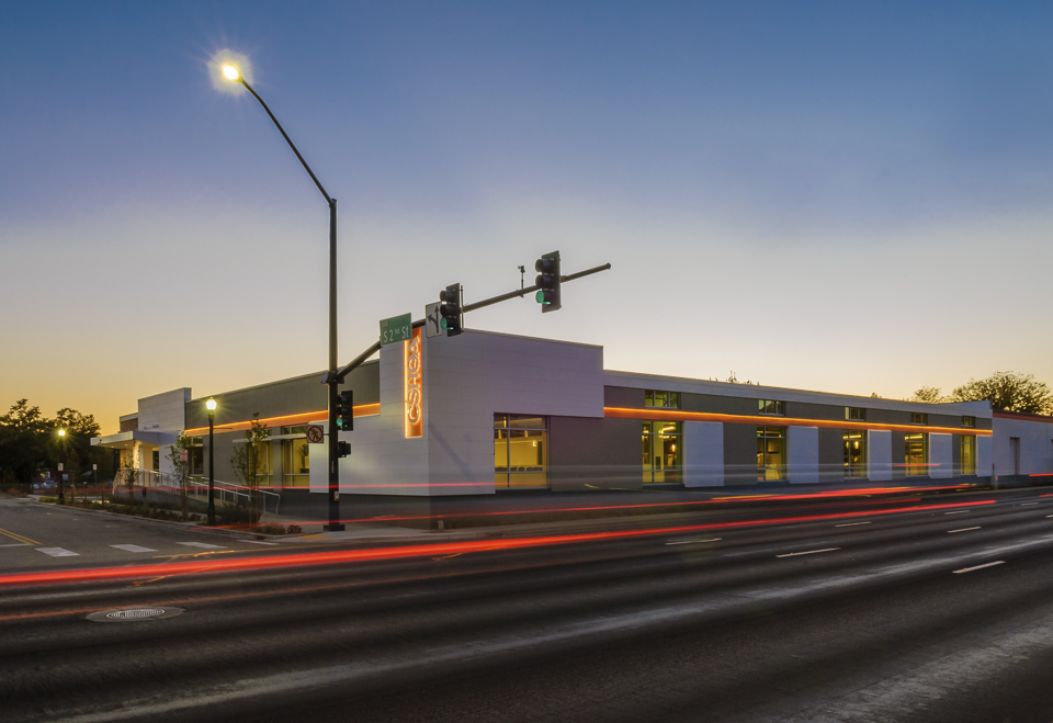
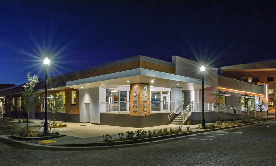
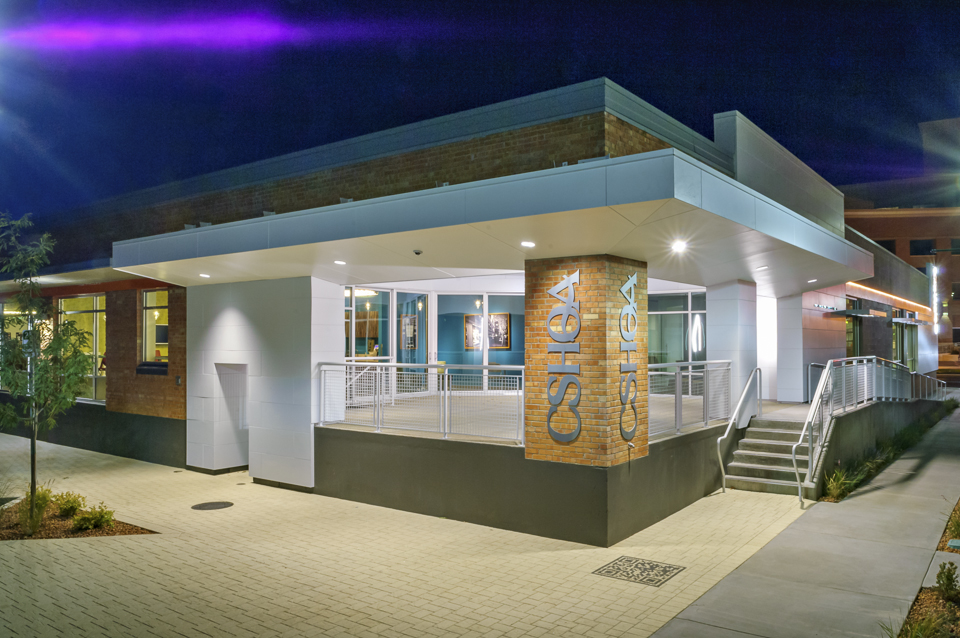
When it came time for CSHQA, an award-winning, full-service architecture and engineering firm, to move office locations, they didn’t need to look far. The 20,000-square-foot warehouse was not only a mere three blocks away, its renovation would be an ideal demonstration piece to show existing and potential clients how a building can be updated without changing its historic nature and while respecting the surrounding area architecturally.
Built in 1959, the building was originally used as storage for the rail lines that once ran along Front Street adjacent to the building. The interior space, although smaller, occupies only one floor—unlike the three floors in their previous location—allowing for closer collaboration of employees. The interior design philosophy was to expose the original wood ceiling composed of 10x26 solid timber beams and joists, and and to add 14 new skylights to create uniform interior light levels and reduce energy use. The existing interior columns, 10” diameter concrete, were refurbished and many were left exposed. In keeping with the vintage feel, reclaimed timber was used for some of the interior woodwork as well as frames for artwork.
In addition, the design takes into account several building efficiencies, including the connection to the city’s geothermal system for radiant floor heating throughout the space. The same radiant system is used to cool the space in the summer. Other sustainability upgrades include extensive daylight harvesting with integrated automated lighting and dimming systems, the use of LED fixtures, sustainable landscaping and on-site storm water management, low-use water fixtures, covered bicycle storage, and preferred parking for fuel-efficient vehicles. The building is targeting LEED Platinum and Green Globes certifications. If achieved, the CSHQA office will be the first LEED Platinum office renovation in Idaho.
CHALLENGE
Find an exterior technology that understood the design and aesthetic goals while also contributing to the building’s LEED Platinum certification.SOLUTION
The Illumination Series Panels, in a custom cool white color, and Smooth NichiBoard to ensure a clean, flawless exterior look.RESULT
The Nichiha panels provided the client design flexibility to modernize the historic building and the first large-scale use of fiber cement panels in the area.
Like many urban areas, Boise is seeing quite a bit of transition in its downtown core. Amidst the tear-downs and new structures, this warehouse renovation was a chance for CSHQA to showcase something new out of something old. With that in mind, the team specified Nichiha’s Illumination Series panels and Smooth NichiBoard to ensure a clean, flawless look on the exterior. The building called for a specific color match, a cool white, to match the sheet metal coping at the top of the new walls.
Another selling point: a built-in ventilated rainscreen system, unique to Nichiha panels, that eliminates the threat of trapped moisture.
“One of the many goals of the building renovation was to explore different technologies and showcase them within and on the building,” says Ted Isbell, AIA, LEED AP BD+C, a senior associate at CSHQA. “We looked at several exterior wall cladding systems, including metal, wood, ACP panels, phenolic resin panels, and fiber cement. Nichiha worked with us to understand our goals.”
Nichiha panels on the CSHQA warehouse were the first large-scale use of fiber cement panels in the Boise area. The panels provided flexibility to work with different design decisions, while modernizing the historic building.
“It completely changed the look of the building,” said Mandie Brozo, project manager at CSHQA, noting that the clean look of the panels has attracted the attention of the real estate community. “Before the renovation, the building was anonymous, no one ever remembered it, and now people are noticing; it’s like a new building.”
For more information about Illumination and other Nichiha products, please visit: www.nichiha.com.
Architect: CSHQA
Location: Boise, Idaho
Project type: Historic remodel
Product: Illumination Series
Project features:
- Smooth, satin finish
- Virtually limitless color palette
- Easy installation
- Low maintenance
- 40% recycled content
Related Stories
Building Tech | Apr 13, 2016
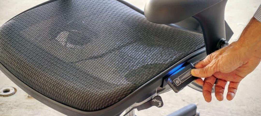
The Hyperchair gives employees access to their own personal set of climate controls
Not only can the Hyperchair reduce heating and cooling costs and maximize employee comfort, but it can help a company become more environmentally friendly, as well.
Architects | Mar 20, 2016
Ars Gratia Artis: A North Carolina architect emphasizes the value of art in its designs
Turan Duda says clients are receptive, but the art must still be integral to the building’s overall vision.
Office Buildings | Mar 16, 2016
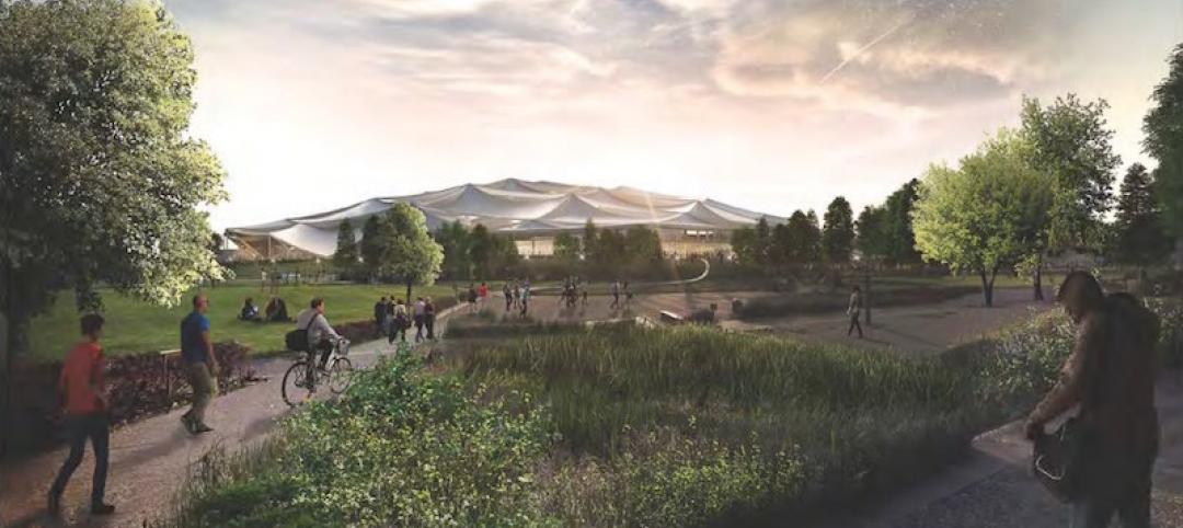
Google releases new plans and renderings of its Mountain View campus
The original canopy design scheme is still in place, but the plans now call for it to be opaque.
Office Buildings | Mar 10, 2016
Expedia unveils design for Seattle waterfront campus
Transparency and outdoor areas will give the complex a Pacific Northwest vibe.
Office Buildings | Mar 9, 2016
CBRE: Workplace wellness on the rise
As insurance premiums and deductibles continue to rise, both employees and employers are evaluating options to improve their wellbeing, writes CBRE Healthcare Managing Director Craig Beam.
Market Data | Mar 6, 2016
Real estate execs measure success by how well they manage ‘talent,’ costs, and growth
A new CBRE survey finds more companies leaning toward “smarter” workspaces.
Office Buildings | Mar 2, 2016
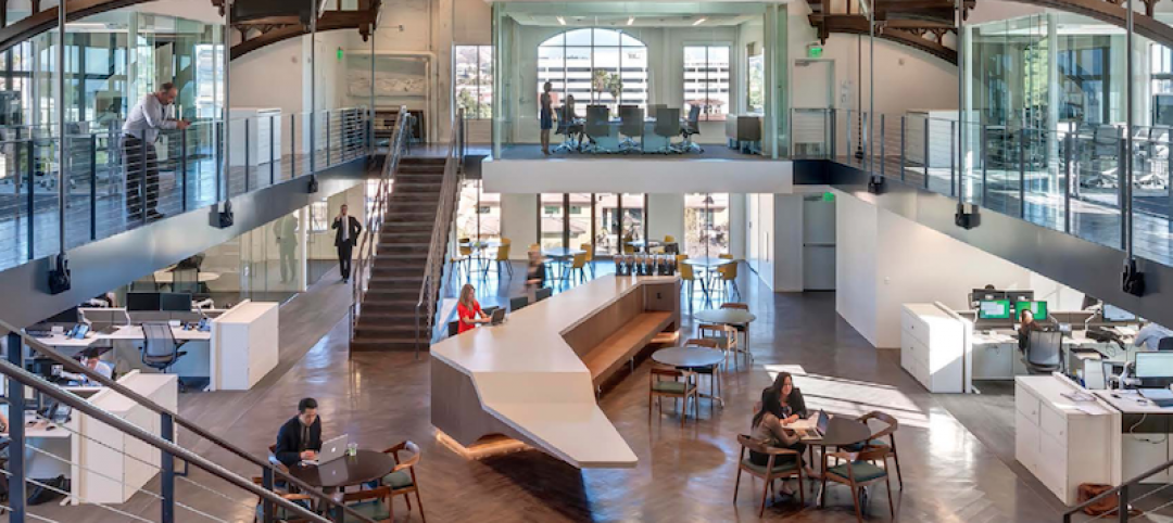
HDR redesigns Twin Cities' studio to have coffee shop vibe
With open spaces, huddle rooms, and a design lab, the firm's new digs are drastically different than the old studio, which felt like working in a law office. Design Principal Mike Rodriguez highlights HDR's renovation plan.
Office Buildings | Mar 1, 2016
SmithGroupJJR and The Christman Company create a financial headquarters without the drab
The “un-bank” design ditched the stuffy design elements typical of financial institutions and, instead, created something much more inviting.
Office Buildings | Feb 29, 2016
Mobileapolis: An open experiment in workplace mobility
Check out this fun infographic that explains Perkins+Will's ambitions, findings, and next steps for the future home of the firm's Minneapolis office.
Office Buildings | Feb 26, 2016
Benching, desking, and (mostly) paper-free: Report identifies top trends in workplace design for 2016
The report, from Ted Moudis Associates, encompasses over 2.5 million sf of workspace built over the past two years.


