In 2012, the architectural firm Page Southerland Page did pro bono programming work for Healthcare for the Homeless Houston (HHH), a nonprofit organization that provides long-term care for that city’s homeless men, women, and children.
At the time, HHH—which was founded in 1999 and is part of a national organization with more than 150 health centers—was operating out of a shoebox, a 6,425-sf building it shared with another homeless services group. The programming was conducted with an eye toward assisting HHH in its strategy to relocate and expand.
“They knew they had to leave that building,” recalls Kurt Neubek, FAIA, Principal with Page’s Houston office.
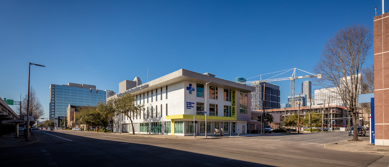
The organization found a three-story, 24,250-sf building that had been a Merchant Marine hall known as the Seafarer’s Union, which HHH selected in part for its proximity to St. Joseph Hospital, which handles many homeless patients.
“Our goal was to design the clinic around our clinical model,” which is the integration of primary care, behavioral care, and consultation and case management services, explains Frances Isbell, M.A., HHH’s chief executive officer. “We also didn’t want it to look like a bus station.”
Last February, HHH celebrated its first anniversary in its new, larger digs, whose extensive renovation presented a number of challenges to a Building Team that included Page (architect and MEP engineer), WSP (co-consultant), ASA Daily (SE), H2B Engineers (CE), Forney Construction (CE), FMG Design (signage and graphics), and TechKnowledge (A/V, IT, Security).
For one thing, each floorplate is only 8,000 sf. Half of the first floor was taken up by indoor parking. And the third floor was a giant open meeting room.
The first thing that Page did, says Neubek, was to move the front door to the short side of the building, partly to dissuade the homeless from congregating at a nearby restaurant. Page also relocated the parking garage to the back of the first floor, which freed up a bit more administrative space.
The second floor includes the main reception desk and the medical clinic with 12 exam rooms, an in-house pharmacy, and small testing labs. The design of this floor is a flexible module so offices can be converted to exam rooms if needed, and vice versa.
The third floor has six dental stations—dental care being HHH’s most sought-after service, says Isbell—and behavioral health spaces and offices with glass sidelights that allow more daylight to come onto the floor. The third floor includes workstations, training areas, and lockers for HHH’s 400 annual volunteers.
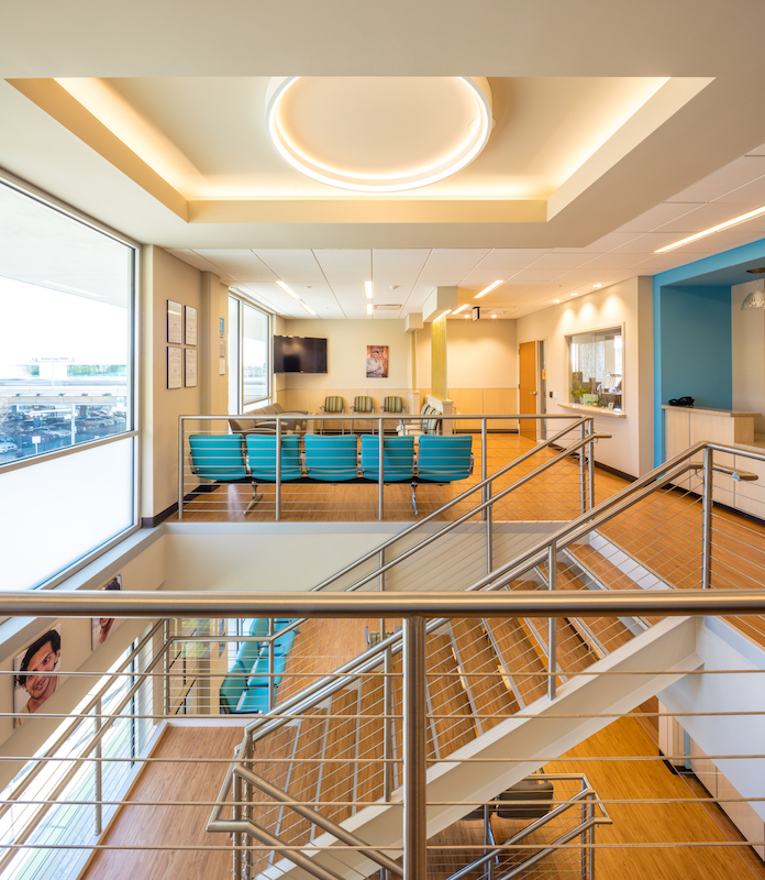
A “grand staircase” between waiting rooms ties together the floors of this facility. Vinyl plank flooring was selected for its durability and sense of warmth. Image: Slyworks Photography/Courtesy of Page.
Before construction, exam rooms were mocked up to allow physicians and attending staff to determine if counter and cabinet heights and spaces between equipment were positioned properly. Patient rooms were also oriented toward the back of the building, which provides the staff with a higher measure of safety in the event that patient behavior becomes problematic.
Other design accommodations include an open staircase between waiting areas that ties the floors together, more exterior coverage over the reclad entryway with a new exterior lantern, a new elevator, and larger energy efficiency windows. The second floor clinic offers patients electrical outlets where they can recharge the mobile devices. Translucent partitions between the dental stations and waiting rooms offer privacy while still letting light permeate the building.
One of the more noticeable features of the new building is its flooring. Isbell says that it had to be durable, “as people living on the street are bringing all of their worldly possessions in with them.” HHH also wanted the interior design to provide a sense of warmth. So 2,232 sf of the second and third floors and stairwell are covered with Parterre’s ingrained natural oak luxury vinyl planks.
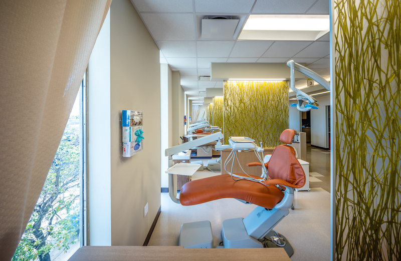
Dental care is the most sought-after service at Healthcare for the Homeless Houston's new facility, which has six dental stations bookended by translucent partitions. Image: Slyworks Photography/Courtesy of Page.
The whole project cost about $8.5 million, which HHH financed through a combination of state and private foundation grants. Neubek says TechKnowledge donated all of its services, and most of the ceiling tile and lighting used for the renovation were donated, too.
Isbell says that moving into the new center is a benchmark for this organization, which operates two other facilities in Houston. Most important, it allows the organization to see more patients daily. (The three centers average about 100 per day.) But, she laughs, “if it ever happens again, I’ll retire. It was a lot of work.”
Related Stories
Building Team Awards | Oct 20, 2020
Seamless speed to market drives Texas hospital’s growth
Learn why the Methodist Richardson Medical Center Vertical Expansion, in Richardson, Texas, was honored with a Gold Award in the 2020 Building Team Awards.
Healthcare Facilities | Oct 2, 2020
Healthcare Design Awards promote projects that heal
Awards program highlights trends in healthcare facility designs.
University Buildings | Sep 16, 2020
A new interprofessional hub opens on U. Minnesota’s campus
The Health Sciences Education Center includes two floors for simulation and immersive training.
Healthcare Facilities | Sep 16, 2020
New Foster + Partners-designed hospital begins construction in Cairo
The project focuses on natural light, greenery, and views of the outside.
Healthcare Facilities | Sep 10, 2020
Easing the oncology journey: The role of urgent care
Oncology patients are better served when they’re connected to the right staff.
Giants 400 | Aug 28, 2020
2020 Giants 400 Report: Ranking the nation's largest architecture, engineering, and construction firms
The 2020 Giants 400 Report features more than 130 rankings across 25 building sectors and specialty categories.
Healthcare Facilities | Aug 27, 2020
A hospital addition in Maryland was designed and built in 120 days
Lean practices, and early engagement with the county’s permitting department, moved this project forward quickly.
Building Team | Aug 21, 2020
A healthcare project in Wisconsin benefits from including MEP subs in early design discussions
Prefabrication played a major role in quickening construction.
Healthcare Facilities | Aug 13, 2020
New VA care center showcases the agency’s P3 approach to financing healthcare facilities
Clinic programming enhances patient privacy.
Healthcare Facilities | Aug 5, 2020
New Shenzhen Children’s Hospital will be covered in sky gardens
B+H Architects is designing the project.


