In 2012, the architectural firm Page Southerland Page did pro bono programming work for Healthcare for the Homeless Houston (HHH), a nonprofit organization that provides long-term care for that city’s homeless men, women, and children.
At the time, HHH—which was founded in 1999 and is part of a national organization with more than 150 health centers—was operating out of a shoebox, a 6,425-sf building it shared with another homeless services group. The programming was conducted with an eye toward assisting HHH in its strategy to relocate and expand.
“They knew they had to leave that building,” recalls Kurt Neubek, FAIA, Principal with Page’s Houston office.
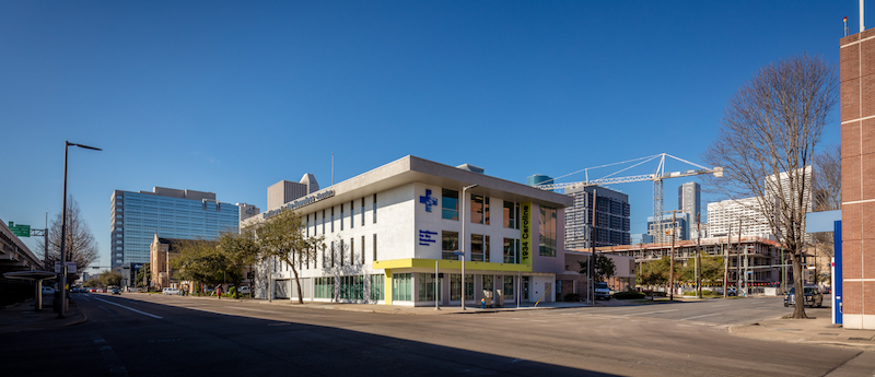
The organization found a three-story, 24,250-sf building that had been a Merchant Marine hall known as the Seafarer’s Union, which HHH selected in part for its proximity to St. Joseph Hospital, which handles many homeless patients.
“Our goal was to design the clinic around our clinical model,” which is the integration of primary care, behavioral care, and consultation and case management services, explains Frances Isbell, M.A., HHH’s chief executive officer. “We also didn’t want it to look like a bus station.”
Last February, HHH celebrated its first anniversary in its new, larger digs, whose extensive renovation presented a number of challenges to a Building Team that included Page (architect and MEP engineer), WSP (co-consultant), ASA Daily (SE), H2B Engineers (CE), Forney Construction (CE), FMG Design (signage and graphics), and TechKnowledge (A/V, IT, Security).
For one thing, each floorplate is only 8,000 sf. Half of the first floor was taken up by indoor parking. And the third floor was a giant open meeting room.
The first thing that Page did, says Neubek, was to move the front door to the short side of the building, partly to dissuade the homeless from congregating at a nearby restaurant. Page also relocated the parking garage to the back of the first floor, which freed up a bit more administrative space.
The second floor includes the main reception desk and the medical clinic with 12 exam rooms, an in-house pharmacy, and small testing labs. The design of this floor is a flexible module so offices can be converted to exam rooms if needed, and vice versa.
The third floor has six dental stations—dental care being HHH’s most sought-after service, says Isbell—and behavioral health spaces and offices with glass sidelights that allow more daylight to come onto the floor. The third floor includes workstations, training areas, and lockers for HHH’s 400 annual volunteers.
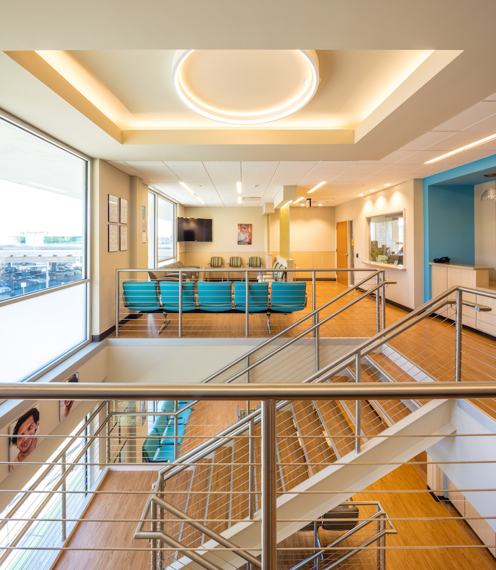
A “grand staircase” between waiting rooms ties together the floors of this facility. Vinyl plank flooring was selected for its durability and sense of warmth. Image: Slyworks Photography/Courtesy of Page.
Before construction, exam rooms were mocked up to allow physicians and attending staff to determine if counter and cabinet heights and spaces between equipment were positioned properly. Patient rooms were also oriented toward the back of the building, which provides the staff with a higher measure of safety in the event that patient behavior becomes problematic.
Other design accommodations include an open staircase between waiting areas that ties the floors together, more exterior coverage over the reclad entryway with a new exterior lantern, a new elevator, and larger energy efficiency windows. The second floor clinic offers patients electrical outlets where they can recharge the mobile devices. Translucent partitions between the dental stations and waiting rooms offer privacy while still letting light permeate the building.
One of the more noticeable features of the new building is its flooring. Isbell says that it had to be durable, “as people living on the street are bringing all of their worldly possessions in with them.” HHH also wanted the interior design to provide a sense of warmth. So 2,232 sf of the second and third floors and stairwell are covered with Parterre’s ingrained natural oak luxury vinyl planks.
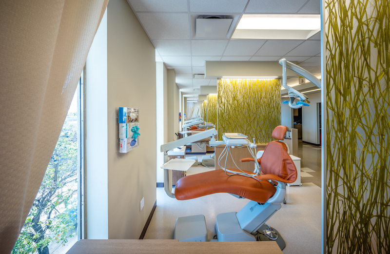
Dental care is the most sought-after service at Healthcare for the Homeless Houston's new facility, which has six dental stations bookended by translucent partitions. Image: Slyworks Photography/Courtesy of Page.
The whole project cost about $8.5 million, which HHH financed through a combination of state and private foundation grants. Neubek says TechKnowledge donated all of its services, and most of the ceiling tile and lighting used for the renovation were donated, too.
Isbell says that moving into the new center is a benchmark for this organization, which operates two other facilities in Houston. Most important, it allows the organization to see more patients daily. (The three centers average about 100 per day.) But, she laughs, “if it ever happens again, I’ll retire. It was a lot of work.”
Related Stories
| Dec 13, 2013
Safe and sound: 10 solutions for fire and life safety
From a dual fire-CO detector to an aspiration-sensing fire alarm, BD+C editors present a roundup of new fire and life safety products and technologies.
| Dec 10, 2013
16 great solutions for architects, engineers, and contractors
From a crowd-funded smart shovel to a why-didn’t-someone-do-this-sooner scheme for managing traffic in public restrooms, these ideas are noteworthy for creative problem-solving. Here are some of the most intriguing innovations the BD+C community has brought to our attention this year.
| Dec 10, 2013
Modular Pedia-Pod: Sustainability in healthcare construction [slideshow]
Greenbuild 2013 in Philadelphia was the site of a unique display—Pedia-Pod, a modular pediatric treatment room designed and built by NRB, in collaboration with the editors of Building Design+Construction, SGC Horizon LLC, and their team of medical design consultants.
| Dec 3, 2013
Creating a healthcare capital project plan: The truth behind the numbers
When setting up a capital project plan, it's one thing to have the data, but quite another to have the knowledge of the process.
| Nov 27, 2013
Pediatric hospitals improve care with flexible, age-sensitive design
Pediatric hospitals face many of the same concerns as their adult counterparts. Inpatient bed demand is declining, outpatient visits are soaring, and there is a higher level of focus on prevention and reduced readmissions.
| Nov 27, 2013
Exclusive survey: Revenues increased at nearly half of AEC firms in 2013
Forty-six percent of the respondents to an exclusive BD+C survey of AEC professionals reported that revenues had increased this year compared to 2012, with another 24.2% saying cash flow had stayed the same.
| Nov 27, 2013
Wonder walls: 13 choices for the building envelope
BD+C editors present a roundup of the latest technologies and applications in exterior wall systems, from a tapered metal wall installation in Oklahoma to a textured precast concrete solution in North Carolina.
| Nov 27, 2013
LEED for Healthcare offers new paths to green
LEED for Healthcare debuted in spring 2011, and certifications are now beginning to roll in. They include the new Puyallup (Wash.) Medical Center and the W.H. and Elaine McCarty South Tower at Dell Children’s Medical Center of Central Texas in Austin.
| Nov 26, 2013
Construction costs rise for 22nd straight month in November
Construction costs in North America rose for the 22nd consecutive month in November as labor costs continued to increase, amid growing industry concern over the tight availability of skilled workers.
| Nov 25, 2013
Building Teams need to help owners avoid 'operational stray'
"Operational stray" occurs when a building’s MEP systems don’t work the way they should. Even the most well-designed and constructed building can stray from perfection—and that can cost the owner a ton in unnecessary utility costs. But help is on the way.


