Earlier this month, Clark Construction, on behalf of the owner Carr Properties, filed applications to raze four buildings in Washington D.C., which include the headquarters of the Washington Post, which is moving to a new location.
That demolition—of two seven-story office buildings, one 10-story building, and a 12-story office building—isn’t scheduled to occur until next year at the earliest.
But Carr—which paid $157.4 million to acquire these properties in March 2014—has already signed Fannie Mae as an anchor tenant for a new development that the developer is planning for this site.
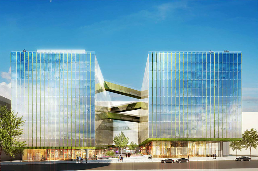
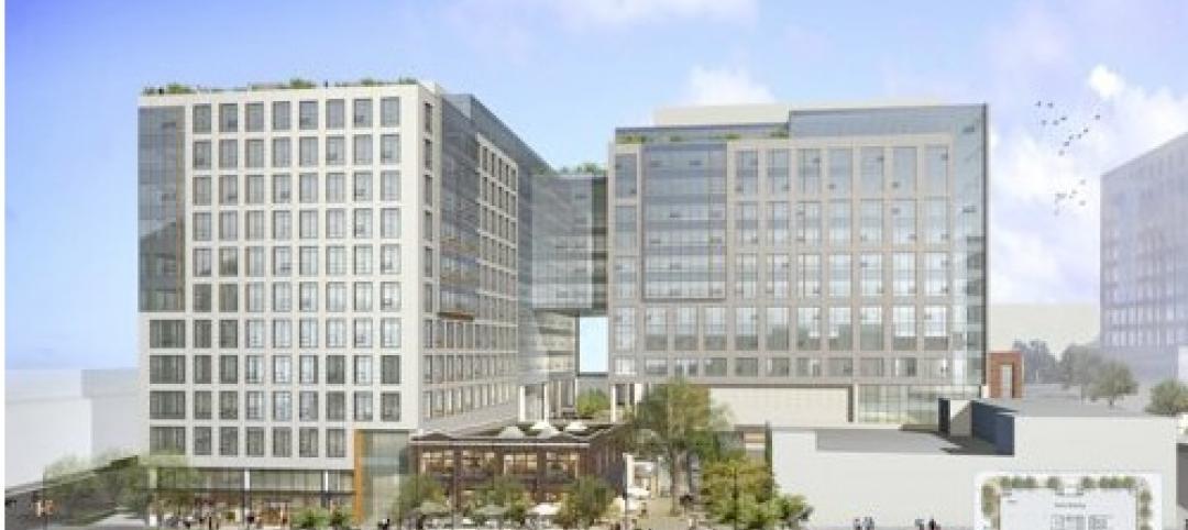
On Monday, Carr Properties filed its plans with the city’s Board of Zoning Adjustments for an 838,480-sf 12-story metal and glass office building. Fannie Mae will lease about 85% of the building’s space and intends to occupy the property in two phases starting in late 2017.
When it relocates, Fannie Mae would be consolidating the 1 million sf its current headquarters takes up. Fannie has announced plans to put that headquarters building, as well as two other buildings, up for sale.
Carr intends to link this building to the nearby Columbia Center—which earlier this month it purchased for $120 million—using a canopy structure that could be as large as 4,000 sf. Overall, the two buildings will consist of 1,252,600 sf. Urban Turf.com reports that the new building will be constructed to a height of 130 feet as measured from the elevation at the midpoint of the building along 15th Street to the top of the parapet.
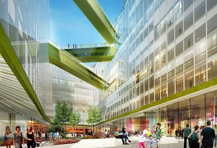
The building will feature two wings, separated by a large open and landscaped courtyard. There will be a series of retail pavilions totaling 42,000 sf, and 579 parking spaces on three underground levels.
The architects listed for this project are WDG Architecture and SHoP Architects. The Washington Business Journal observes that this design is similar to the one SHoP designed for Uber’s headquarters in San Francisco.
But initial reaction to the design for D.C. building was decidedly mixed. Several readers commented on Urban Turf’s website that they thought the design was too boxy, and used words like “boring,” “cut-rate,” and “dull” to describe its look. Some readers also seemed peeved that Carr had hired out-of-town architects to design its building.
Related Stories
| May 11, 2011
DOE releases guide for 50% more energy-efficient office buildings
The U.S. Department of Energy today announced the release of the first in a new series of Advanced Energy Design Guides to aid in the design of highly energy efficient office buildings. The 50% AEDG series will provide a practical approach to commercial buildings designed to achieve 50% energy savings compared to the commercial building energy code used in many areas of the country.
| May 10, 2011
Google hires Ingenhoven Architects to design new Mountain View office
The current Googleplex is straining at the seams and yet the company is preparing its biggest hiring surge ever, so Google decided now’s the time to build its own office space—a first for the Internet giant. The company hired Ingenhoven Architects, a German firm that specializes in sustainable architecture, to create plans for what could be a 600,000-sf office.
| Apr 13, 2011
Office interaction was the critical element to Boston buildout
Margulies Perruzzi Architects, Boston, designed the new 11,460-sf offices for consultant Interaction Associates and its nonprofit sister organization, The Interaction Institute for Social Change, inside an old warehouse near Boston’s Seaport Center.
| Apr 13, 2011
Red Bull Canada HQ a mix of fluid spaces and high-energy design
The Toronto architecture firm Johnson Chou likes to put a twist on its pared-down interiors, and its work on the headquarters for Red Bull Canada is no exception. The energy drink maker occupies 12,300 sf on the top two floors of a three-story industrial building in Toronto, and the design strategy for its space called for leaving the base building virtually untouched while attention was turned to the interior architecture.
| Apr 13, 2011
Former department store gets new lease on life as MaineHealth HQ
The long-vacant Sears Roebuck building in Portland, Maine, was redeveloped into the corporate headquarters for MaineHealth. Consigli Construction and local firm Harriman Architects + Engineers handled the 14-month fast-track project, transforming the 89,000-sf, four-story facility for just $100/sf.
| Mar 29, 2011
Chicago’s Willis Tower to become a vertical solar farm
Chicago’s iconic Willis Tower (formerly the Sears Tower) is set to become a massive solar electric plant with the installation of a pilot solar electric glass project.
| Mar 29, 2011
Read up on Amazon.com's new green HQ
Phase IV of Amazon’s new headquarters in Seattle is nearly complete. The company has built 10 of the 11 buildings planned for its new campus in the South Lake Union neighborhood, and is on-track for a 2013 grand opening.
| Mar 11, 2011
Blockbuster remodel transforms Omaha video store into a bank
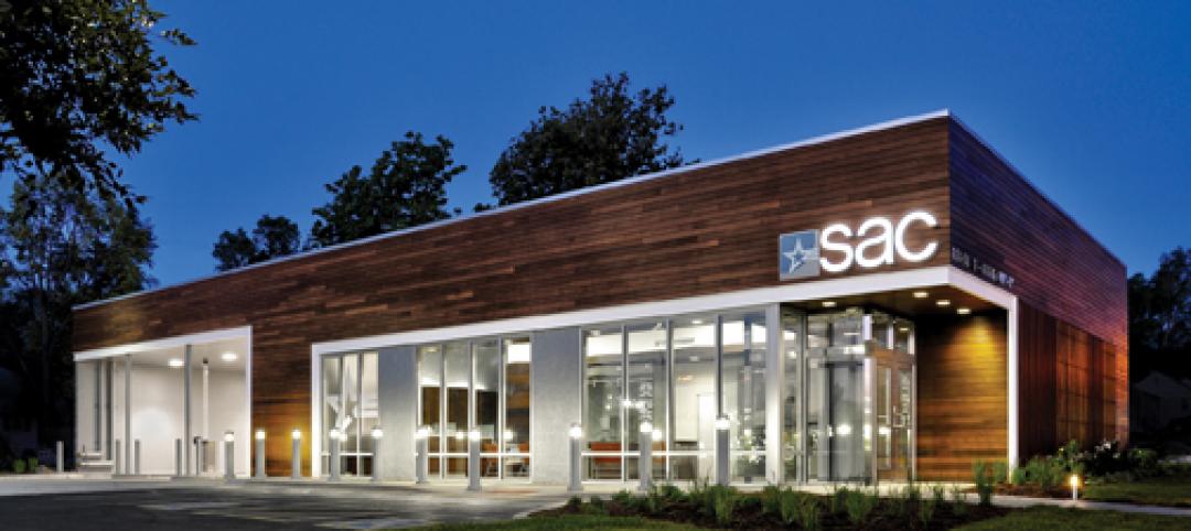
A former Hollywood Video store in Omaha, Neb., was renovated and repurposed as the SAC Federal Credit Union, Ames Branch. Architects at Leo A Daly transformed the outdated 5,000-sf retail space into a modern facility by wrapping the exterior in poplar siding and adding a new glass storefront that floods the interior with natural light.
| Mar 11, 2011
Chicago office building will serve tenants and historic church
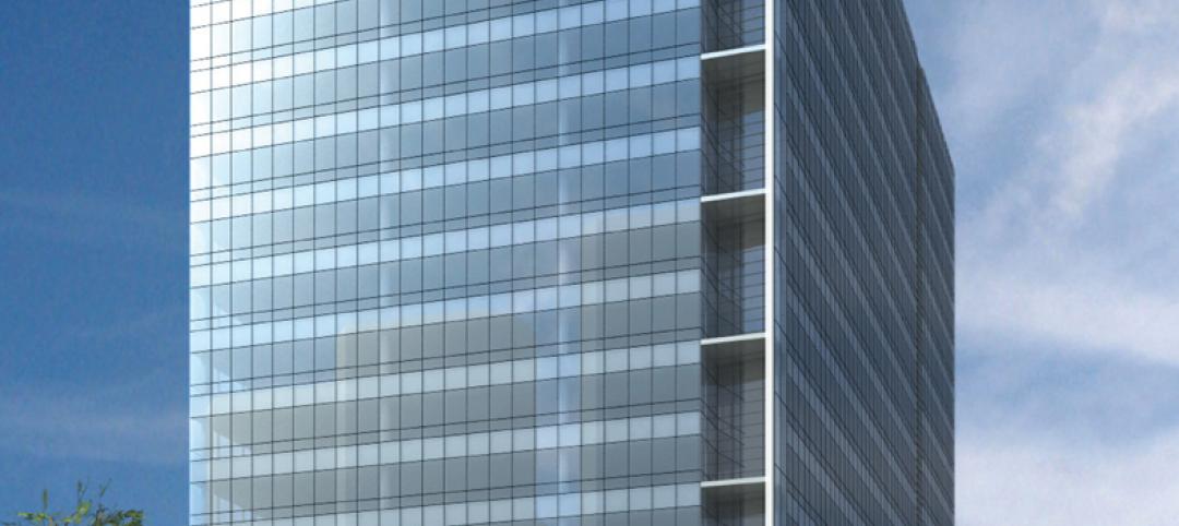
The Alter Group is partnering with White Oak Realty Partners to develop a 490,000-sf high-performance office building in Chicago’s West Loop. The tower will be located on land owned by Old St. Patrick’s Church (a neighborhood landmark that survived the Chicago Fire of 1871) that’s currently being used as a parking lot.
| Mar 9, 2011
Hoping to win over a community, Facebook scraps its fortress architecture
Facebook is moving from its tony Palo Alto, Calif., locale to blue-collar Belle Haven, and the social network want to woo residents with community-oriented design.


