Earlier this month, Clark Construction, on behalf of the owner Carr Properties, filed applications to raze four buildings in Washington D.C., which include the headquarters of the Washington Post, which is moving to a new location.
That demolition—of two seven-story office buildings, one 10-story building, and a 12-story office building—isn’t scheduled to occur until next year at the earliest.
But Carr—which paid $157.4 million to acquire these properties in March 2014—has already signed Fannie Mae as an anchor tenant for a new development that the developer is planning for this site.
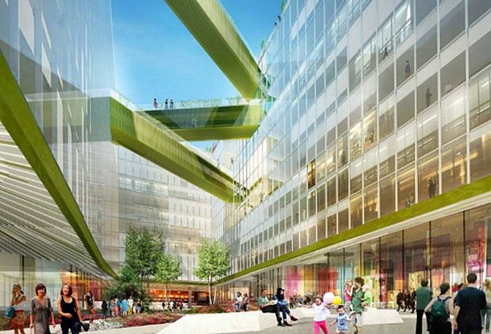
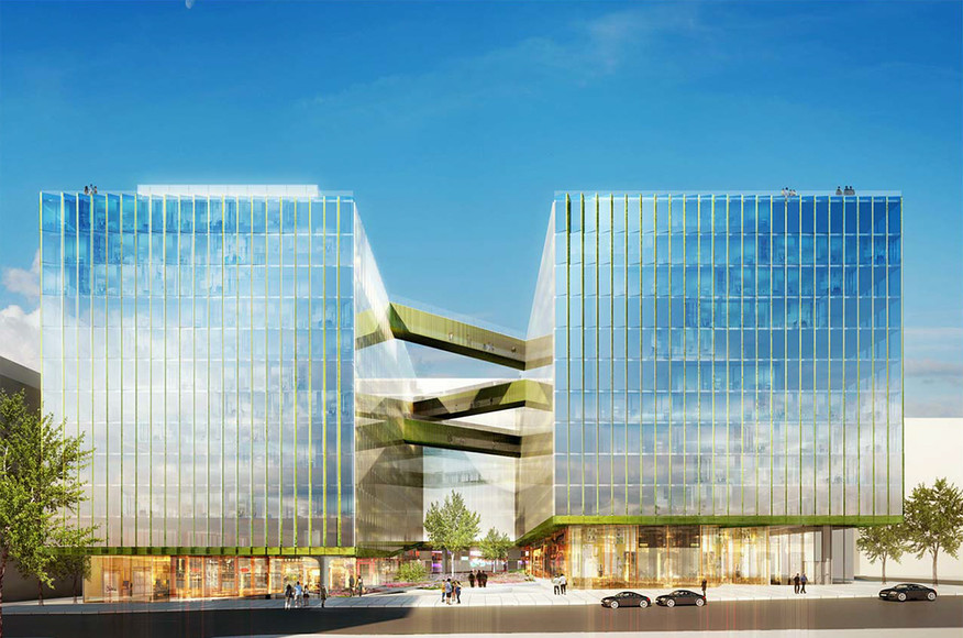
On Monday, Carr Properties filed its plans with the city’s Board of Zoning Adjustments for an 838,480-sf 12-story metal and glass office building. Fannie Mae will lease about 85% of the building’s space and intends to occupy the property in two phases starting in late 2017.
When it relocates, Fannie Mae would be consolidating the 1 million sf its current headquarters takes up. Fannie has announced plans to put that headquarters building, as well as two other buildings, up for sale.
Carr intends to link this building to the nearby Columbia Center—which earlier this month it purchased for $120 million—using a canopy structure that could be as large as 4,000 sf. Overall, the two buildings will consist of 1,252,600 sf. Urban Turf.com reports that the new building will be constructed to a height of 130 feet as measured from the elevation at the midpoint of the building along 15th Street to the top of the parapet.
The building will feature two wings, separated by a large open and landscaped courtyard. There will be a series of retail pavilions totaling 42,000 sf, and 579 parking spaces on three underground levels.
The architects listed for this project are WDG Architecture and SHoP Architects. The Washington Business Journal observes that this design is similar to the one SHoP designed for Uber’s headquarters in San Francisco.
But initial reaction to the design for D.C. building was decidedly mixed. Several readers commented on Urban Turf’s website that they thought the design was too boxy, and used words like “boring,” “cut-rate,” and “dull” to describe its look. Some readers also seemed peeved that Carr had hired out-of-town architects to design its building.

Related Stories
| Aug 11, 2010
U.S. firm designing massive Taiwan project
MulvannyG2 Architecture is designing one of Taipei, Taiwan's largest urban redevelopment projects. The Bellevue, Wash., firm is working with developer The Global Team Group to create Aquapearl, a mixed-use complex that's part of the Taipei government's "Good Looking Taipei 2010" initiative to spur redevelopment of the city's Songjian District.
| Aug 11, 2010
High-Performance Workplaces
Building Teams around the world are finding that the workplace is changing radically, leading owners and tenants to reinvent corporate office buildings to compete more effectively on a global scale. The good news is that this means more renovation and reconstruction work at a time when new construction has stalled to a dribble.
| Aug 11, 2010
Idea Center at Playhouse Square: A better idea
Through a unique partnership between a public media organization and a performing arts/education entity, a historic building in the heart of downtown Cleveland has been renovated as a model of sustainability and architectural innovation. Playhouse Square, which had been working for more than 30 years to revitalize the city's arts district, teamed up with ideastream, a newly formed media group t...
| Aug 11, 2010
200 East Brady
Until July 2004, 200 East Brady, a 40,000-sf, 1920s-era warehouse, had been an abandoned eyesore in Tulsa, Okla.'s Brady district. The building, which was once home to a grocery supplier, then a steel casting company, and finally a casket storage facility, was purchased by Tom Wallace, president and founder of Wallace Engineering, to be his firm's new headquarters.
| Aug 11, 2010
Two Rivers Marketing: Industrial connection
It was supposed to be the perfect new office. In July 2003, Two Rivers Marketing Group of Des Moines, Iowa, began working with Shiffler Associates Architects on a 14,000-sf building to house their rapidly growing marketing firm. Over the next six months they put together an innovative program that drew on unprecedented amounts of employee feedback.
| Aug 11, 2010
AIA Course: Enclosure strategies for better buildings
Sustainability and energy efficiency depend not only on the overall design but also on the building's enclosure system. Whether it's via better air-infiltration control, thermal insulation, and moisture control, or more advanced strategies such as active façades with automated shading and venting or novel enclosure types such as double walls, Building Teams are delivering more efficient, better performing, and healthier building enclosures.
| Aug 11, 2010
Glass Wall Systems Open Up Closed Spaces
Sectioning off large open spaces without making everything feel closed off was the challenge faced by two very different projects—one an upscale food market in Napa Valley, the other a corporate office in Southern California. Movable glass wall systems proved to be the solution in both projects.
| Aug 11, 2010
Silver Award: Pere Marquette Depot Bay City, Mich.
For 38 years, the Pere Marquette Depot sat boarded up, broken down, and fire damaged. The Prairie-style building, with its distinctive orange iron-brick walls, was once the elegant Bay City, Mich., train station. The facility, which opened in 1904, served the Flint and Pere Marquette Railroad Company when the area was the epicenter of lumber processing for the shipbuilding and kit homebuilding ...
| Aug 11, 2010
Special Recognition: Durrant Group Headquarters, Dubuque, Iowa
Architecture firm Durrant Group used the redesign of its $3.7 million headquarters building as a way to showcase the firm's creativity, design talent, and technical expertise as well as to create a laboratory for experimentation and education. The Dubuque, Iowa, firm's stated desire was to set a high sustainability standard for both itself and its clients by recycling a 22,890-sf downtown buil...
| Aug 11, 2010
Thrown For a Loop in China
While the Bird's Nest and Water Cube captured all the TV coverage during the Beijing Olympics in August, the Rem Koolhaas-designed CCTV Headquarters in Beijing—known as the “Drunken Towers” or “Big Shorts,” for its unusual shape—is certain to steal the show when it opens next year.


