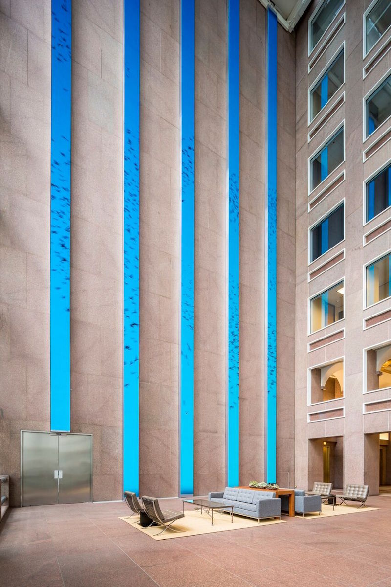
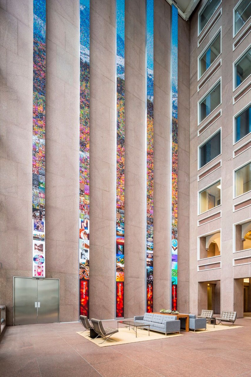
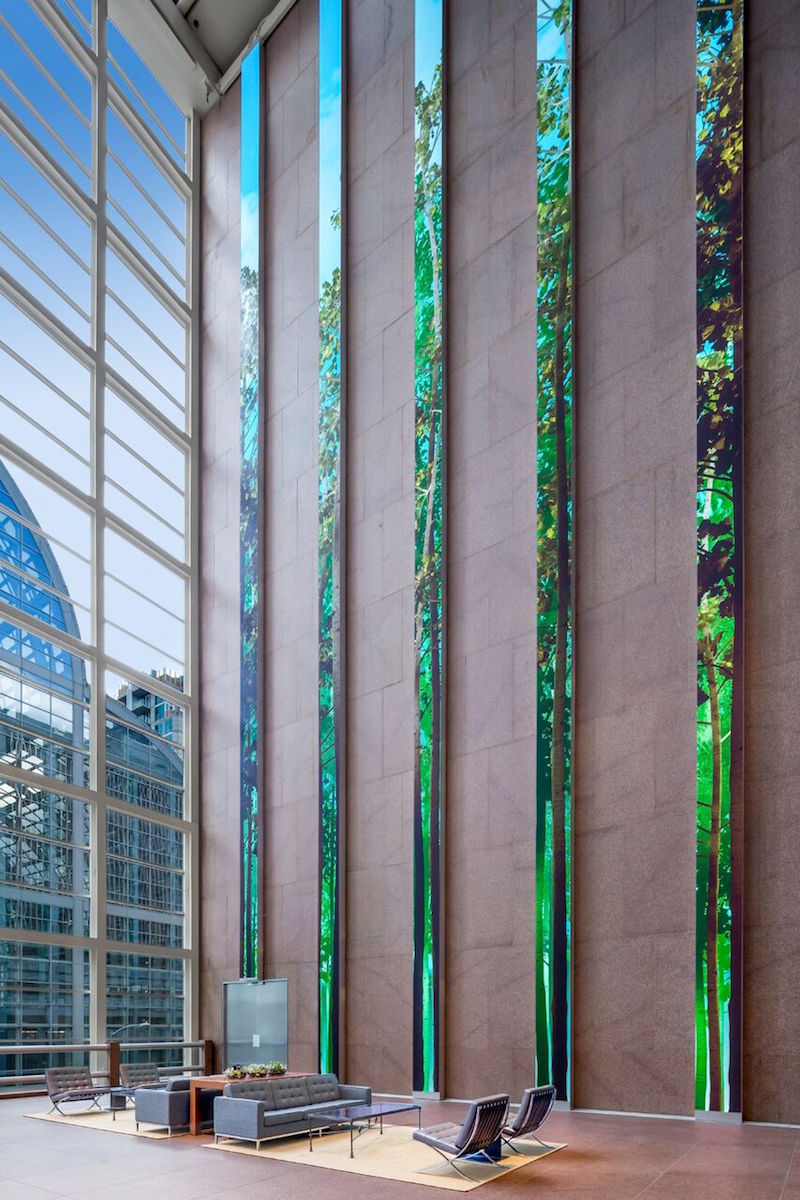
While the entirety of Denver’s Wells Fargo Center may have just completed a three-year renovation process, it is the 86-foot floor-to-ceiling digital installation in the lobby that is getting all the attention. Five thin LED columns with screen resolutions that are six times that of normal HD are bringing life to the previously somber lobby of the building originally designed by Philip Johnson.
The five screens, when viewed together, create one cohesive canvas that alternates between artistic and conceptual images such as colorful swirling ink drops or realistic depictions of the surrounding Colorado landscape. A grove of trees rises 86-feet into the air and slowly sways in the breeze, changing with the time of day and the time of season; a flock of birds, animated in real-time, can fly across the screens for hours and never repeat the same flight pattern; and mountainscapes created from thousands of Instagram photos provide different viewing experiences depending on your proximity to the screens. The installation can serve a practical purpose, as well, such as displaying the five-day weather outlook.
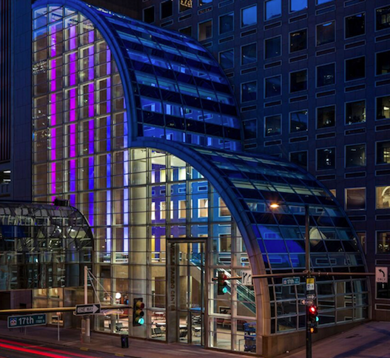
The main goal was for the screens to feel like a giant window to the outside, according to Ed Purver, Senior Immersive Designer at ESI Design. The installation is visible from outside through the glass atrium and is quickly becoming a new tourist attraction in the city of Denver.
The lobby also underwent changes to make it more modern, social, and comfortable. New works of art, commissioned specifically for the site, furniture, and lighting were added in an effort to keep the original Philip Johnson aesthetic alive while giving the space a more modern feel.
You can view images of the display and a video below.
 Photo Courtesy of ESI Design
 Photo Courtesy of ESI Design
 Photo Courtesy of ESI Design
Wells Fargo Center, Denver, by ESI Design from ESI Design on Vimeo.
Related Stories
| Aug 11, 2010
Top of the rock—Observation deck at Rockefeller Center
Opened in 1933, the observation deck at Rockefeller Center was designed to evoke the elegant promenades found on the period's luxury transatlantic liners—only with views of the city's skyline instead of the ocean. In 1986 this cultural landmark was closed to the public and sat unused for almost two decades.
| Aug 11, 2010
200 Fillmore
Built in 1963, the 32,000-sf 200 Fillmore building in Denver housed office and retail in a drab, outdated, and energy-splurging shell—a “style” made doubly disastrous by 200 Fillmore's function as the backdrop for a popular public plaza and outdoor café called “The Beach.
| Aug 11, 2010
Integrated Project Delivery builds a brave, new BIM world
Three-dimensional information, such as that provided by building information modeling, allows all members of the Building Team to visualize the many components of a project and how they work together. BIM and other 3D tools convey the idea and intent of the designer to the entire Building Team and lay the groundwork for integrated project delivery.
| Aug 11, 2010
Inspiring Offices: Office Design That Drives Creativity
Office design has always been linked to productivity—how many workers can be reasonably squeezed into a given space—but why isn’t it more frequently linked to creativity? “In general, I don’t think enough people link the design of space to business outcome,” says Janice Linster, partner with the Minneapolis design firm Studio Hive.
| Aug 11, 2010
Great Solutions: Products
14. Mod Pod A Nod to Flex Biz Designed by the British firm Tate + Hindle, the OfficePOD is a flexible office space that can be installed, well, just about anywhere, indoors or out. The self-contained modular units measure about seven feet square and are designed to serve as dedicated space for employees who work from home or other remote locations.


