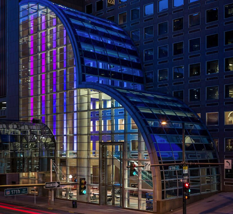
While the entirety of Denver’s Wells Fargo Center may have just completed a three-year renovation process, it is the 86-foot floor-to-ceiling digital installation in the lobby that is getting all the attention. Five thin LED columns with screen resolutions that are six times that of normal HD are bringing life to the previously somber lobby of the building originally designed by Philip Johnson.
The five screens, when viewed together, create one cohesive canvas that alternates between artistic and conceptual images such as colorful swirling ink drops or realistic depictions of the surrounding Colorado landscape. A grove of trees rises 86-feet into the air and slowly sways in the breeze, changing with the time of day and the time of season; a flock of birds, animated in real-time, can fly across the screens for hours and never repeat the same flight pattern; and mountainscapes created from thousands of Instagram photos provide different viewing experiences depending on your proximity to the screens. The installation can serve a practical purpose, as well, such as displaying the five-day weather outlook.
The main goal was for the screens to feel like a giant window to the outside, according to Ed Purver, Senior Immersive Designer at ESI Design. The installation is visible from outside through the glass atrium and is quickly becoming a new tourist attraction in the city of Denver.
The lobby also underwent changes to make it more modern, social, and comfortable. New works of art, commissioned specifically for the site, furniture, and lighting were added in an effort to keep the original Philip Johnson aesthetic alive while giving the space a more modern feel.
You can view images of the display and a video below.
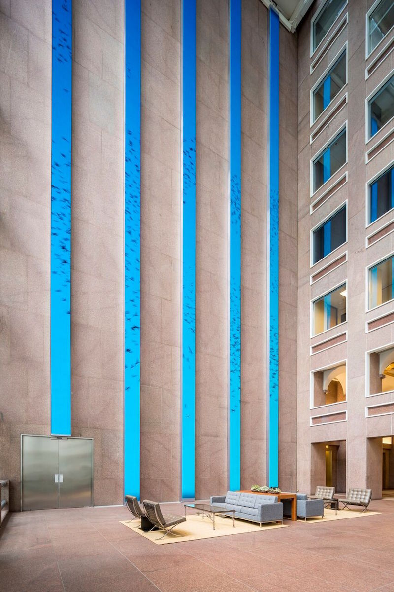 Photo Courtesy of ESI Design
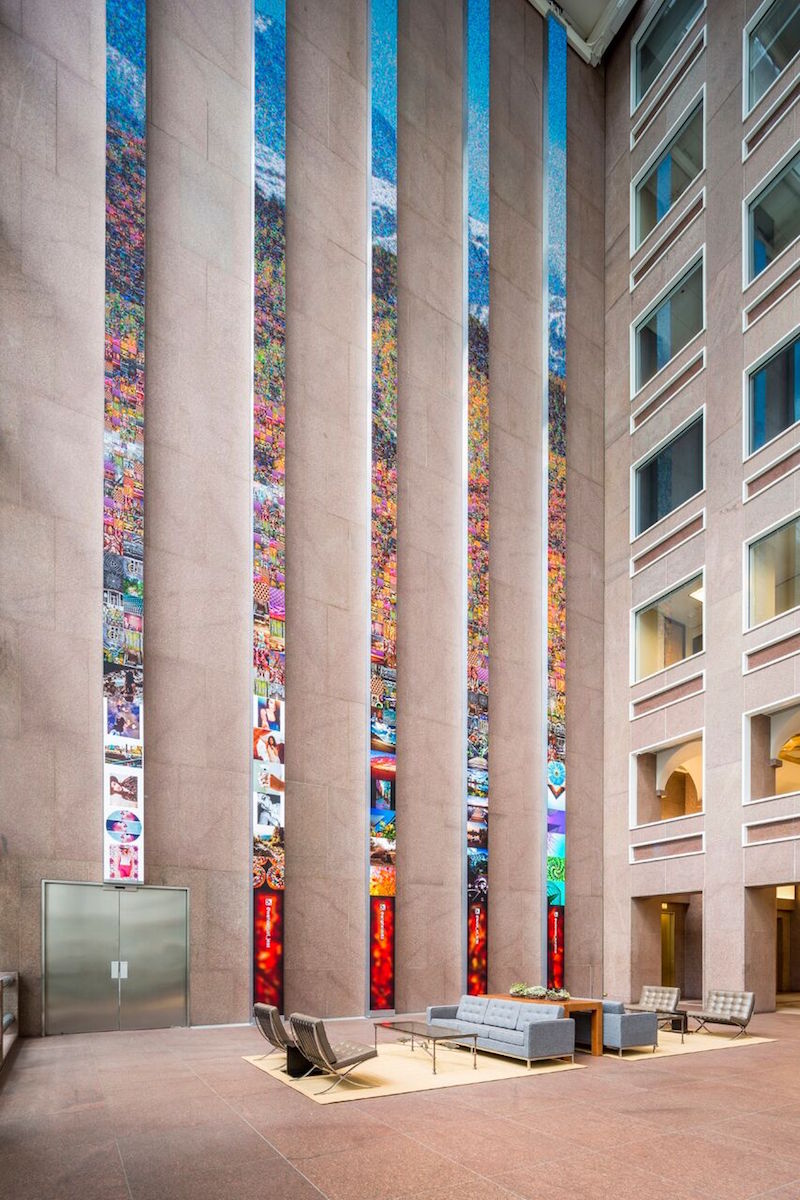 Photo Courtesy of ESI Design
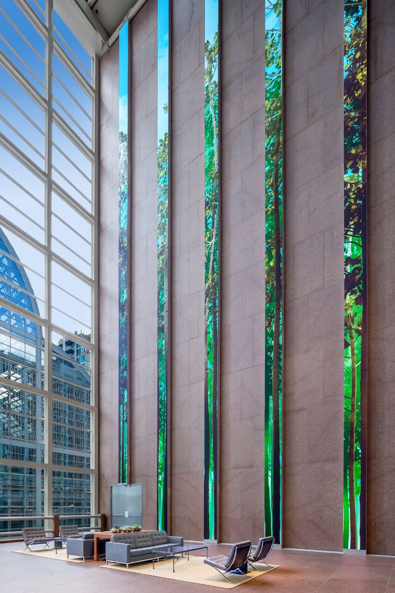 Photo Courtesy of ESI Design
Wells Fargo Center, Denver, by ESI Design from ESI Design on Vimeo.
Related Stories
Office Buildings | Jul 12, 2016
CF Møller designs LEGO world headquarters complex in Denmark
The 52,000-sm complex will incorporate many familiar motifs from the popular plastic building block toys.
Office Buildings | Jul 11, 2016
CetraRuddy designs office tower for Manhattan’s Meatpacking district
Plans originally called for a hotel, but the architect and developers adapted their design for commercial use.
Market Data | Jul 6, 2016
A thriving economy and influx of businesses spur construction in downtown Seattle
Development investment is twice what it was five years ago.
Contractors | Jul 4, 2016
A new report links infrastructure investment to commercial real estate expansion
Competitiveness and economic development are at stake for cities, says Transwestern.
High-rise Construction | Jun 29, 2016
Best Tall Buildings around the world favor unusual shapes and hybrid functions
The Council on Tall Buildings and Urban Habitat selects winners in four regions.
Office Buildings | Jun 16, 2016
Ability to focus, not perks, is top concern for office employees
Open-plan offices found to worsen distraction problem.
High-rise Construction | Jun 15, 2016
WilkinsonEyre designs diamond-patterned Bay Park Centre for Toronto
A sloping plaza with trees, grass, and gardens connects the two downtown towers.
Office Buildings | Jun 14, 2016
Let's not forget introverts when it comes to workplace design
Recent design trends favor extroverts who enjoy collaboration. HDR's Lynn Mignola says that designers need to accommodate introverts, people who recharge with solitude, as well.
Movers+Shapers | Jun 13, 2016
THE DISRUPTORS: The Millennial generation is imposing its will on design
AEC firms, particularly those that design hotels and offices, gain a competitive edge by knowing how to appeal to the largest share of the American workforce.
Office Buildings | Jun 10, 2016
Buildings that invest in wellbeing see healthy returns
Healthy workers are more productive workers, but fitness can be tough when employees at the office for 50 hours a week. Perkins+Will's Janine Grossmann offers the wellness components that landlords and companies should prioritize.


