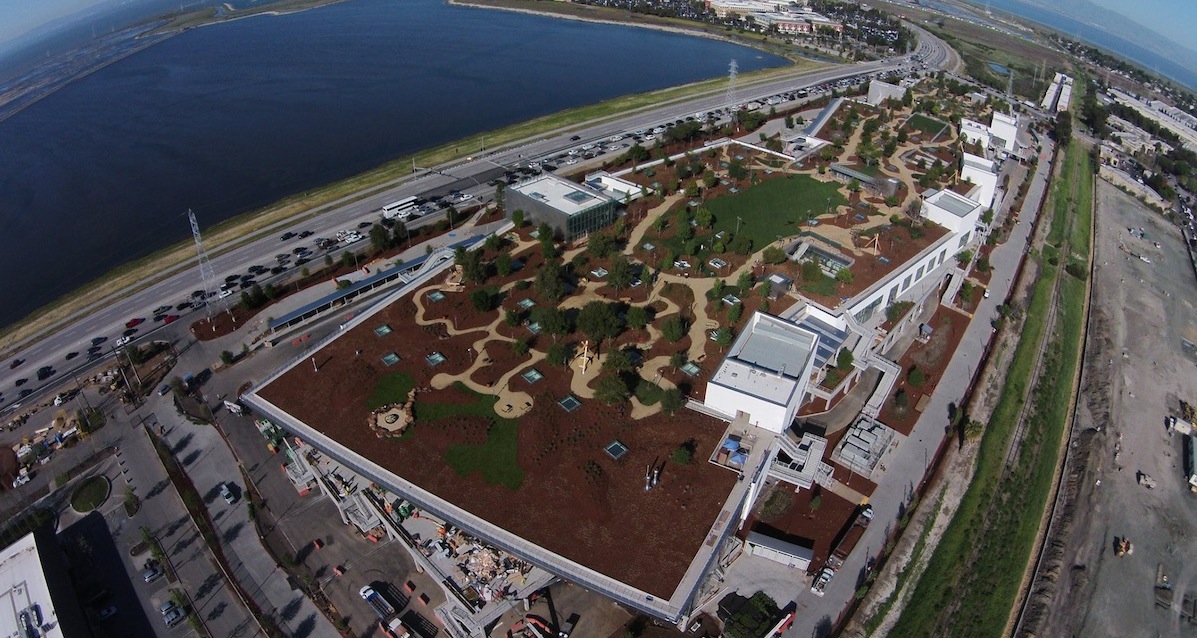
Employees have started moving into Facebook’s new headquarters, a 435,555-sf building in Menlo Park, Calif., whose famed architect Frank Gehry describes as “unassuming, matter-of-fact, and cost effective.”
Gehry says he and Mark Zuckerberg, Facebook’s CEO, had been working on this project for more than three years. The building sits on 22 acres within Facebook’s complex, the former campus of Sun Microsystems that the social media giant acquired in February 2011. The new headquarters is the 20th building to be constructed on that campus, hence its nickname MK20.
Level 10 was the General Contractor on this project, whose cost has not been disclosed by Facebook.
The headquarters features what Zuckerberg, on his own Facebook page, says is “the largest open floor plan in the world, a single room that fits thousands of people.” Winding staircases lead between floors. Zuckerberg says that the interior design “is pretty simple, it isn’t fancy. That’s on purpose.” About 2,800 of Facebook’s engineers will work in this building.
Glass-enclosed meeting rooms are situated in the center of this open space. One of the meeting rooms has been compared to a ball pit at Chuck E. Cheese or a McDonald’s playground. Indeed, there’s more than a little playfulness in the brightly colored furniture and walls throughout (including a glaringly orange hallway).
Facebook also hired Bay Area artists to design art installations for the building, which include an undulating mosaic wall and lots of dripping paint.
While it hasn’t released official photos of the headquarters, Facebook let Instagrammers with larger follower counts roam the building and photograph what they thought looked interesting or cool.
The building dips and rises from 45 to 73 feet. One of its attractions is a nine-acre rooftop park, designed by CMG Landscape Architecture, which includes a half-mile looping walking path. More than 400 trees were planted on what Wired magazine calls “a garden-roofed fantasyland.” The insulated roof also contributed to this building earning LEED Gold certification.
The exterior is sheathed in hyper-reflective siding, which is something of a Gehry trademark. But Facebook chose fritted window panes because the lines or patterns embedded in the glass are more visible, and, therefore, safer for birds that otherwise might fly into the windows.
Construction started on this building in early 2013. Among the concessions that Facebook made to get municipal approval include agreeing to build 15 low-cost homes or contribute $4.5 million toward affordable housing. It also agreed to restrict the number of vehicles that enter and leave the campus.
Facebook is creating a $500,000 charitable foundation and setting up a local job-training program. It is also cleaning up soil contaminated with toxic chemicals.
Related Stories
| Aug 11, 2010
Top of the rock—Observation deck at Rockefeller Center
Opened in 1933, the observation deck at Rockefeller Center was designed to evoke the elegant promenades found on the period's luxury transatlantic liners—only with views of the city's skyline instead of the ocean. In 1986 this cultural landmark was closed to the public and sat unused for almost two decades.
| Aug 11, 2010
200 Fillmore
Built in 1963, the 32,000-sf 200 Fillmore building in Denver housed office and retail in a drab, outdated, and energy-splurging shell—a “style” made doubly disastrous by 200 Fillmore's function as the backdrop for a popular public plaza and outdoor café called “The Beach.
| Aug 11, 2010
Integrated Project Delivery builds a brave, new BIM world
Three-dimensional information, such as that provided by building information modeling, allows all members of the Building Team to visualize the many components of a project and how they work together. BIM and other 3D tools convey the idea and intent of the designer to the entire Building Team and lay the groundwork for integrated project delivery.
| Aug 11, 2010
Inspiring Offices: Office Design That Drives Creativity
Office design has always been linked to productivity—how many workers can be reasonably squeezed into a given space—but why isn’t it more frequently linked to creativity? “In general, I don’t think enough people link the design of space to business outcome,” says Janice Linster, partner with the Minneapolis design firm Studio Hive.
| Aug 11, 2010
Great Solutions: Products
14. Mod Pod A Nod to Flex Biz Designed by the British firm Tate + Hindle, the OfficePOD is a flexible office space that can be installed, well, just about anywhere, indoors or out. The self-contained modular units measure about seven feet square and are designed to serve as dedicated space for employees who work from home or other remote locations.


