Ferrara Candy Company’s new headquarters space in Chicago’s Old Post Office building was designed to accommodate the company’s growth and flexibility and provide more meeting and conference spaces to encourage collaboration and information sharing.
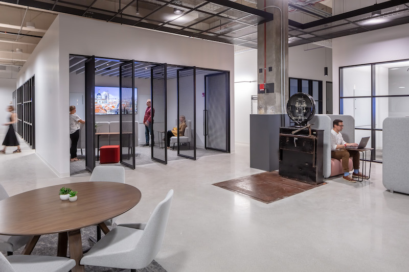
The office’s floor plan is laid out with a singular path to create a feeling of connectedness between the divided “neighborhoods.” Each neighborhood is equipped with small- and large-scale conference rooms, huddle rooms, and open collaboration spaces. Workstations are scattered throughout to provide employees better access to each other and to natural light.
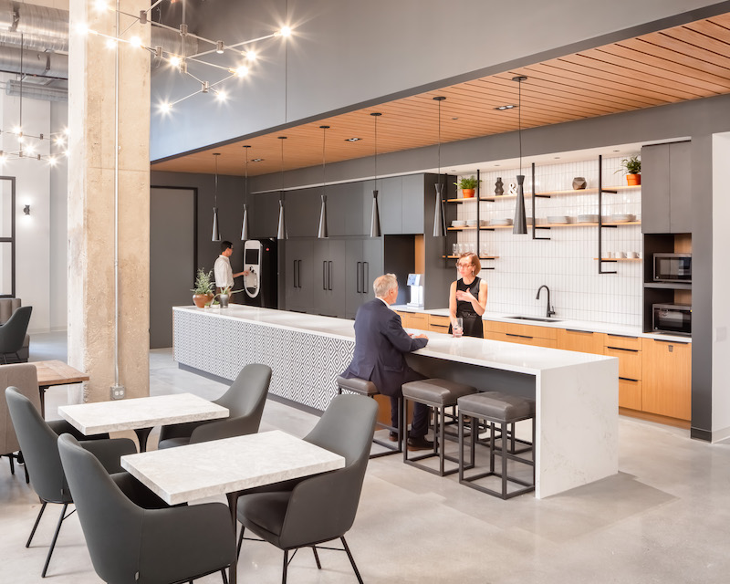
Industrial metal frames are used as space dividers and are infilled with whiteboards and felt panels that serve as tools to encourage brainstorming and innovation. Exposed sightlines encourage a more open and transparent culture, while huddle rooms and private offices give options for privacy and concentration. A cafe space can be transformed throughout the day from a coffee bar and informal meeting area to a happy hour or event venue after hours.
See Also: IH Mississippi Valley Credit Union headquarters completes construction
The design takes care to maintain the historic Old Post Office building’s industrial nature by accentuating the 18-foot-tall ceilings, two vintage mail chutes, and two package scales.
Related Stories
Office Buildings | Apr 8, 2019
Denver office building features 13,000 sf green roof
Dynia Architects designed the building.
Office Buildings | Apr 5, 2019
2019 trends in the workplace
From retention and career advancement to the ethics of inclusion and diversity, these five trends will play a major role this year in design, strategic planning and workplace development.
Industrial Facilities | Mar 10, 2019
The burgeoning Port San Antonio lays out growth plans
Expansions would accommodate cybersecurity, aerospace, and defense tenants, and help commercialize technologies.
Office Buildings | Mar 6, 2019
How to leverage design and culture’s two-way relationship for better workplaces
The relationship between workplace design and company culture isn’t all that different from a tango.
Office Buildings | Feb 15, 2019
A healthier perspective: Office developers bet on wellness amenities to attract top-notch tenants
Owners and developers are driving demand for wellness features and practices—active stairways, biophilia, enhanced air quality, etc.—as one more way draw tenants.
Office Buildings | Feb 15, 2019
Vancouver’s new office building will be a stack of reflective boxes
OSO and Merrick Architecture designed the building.
Office Buildings | Feb 11, 2019
Real-world wellness pays off
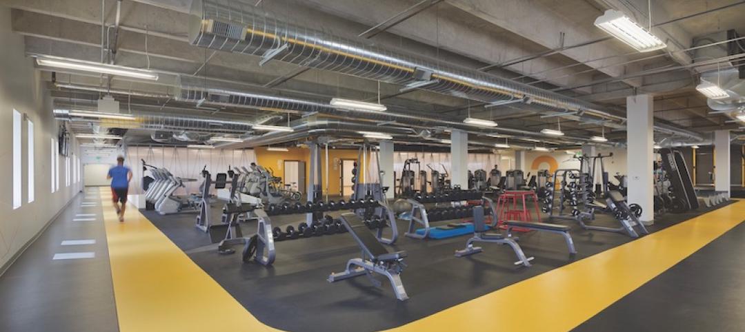
3form, a materials manufacturer, did a top-to-bottom remodel of its Salt Lake City headquarters campus that included adding a 14,500-sf gym.
Office Buildings | Feb 5, 2019
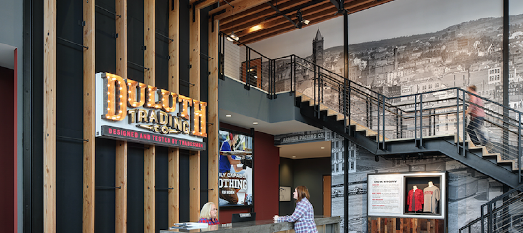
Duluth Trading Company moves to new HQ building
Plunkett Raysich Architects designed the project.
Interior Architecture | Jan 14, 2019
To get more involved earlier in projects, a leading furniture dealer launches a firm for commercial interiors construction
Vantis is positioned to integrate design with offsite customized fabrication.
Office Buildings | Jan 11, 2019
Open offices are bad!
The Harvard studies on the unintended effects of open office defines it as space where 'one entire floor was open, transparent and boundaryless… [with] assigned seats,' and the other had 'similarly assigned seats in an open office design, with large rooms of desks and monitors and no dividers between people's desks.'


