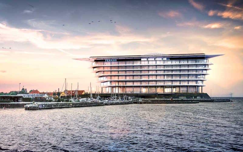
Ferring Pharmaceuticals’ new headquarters building is being constructed on the urban fringe of Copenhagen in Kastrup. Designed by Foster + Partners, the 39,000 sm glass building consists of six stacked floors and sits above a stone plinth, giving the building the appearance of floating. The plinth also acts as the first line of defense against flooding due to the structures waterside location, according to Foster + Partners.
The firm said they wanted to create a strong base that not only connects the building to its waterside location, but also lifts it above water level to provide the best views possible from the ground floor up to the top level.
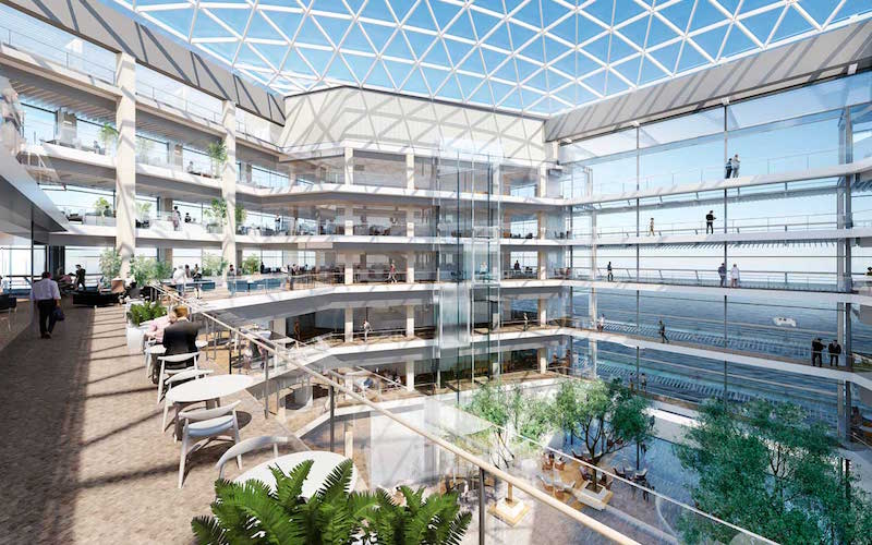
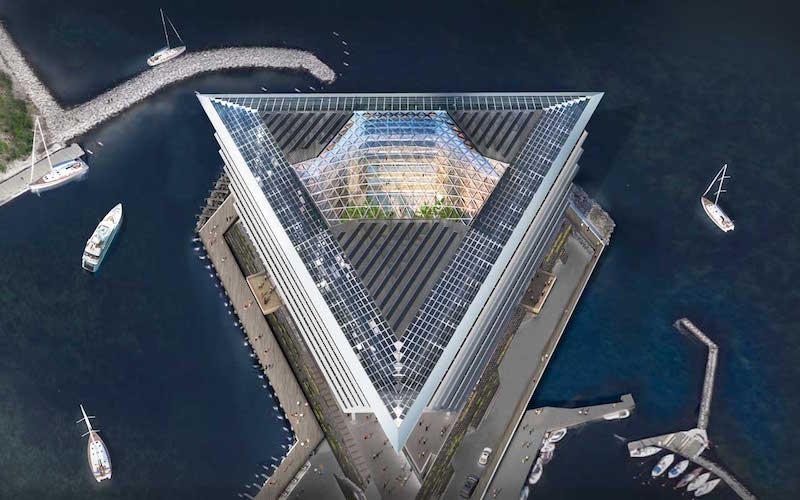
From a top down perspective, the building takes the shape of an equilateral triangle with its glass atrium roof on full display right in the center. The atrium includes the entrance lobby, a café, breakout space, catered conference facilities, and space for social events.
Foster + Partners conducted targeted interviews and in-depth studies to best understand how the employees at Ferring worked in order to design a space specifically tailored to their needs. The offices and laboratories, for quiet, individual work, are located on the perimeter of the building in order to take advantage of surrounding views and natural light. All of the more collaborative meeting spaces are located closer to the center of the building and overlook the naturally lit atrium.
The roof canopy and all six floors cantilever out over the stone plinth to enhance surrounding views while also providing the more practical effect of creating self-shaded spaces on each floor. In order to blend in with the surrounding low-rise urban area, the façade of the headquarters building has a horizontal emphasis.
The scheduled completion date for the new Ferring Pharmaceuticals headquarters building is 2019.
 Rendering courtesy of Foster + Partners
 Rendering courtesy of Foster + Partners
Related Stories
| Aug 11, 2010
Top of the rock—Observation deck at Rockefeller Center
Opened in 1933, the observation deck at Rockefeller Center was designed to evoke the elegant promenades found on the period's luxury transatlantic liners—only with views of the city's skyline instead of the ocean. In 1986 this cultural landmark was closed to the public and sat unused for almost two decades.
| Aug 11, 2010
200 Fillmore
Built in 1963, the 32,000-sf 200 Fillmore building in Denver housed office and retail in a drab, outdated, and energy-splurging shell—a “style” made doubly disastrous by 200 Fillmore's function as the backdrop for a popular public plaza and outdoor café called “The Beach.
| Aug 11, 2010
Integrated Project Delivery builds a brave, new BIM world
Three-dimensional information, such as that provided by building information modeling, allows all members of the Building Team to visualize the many components of a project and how they work together. BIM and other 3D tools convey the idea and intent of the designer to the entire Building Team and lay the groundwork for integrated project delivery.
| Aug 11, 2010
Inspiring Offices: Office Design That Drives Creativity
Office design has always been linked to productivity—how many workers can be reasonably squeezed into a given space—but why isn’t it more frequently linked to creativity? “In general, I don’t think enough people link the design of space to business outcome,” says Janice Linster, partner with the Minneapolis design firm Studio Hive.
| Aug 11, 2010
Great Solutions: Products
14. Mod Pod A Nod to Flex Biz Designed by the British firm Tate + Hindle, the OfficePOD is a flexible office space that can be installed, well, just about anywhere, indoors or out. The self-contained modular units measure about seven feet square and are designed to serve as dedicated space for employees who work from home or other remote locations.


