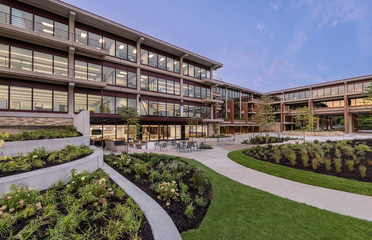
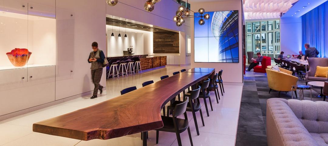
In Oak Brook, Ill., about 15 miles west of downtown Chicago, McDonald’s former corporate headquarters has been transformed into a modern office building for its new tenant, Ace Hardware. Now for the first time, Ace Hardware can bring 1,700 employees from three facilities under one roof. (See more office building news from BD+C.)
Originally designed by architect Dirk Lohan, grandson of Mies van der Rohe, McDonald’s old corporate HQ had quirky design elements such as golden arches on door handles and a circular, tiered boardroom that resembled a Quarter Pounder, with “sesame seeds” on the ceiling. In addition to the 300,000-sf office building and 130,000-sf training facility (which housed Hamburger University), the campus comprises a 218-room Hyatt and a smaller leased office building.
Modernizing McDonald’s headquarters while preserving its mid-century modern architecture
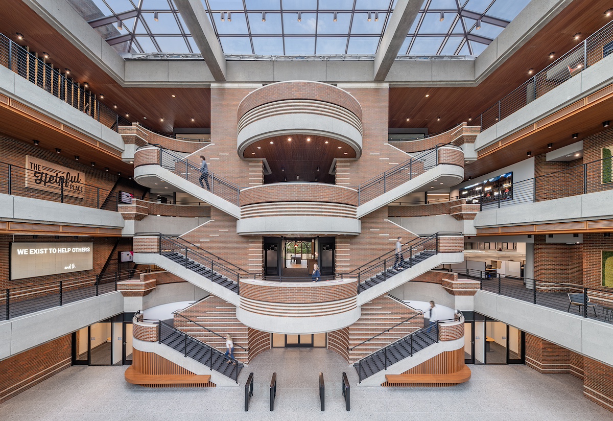
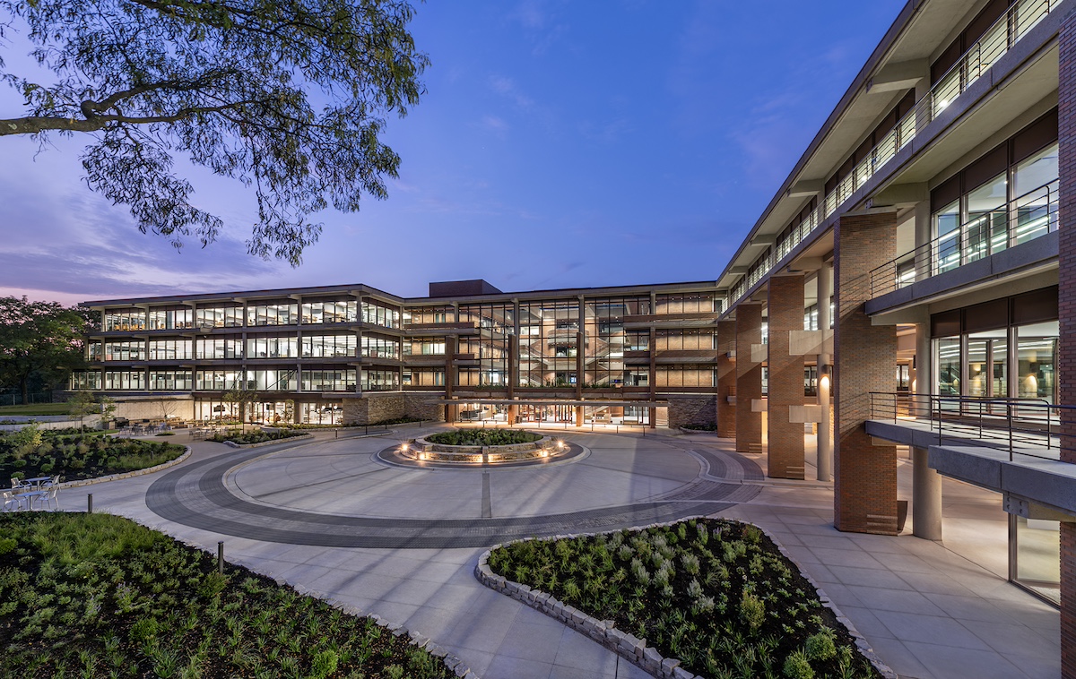
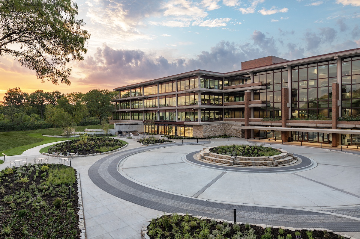
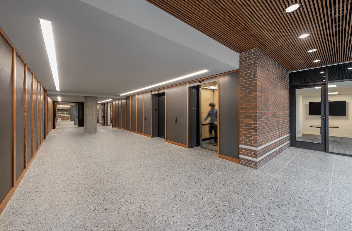
Architecture firm Studio Steinbomer has modernized the administrative building while preserving its midcentury architecture and design. Throughout the building, the design team emphasized the midcentury aesthetic—introducing terrazzo flooring, wood slats, metal panels and brick, as well as replacing windows using the original’s same glass profile.
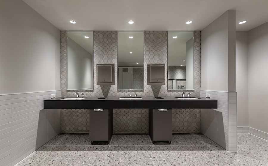
The team reconfigured and renovated the building to serve Ace’s needs, made updates to meet code requirements, and fully renovated all the restrooms, elevator lobbies, and main lobby. A new amenity center includes a café, private dining rooms, commercial kitchen, fitness center, multipurpose room, interview rooms, and conference center.
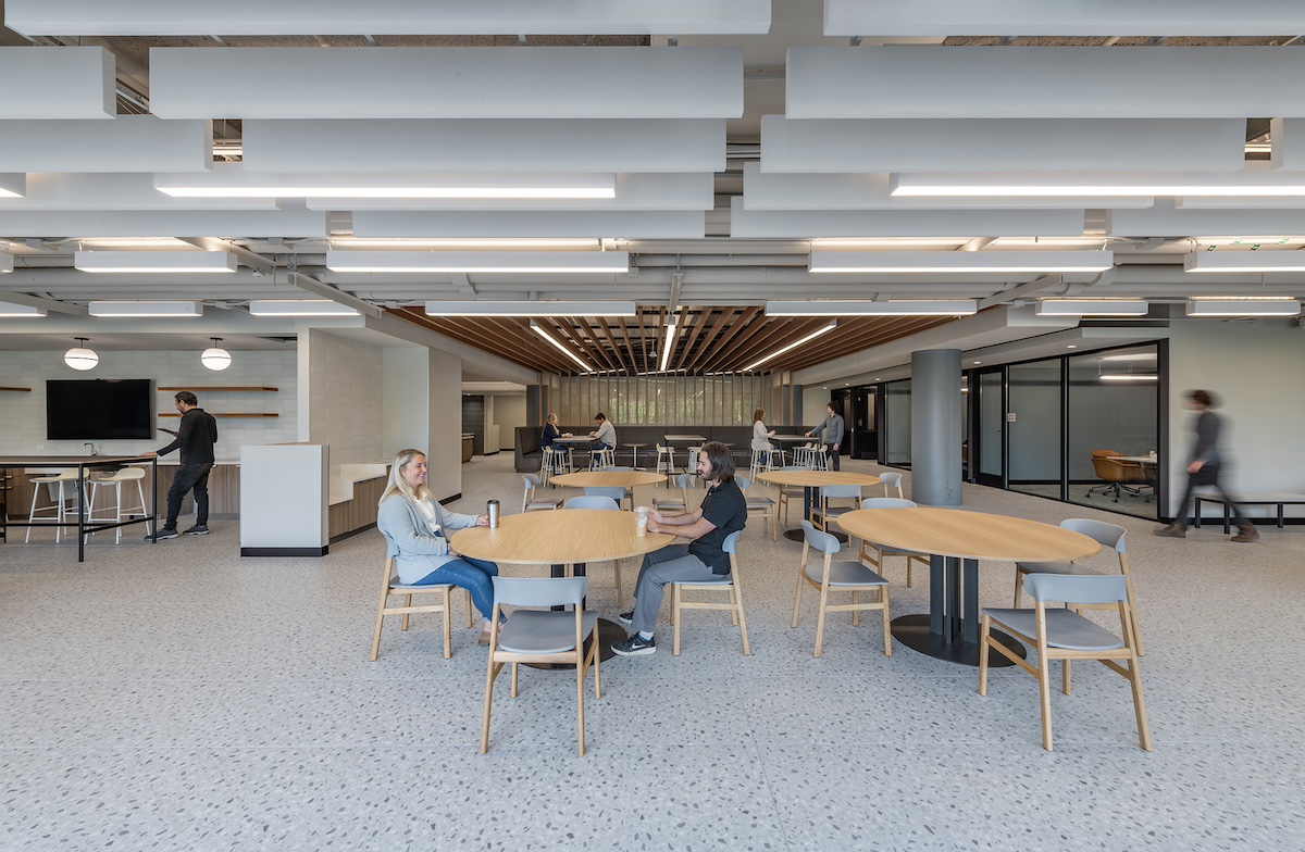
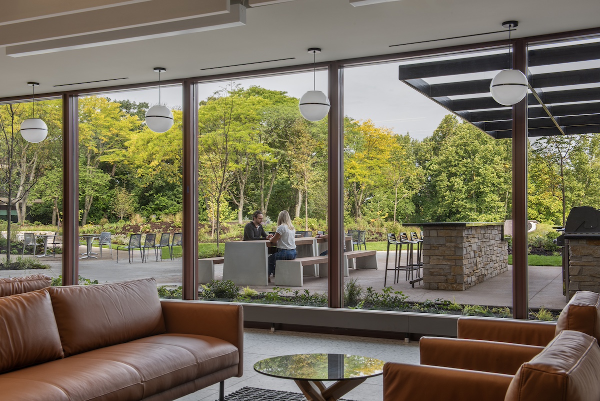
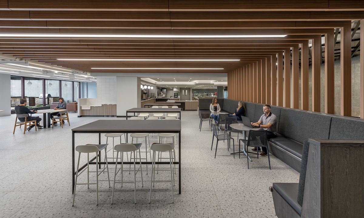
Two changes represented the most significant interventions: first, converting McDonald’s large test kitchens on the top floor into offices that can enjoy views of the campus; and second, turning the parking garage into a food service area with a café that opens to an outdoor plaza. Both of these elements aim to provide employees with stronger connections to the site. Similarly, the conference center has been equipped with modern technology and flexible folding walls inside a sunlit, glass-encased space, creating a visual and physical connection with the surroundings.
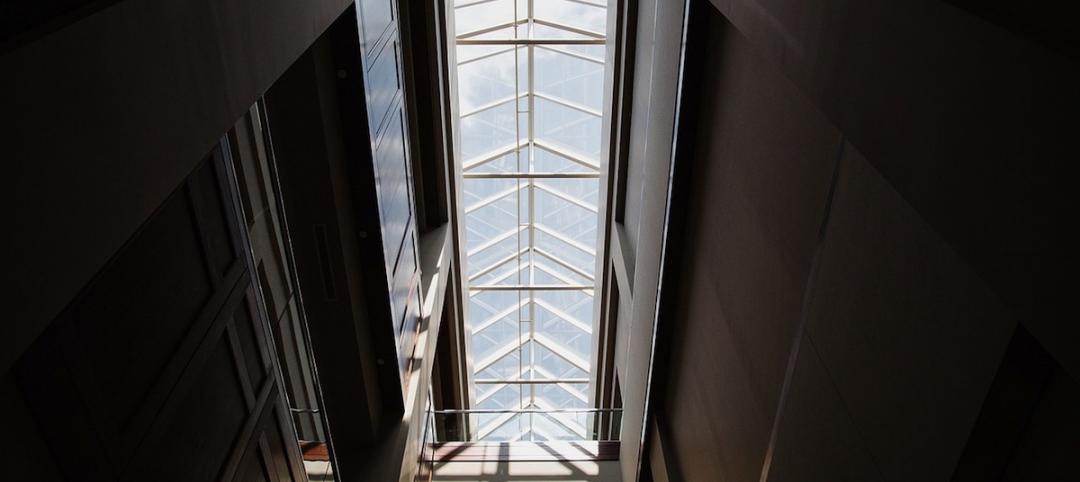
Previously, the administrative facility’s ground floor had been mostly devoted to back-of-house functions. By converting the parking garage and expanding ground-floor uses with vestibules and meeting areas, the lobby is now more interactive and functional. As a result, people feel welcome to linger in the space under its massive skylight.
On the Building Team:
Owner/developer: JPD Oak Brook Holdings, LLC
Design architect and architect of record: Studio Steinbomer
Landscape Architect: Lamar Johnson Collaborative
MEP engineer: ESD (now Stantec)
Structural engineer: Wiss, Janney, Elstner Associates, Inc.
General contractor: Executive Construction, Inc.
Here is the project summary from architect Studio Steinbomer:
The project to renovate this former McDonalds corporate campus, which was much beloved for its mid-century design and unique features, brought very particular challenges. The 80-acre site, located 15 miles west of downtown Chicago, includes lakes and streams, as well as abundant trees, and even boasts the oldest tree in Illinois. In addition to the 300,000-square-foot office building and 130,000-square-foot training facility - which housed Hamburger University - the campus also comprises a 218-key Hyatt and a smaller leased office building. McDonalds’ departure in 2021 left the specialized buildings and bucolic campus in search of a new use and brought significant concern among both architects and the public that the buildings would be lost to a lack of imagination. Fortunately, the new owner saw opportunity in the existing design and brought in Studio Steinbomer to complete base building improvements of the administrative building for new tenant Ace Hardware
The existing headquarters building carries significant architectural bona fides; it was designed by architect Dirk Lohan, grandson of Mies van der Rohe, and was endowed with exquisite, if somewhat dated and worn, detailing. Its function as McDonald's corporate headquarters also brought with it quirky design elements, including golden arches on door handles and a circular boardroom with three tiers of seating resembling the layers of a quarter pounder, complete with “sesame seeds” on the ceiling. The Steinbomer team took stock of the existing opportunities and gave careful attention to curating what should stay and what could go.
Studio Steinbomer's scope of work included the full renovation of all restrooms, elevator lobbies, and the main lobby, as well as creating a new amenity center that includes a café, private dining rooms, commercial kitchen, fitness center, multi-purpose room, interview rooms, and a conference center. The architects’ efforts included updates to meet code requirements and reconfiguring the program’s spaces and functions, while celebrating the mid-century style and preserving the original architectural design. For Ace Hardware, the project consolidated 1,700 employees from three facilities under one roof for the first time and represented an opportunity to bolster its culture, provide a beautiful workplace, and leave room for expansion. The dramatic adaptive re-use amounted to a taking leap of faith that the interiors could not only be brought into a more modern aesthetic, but also accommodate current technology needs and employee expectations.
The most significant interventions involved converting the large test kitchens on the top floor into offices that take advantage of campus views, and adapting the parking garage into a food service area with a café that opens to an outdoor plaza, both design gestures that provide employees with stronger connections to the site. Likewise, the conference center was fitted with modern technology packages and flexible folding walls inside a sunlit, glass-encased space that interacts visually and physically with its surroundings.
The large administrative facility’s ground floor had been predominantly devoted to back-of-house functions. The lobby, although establishing a grand entrance, previously had little else to offer the building's ground floor experience or uses; there was nowhere to go but up. By converting the parking garage and expanding ground-floor uses with vestibules and meeting areas around the perimeter, the dramatic lobby is now more interactive and functional, inviting people to linger in the charming space under the massive skylight. Throughout the building, but here especially, the Steinbomer team leaned into the mid-century aesthetic, introducing terrazzo flooring, wood slats, metal panels and brick, as well as replacing windows using the same glass profile of the original and continuing the detailing and simplicity of the original design. Dated glass blocks were replaced by glass or slatted wall panels throughout the building to retain the sense of transparency in walls and partitions.
Converting the ground-floor parking garage into the desired café amenity brought different challenges. Because the live load requirement for vehicles is lower than that for people, parts of the garage space required a reinforced structural slab to be placed on top of the existing slab and columns to also be reinforced, creating further spatial limitations. In addition, accommodating modern technology, electrical, and HVAC infrastructure added a layer of complexity in the building’s various low-slung interiors with long, open spans. In response, the architects varied ceiling heights where possible to open interior spaces and introduced acoustical ceiling baffles to mitigate any closed-in effect. To create a sense of void above the low ceiling in the café, for example, wooden slats were layered overhead to create the perception of an unseen void. The effect creates the feeling of sitting under a pergola shelter that opens onto the verdant campus via the floor-to-ceiling glass that opens to the adjacent patio.
The artful adaptive re-use of the campus, once thought to be un-adaptable due to its specific program and quirky features, manages to deftly retain the existing bones of the architecture, the character and quality of the design, and the spirit of the place to keep the building alive and functioning well into the future.

Related Stories
Sponsored | Coatings | May 14, 2015
Prismatic coatings accent the new Altara Center
This multi-use campus will contain a university, sports facilities, medical center, and world-class shopping
Industrial Facilities | May 11, 2015
SOM-designed Manufacturing and Design Innovation Institute opens in Chicago
The new space will be a place for academia, industries, and civic bodies to collaborate.
Mixed-Use | May 10, 2015
Construction on Orlando’s massive ‘innovation hub’ is finally starting
The $1 billion Creative Village development will create a business and education hub.
High-rise Construction | May 6, 2015
Two new designs submitted for New York City Riverside Center
Both designs reference the cantilevers and other elements featured in architect Christian de Portzamparc’s original masterplan for the complex, which has now been scrapped.
High-rise Construction | May 6, 2015
Parks in the sky? Subterranean bike paths? Meet the livable city, designed in 3D
Today’s great cities must be resilient—and open—to many things, including the influx of humanity, writes Gensler co-CEO Andy Cohen.
Building Owners | May 6, 2015
Hackathons and RFCs: Why one developer killed the RFP
In lieu of an RFP process, Skanska Commercial Development hosted a three-week "hackathon" to find an architect for its 2&U tower in Seattle.
Office Buildings | May 6, 2015
Is the office lobby the workplace of the future?
Perkins+Will's Tony Layne discusses three key trends driving the shift to workplaces that offer greater flexibility and choice for employees.
Mixed-Use | May 5, 2015
Miami ‘innovation district’ will have 6.5 million sf of dense, walkable space
Designing a neighborhood from the ground-up, developers aim to create a dense, walkable district that fulfills what is lacking from Miami’s current auto-dependent layout.
Codes and Standards | May 1, 2015
New energy efficiency program, Tenant Star, gets OK from Congress
The voluntary program for commercial and government buildings is modeled after Energy Star.
High-rise Construction | Apr 30, 2015
World Trade Center developer looks to Bjarke Ingels for new tower design
Norman Foster’s design for 2 World Trade Center may be ousted, as developers are currently negotiating with Danish firm BIG to redesign the original scheme.


