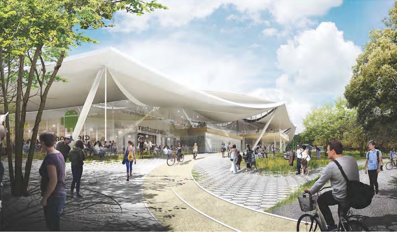
The circus is headed to Mountain View, Calif.! Or, at least that’s what it looks like, as the newly released design plans for Google’s new Charleston East campus show a building with the appearance of a giant futuristic circus tent. However, despite the color of Google’s logo, don’t expect to see this building filled with clowns or acrobats, as the building will incorporate many state-of-the-art features to provide the most efficient workplace possible.
Back in February 2015, Google released its initial plans for the project, but this past February saw them update and alter those plans. The most visible difference between the plans is the loss of a translucent canopy that was meant to regulate climate, air quality, and sound while enclosing flexible building segments that had the ability to be moved around both inside and outside of the enclosure. For any of you thinking to yourself, Simpsons did it! Simpsons did it! Yes, the design looked a little bit like when The Simpsons Movie put a glass dome over the entirety of Springfield.
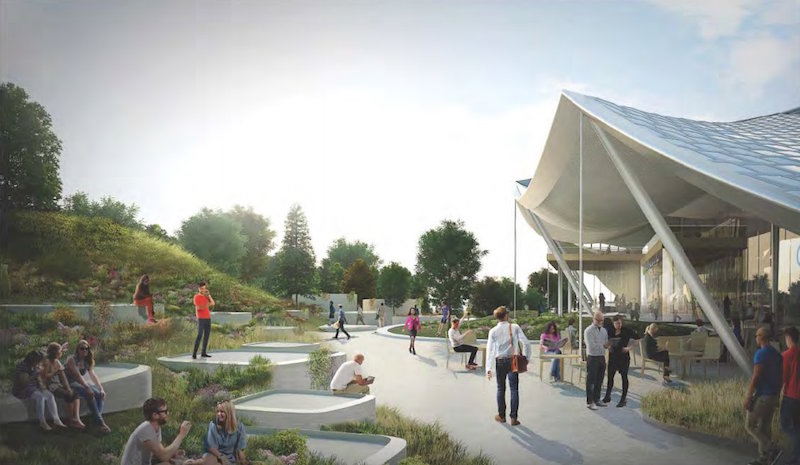
The canopy is still in place and it is still designed with the purpose of regulating indoor climate, air quality, and sound, but the plans now call for it to be opaque. The building components are still labeled as "flexible" and are designed to be adaptable to Google’s changing needs, but they seem to have lost at least some of their originally planned mobility.
Photovoltaic panels will be incorporated over much of the canopy’s surface to generate as much electricity from renewable resources as possible. The actual amount of electricity that would be generated is still being studied.
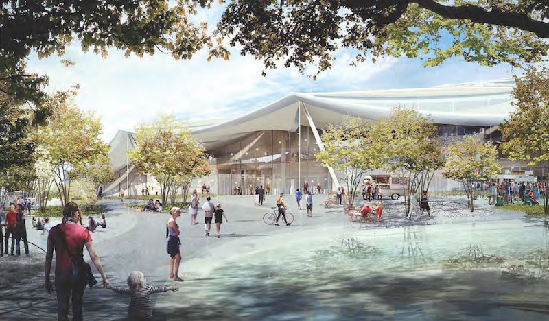
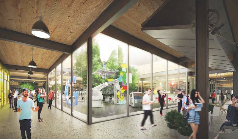
In another effort to help decrease electricity consumption, the structure uses smile-shaped clerestories that span two sides of each 102-foot bay to bring direct, indirect, and diffused natural light into the building. The way the building is designed and laid out makes it so even the centers of the lower level floor plans are able to receive natural light. Google is still experimenting with different glazing strategies and technologies to control and scatter direct sunlight in order to minimize glare.
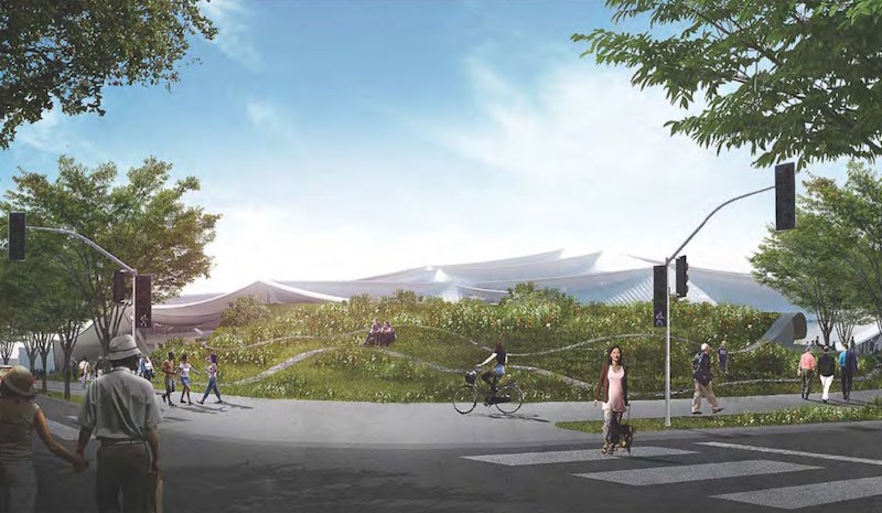
The building is designed with nature in mind and the landscape strategies of the building aim to nurture and restore native ecologies of the North Bayshore area. Google is working with local ecological consultants and wildlife experts in an effort to help wildlife species on the site to thrive. Not much has been overlooked, as bird safety has even been integrated into the design. The building plans call for bird-friendly design elements to help eliminate any birds flying into windows or other areas using clear glass or disturbing migration patterns with light pollution. Some of these design elements are fine-grained visual obstacles in the vertical envelope glass coatings that reduce reflection, limited light pollution at night, and carefully placed vegetation.
The overall design concept is driven by five guiding principles to provide the highest quality work environment possible and represent a vision for the workplace of the future. These design principles are:
- Beauty and simplicity
- Flexible and hackable spaces
- Ecology and access to nature
- Efficiency of resources and materials
- Health and environmental quality
Google is hoping these guiding principles will help them achieve LEED Platinum certification.
While the new building lost its visionary clear canopy made, the new plans still present an innovative, modern design that blends in with the surrounding ecosystems and landscape instead of standing in stark contrast to them. And, who knows, maybe Cirque du Soleil will get mixed up and think the building is their tent one day, leading to some very good lunchtime entertainment. However, the company is still in the early stages of planning this structure and there is still plenty of work that needs to be done before any type of construction begins.
Google chose Bjarke Ingels Group and Heatherwick Studio as design consultants for the project, Adamson Associates as the architect of record, Arup as the structural/MEP engineer, and Hargreaves Jones Landscape Architecture as the landscape consultant.
The plans can be viewed in their entirety on the City of Mountain view website.
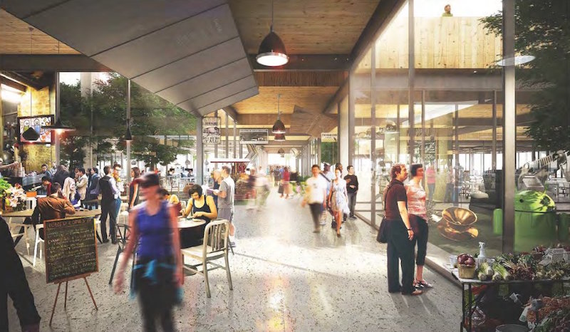
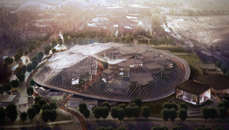 The original plans called for a translucent canopy to cover the majority of the campus. This has been changed in subsequent plans. Renderings courtesy Google
Related Stories
| May 11, 2011
DOE releases guide for 50% more energy-efficient office buildings
The U.S. Department of Energy today announced the release of the first in a new series of Advanced Energy Design Guides to aid in the design of highly energy efficient office buildings. The 50% AEDG series will provide a practical approach to commercial buildings designed to achieve 50% energy savings compared to the commercial building energy code used in many areas of the country.
| May 10, 2011
Google hires Ingenhoven Architects to design new Mountain View office
The current Googleplex is straining at the seams and yet the company is preparing its biggest hiring surge ever, so Google decided now’s the time to build its own office space—a first for the Internet giant. The company hired Ingenhoven Architects, a German firm that specializes in sustainable architecture, to create plans for what could be a 600,000-sf office.
| Apr 13, 2011
Office interaction was the critical element to Boston buildout
Margulies Perruzzi Architects, Boston, designed the new 11,460-sf offices for consultant Interaction Associates and its nonprofit sister organization, The Interaction Institute for Social Change, inside an old warehouse near Boston’s Seaport Center.
| Apr 13, 2011
Red Bull Canada HQ a mix of fluid spaces and high-energy design
The Toronto architecture firm Johnson Chou likes to put a twist on its pared-down interiors, and its work on the headquarters for Red Bull Canada is no exception. The energy drink maker occupies 12,300 sf on the top two floors of a three-story industrial building in Toronto, and the design strategy for its space called for leaving the base building virtually untouched while attention was turned to the interior architecture.
| Apr 13, 2011
Former department store gets new lease on life as MaineHealth HQ
The long-vacant Sears Roebuck building in Portland, Maine, was redeveloped into the corporate headquarters for MaineHealth. Consigli Construction and local firm Harriman Architects + Engineers handled the 14-month fast-track project, transforming the 89,000-sf, four-story facility for just $100/sf.
| Mar 29, 2011
Chicago’s Willis Tower to become a vertical solar farm
Chicago’s iconic Willis Tower (formerly the Sears Tower) is set to become a massive solar electric plant with the installation of a pilot solar electric glass project.
| Mar 29, 2011
Read up on Amazon.com's new green HQ
Phase IV of Amazon’s new headquarters in Seattle is nearly complete. The company has built 10 of the 11 buildings planned for its new campus in the South Lake Union neighborhood, and is on-track for a 2013 grand opening.
| Mar 11, 2011
Blockbuster remodel transforms Omaha video store into a bank
A former Hollywood Video store in Omaha, Neb., was renovated and repurposed as the SAC Federal Credit Union, Ames Branch. Architects at Leo A Daly transformed the outdated 5,000-sf retail space into a modern facility by wrapping the exterior in poplar siding and adding a new glass storefront that floods the interior with natural light.
| Mar 11, 2011
Chicago office building will serve tenants and historic church
The Alter Group is partnering with White Oak Realty Partners to develop a 490,000-sf high-performance office building in Chicago’s West Loop. The tower will be located on land owned by Old St. Patrick’s Church (a neighborhood landmark that survived the Chicago Fire of 1871) that’s currently being used as a parking lot.
| Mar 9, 2011
Hoping to win over a community, Facebook scraps its fortress architecture
Facebook is moving from its tony Palo Alto, Calif., locale to blue-collar Belle Haven, and the social network want to woo residents with community-oriented design.


