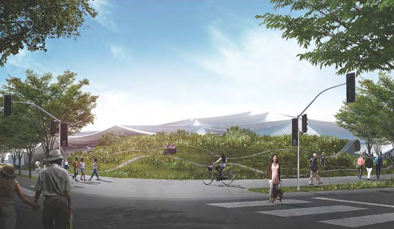
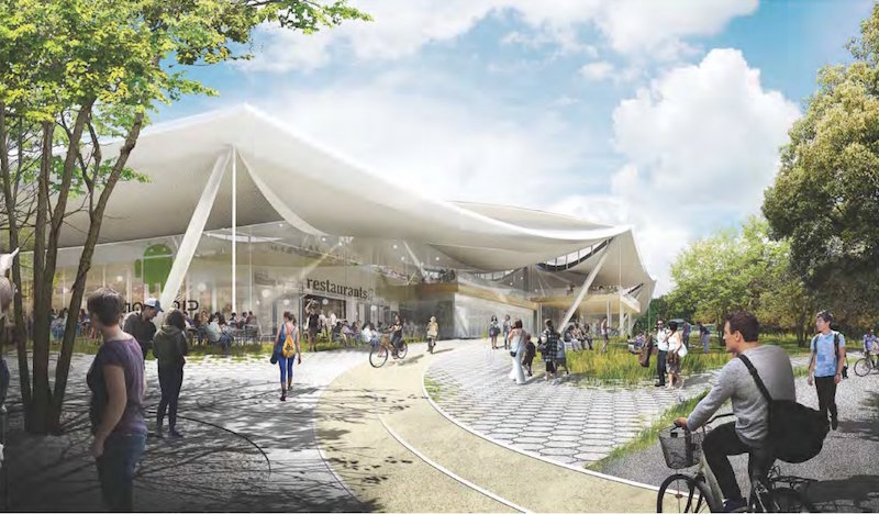
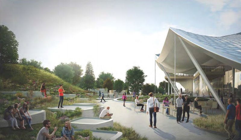
The circus is headed to Mountain View, Calif.! Or, at least that’s what it looks like, as the newly released design plans for Google’s new Charleston East campus show a building with the appearance of a giant futuristic circus tent. However, despite the color of Google’s logo, don’t expect to see this building filled with clowns or acrobats, as the building will incorporate many state-of-the-art features to provide the most efficient workplace possible.
Back in February 2015, Google released its initial plans for the project, but this past February saw them update and alter those plans. The most visible difference between the plans is the loss of a translucent canopy that was meant to regulate climate, air quality, and sound while enclosing flexible building segments that had the ability to be moved around both inside and outside of the enclosure. For any of you thinking to yourself, Simpsons did it! Simpsons did it! Yes, the design looked a little bit like when The Simpsons Movie put a glass dome over the entirety of Springfield.
The canopy is still in place and it is still designed with the purpose of regulating indoor climate, air quality, and sound, but the plans now call for it to be opaque. The building components are still labeled as "flexible" and are designed to be adaptable to Google’s changing needs, but they seem to have lost at least some of their originally planned mobility.
Photovoltaic panels will be incorporated over much of the canopy’s surface to generate as much electricity from renewable resources as possible. The actual amount of electricity that would be generated is still being studied.
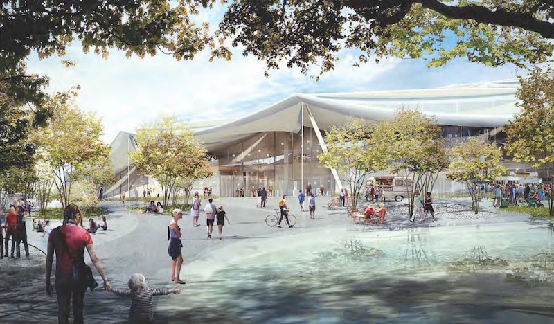
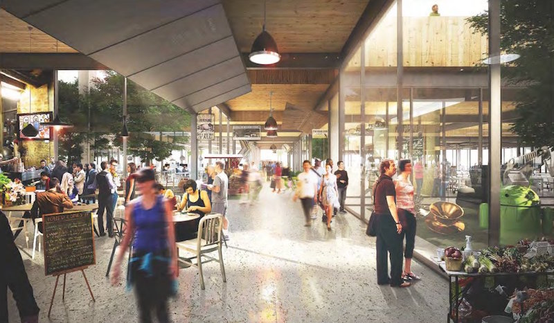
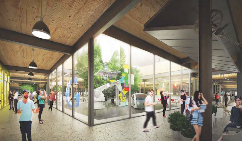
In another effort to help decrease electricity consumption, the structure uses smile-shaped clerestories that span two sides of each 102-foot bay to bring direct, indirect, and diffused natural light into the building. The way the building is designed and laid out makes it so even the centers of the lower level floor plans are able to receive natural light. Google is still experimenting with different glazing strategies and technologies to control and scatter direct sunlight in order to minimize glare.
The building is designed with nature in mind and the landscape strategies of the building aim to nurture and restore native ecologies of the North Bayshore area. Google is working with local ecological consultants and wildlife experts in an effort to help wildlife species on the site to thrive. Not much has been overlooked, as bird safety has even been integrated into the design. The building plans call for bird-friendly design elements to help eliminate any birds flying into windows or other areas using clear glass or disturbing migration patterns with light pollution. Some of these design elements are fine-grained visual obstacles in the vertical envelope glass coatings that reduce reflection, limited light pollution at night, and carefully placed vegetation.
The overall design concept is driven by five guiding principles to provide the highest quality work environment possible and represent a vision for the workplace of the future. These design principles are:
- Beauty and simplicity
- Flexible and hackable spaces
- Ecology and access to nature
- Efficiency of resources and materials
- Health and environmental quality
Google is hoping these guiding principles will help them achieve LEED Platinum certification.
While the new building lost its visionary clear canopy made, the new plans still present an innovative, modern design that blends in with the surrounding ecosystems and landscape instead of standing in stark contrast to them. And, who knows, maybe Cirque du Soleil will get mixed up and think the building is their tent one day, leading to some very good lunchtime entertainment. However, the company is still in the early stages of planning this structure and there is still plenty of work that needs to be done before any type of construction begins.
Google chose Bjarke Ingels Group and Heatherwick Studio as design consultants for the project, Adamson Associates as the architect of record, Arup as the structural/MEP engineer, and Hargreaves Jones Landscape Architecture as the landscape consultant.
The plans can be viewed in their entirety on the City of Mountain view website.
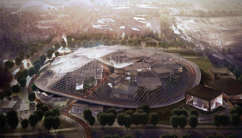 The original plans called for a translucent canopy to cover the majority of the campus. This has been changed in subsequent plans. Renderings courtesy Google
Related Stories
| Feb 6, 2014
End of the open workplace?
If you’ve been following news about workplace design in the popular media, you might believe that the open workplace has run its course. While there’s no shortage of bad open-plan workplaces, there are two big flaws with the now common claim that openness is bad.
| Feb 5, 2014
Extreme conversion: Atlanta turns high-rise office building into high school
Formerly occupied by IBM, the 11-story Lakeside building is the new home for North Atlanta High School.
| Feb 5, 2014
7 towers that define the 'skinny skyscraper' boom [slideshow]
Recent advancements in structural design, combined with the loosening of density and zoning requirements, has opened the door for the so-called "superslim skyscraper."
| Jan 30, 2014
See how architects at NBBJ are using computational design to calculate the best views on projects [video]
In an ideal world, every office employee would have a beautiful view from his or her desk. While no one can make that happen in real life, computational design can help architects maximize views from every angle.
| Jan 30, 2014
The evolving workplace: One designer's inspiration board
"Open office" has been a major buzzword for decades, and like any buzzword, some of the novelty has worn off. I don't believe we will abandon the open office, but I do think we need to focus on providing a dynamic mix of open and closed spaces.
| Jan 29, 2014
Richard Meier unveils 'urban courtyard' scheme for Mexico City towers
A grand atrium, reaching some 30 stories, highlights the contemporary, bright-white design scheme unveiled this week by Richard Meier & Partners for a new mixed-use development in Mexico City.
| Jan 28, 2014
2014 predictions for skyscraper construction: More twisting towers, mega-tall projects, and 'superslim' designs
Experts from the Council on Tall Buildings and Urban Habitat release their 2014 construction forecast for the worldwide high-rise industry.
| Jan 28, 2014
16 awe-inspiring interior designs from around the world [slideshow]
The International Interior Design Association released the winners of its 4th Annual Global Excellence Awards. Here's a recap of the winning projects.
| Jan 28, 2014
Big Ten Conference opens swanky HQ and museum [slideshow]
The new mixed-use headquarters includes a museum, broadcast studios, conference facilities, office spaces, and, oh yeah, a Brazilian steakhouse.
| Jan 23, 2014
Adrian Smith + Gordon Gill-designed Federation of Korean Industries tower opens in Seoul [slideshow]
The 50-story tower features a unique, angled building-integrated photovoltaic (BIPV) exterior designed to maximize the amount of energy collected.


