IBM Watson is heralding in the next technology revolution from its new 150,000-sf headquarters in Manhattan’s Silicon Alley, designed by interior architect The Switzer Group.
Transforming floors four through seven of Fumihiko Maki’s glass-and-steel structure at 51 Astor Place, Switzer Group created an incubator for new applications of IBM’s breakthrough cognitive computing technology, and a design studio for next-generation programs, software, and apps.
The dedicated IBM Watson headquarters was conceived as a showcase for Watson’s capabilities, and as an inspirational workspace for Millennials and idea generators of all ages. Functionally and stylistically, the facility represents a departure for Switzer Group’s work with IBM, which dates back 40 years to the design firm’s opening in 1975—the same year IBM launched its first portable computer, weighing in at 50 lbs.
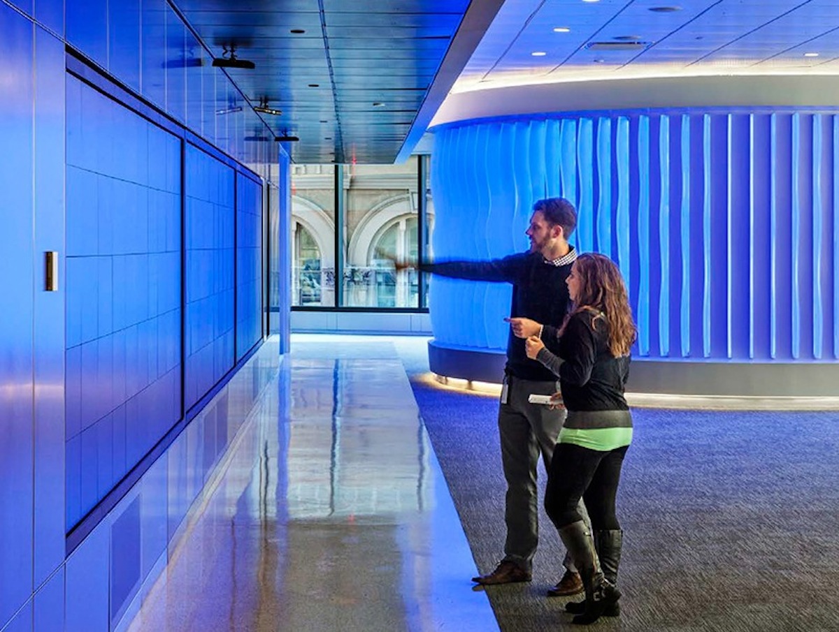
To represent Watson’s capabilities, the Building Team designed a total sensory experience on the office’s fifth floor. Architectural fins that change color with the voice of Watson surround the circumference of an immersion room, where clients can interact directly with the technology.
“Our primary goal at 51 Astor Place was to create a spirit of excitement, openness, and collaboration in order to move IBM’s business forward and help introduce Watson to developers and industry,” says Lou Switzer, CEO of the Switzer Group. “The new building’s core and shell, with floor to ceiling windows, high slab to slab height, column-less upper floors, and 360 degree light, served this objective well.”
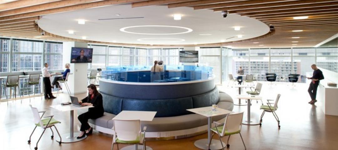
The Switzer Group set the tone with a clean, timeless look for the interiors, combining terrazzo and textured metallic Laminam materials in the elevator banks, and lots of glass, acoustical wood with walnut veneers, European-inspired furnishings and LED lighting throughout. The fourth floor design studio is a totally flexible, open floor plan, divisible by hanging panels that double as marker boards.
Desks with all white surfaces are moveable and can be raised and lowered for standing or sitting. To counterpoint the wide open spaces, seating areas and niches for small group gatherings, and glass enclosed “phone booths” for increased privacy, are strategically situated.
“The design approach was to create a blank canvas from which IBM could operate in an ever-changing environment, one that is fluid and expansive rather than static and fixed,” says Switzer Group Creative Director Luc Massaux.
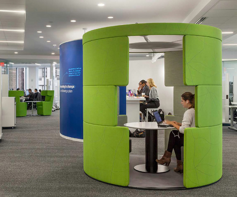 Image: The Switzer Group
The Watson experience
As demonstrated in its 2011 winning debut against top players on the game show Jeopardy, IBM’s Watson processes information more like a human than a traditional computer. The system understands natural language, develops evidence-based hypotheses, and “gets smarter” as it receives and integrates feedback.
To represent Watson’s capabilities, IBM and The Switzer Group, along with Cosentini MEP engineers and AV Services, designed a total sensory experience on the office’s fifth floor. Architectural fins that change color with the voice of Watson surround the circumference of an immersion room, where clients can interact directly with the technology. A 40 ft video wall equipped with Oblong Industries’ futuristic Mezzanine system allows visitors to move data from one screen to another with a wave of their hand.
“The real challenge was finding the best way to integrate the audiovisual and technology with the aesthetic," says Switzer Group Executive Principal Beth Holechek. "Everything had to be planned to extreme tolerances. Sensors had strict placement requirements, with a precise amount of a light, air and space needed for the system to function properly.”
Completed on an ultra-fast track in October of 2014, IBM plans to roll out Switzer’s interior design approach for IBM Watson worldwide, with work currently underway for facilities in Texas and North Carolina.
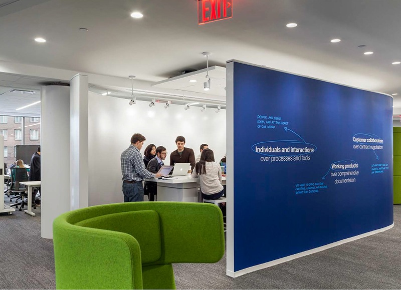 Image: The Switzer Group
Related Stories
Codes and Standards | Feb 12, 2015
New Appraisal Institute form aids in analysis of green commercial building features
The Institute’s Commercial Green and Energy Efficient Addendum offers a communication tool that lenders can use as part of the scope of work.
Office Buildings | Feb 12, 2015
Is Houston headed for an office glut?
More than 13 million sf could be completed this year, adding to this metro’s double-digit vacancy woes.
Architects | Feb 11, 2015
Shortlist for 2015 Mies van der Rohe Award announced
Copenhagen, Berlin, and Rotterdam are the cities where most of the shortlisted works have been built.
Office Buildings | Feb 6, 2015
6 factors steering workplace design at financial services firms
Grossly underutilized space and a lack of a mobility strategy are among the trends identified by HOK based on its research of 11 top-tier financial services firms.
Contractors | Feb 6, 2015
Census Bureau: Capital spending by U.S. businesses increased 4.5%
Of the 19 industry sectors covered in the report, only one had a statistically significant year-to-year decrease in capital spending: the utilities sector.
Office Buildings | Feb 3, 2015
5 trends transforming workplace design
RTKL's workplace design expert Jodi Williams foresees healthier and more technologically enabled offices that allow productive worker interaction, wherever they happen to be.
Office Buildings | Feb 3, 2015
Bjarke Ingels' BIG proposes canopied, vertical village for Middle East media company
The tensile canopy shades a relaxation plaza from the desert sun.
Office Buildings | Feb 2, 2015
Study shows modern workers struggle to leave work at the office
Study findings indicate that more than half the respondents holds tight to their smartphones, checking and responding to email and taking phone calls, all or most of the time.
Office Buildings | Jan 28, 2015
Sustainability’s missed opportunity: small commercial buildings
The real opportunity for shrinking the nation’s energy footprint lies in the mundane world of small commercial buildings, writes BD+C's David Barista.
Office Buildings | Jan 27, 2015
London plans to build Foggo Associates' 'can of ham' building
The much delayed high-rise development at London’s 60-70 St. Mary Axe resembles a can of ham, and the project's architects are embracing the playful sobriquet.


