IBM Watson is heralding in the next technology revolution from its new 150,000-sf headquarters in Manhattan’s Silicon Alley, designed by interior architect The Switzer Group.
Transforming floors four through seven of Fumihiko Maki’s glass-and-steel structure at 51 Astor Place, Switzer Group created an incubator for new applications of IBM’s breakthrough cognitive computing technology, and a design studio for next-generation programs, software, and apps.
The dedicated IBM Watson headquarters was conceived as a showcase for Watson’s capabilities, and as an inspirational workspace for Millennials and idea generators of all ages. Functionally and stylistically, the facility represents a departure for Switzer Group’s work with IBM, which dates back 40 years to the design firm’s opening in 1975—the same year IBM launched its first portable computer, weighing in at 50 lbs.
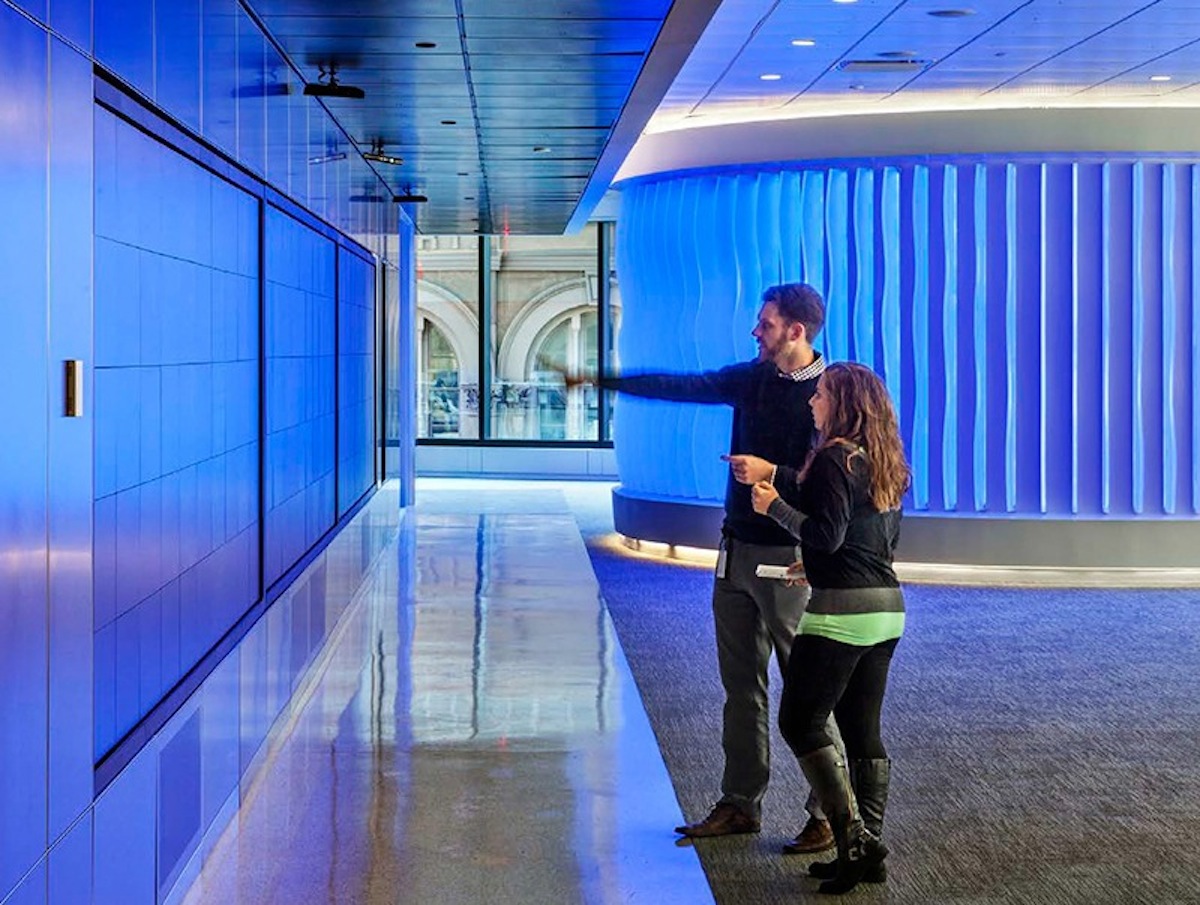
To represent Watson’s capabilities, the Building Team designed a total sensory experience on the office’s fifth floor. Architectural fins that change color with the voice of Watson surround the circumference of an immersion room, where clients can interact directly with the technology.
“Our primary goal at 51 Astor Place was to create a spirit of excitement, openness, and collaboration in order to move IBM’s business forward and help introduce Watson to developers and industry,” says Lou Switzer, CEO of the Switzer Group. “The new building’s core and shell, with floor to ceiling windows, high slab to slab height, column-less upper floors, and 360 degree light, served this objective well.”
The Switzer Group set the tone with a clean, timeless look for the interiors, combining terrazzo and textured metallic Laminam materials in the elevator banks, and lots of glass, acoustical wood with walnut veneers, European-inspired furnishings and LED lighting throughout. The fourth floor design studio is a totally flexible, open floor plan, divisible by hanging panels that double as marker boards.
Desks with all white surfaces are moveable and can be raised and lowered for standing or sitting. To counterpoint the wide open spaces, seating areas and niches for small group gatherings, and glass enclosed “phone booths” for increased privacy, are strategically situated.
“The design approach was to create a blank canvas from which IBM could operate in an ever-changing environment, one that is fluid and expansive rather than static and fixed,” says Switzer Group Creative Director Luc Massaux.
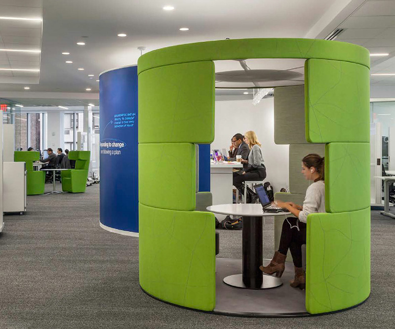 Image: The Switzer Group
The Watson experience
As demonstrated in its 2011 winning debut against top players on the game show Jeopardy, IBM’s Watson processes information more like a human than a traditional computer. The system understands natural language, develops evidence-based hypotheses, and “gets smarter” as it receives and integrates feedback.
To represent Watson’s capabilities, IBM and The Switzer Group, along with Cosentini MEP engineers and AV Services, designed a total sensory experience on the office’s fifth floor. Architectural fins that change color with the voice of Watson surround the circumference of an immersion room, where clients can interact directly with the technology. A 40 ft video wall equipped with Oblong Industries’ futuristic Mezzanine system allows visitors to move data from one screen to another with a wave of their hand.
“The real challenge was finding the best way to integrate the audiovisual and technology with the aesthetic," says Switzer Group Executive Principal Beth Holechek. "Everything had to be planned to extreme tolerances. Sensors had strict placement requirements, with a precise amount of a light, air and space needed for the system to function properly.”
Completed on an ultra-fast track in October of 2014, IBM plans to roll out Switzer’s interior design approach for IBM Watson worldwide, with work currently underway for facilities in Texas and North Carolina.
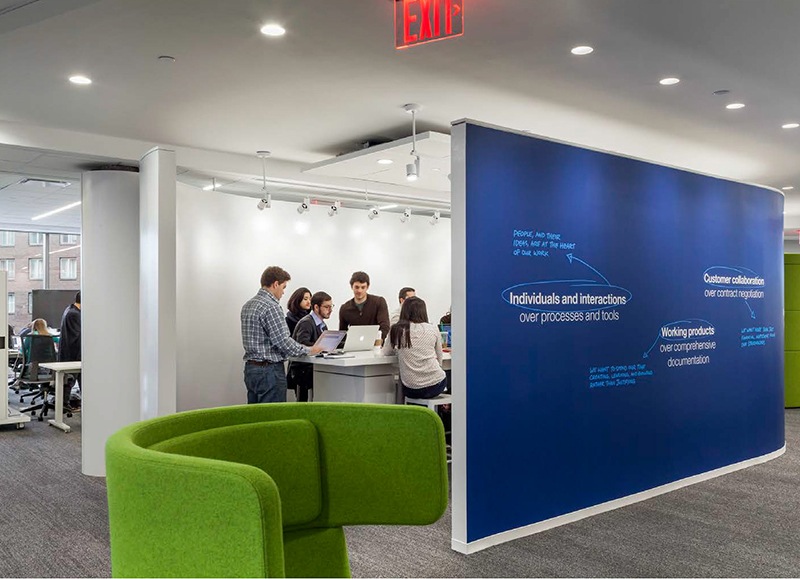 Image: The Switzer Group
Related Stories
| Sep 2, 2014
Ranked: Top green building sector AEC firms [2014 Giants 300 Report]
AECOM, Gensler, and Turner top BD+C's rankings of the nation's largest green design and construction firms.
| Sep 1, 2014
Ranked: Top federal government sector AEC firms [2014 Giants 300 Report]
Clark Group, Fluor, and HOK top BD+C's rankings of the nation's largest federal government design and construction firms, as reported in the 2014 Giants 300 Report.
| Aug 29, 2014
China Syndrome: How long will U.S. firms keep milking the Middle Kingdom?
U.S. architecture and engineering firms like Goettsch Partners have been enjoying full employment in China. But will there come a point when Chinese officials—and Chinese designers—say, We can handle this? BD+C's Robert Cassidy digs into this issue.
| Aug 28, 2014
Stantec releases design for Edmonton's tallest tower
At 227 meters, Stantec Tower will be the tallest building in the city, dwarfing the two next-tallest: Epcor Tower and Manulife Tower.
| Aug 27, 2014
Designs for community-based workspace in Carlsbad unveiled
Cruzan announced make, a 175,000-square-foot office redevelopment project on the coast of Carlsbad, Calif. Cruzan will usher this next generation of community-based, integrated workspace into existence in fall 2014.
| Aug 25, 2014
Tall wood buildings: Surveying the early innovators
Timber has been largely abandoned as a structural solution in taller buildings during the last century, in favor of concrete and steel. Perkins+Will's Rebecca Holt writes about the firm's work in surveying the burgeoning tall wood buildings sector.
| Aug 25, 2014
'Vanity space' makes up large percentage of world's tallest buildings [infographic]
Large portions of some skyscrapers are useless space used to artificially enhance their height, according to the Council on Tall Buildings and Urban Habitat.
| Aug 25, 2014
Photographer creates time-lapse video of 1 WTC using 30,000 photos
Choosing from 30,000 photos he took from the day construction began in 2006 to the day when construction was finished in 2012, Brooklyn-based photographer Benjamin Rosamund compressed 1,100 photos to create the two-minute video.
| Aug 19, 2014
Goettsch Partners unveils design for mega mixed-use development in Shenzhen [slideshow]
The overall design concept is of a complex of textured buildings that would differentiate from the surrounding blue-glass buildings of Shenzhen.
| Aug 18, 2014
From icon to breadbasket: Gehry building to be turned into Whole Foods
The Howard Hughes Corporation, in association with architecture firm Cho Benn Holback + Associates, plans to turn the building—at least the majority of it—into a Whole Foods.


