Office design has always been linked to productivity—how many workers can be reasonably squeezed into a given space—but why isn’t it more frequently linked to creativity?
“In general, I don’t think enough people link the design of space to business outcome,” says Janice Linster, partner with the Minneapolis design firm Studio Hive. “Encounters and activities that happen in creative spaces outside a structured environment are important and can spark ideas that can make a project more successful.”
If office design and business outcome are so closely linked, why aren’t more office environments designed to influence and inspire creativity?
According to Linster, it’s because a lot of people approach creative office design incorrectly: “It isn’t about a creative desk or a creative conference room or bright paint. It’s about the whole experience of being in this workplace and thinking through every step of a daily routine.”
BD+C interviewed several leading architects about offices that they designed to support and influence creativity. Perhaps the special features they worked into their designs will serve as a source of inspiration for your next office project.
Architect: Johnson Chou
Project: Grip Limited
 The "hot tub" conversation pit seats 10 and is designed to inspire Grip Limited's employees and disarm its clients. The beer tap on the adjacent countertop is a nod to the firm's beer clients. Photos: Tom Arban Photography |
For years, beer paid the bills at Grip Limited, a Toronto-based advertising agency known for creating memorable campaigns for such clients as Labatt Breweries of Canada and InBev, whose many beer brands include Bass, Beck’s, and St. Pauli Girl. The ad firm’s partners, however, worried they were being typecast as “beer guys” when they wanted to be seen as a sophisticated agency that’s versatile enough to land blue-chip clients and still enjoy success with their bread-and-butter beer accounts.
A new image required new ideas, so Grip’s partners hired architect Johnson Chou, principal at his eponymous Toronto design firm, to create an office that would inspire creativity on the part of their staff. “The environment itself had to be inspiring, and to be inspiring and creative, you have to have experiences,” says Chou, who transformed 21,500 sf of unfinished downtown office space into the agency’s new creative studio, complete with a bright orange slide, a fire pole, and a “hot tub” conversation pit with an adjacent beer tap (Labatt is still a key client).
The firm’s three-story office space, completed for under $2 million in May 2006, has succeeded in inspiring Grip’s nearly 100 employees to think differently and creatively—and successfully pushed the firm’s image forward in the corporate world. Grip Limited’s client roster now includes automakers Honda and Acura, as well as pharmaceutical giant GlaxoSmithKline. You can’t get more blue chip than that.
 For those who find stairs too pedestrian, Grip Limited has a slide and a fire pole, which do get used, according to architect Johnson Chou. Versatile seating for impromptu conversations includes contoured window seats and an upholstered fire pole landing-even bleachers (left, next to staircase). The atrium's white walls double as projection screens. |
How architect Johnson Chou’s design for Grip Limited’s office influences creativity:
1. Inspire but don’t distract. The Grip office has a slide and a fire pole connecting the main two floors, but they don’t distract from the work environment because they’re located in the entry atrium. “I wanted to create a sense of energy and I wanted the space itself to be inspiring, but obviously I wasn’t going to have a hot tub conversation pit in a quiet area,” says Chou. “You have to strike a balance and put things where they belong.”
Chou also made sure to reduce distractions in the open workstation areas by enclosing nearby meeting spaces. “You have to respect the people around you, and collaboration space in private areas just can’t be as open,” says Chou. Of course a little noise is perfectly acceptable in such environments because it signifies the hum of excitement and creativity.
2. Inventive collaboration spaces. Creative thinkers often work in teams and are inspired by one another, so Chou included a mix of collaboration and meeting spaces that allow formal, informal, and spontaneous encounters. “There are meeting areas everywhere,” says Chou. They include a formal boardroom called “The Fridge” (the room’s outer walls are clad in stainless steel and its inner walls in white synthetic grass to suggest frost); multiple small meeting rooms (with the same white synthetic grass) are called “Ice Cubes.”
The 10-person hot tub conversation pit is often used to inspire—and disarm—the firm’s clients. The atrium circulation space has versatile soft seating to encourage employees to stop for ad hoc conversations. Presentations are given in the atrium, whose white walls double as a projection screen; permanent bleacher seating can accommodate the entire staff.
3. Let the client’s clients serve as inspiration. “If you’re concerned about being creative and imbuing that on your clients, you have to be very conscious of image,” says Chou. “Use ideas they already have and reinterpret them into the space. Be inspired by the client’s work.”
Thus, Grip’s reception desk is clad in black rubber, a nod to the firm’s automotive clients. The fridge and frost motifs are nods to beer clients. The slide’s orange color is borrowed from the Grip Limited logo. “Details are what’s really important to the creative environment, and it’s what always gets lost because of budget issues or burnout on a project,” says Chou. “But it’s the details that inspire people the most.”
|
Architect: Sasaki Associates
Project: Monitor Group
Sasaki Associates, based in Watertown, Mass., recently completed offices for two different clients who had a similar request: Give us office spaces that would inspire creativity in employees and collaboration among colleagues.
Sasaki’s design for the new 100-person San Francisco office of Monitor Group, a business consulting firm, encompassed 28,374 sf in an SOM-designed high-rise, but the firm’s insistence on an all-private office environment (a company recruiting strategy: prospective hires are told they will get a shared office rather than a cubicle) proved nettlesome to the design team.
How Sasaki Associates’ design for Monitor Group’s office influences creativity:
1. The piazza and the sandbox. “Insight often comes to employees when they get out of their office, go to another space, and interact with colleagues,” says Cathy Bell, principal at Sasaki Associates. The piazza and sandbox are those spaces. Bell designed a floor plan consisting of a grid of cross streets intersected by a diagonal main street, with the elliptical piazza sitting at one end and the sandbox on the other.
The piazza serves as the hub of the office, part coffee bar, part library, part meeting area, and part mailroom. (With square footage at such a premium, many offices can’t afford to have single-purpose lunchrooms, so spaces are evolving into these types of multipurpose centers.) “There are lots of things that make people have to go there, so it’s the perfect creative space because it allows impromptu interactions,” says Bell. However, Bell advises against going overboard with such spaces. “You don’t want too many because the whole point is to provide chances to run into someone you wouldn’t ordinarily run into,” she says. “If there are too many, you might never run into them.”
The sandbox, a touchdown space just off the lobby, is designed mostly for interaction with clients. Several meeting rooms connect to this space, which also has a computer alcove and a library niche displaying publications authored by Monitor Group employees.
2. Main Street. Hallways are great spaces for spontaneous interactions, and architects at Sasaki originally thought that employees would reap the benefits of wide hallways. Wrong! “We found that wide hallways allowed employees to ignore each other as they passed,” says Bell. For the Monitor Group’s main street, Bell designed an alcove to encourage people to step our of the foot traffic and talk or sit down together.
3. Cockpits. Maintaining privacy while cutting down on distracting noise can be a huge problem in offices with open elements—even those with private offices—so Bell designed small 80-sf enclosed spaces called cockpits, which are scattered throughout the office for employees who need short-term privacy and isolation from noise.
 The large piazza is the hub of Monitor Group's San Francisco offices, the mixed-use space serves as the lunchroom ( a full kitchen is out of view behind the coffee bar), a meeting area, a library, and the mailroom. Photo: Robert Benson |
Architect: Hixson Architecture, Engineering, and Interiors
Project: Ethicon Endo-Surgery
The 17,954-sf Ethicon Endo-Surgery research and development center in Cincinnati, Ohio, was designed by local firm Hixson Architecture, Engineering, and Interiors to be a place where out-of-the-box thinkers could create new medical devices free from the confines of the firm’s corporate headquarters.
Purposely located about a mile from the company’s main offices, this converted warehouse space was conceived of as a kind of creative “skunkworks,” where new ideas could flourish apart from too much corporate influence. “For this space, the client wanted organized chaos,” says Colleen McCafferty, interior design lead and workplace strategist at Hixson.
How Hixson’s design for Ethicon Endo-Surgery influences creativity:
1. Visual stimulation. “This space energizes people,” says McCafferty. “It makes them want to work.” There was a real push to add color, angles, a variety of lighting, and whimsical elements (such as garage doors for the conference room) to get people to see and think differently. Perimeter walls are covered with marker boards—one huge band, six feet high, running around the building. Most of the office is open studio space. “We took away a lot of real estate from the individual and gave it back to the communal,” says McCafferty, who suggests that when planning such open areas, create buffer zones between the various activities.
2. Coffee bar extraordinaire. The office has very few designated meeting areas—only the one conference room—and no hallways to facilitate spontaneous conversation, so the design team expanded on the idea of the coffee counter as the common area, similar to how Sasaki created a piazza for the Monitor Group. Located front and center, the communal coffee bar is not large but it’s prominent, hip, and enticing—perfect for encouraging serendipitous encounters. “We’re creating areas that just happen to support social interaction even if those interactions aren’t sought out,” says McCafferty. Bryon Sutherly, senior project architect at Hixson, adds, “The trend is to create that type of space where people can just run into someone else they may not interact with frequently and as a result, the interaction can result in the most creative things coming about.”
Architect: Sasaki Associates
Project: Continuum
The Swiffer sweeper, Reebok’s “pump” sneaker, and a host of other iconic consumer products were designed by Continuum of West Newton, Mass. When the firm decided to expand its two-story office in an old shoe factory to 45,000 sf, they asked Sasaki to open up the office and connect people as much as possible. “This office had to be entirely about creativity, collaboration, and process,” says Victor Vizgaitis, senior associate at Sasaki.
How Sasaki Associates’ design for Continuum influences creativity:
1. Open studios. There are a few private rooms to keep brand and product development confidential, but otherwise the bulk of the office is open collaborative studio space, with some informal meeting spaces and few fixed walls. Almost all workstations are open desks, a concept that first worried Continuum employees who previously had private workspaces before the expansion. “They were worried their productivity would go down and that earnings would go down,” says Nancy Harrod, interior designer at Sasaki. But during the six-month renovation, everyone was moved to open desks, and earnings went up. “Everyone works better because of the interconnections,” says Vizgaitis. “The space, as much as anything else they use, has become a tool to facilitate them to do their work.”
Vizaitis has a simple tip for placating employees who want more privacy or quiet: just locate their desk to the quietest areas, such as the back of the office or at the end of a run of desks. However, Harrod says, “These offices are quieter than you think. It all has to do with what someone’s perception of noise is.”
2. Neutral environment. Frequently, people associate bright colors and snazzy materials with creative environments, but decoration doesn’t make the space; in Continuum’s office, bright colors would prove overwhelming and become a detriment to the employees’ creative process. “They work with color and material all the time and are very sensitive to it,” says Harrod. “It was important to have a neutral background that’s not impacting their ability to do their work.”
Related Stories
Architects | Feb 27, 2023
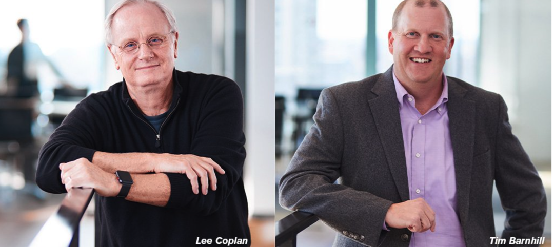
Hord Coplan Macht announces retirement of Founder/CEO Lee Coplan, FAIA, and names successor
Hord Coplan Macht, an award-winning integrated architecture, interior design, landscape architecture, and planning firm, announces the retirement of Founder and Chief Executive Officer Lee Coplan, FAIA. Lee leaves behind a long and celebrated career leading the practice over the last four decades while bringing innovative design strategies and leadership to the architecture and design community.
Libraries | Feb 26, 2023
A $17 million public library in California replaces one that was damaged in a 2010 earthquake
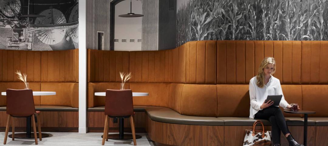
California’s El Centro community, about two hours east of San Diego, recently opened a new $17 million public library. With design by Ferguson Pape Baldwin Architects and engineering services by Latitude 33 Planning & Engineering, the 19,811-sf building replaces the previous library, which was built in the early 1900s, damaged by a 7.2 earthquake that struck Baja California in 2010, and demolished in 2016.
Architects | Feb 24, 2023
7 takeaways from HKS’s yearlong study on brain health in the workplace
Managing distractions, avoiding multitasking, and cognitive training are key to staff wellbeing and productivity, according to a yearlong study of HKS employees in partnership with the University of Texas at Dallas’ Center for BrainHealth.
University Buildings | Feb 23, 2023
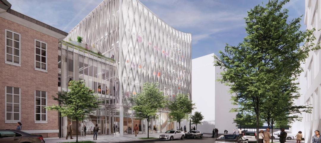
Johns Hopkins shares design for new medical campus building named in honor of Henrietta Lacks
In November, Johns Hopkins University and Johns Hopkins Medicine shared the initial design plans for a campus building project named in honor of Henrietta Lacks, the Baltimore County woman whose cells have advanced medicine around the world. Diagnosed with cervical cancer, Lacks, an African-American mother of five, sought treatment at the Johns Hopkins Hospital in the early 1950s. Named HeLa cells, the cell line that began with Lacks has contributed to numerous medical breakthroughs.
Arenas | Feb 23, 2023
Using data to design the sports venue of the future
Former video game developer Abe Stein and HOK's Bill Johnson discuss how to use data to design stadiums and arenas that keep fans engaged and eager to return.
Museums | Feb 22, 2023
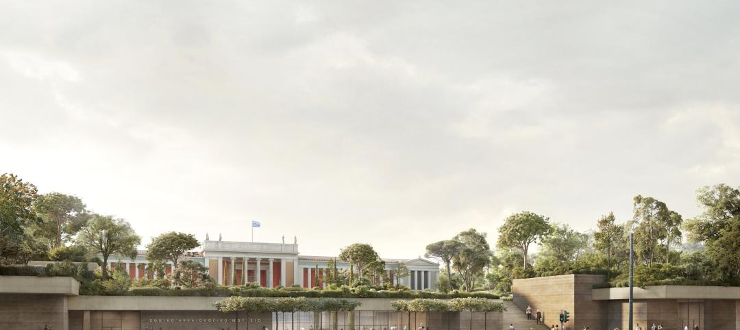
David Chipperfield's 'subterranean' design wins competition for National Archaeological Museum in Athens
Berlin-based David Chipperfield Architects was selected as the winner of the design competition for the new National Archaeological Museum in Athens. The project will modernize and expand the original neoclassical museum designed by Ludwig Lange and Ernst Ziller (1866-1874) with new spaces that follow the existing topography of the site. It will add approximately 20,000 sm of space to the existing museum, as well as a rooftop park that will be open to the public.
Multifamily Housing | Feb 21, 2023
Watch: DBA Architects' Bryan Moore talks micro communities and the benefits of walkable neighborhoods
What is a micro-community? Where are they most prevalent? What’s the future for micro communities? These questions (and more) addressed by Bryan Moore, President and CEO of DBA Architects.
Healthcare Facilities | Feb 21, 2023
Cleveland's Glick Center hospital anchors neighborhood revitalization
The newly opened MetroHealth Glick Center in Cleveland, a replacement acute care hospital for MetroHealth, is the centerpiece of a neighborhood revitalization. The eleven-story structure is located within a ‘hospital-in-a-park’ setting that will provide a bucolic space to the community where public green space is lacking. It will connect patients, visitors, and staff to the emotional and physical benefits of nature.
Multifamily Housing | Feb 21, 2023
Multifamily housing investors favoring properties in the Sun Belt
Multifamily housing investors are gravitating toward Sun Belt markets with strong job and population growth, according to new research from Yardi Matrix. Despite a sharp second-half slowdown, last year’s nationwide $187 billion transaction volume was the second-highest annual total ever.
Multifamily Housing | Feb 21, 2023
New multifamily housing and mixed-use buildings in Portland, Ore., must be ready for electric vehicle charging
The Portland, Ore., City Council recently voted unanimously to require all new residential and mixed-use buildings to be ready for electric vehicle charging. The move amends Portland’s zoning laws to require all new multi-dwelling and mixed-use development of five or more units with onsite parking to provide electric vehicle charging infrastructure.


