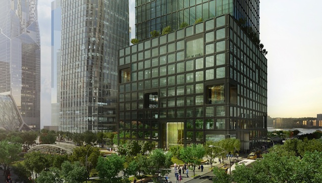
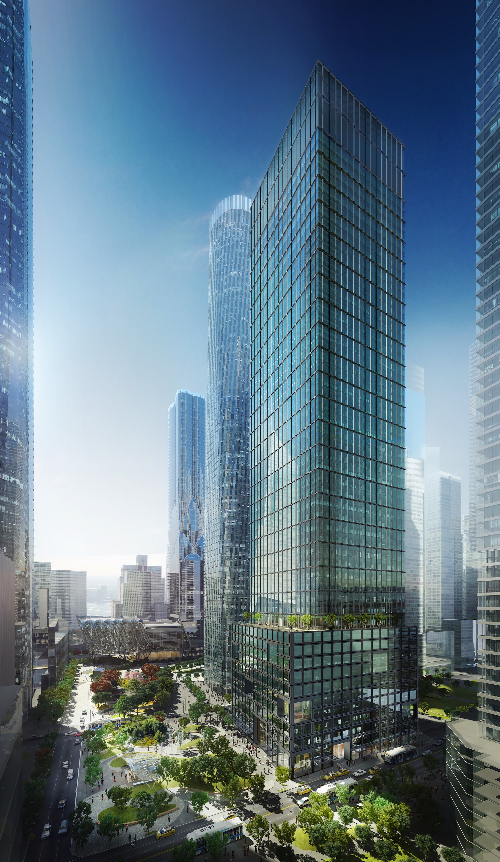
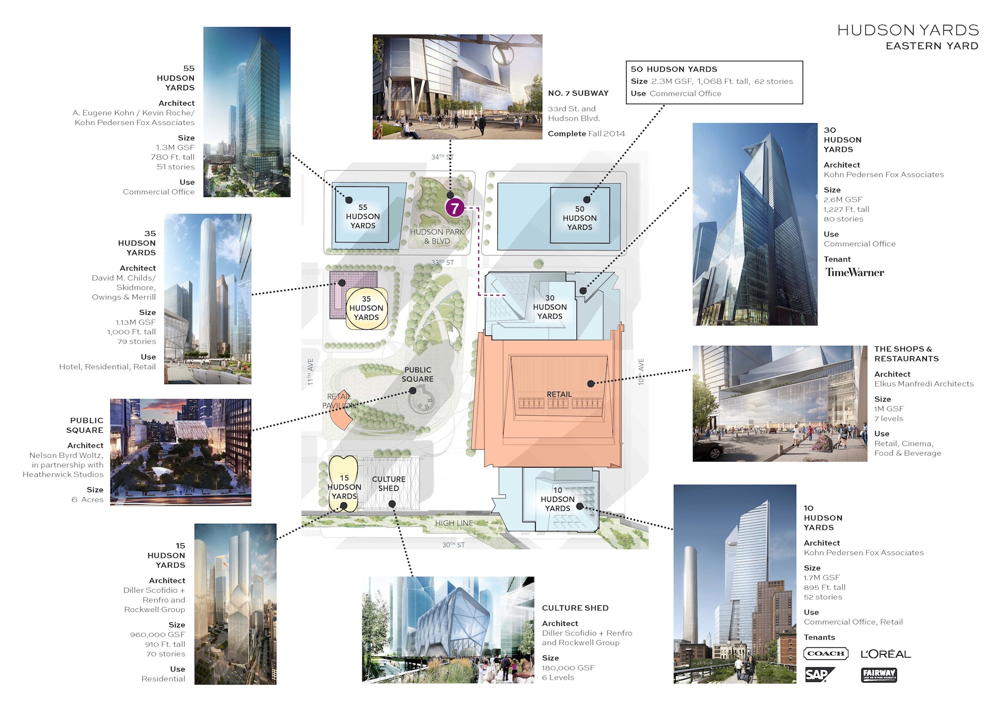
Related Companies and Oxford Properties Group today unveiled Fifty Five Hudson Yards, the latest addition to the commercial office tower collection in the 28-acre Hudson Yards development. The building is perfectly positioned at the intersection of Hudson Yards, the High Line and Hudson Park & Boulevard.
The entrance to the building is just across from the new No. 7 subway extension which connects to every other major subway line as well as Grand Central Station. Penn Station is also a less than five-minute walk away. The anticipated LEED Gold, 51-story, 1.3 million gross square foot building is slated to commence construction in January of 2015 and be ready for occupancy at the end of 2017.
The design of Fifty Five Hudson Yards is defined by its indoor-outdoor spaces, SoHo and early modernism inspired exterior design, and exceptionally efficient interior space planning. The conceptual design of the building was a joint venture of A. Eugene Kohn of Kohn Pedersen Fox (KPF) and Pritzker Prize-winning architect Kevin Roche; KPF served as the Design Architect.
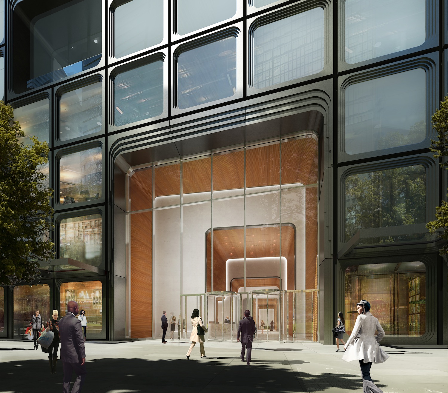
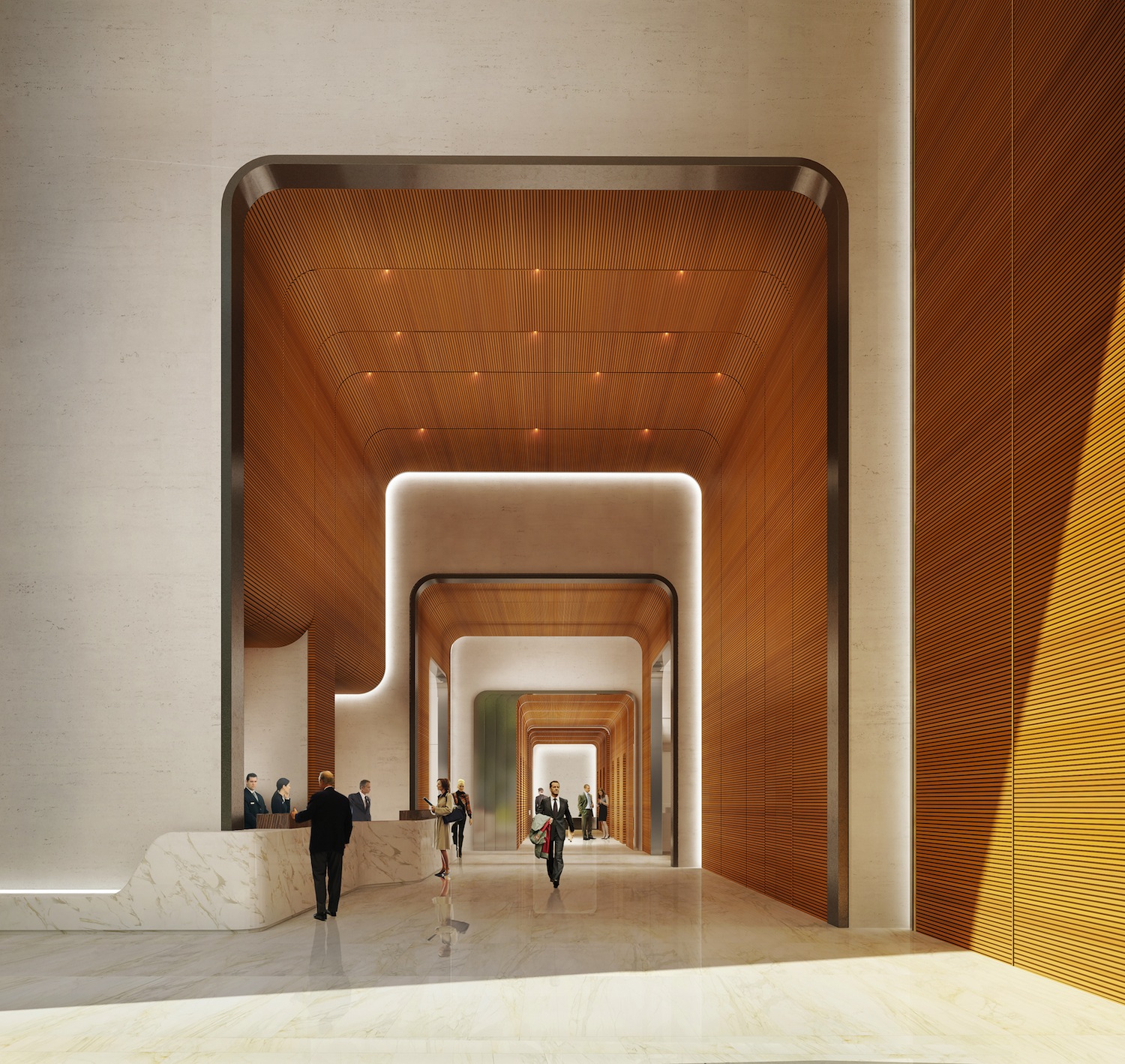
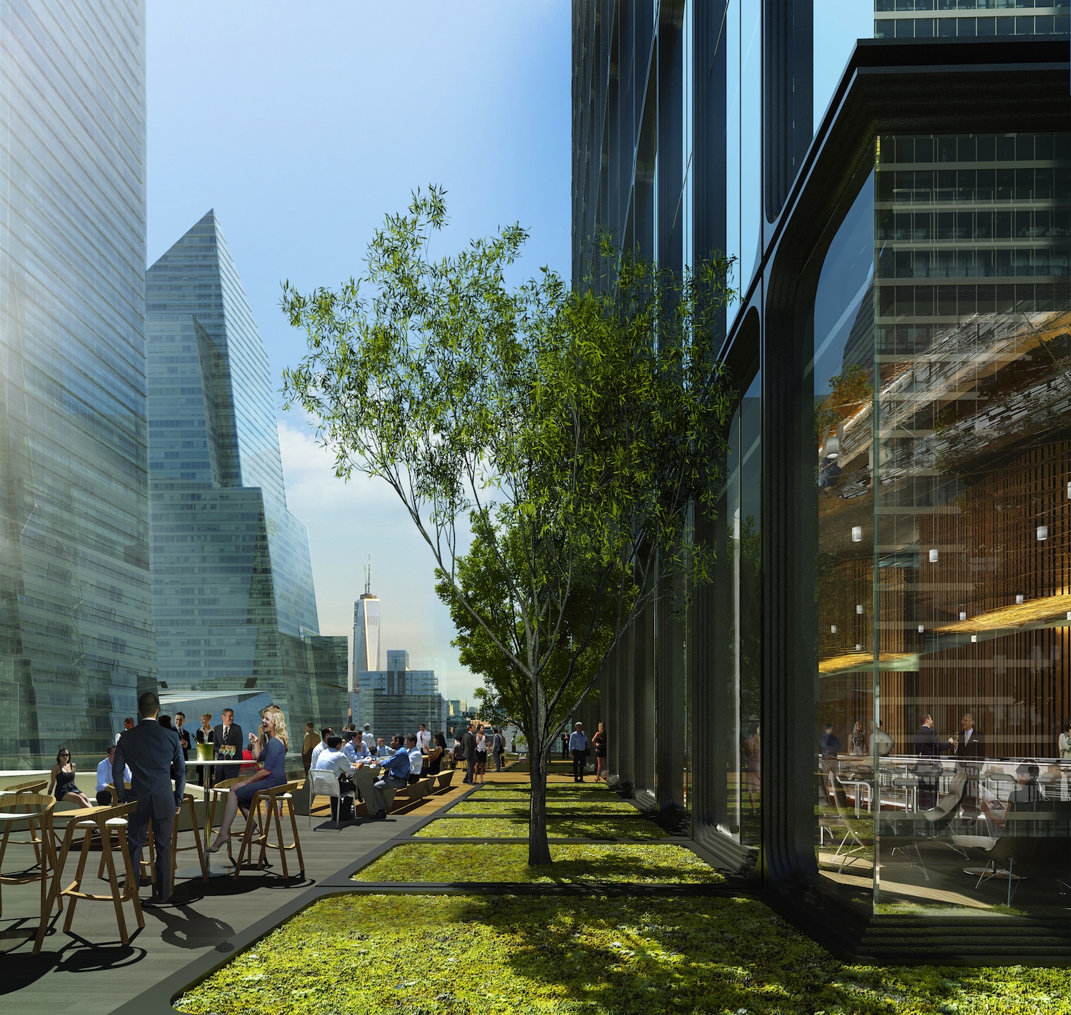
One of the few office buildings in the entire city opening directly onto a park, the main lobby of Fifty Five Hudson Yards sits at the southwestern edge of the City’s new Hudson Park. With a unique buffer of green space, light and air around the building, Fifty Five Hudson Yards offers a welcoming arrival experience for building tenants and visitors. The architects built on the appeal of this great outdoor space by designing a dramatic outdoor terrace overlooking the park on the building’s tenth floor.
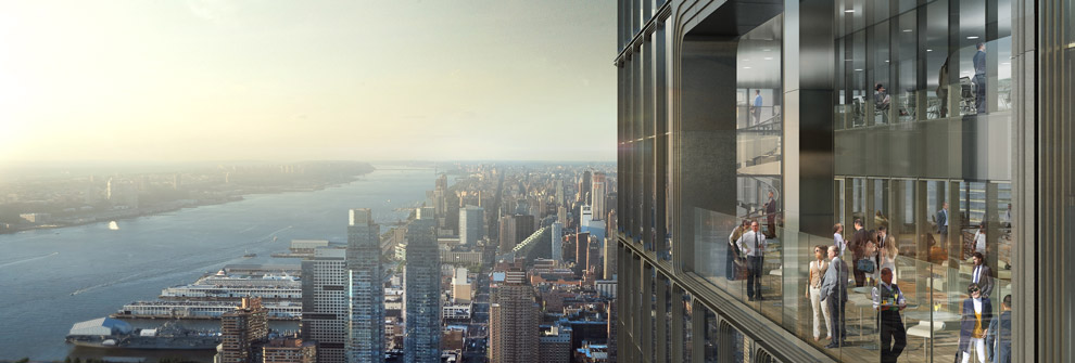
Situated where the building sets back from the podium floors to the tower, this elegantly landscaped vantage will provide scenic views of Hudson Park as it extends to the north, and the Hudson Yards Public Square and the High Line to the south. The ability to provide gracious indoor-outdoor space continues up the building as the design offers the ability to carve private, double-height terrace spaces into the tower in flexible locations. These tower terraces allow tenants and guests to enjoy an outdoor experience surrounded by superb views of the Hudson River and the Midtown skyline without having to leave the building.
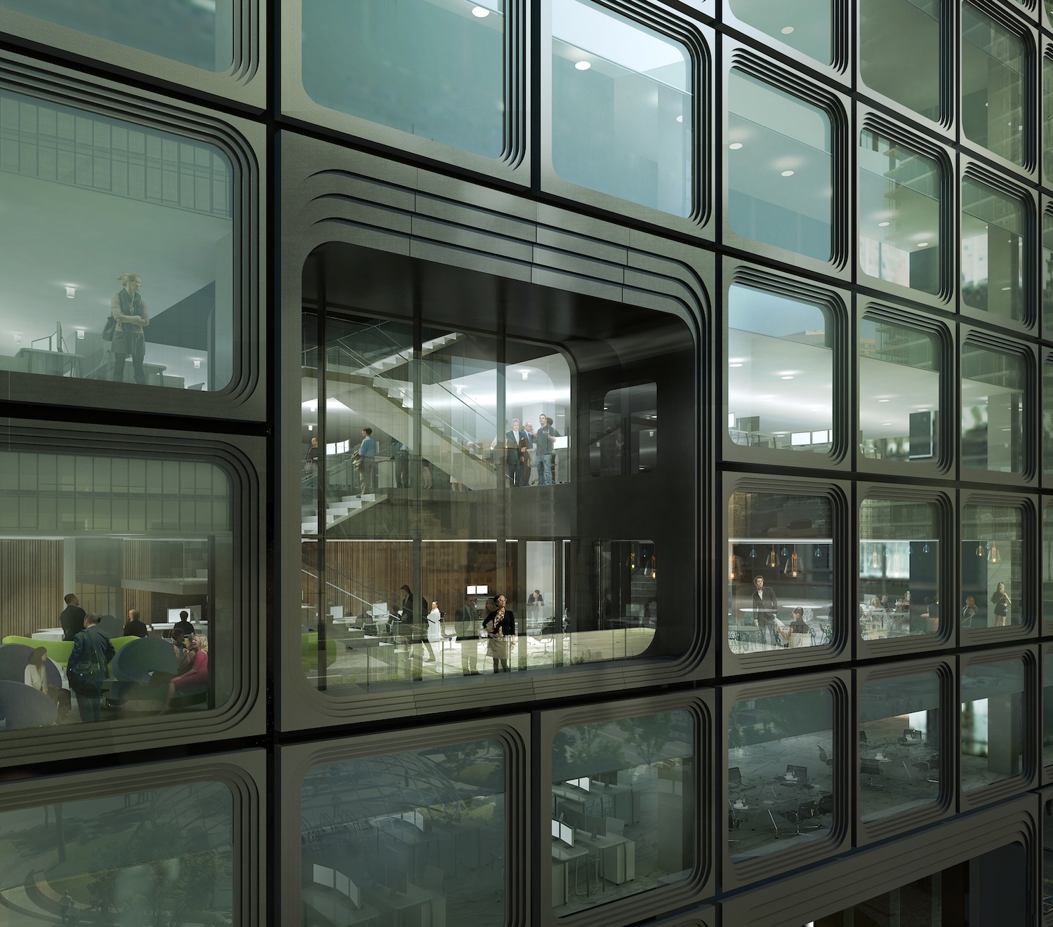
The revitalized High Line district, the manufactured cast iron façade of SoHo commercial buildings and the best of early modernism have inspired the façade of Fifty Five Hudson Yards. The matte metal and stepped articulation of the window frames present a strong and solid exterior appearance, which is modern but uniquely New York in character.
Sun and shadow play across the detailed façade frames creating a visually rich interplay and an unusually strong sense of texture and depth. While the building references the solid exterior of the City’s classic cast iron buildings, it also shares their expansive windows and interior light. Fifty Five Hudson Yards will offer floor-to-ceiling glass throughout the building, bringing light streaming across the entirety of each floor and helping to promote the open skyline and river views it enjoys.
The interior planning of the building was conceived after extensive study of the space needs of professional service, financial, creative and technology firms. The plan starts with a tight, efficient core configuration that eliminates all openings from its perimeter. Without these openings, and with the tower floors free of interior columns, the flexibility of the usable space on each floor is limitless.
Moreover, floor-to-ceiling glass, 35-foot lease-spans and the absence of any corner columns imbue the floors with a sense of light and air through clear-finished, extra-high, 10-foot ceilings. Each floor contains an on-floor, independent HVAC system with single path circulation. The design has multiple opportunities to showcase tenant’s brands and is designed to meet every business need with premium amenities, destination dispatch elevators and designated car drop off access. At a height of over 780 feet, the unobstructed views over the Hudson River and of midtown will be stunning throughout the tower floors.
“Fifty Five Hudson Yards further establishes Hudson Yards as the new heart of New York,” said Jay Cross, President of Related Hudson Yards. “Featuring the best in culture, dining, shopping and more, the commercial office space, steps from transportation and lush, expansive green space, sets a new standard for working in New York City. Today’s business leaders are now more than ever focused on the recruitment and retention of talent and we believe a corporate address at Fifty Five Hudson Yards offers a distinct competitive advantage with a compelling experience inside and outside of the office.”
CLICK MAP TO ENLARGE
South of Fifty Five is the Hudson Yards Public Square, which will serve as an urban stage, celebrating the energy of the City with space for events, exhibitions and gatherings. The Public Square, designed by Thomas Heatherwick and Thomas Woltz, features six acres of gardens and public plazas.
Hudson Yards is the largest private real estate development in the history of the United States and the largest development in New York City since Rockefeller Center. The 28-acre site will include more than 17 million square feet of commercial and residential space, more than 100 shops and restaurants, approximately 5,000 residences, a unique cultural space, 14 acres of public open space, a 750-seat public school and a 150-room luxury hotel—all offering unparalleled amenities for residents, employees and guests. It is anticipated that more than 24 million people will visit Hudson Yards every year.
For more information about Fifty Five Hudson Yards please visit 55HudsonYards.com or www.hudsonyardsnewyork.com.
Related Stories
| Feb 11, 2011
RS Means Cost Comparison Chart: Office Buildings
This month's RS Means Cost Comparison Chart focuses on office building construction.
| Feb 11, 2011
Sustainable features on the bill for dual-building performing arts center at Soka University of America
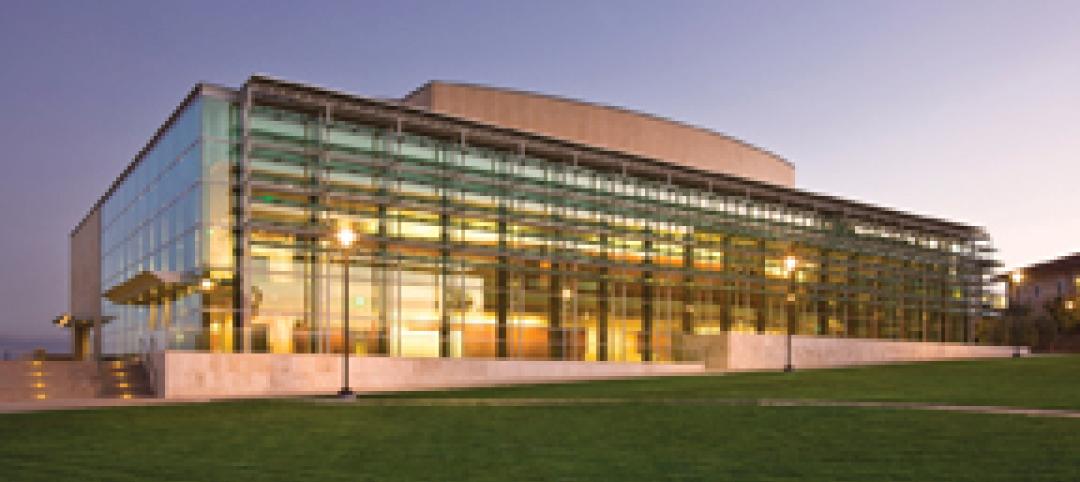
The $73 million Soka University of America’s new performing arts center and academic complex recently opened on the school’s Aliso Viejo, Calif., campus. McCarthy Building Companies and Zimmer Gunsul Frasca Architects collaborated on the two-building project. One is a three-story, 47,836-sf facility with a grand reception lobby, a 1,200-seat auditorium, and supports spaces. The other is a four-story, 48,974-sf facility with 11 classrooms, 29 faculty offices, a 150-seat black box theater, rehearsal/dance studio, and support spaces. The project, which has a green roof, solar panels, operable windows, and sun-shading devices, is going for LEED Silver.
| Feb 11, 2011
BIM-enabled Texas church complex can broadcast services in high-def
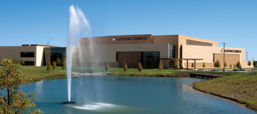
After two years of design and construction, members of the Gateway Church in Southland, Texas, were able to attend services in their new 4,000-seat facility in late 2010. Located on a 180-acre site, the 205,000-sf complex has six auditoriums, including a massive 200,000-sf Worship Center, complete with catwalks, top-end audio and video system, and high-definition broadcast capabilities. BIM played a significant role in the building’s design and construction. Balfour Beatty Construction and Beck Architecture formed the nucleus of the Building Team.
| Feb 11, 2011
Kentucky’s first green adaptive reuse project earns Platinum
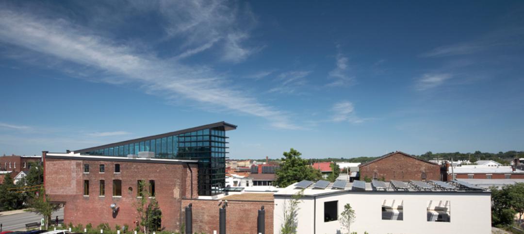
(FER) studio, Inglewood, Calif., converted a 115-year-old former dry goods store in Louisville, Ky., into a 10,175-sf mixed-use commercial building earned LEED Platinum and holds the distinction of being the state’s first adaptive reuse project to earn any LEED rating. The facility, located in the East Market District, houses a gallery, event space, offices, conference space, and a restaurant. Sustainable elements that helped the building reach its top LEED rating include xeriscaping, a green roof, rainwater collection and reuse, 12 geothermal wells, 81 solar panels, a 1,100-gallon ice storage system (off-grid energy efficiency is 68%) and the reuse and recycling of construction materials. Local firm Peters Construction served as GC.
| Feb 11, 2011
Former Richardson Romanesque hotel now houses books, not beds
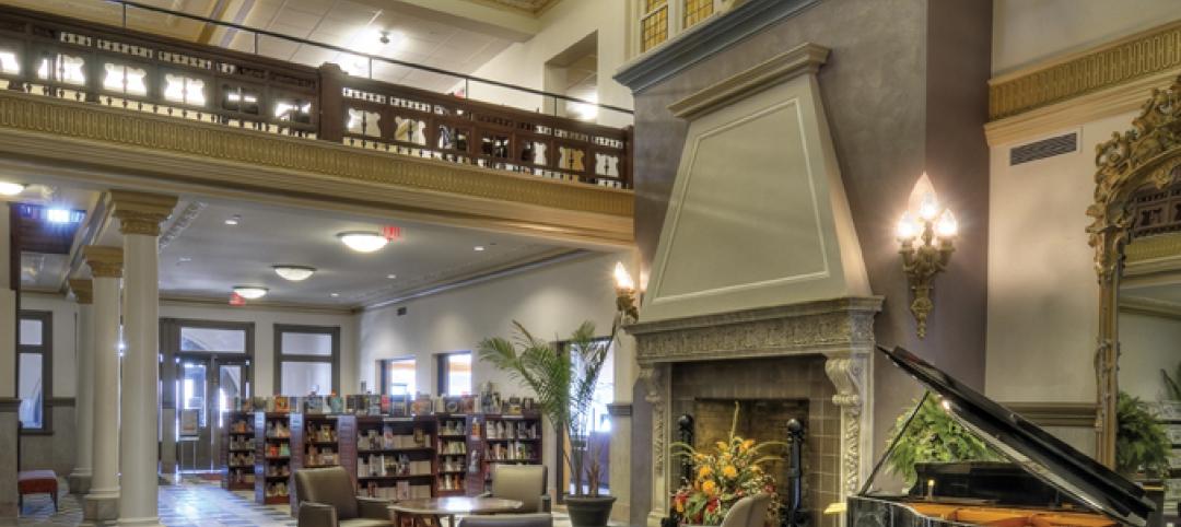
The Piqua (Ohio) Public Library was once a late 19th-century hotel that sat vacant and deteriorating for years before a $12.3 million adaptive reuse project revitalized the 1891 building. The design team of PSA-Dewberry, MKC Associates, and historic preservation specialist Jeff Wray Associates collaborated on the restoration of the 80,000-sf Richardson Romanesque building, once known as the Fort Piqua Hotel. The team restored a mezzanine above the lobby and repaired historic windows, skylight, massive fireplace, and other historic details. The basement, with its low ceiling and stacked stone walls, was turned into a castle-like children’s center. The Piqua Historical Museum is also located within the building.
| Feb 11, 2011
Justice center on Fall River harbor serves up daylight, sustainable elements, including eucalyptus millwork
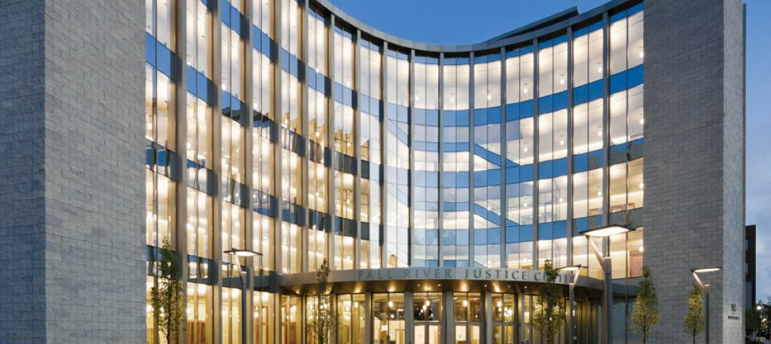
Located on historic South Main Street in Fall River, Mass., the Fall River Justice Center opened last fall to serve as the city’s Superior and District Courts building. The $85 million facility was designed by Boston-based Finegold Alexander + Associates Inc., with Dimeo Construction as CM and Arup as MEP. The 154,000-sf courthouse contains nine courtrooms, a law library, and a detention area. Most of the floors have the same ceiling height, which will makes them easier to reconfigure in the future as space needs change. Designed to achieve LEED Silver, the facility’s elliptical design offers abundant natural daylight and views of the harbor. Renewable eucalyptus millwork is one of the sustainable features.
| Feb 11, 2011
Research facility separates but also connects lab spaces
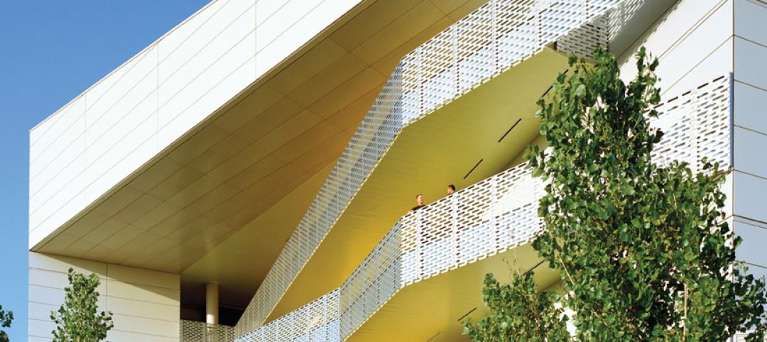
California State University, Northridge, consolidated its graduate and undergraduate biology and mathematics programs into one 90,000-sf research facility. Architect of record Cannon Design worked on the new Chaparral Hall, creating a four-story facility with two distinct spaces that separate research and teaching areas; these are linked by faculty offices to create collaborative spaces. The building houses wet research, teaching, and computational research labs, a 5,000-sf vivarium, classrooms, and administrative offices. A four-story outdoor lobby and plaza and an outdoor staircase provide orientation. A covered walkway links the new facility with the existing science complex. Saiful/Bouquet served as structural engineer, Bard, Rao + Athanas Consulting Engineers served as MEP, and Research Facilities Design was laboratory consultant.
| Feb 11, 2011
A feast of dining options at University of Colorado community center, but hold the buffalo stew
The University of Colorado, Boulder, cooked up something different with its new $84.4 million Center for Community building, whose 900-seat foodservice area consists of 12 micro-restaurants, each with its own food options and décor. Centerbrook Architects of Connecticut collaborated with Denver’s Davis Partnership Architects and foodservice designer Baker Group of Grand Rapids, Mich., on the 323,000-sf facility, which also includes space for a career center, international education, and counseling and psychological services. Exterior walls of rough-hewn, variegated sandstone and a terra cotta roof help the new facility blend with existing campus buildings. Target: LEED Gold.
| Feb 11, 2011
Chicago high-rise mixes condos with classrooms for Art Institute students
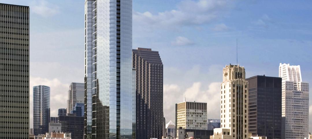
The Legacy at Millennium Park is a 72-story, mixed-use complex that rises high above Chicago’s Michigan Avenue. The glass tower, designed by Solomon Cordwell Buenz, is mostly residential, but also includes 41,000 sf of classroom space for the School of the Art Institute of Chicago and another 7,400 sf of retail space. The building’s 355 one-, two-, three-, and four-bedroom condominiums range from 875 sf to 9,300 sf, and there are seven levels of parking. Sky patios on the 15th, 42nd, and 60th floors give owners outdoor access and views of Lake Michigan.
| Feb 11, 2011
Iowa surgery center addresses both inpatient and outpatient care
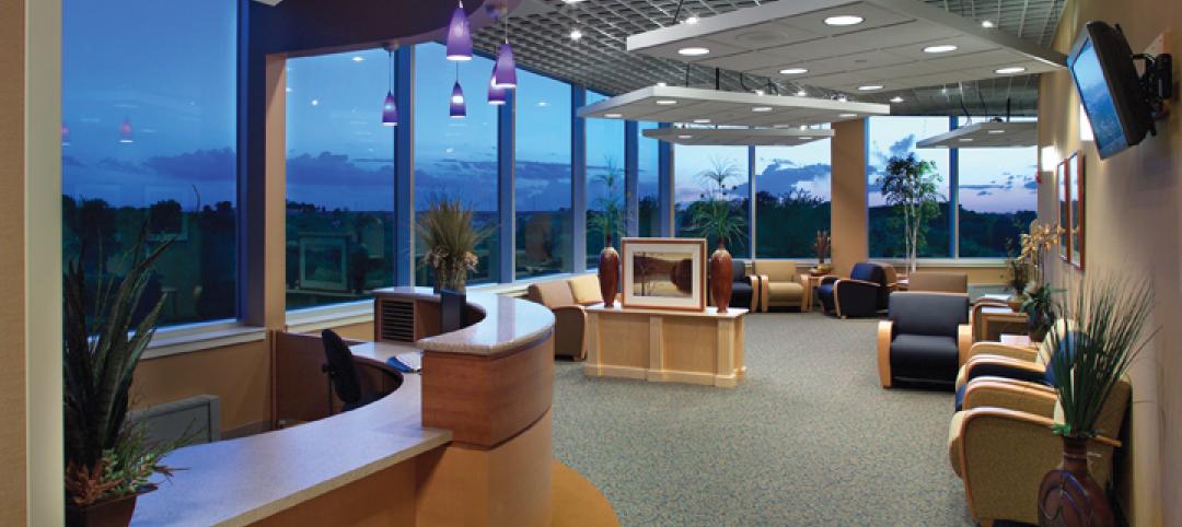
The 12,000-person community of Carroll, Iowa, has a new $28 million surgery center to provide both inpatient and outpatient care. Minneapolis-based healthcare design firm Horty Elving headed up the four-story, 120,000-sf project for St. Anthony’s Regional Hospital. The center’s layout is based on a circular process flow, and includes four 800-sf operating rooms with poured rubber floors to reduce leg fatigue for surgeons and support staff, two substerile rooms between each pair of operating rooms, and two endoscopy rooms adjacent to the outpatient prep and recovery rooms. Recovery rooms are clustered in groups of four. The large family lounge (left) has expansive windows with views of the countryside, and television monitors that display coded information on patient status so loved ones can follow a patient’s progress.


