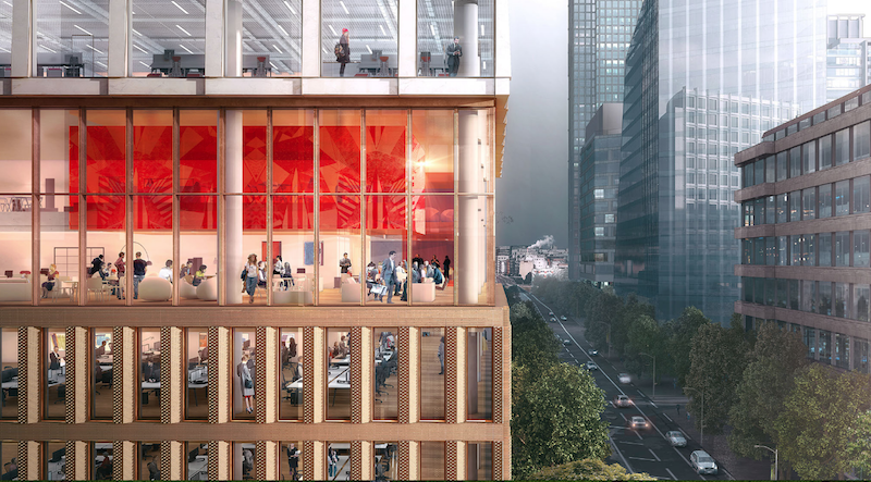
The site for a new 21-story office building, dubbed Friars Bridge Court, from PLP Architecture is unique in terms of the surrounding architecture. The new building will replace an old office building from 1991 at the northern end of Blackfriars Road in the London Borough of Southwark. What makes the site unique, and, ultimately, what will make the building itself unique, is that buildings fairly uniform in height characterize the southern half of Blackfriars Road, but the northern half has a more varied street wall that culminates in a series of object towers near the northern terminus, according to the architect’s website.
In an effort to complement both the southern and northern buildings, the new tower will employ a series of transitional elements into its design. As the firm explains on its website, the building “is designed to strengthen the end of the block in which it sits and announce through its scale the transition to the more singular buildings towards the river.”
The design proposes a “volumetric extrusion” of a height similar to that of the mid-rise buildings nearby. The volume is then split vertically into two volumes. The Western volume is lowered in order to establish a street height with the other buildings adjoining the site. The volume, which has already been divided into two, is then divided further, horizontally across its base this time, to form an upper and lower component. The lower component, which includes the shorter western volume to form an “L” shape, is meant to anchor the building into the immediate context (meaning the uniform, smaller buildings on the south side of the street), while the upper component is to be perceived in the wider townscape setting.
Between the upper and lower volumes will be a large gallery space, providing open views into and out of the building. This gallery space exists at a point that works to strengthen datum lines on the facades of surrounding buildings. A recessed double-height lobby space is added at the ground level.
The building’s form is not the only transitional aspect of the tower. The masonry envelope will also differ between volumes. The lower portion of the building will be clad in a denser grain façade expressed through the use of light-colored brick. The upper volume’s facade will be a light sandstone colored mineral finished grid.
The result of all of these transitional elements is a building that manages to fit in with the smaller buildings immediately surrounding it while also softening the height difference between the southern and northern buildings.
The completed tower will provide 196,800 sf of office space and 7,300 sf of retail space. Additionally, the tower will emphasize flexibility in its office space, something the old building could not provide. Friars Bridge Court will also provide amenity spaces and two roof top terraces.
 Rendering courtesy of PLP Architecture.
Related Stories
Office Buildings | Jul 12, 2016
CF Møller designs LEGO world headquarters complex in Denmark
The 52,000-sm complex will incorporate many familiar motifs from the popular plastic building block toys.
Office Buildings | Jul 11, 2016
CetraRuddy designs office tower for Manhattan’s Meatpacking district
Plans originally called for a hotel, but the architect and developers adapted their design for commercial use.
Market Data | Jul 6, 2016
A thriving economy and influx of businesses spur construction in downtown Seattle
Development investment is twice what it was five years ago.
Contractors | Jul 4, 2016
A new report links infrastructure investment to commercial real estate expansion
Competitiveness and economic development are at stake for cities, says Transwestern.
High-rise Construction | Jun 29, 2016
Best Tall Buildings around the world favor unusual shapes and hybrid functions
The Council on Tall Buildings and Urban Habitat selects winners in four regions.
Office Buildings | Jun 16, 2016
Ability to focus, not perks, is top concern for office employees
Open-plan offices found to worsen distraction problem.
High-rise Construction | Jun 15, 2016
WilkinsonEyre designs diamond-patterned Bay Park Centre for Toronto
A sloping plaza with trees, grass, and gardens connects the two downtown towers.
Office Buildings | Jun 14, 2016
Let's not forget introverts when it comes to workplace design
Recent design trends favor extroverts who enjoy collaboration. HDR's Lynn Mignola says that designers need to accommodate introverts, people who recharge with solitude, as well.
Movers+Shapers | Jun 13, 2016
THE DISRUPTORS: The Millennial generation is imposing its will on design
AEC firms, particularly those that design hotels and offices, gain a competitive edge by knowing how to appeal to the largest share of the American workforce.
Office Buildings | Jun 10, 2016
Buildings that invest in wellbeing see healthy returns
Healthy workers are more productive workers, but fitness can be tough when employees at the office for 50 hours a week. Perkins+Will's Janine Grossmann offers the wellness components that landlords and companies should prioritize.


