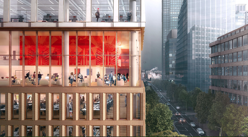
The site for a new 21-story office building, dubbed Friars Bridge Court, from PLP Architecture is unique in terms of the surrounding architecture. The new building will replace an old office building from 1991 at the northern end of Blackfriars Road in the London Borough of Southwark. What makes the site unique, and, ultimately, what will make the building itself unique, is that buildings fairly uniform in height characterize the southern half of Blackfriars Road, but the northern half has a more varied street wall that culminates in a series of object towers near the northern terminus, according to the architect’s website.
In an effort to complement both the southern and northern buildings, the new tower will employ a series of transitional elements into its design. As the firm explains on its website, the building “is designed to strengthen the end of the block in which it sits and announce through its scale the transition to the more singular buildings towards the river.”
The design proposes a “volumetric extrusion” of a height similar to that of the mid-rise buildings nearby. The volume is then split vertically into two volumes. The Western volume is lowered in order to establish a street height with the other buildings adjoining the site. The volume, which has already been divided into two, is then divided further, horizontally across its base this time, to form an upper and lower component. The lower component, which includes the shorter western volume to form an “L” shape, is meant to anchor the building into the immediate context (meaning the uniform, smaller buildings on the south side of the street), while the upper component is to be perceived in the wider townscape setting.
Between the upper and lower volumes will be a large gallery space, providing open views into and out of the building. This gallery space exists at a point that works to strengthen datum lines on the facades of surrounding buildings. A recessed double-height lobby space is added at the ground level.
The building’s form is not the only transitional aspect of the tower. The masonry envelope will also differ between volumes. The lower portion of the building will be clad in a denser grain façade expressed through the use of light-colored brick. The upper volume’s facade will be a light sandstone colored mineral finished grid.
The result of all of these transitional elements is a building that manages to fit in with the smaller buildings immediately surrounding it while also softening the height difference between the southern and northern buildings.
The completed tower will provide 196,800 sf of office space and 7,300 sf of retail space. Additionally, the tower will emphasize flexibility in its office space, something the old building could not provide. Friars Bridge Court will also provide amenity spaces and two roof top terraces.
 Rendering courtesy of PLP Architecture.
Related Stories
Game Changers | Feb 4, 2016
GAME CHANGERS: 6 projects that rewrite the rules of commercial design and construction
BD+C’s inaugural Game Changers report highlights today’s pacesetting projects, from a prefab high-rise in China to a breakthrough research lab in the Midwest.
Mixed-Use | Jan 25, 2016
SOM unveils renderings of dual-tower Manhattan West development
The five million-sf project includes two office towers, a residential tower, retail space, and a new public square.
Office Buildings | Jan 21, 2016
Nike reveals design, first images of planned 3.2 million-sf expansion to its world headquarters
The expansion looks to combine design elements inspired by human movement, speed, and the strength and energy of competition.
| Jan 14, 2016
How to succeed with EIFS: exterior insulation and finish systems
This AIA CES Discovery course discusses the six elements of an EIFS wall assembly; common EIFS failures and how to prevent them; and EIFS and sustainability.
Office Buildings | Jan 14, 2016
JLL: Slowdown not expected for office market
The booming sector had an occupancy growth rate 1.3 times that of new supply in the fourth quarter of 2015.
Office Buildings | Jan 11, 2016
Spec for tech: Designing for the creative class
The new work environment, settings which blur the line between work and life, is inspired by cities and the attributes that all great urban environments share, writes Ben Tranel of Gensler.
Office Buildings | Jan 6, 2016
4 tips for creating flow in a multi-level workspace
Successful workplaces enable a clear progression of ideas and people, which can be challenging for workplaces that occupy multiple levels. Perkins+Will's Sarah Stanford found some strategies that have proven successful.
Office Buildings | Dec 23, 2015
Good design alone won’t eradicate mindless meetings
Gensler's Johnathan Sandler discusses efficient alternatives to dull, wasteful workplace meetings.
Office Buildings | Dec 17, 2015
John Buck Company to develop CNA’s Chicago headquarters
The 35-story building will have plenty of column-free space.
Office Buildings | Dec 9, 2015
HOK collaborates with IFMA on new workplace strategy research report
Report cites work-life balance as the top reason for implementing “distributed work” strategies.


