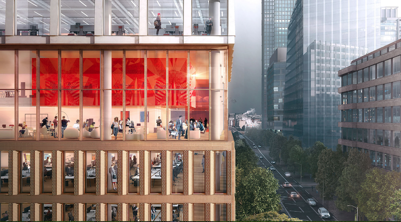
The site for a new 21-story office building, dubbed Friars Bridge Court, from PLP Architecture is unique in terms of the surrounding architecture. The new building will replace an old office building from 1991 at the northern end of Blackfriars Road in the London Borough of Southwark. What makes the site unique, and, ultimately, what will make the building itself unique, is that buildings fairly uniform in height characterize the southern half of Blackfriars Road, but the northern half has a more varied street wall that culminates in a series of object towers near the northern terminus, according to the architect’s website.
In an effort to complement both the southern and northern buildings, the new tower will employ a series of transitional elements into its design. As the firm explains on its website, the building “is designed to strengthen the end of the block in which it sits and announce through its scale the transition to the more singular buildings towards the river.”
The design proposes a “volumetric extrusion” of a height similar to that of the mid-rise buildings nearby. The volume is then split vertically into two volumes. The Western volume is lowered in order to establish a street height with the other buildings adjoining the site. The volume, which has already been divided into two, is then divided further, horizontally across its base this time, to form an upper and lower component. The lower component, which includes the shorter western volume to form an “L” shape, is meant to anchor the building into the immediate context (meaning the uniform, smaller buildings on the south side of the street), while the upper component is to be perceived in the wider townscape setting.
Between the upper and lower volumes will be a large gallery space, providing open views into and out of the building. This gallery space exists at a point that works to strengthen datum lines on the facades of surrounding buildings. A recessed double-height lobby space is added at the ground level.
The building’s form is not the only transitional aspect of the tower. The masonry envelope will also differ between volumes. The lower portion of the building will be clad in a denser grain façade expressed through the use of light-colored brick. The upper volume’s facade will be a light sandstone colored mineral finished grid.
The result of all of these transitional elements is a building that manages to fit in with the smaller buildings immediately surrounding it while also softening the height difference between the southern and northern buildings.
The completed tower will provide 196,800 sf of office space and 7,300 sf of retail space. Additionally, the tower will emphasize flexibility in its office space, something the old building could not provide. Friars Bridge Court will also provide amenity spaces and two roof top terraces.
 Rendering courtesy of PLP Architecture.
Related Stories
Greenbuild Report | Dec 8, 2015
Is ‘green’ still a selling point in the office sector?
Some developers are missing an opportunity by downplaying sustainability at a time when demand for such features is palpable among lessee firms who are trying to attract younger workers.
Energy Efficiency | Nov 16, 2015
Amazon will heat its new Seattle campus with waste heat from next-door data centers
Up to 4 million kilowatt-hours of energy will be saved each year.
Office Buildings | Nov 6, 2015
Real Madrid to get new headquarters designed by Rafael de La-Hoz
The design of the building is made of a set of two parallelepiped-shaped volumes.
Office Buildings | Nov 3, 2015
Emotional intelligence and design
In a world in which technology and its skills are constantly changing, good people skills are becoming more important, writes VOA's Angie Lee.
Office Buildings | Oct 19, 2015
10 ways to work better
Each office workplace requires a different blend of people, processes, tools, and spaces to support its employees. HDR's Allison Arnone has tips that can guide you toward the perfect balance for your company.
Office Buildings | Oct 16, 2015
#Thank you for sharing: How social media is reshaping the workplace
The rapid growth of mobile technologies threatens to push the desktop PC into extinction. When this happens, the most pertinent question for workplace designers will be what is the purpose of the desk, writes Gensler’s Philip Tidd.
Office Buildings | Oct 5, 2015
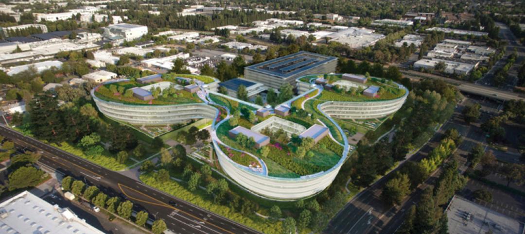
Renderings revealed for Apple's second 'spaceship': a curvy, lush office complex in Sunnyvale
The project has been dubbed as another “spaceship,” referencing the nickname for the loop-shaped Apple Campus under construction in Cupertino.
High-rise Construction | Oct 5, 2015
Zaha Hadid designs cylindrical office building with world’s tallest atrium
The 200-meter-high open space will cut the building in two.
Office Buildings | Sep 28, 2015
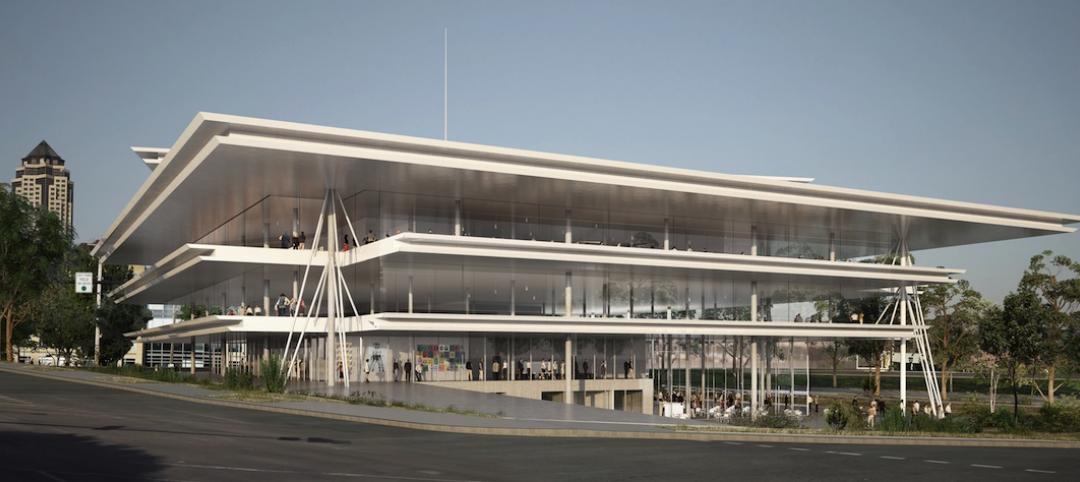
Simplicity and angularity define Renzo Piano’s design for Kum & Go’s headquarters
The new building is part of a downtown Des Moines, Iowa, redevelopment project, and is intended to echo the shapes of a nearby sculpture park.
High-rise Construction | Sep 3, 2015
Rafael Viñoly's 'Walkie-Talkie' tower named U.K.'s worst new building
The curved, glass tower at 20 Fenchurch Street in London has been known to reflect intense heat onto the streets below (in one instance damaging a car) and cause severe wind gusts.


