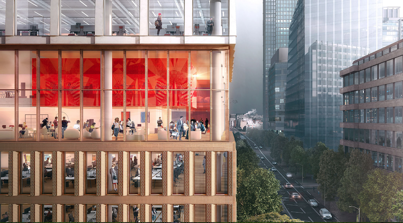
The site for a new 21-story office building, dubbed Friars Bridge Court, from PLP Architecture is unique in terms of the surrounding architecture. The new building will replace an old office building from 1991 at the northern end of Blackfriars Road in the London Borough of Southwark. What makes the site unique, and, ultimately, what will make the building itself unique, is that buildings fairly uniform in height characterize the southern half of Blackfriars Road, but the northern half has a more varied street wall that culminates in a series of object towers near the northern terminus, according to the architect’s website.
In an effort to complement both the southern and northern buildings, the new tower will employ a series of transitional elements into its design. As the firm explains on its website, the building “is designed to strengthen the end of the block in which it sits and announce through its scale the transition to the more singular buildings towards the river.”
The design proposes a “volumetric extrusion” of a height similar to that of the mid-rise buildings nearby. The volume is then split vertically into two volumes. The Western volume is lowered in order to establish a street height with the other buildings adjoining the site. The volume, which has already been divided into two, is then divided further, horizontally across its base this time, to form an upper and lower component. The lower component, which includes the shorter western volume to form an “L” shape, is meant to anchor the building into the immediate context (meaning the uniform, smaller buildings on the south side of the street), while the upper component is to be perceived in the wider townscape setting.
Between the upper and lower volumes will be a large gallery space, providing open views into and out of the building. This gallery space exists at a point that works to strengthen datum lines on the facades of surrounding buildings. A recessed double-height lobby space is added at the ground level.
The building’s form is not the only transitional aspect of the tower. The masonry envelope will also differ between volumes. The lower portion of the building will be clad in a denser grain façade expressed through the use of light-colored brick. The upper volume’s facade will be a light sandstone colored mineral finished grid.
The result of all of these transitional elements is a building that manages to fit in with the smaller buildings immediately surrounding it while also softening the height difference between the southern and northern buildings.
The completed tower will provide 196,800 sf of office space and 7,300 sf of retail space. Additionally, the tower will emphasize flexibility in its office space, something the old building could not provide. Friars Bridge Court will also provide amenity spaces and two roof top terraces.
 Rendering courtesy of PLP Architecture.
Related Stories
Codes and Standards | Feb 12, 2015
New Appraisal Institute form aids in analysis of green commercial building features
The Institute’s Commercial Green and Energy Efficient Addendum offers a communication tool that lenders can use as part of the scope of work.
Office Buildings | Feb 12, 2015
Is Houston headed for an office glut?
More than 13 million sf could be completed this year, adding to this metro’s double-digit vacancy woes.
Architects | Feb 11, 2015
Shortlist for 2015 Mies van der Rohe Award announced
Copenhagen, Berlin, and Rotterdam are the cities where most of the shortlisted works have been built.
Office Buildings | Feb 6, 2015
6 factors steering workplace design at financial services firms
Grossly underutilized space and a lack of a mobility strategy are among the trends identified by HOK based on its research of 11 top-tier financial services firms.
Contractors | Feb 6, 2015
Census Bureau: Capital spending by U.S. businesses increased 4.5%
Of the 19 industry sectors covered in the report, only one had a statistically significant year-to-year decrease in capital spending: the utilities sector.
Office Buildings | Feb 3, 2015
5 trends transforming workplace design
RTKL's workplace design expert Jodi Williams foresees healthier and more technologically enabled offices that allow productive worker interaction, wherever they happen to be.
Office Buildings | Feb 3, 2015
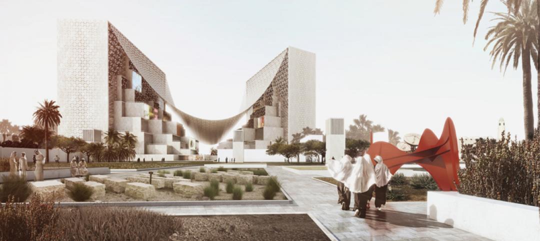
Bjarke Ingels' BIG proposes canopied, vertical village for Middle East media company
The tensile canopy shades a relaxation plaza from the desert sun.
Office Buildings | Feb 2, 2015
Study shows modern workers struggle to leave work at the office
Study findings indicate that more than half the respondents holds tight to their smartphones, checking and responding to email and taking phone calls, all or most of the time.
Office Buildings | Jan 28, 2015
Sustainability’s missed opportunity: small commercial buildings
The real opportunity for shrinking the nation’s energy footprint lies in the mundane world of small commercial buildings, writes BD+C's David Barista.
Office Buildings | Jan 27, 2015
London plans to build Foggo Associates' 'can of ham' building
The much delayed high-rise development at London’s 60-70 St. Mary Axe resembles a can of ham, and the project's architects are embracing the playful sobriquet.


