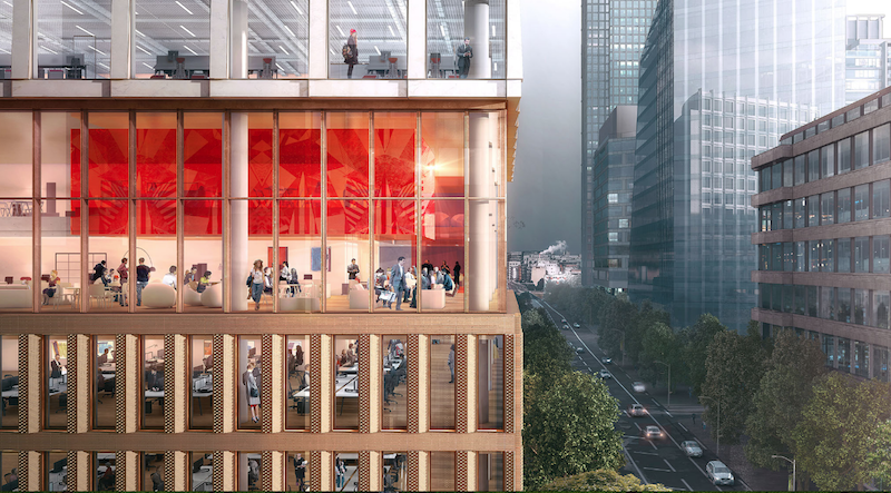
The site for a new 21-story office building, dubbed Friars Bridge Court, from PLP Architecture is unique in terms of the surrounding architecture. The new building will replace an old office building from 1991 at the northern end of Blackfriars Road in the London Borough of Southwark. What makes the site unique, and, ultimately, what will make the building itself unique, is that buildings fairly uniform in height characterize the southern half of Blackfriars Road, but the northern half has a more varied street wall that culminates in a series of object towers near the northern terminus, according to the architect’s website.
In an effort to complement both the southern and northern buildings, the new tower will employ a series of transitional elements into its design. As the firm explains on its website, the building “is designed to strengthen the end of the block in which it sits and announce through its scale the transition to the more singular buildings towards the river.”
The design proposes a “volumetric extrusion” of a height similar to that of the mid-rise buildings nearby. The volume is then split vertically into two volumes. The Western volume is lowered in order to establish a street height with the other buildings adjoining the site. The volume, which has already been divided into two, is then divided further, horizontally across its base this time, to form an upper and lower component. The lower component, which includes the shorter western volume to form an “L” shape, is meant to anchor the building into the immediate context (meaning the uniform, smaller buildings on the south side of the street), while the upper component is to be perceived in the wider townscape setting.
Between the upper and lower volumes will be a large gallery space, providing open views into and out of the building. This gallery space exists at a point that works to strengthen datum lines on the facades of surrounding buildings. A recessed double-height lobby space is added at the ground level.
The building’s form is not the only transitional aspect of the tower. The masonry envelope will also differ between volumes. The lower portion of the building will be clad in a denser grain façade expressed through the use of light-colored brick. The upper volume’s facade will be a light sandstone colored mineral finished grid.
The result of all of these transitional elements is a building that manages to fit in with the smaller buildings immediately surrounding it while also softening the height difference between the southern and northern buildings.
The completed tower will provide 196,800 sf of office space and 7,300 sf of retail space. Additionally, the tower will emphasize flexibility in its office space, something the old building could not provide. Friars Bridge Court will also provide amenity spaces and two roof top terraces.
 Rendering courtesy of PLP Architecture.
Related Stories
| Dec 28, 2014
AIA course: Enhancing interior comfort while improving overall building efficacy
Providing more comfortable conditions to building occupants has become a top priority in today’s interior designs. This course is worth 1.0 AIA LU/HSW.
| Dec 28, 2014
10 key design interventions for a healthier, happier, and more productive workplace
Numerous studies and mountains of evidence confirm what common sense has long suggested: healthy, happier workers are more productive, more likely to collaborate with colleagues, and more likely to innovate in ways that benefit the bottom line, writes Gensler's Kirsten Ritchie.
| Dec 28, 2014
Workplace design trends: Make way for the Millennials
Driven by changing work styles, mobile technology, and the growing presence of Millennials, today’s workplaces are changing, mostly for the better. We examine the top office design trends.
| Dec 27, 2014
7 ways to enhance workplace mobility
The open work environment has allowed owners to house more employees in smaller spaces, minimizing the required real estate and capital costs. But, what about all of their wireless devices?
| Dec 27, 2014
'Core-first' construction technique cuts costs, saves time on NYC high-rise project
When Plaza Construction first introduced the concept of "core first" in managing the construction of a major office building, the procedure of pouring concrete prior to erecting a steel frame had never been done in New York City.
| Dec 19, 2014
Zaha Hadid unveils dune-shaped HQ for Emirati environmental management company
Zaha Hadid Architects released designs for the new headquarters of Emirati environmental management company Bee’ah, revealing a structure that references the shape and motion of a sand dune.
| Dec 18, 2014
In response to ultra-open and uber-collaborative office environments
Susan Cain’s bestselling 2012 book, "Quiet: The Power of Introverts in a World That Can’t Stop Talking" has made an impact on how we understand our current workforce, recognizing that at least one-third of the people we work with are introverts, writes SRG Partnership's Susan Gust.
| Dec 12, 2014
COBE's striking 'concrete finned' scheme wins competition for Adidas' flagship building in Germany
Danish firm COBE has been announced the winner in a contest to design a new Adidas flagship building in Herzogenaurach, Germany. It beat out 29 other teams, including REX and Zaha Hadid.
| Dec 10, 2014
International Olympic Committee releases first images of new HQ in Switzerland
Designed by 3XN, the new headquarters is located within a park on the shores of Lake Geneva and adjacent to historic Château de Vidy, which has been the iconic home of the IOC.
| Dec 6, 2014
Future workplace designs shouldn’t need to favor one generation over another, says CBRE report
A new CBRE survey finds that what Millennials expect and need from offices doesn’t vary drastically from tenured employees.


