A new Foster + Partners-designed office building in Belval, Luxembourg has broken ground.
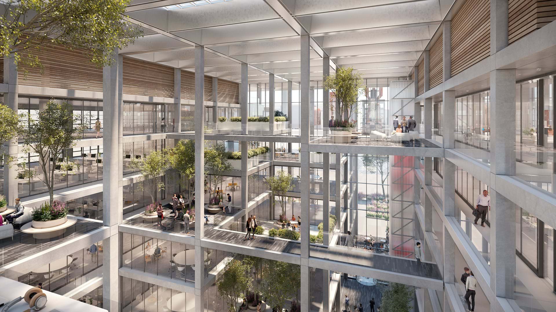
Dubbed ICÔNE, the 202,000-sf office complex has an interior reminiscent of an Escher painting, filled with light and greenery. The flexible layout encourages collaboration and addresses the need for safe working environments and the changes to the workplace that will emerge in the future.
“The project is designed to have open, flexible workspaces that respond to the emerging models of work today,” said Darron Haycock, Partner, Foster + Partners, in a release. “The atrium is a green light-filled space that is very much the social heart of the project, providing visual connectivity and a dynamic atmosphere for both work and play. Biophilia, the green landscaping, natural ventilation and visual connectivity all promoting collaboration and healthy wellbeing.”
![]()
The building was also designed to reference the industrial heritage of Belval and revitalize the area by making a positive contribution to the site and its surroundings. It is wrapped by an orthogonal facade and roof that emphasize the structural grid and give the building a unified industrial look. The façade is both structural and environmentally responsive, providing an integrated solution which allows for internal column-free office spaces as well as solar shading and maximized internal daylight.
The scheme releases to its neighboring buildings and addresses the different characteristics of the principal axes to the east and west. Entrances are articulated differently in response to the urban street and civic plaza while the building edge along Porte de France contains shops. Cafes and restaurants on the ground floor complement Place de l'Académie.
![]()
ICÔNE is arranged as two wings enclosing the central atrium. The atrium resolves the level changes between the street and the plaza though a series of stepped terraces that create an arrival sequence. The open circulation features communal terraces for informal meetings and break out spaces at higher levels overlooking the central volume. Glimpses of interior green spaces can be see-through a series of punched volumes that intersect the gridded structure.
The design, created in collaboration with Beiler Francois Fritsch, aims for a BREEAM Excellent rating and will be WELL Building Standard® certified.
![]()
![]()
Related Stories
Office Buildings | Apr 8, 2019
Denver office building features 13,000 sf green roof
Dynia Architects designed the building.
Office Buildings | Apr 5, 2019
2019 trends in the workplace
From retention and career advancement to the ethics of inclusion and diversity, these five trends will play a major role this year in design, strategic planning and workplace development.
Industrial Facilities | Mar 10, 2019
The burgeoning Port San Antonio lays out growth plans
Expansions would accommodate cybersecurity, aerospace, and defense tenants, and help commercialize technologies.
Office Buildings | Mar 6, 2019
How to leverage design and culture’s two-way relationship for better workplaces
The relationship between workplace design and company culture isn’t all that different from a tango.
Office Buildings | Feb 15, 2019
A healthier perspective: Office developers bet on wellness amenities to attract top-notch tenants
Owners and developers are driving demand for wellness features and practices—active stairways, biophilia, enhanced air quality, etc.—as one more way draw tenants.
Office Buildings | Feb 15, 2019
Vancouver’s new office building will be a stack of reflective boxes
OSO and Merrick Architecture designed the building.
Office Buildings | Feb 11, 2019
Real-world wellness pays off
3form, a materials manufacturer, did a top-to-bottom remodel of its Salt Lake City headquarters campus that included adding a 14,500-sf gym.
Office Buildings | Feb 5, 2019
Duluth Trading Company moves to new HQ building
Plunkett Raysich Architects designed the project.
Interior Architecture | Jan 14, 2019
To get more involved earlier in projects, a leading furniture dealer launches a firm for commercial interiors construction
Vantis is positioned to integrate design with offsite customized fabrication.
Office Buildings | Jan 11, 2019
Open offices are bad!
The Harvard studies on the unintended effects of open office defines it as space where 'one entire floor was open, transparent and boundaryless… [with] assigned seats,' and the other had 'similarly assigned seats in an open office design, with large rooms of desks and monitors and no dividers between people's desks.'


