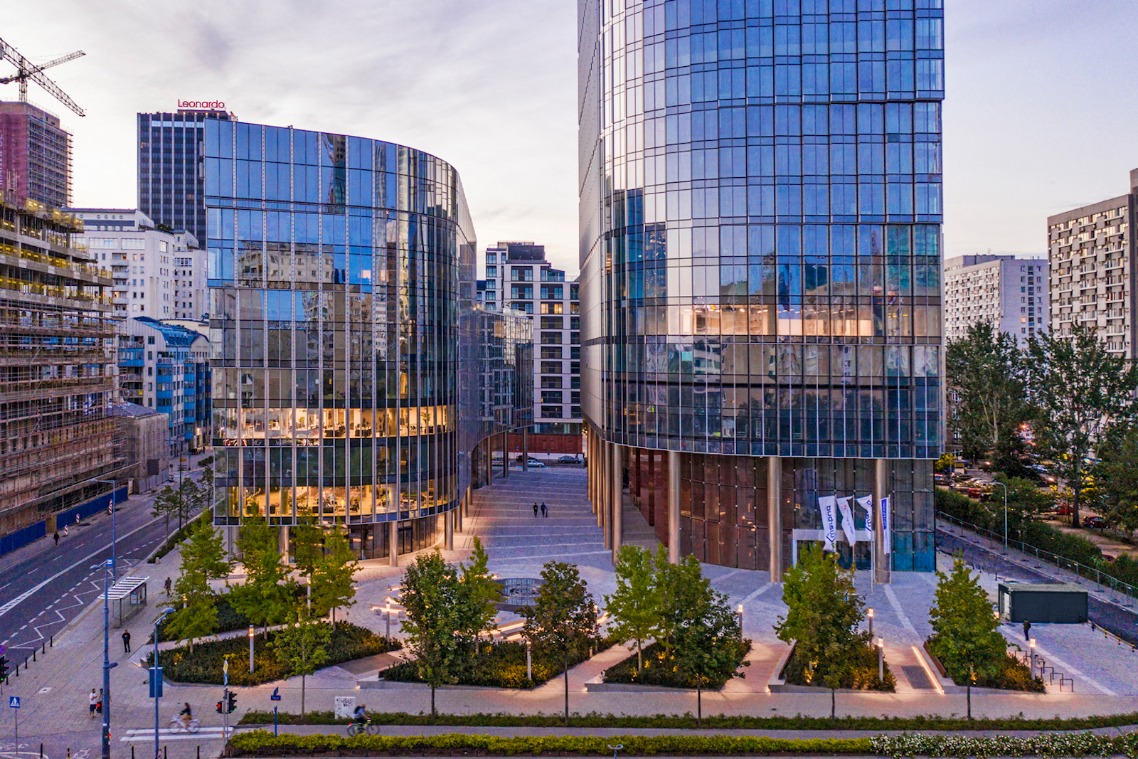
Mennica Legacy Tower marks GP’s first completed project in Poland. The Mennica Legacy Tower was developed by an affiliate of Golub & Company LLC and Mennica Towers GGH MT Sp z o o S.K.A, and delivered in collaboration with Epstein, a design firm with offices in Chicago and Warsaw.
The Master Plan
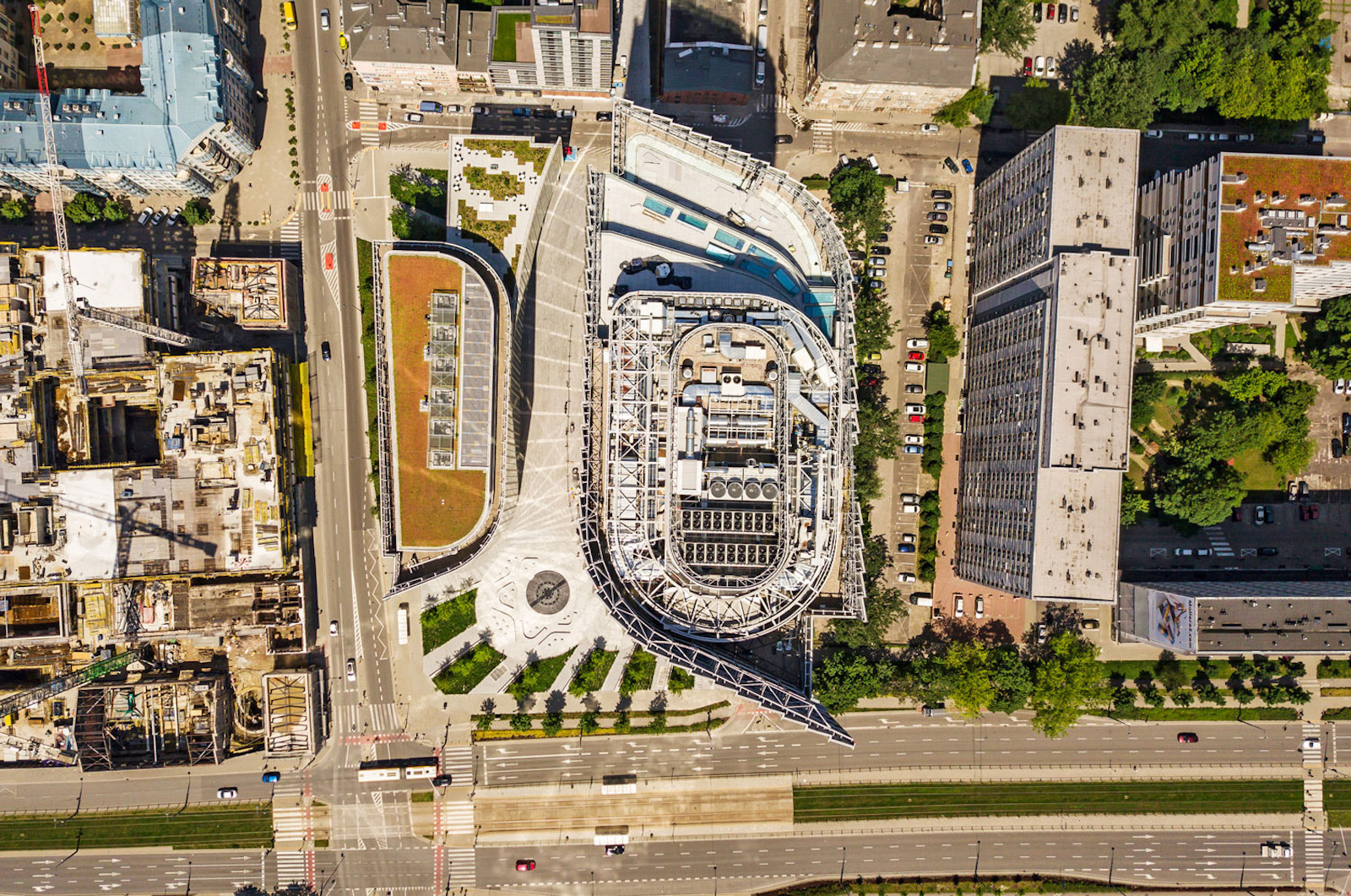
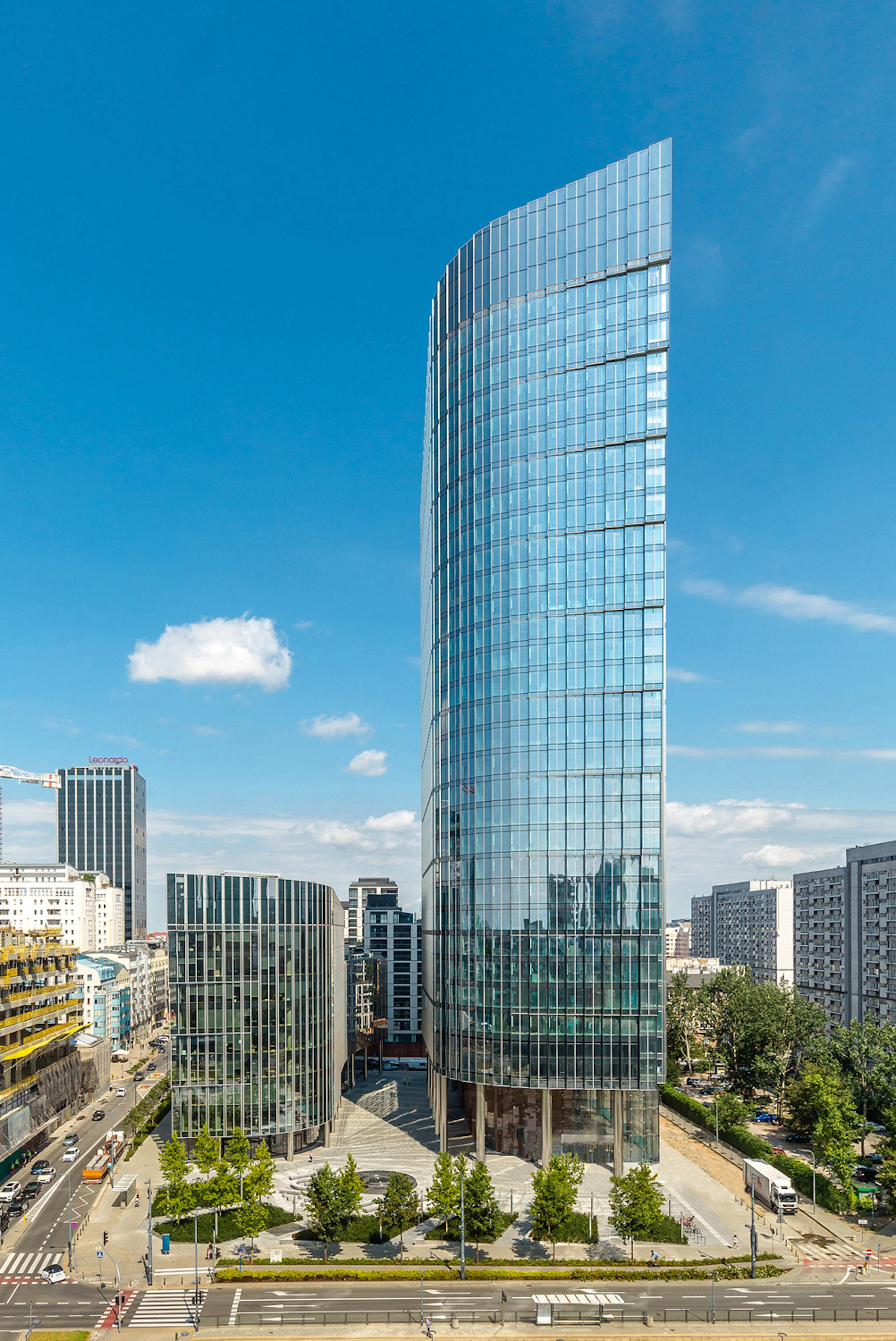
Located at the intersection of Prosta and Zelazna streets in the CBD, both the 35-story and 10-story office buildings open to a landscape plaza with a pedestrian walkway that sits between them. The development is divided into the taller main tower on the east side of the site and the smaller building on the west side.
The 115,000-sm two-building office area is anchored by one of Poland’s largest institutions, mBank, and co-working provider WeWork. The development is part of a newly approved plan in the CBD of Warsaw, and consists of 80,000-sm of Class-A office space, a conference center, fitness center, ground-level retail, and four levels of underground parking and ancillary services.
More Than An Office Complex
A huge part of the local master plan was to make sure there were outdoor areas dedicated to the public where people can sit and enjoy different landscape features. More than 60% of the area is specifically dedicated to this. The stepped arrangement of the two buildings, as well as the sculpted, sloped top of the tower, specifically respond to requirements that allow daylight into adjacent residential buildings.
“The project is much more than a signature new office complex,” says James Goettsch, FAIA, chairman and co-CEO at GP, in a release. “Integrally connected to its central urban plaza, the development creates a unique ‘sense of place’ that enhances the public realm of Warsaw.”
Unique Profile & Features
Rounded corners on the main tower’s northeast and southeast sides help reduce the visible length of the east and west facades. On the opposite corners, the lower tower incorporates a strong, vertical edge.
The southeast and northwest corners are each further distinguished by a vertical recess that breaks up the building’s mass and introduces a dominant feature. The southeast corner, in particular, steps outward in three-floor increments as it rises, opening the recess to the sky and creating a dynamic profile that becomes a glowing beacon at night. A sloping screen wall at the building’s top enhances the profile, and the textured, saw-toothed facades give the enclosure an ever-changing appearance as one moves around the building.
Attention To Detail
A three-story lobby with a cable-supported enclosure utilizes a transparent glazing that blurs the boundary between interior and exterior space. The tower core is clad with large stone slabs that accentuate the solid mass of the core, in contrast to the lightness of the building’s lobby. The 2,000-sm tower floor plate provides an almost column-free space with 11- to 13-m lease spans and a 1.35-m planning grid.
The complex’s triple-glazed, high-performance facade with integrated operable panels supplies fresh air to occupants and combines state-of-the-art building enclosure technology with an appealing aesthetic. Large landscaped outdoor terraces on the fifth level of the main tower and the eighth level of the west building provide exterior amenity spaces with sweeping views that engage the city.
“The tower’s unique profile helps define it as a city landmark,” says Joachim Schuessler, GP Design Principal, in a release. “Its stepped, curved façade further distinguishes it in the skyline from all angles.”
Related Stories
Office Buildings | Feb 8, 2017
London office building employs transitional forms to mediate between the varied heights of surrounding buildings
Friars Bridge Court will provide a transition between the unvarying height of the buildings to the south and the more varied heights of the northern buildings.
Office Buildings | Feb 7, 2017
SOM-designed HQ will provide new riverfront space for C.H. Robinson
Over 1,000 employees will work in the HQ building when completed.
Office Buildings | Feb 6, 2017
The see-through office: Why interior glass is all the rage in workplace design
The hottest material in workplace design—interior glass—opens offices to light and collaboration. But what about privacy and acoustics?
Office Buildings | Feb 3, 2017
Zurich defies center-core office archetype with stacked, cantilevered HQ
The top bar is 500 feet long, spans 180 feet between the bottom two bars, and cantilevers out 60 feet to the east.
Office Buildings | Feb 2, 2017
3 tips for designing workplaces that support culture, brand, and community
An authentic culture cannot be forced, but can be encouraged and supported.
Office Buildings | Dec 14, 2016
The importance of 'Place' in the workplace
More, and more, companies are emphasizing the importance of creating a meaningful sense of place in the office environment for all of their employees, writes Gensler's Kevin Rosenstein.
High-rise Construction | Dec 13, 2016
The tallest building in Manhattan’s Meatpacking district tops out
The office, designed by CetraRuddy, will be completed in 2017.
| Dec 6, 2016
Workplace pilots: Test. Learn. Build
Differentiated from mock-ups or beta sites, workplace pilots are small scale built work environments, where an organization’s employees permanently reside and work on a daily basis.
Office Buildings | Dec 6, 2016
eBay’s San Jose headquarters has a new interactive hub and welcome center named Main Street
The campus’s new ‘front door’ is designed to immerse visitors and employees into the company’s global commerce.
Office Buildings | Nov 16, 2016
Bjarke Ingels Group and Heatherwick Studios confirmed as architects for Google’s new London Headquarters
The headquarters will be located at Kings Cross, London.


