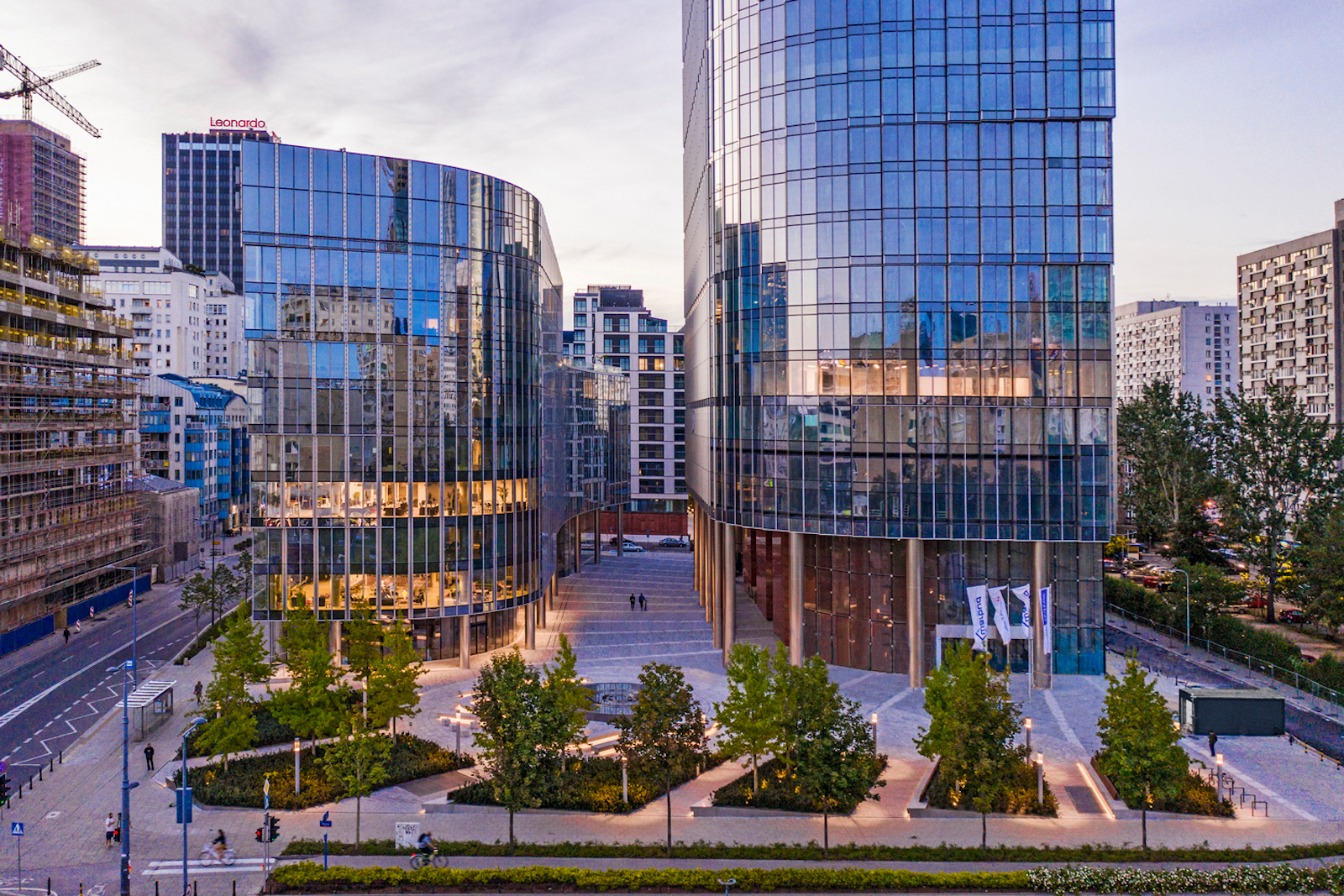
Mennica Legacy Tower marks GP’s first completed project in Poland. The Mennica Legacy Tower was developed by an affiliate of Golub & Company LLC and Mennica Towers GGH MT Sp z o o S.K.A, and delivered in collaboration with Epstein, a design firm with offices in Chicago and Warsaw.
The Master Plan
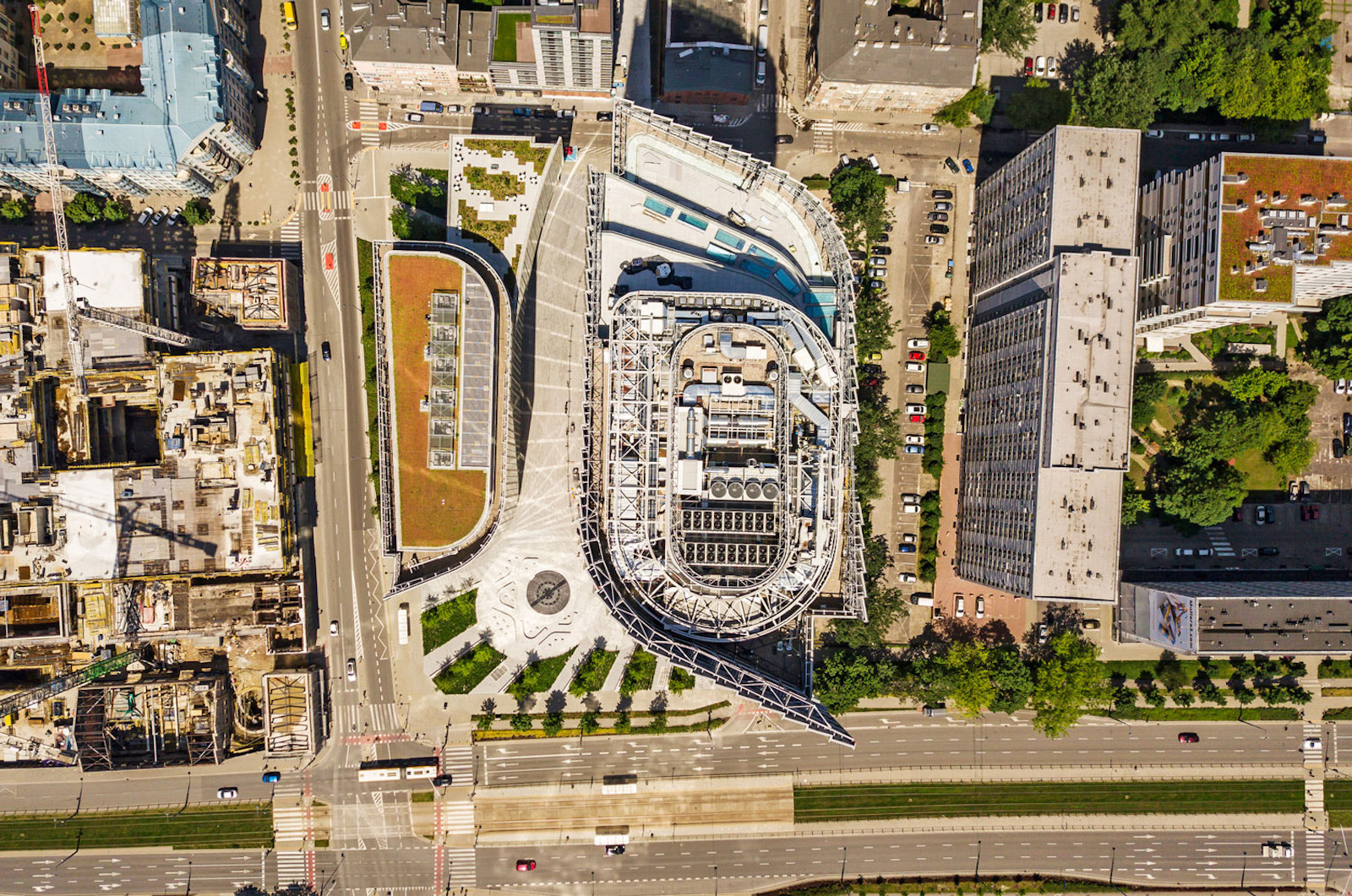
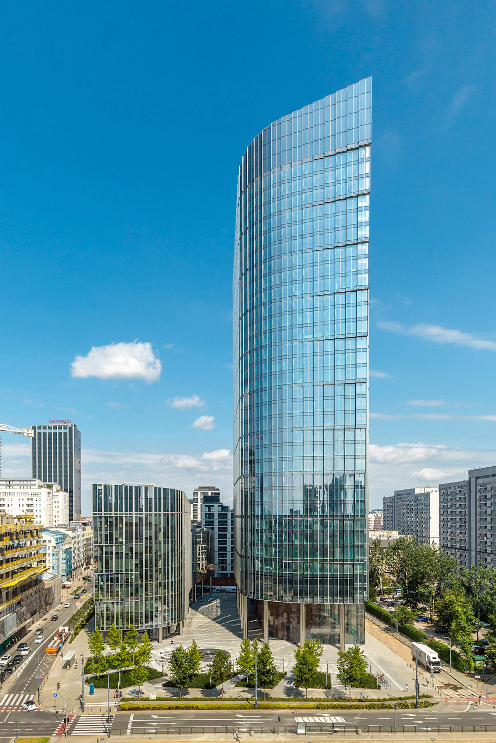
Located at the intersection of Prosta and Zelazna streets in the CBD, both the 35-story and 10-story office buildings open to a landscape plaza with a pedestrian walkway that sits between them. The development is divided into the taller main tower on the east side of the site and the smaller building on the west side.
The 115,000-sm two-building office area is anchored by one of Poland’s largest institutions, mBank, and co-working provider WeWork. The development is part of a newly approved plan in the CBD of Warsaw, and consists of 80,000-sm of Class-A office space, a conference center, fitness center, ground-level retail, and four levels of underground parking and ancillary services.
More Than An Office Complex
A huge part of the local master plan was to make sure there were outdoor areas dedicated to the public where people can sit and enjoy different landscape features. More than 60% of the area is specifically dedicated to this. The stepped arrangement of the two buildings, as well as the sculpted, sloped top of the tower, specifically respond to requirements that allow daylight into adjacent residential buildings.
“The project is much more than a signature new office complex,” says James Goettsch, FAIA, chairman and co-CEO at GP, in a release. “Integrally connected to its central urban plaza, the development creates a unique ‘sense of place’ that enhances the public realm of Warsaw.”
Unique Profile & Features
Rounded corners on the main tower’s northeast and southeast sides help reduce the visible length of the east and west facades. On the opposite corners, the lower tower incorporates a strong, vertical edge.
The southeast and northwest corners are each further distinguished by a vertical recess that breaks up the building’s mass and introduces a dominant feature. The southeast corner, in particular, steps outward in three-floor increments as it rises, opening the recess to the sky and creating a dynamic profile that becomes a glowing beacon at night. A sloping screen wall at the building’s top enhances the profile, and the textured, saw-toothed facades give the enclosure an ever-changing appearance as one moves around the building.
Attention To Detail
A three-story lobby with a cable-supported enclosure utilizes a transparent glazing that blurs the boundary between interior and exterior space. The tower core is clad with large stone slabs that accentuate the solid mass of the core, in contrast to the lightness of the building’s lobby. The 2,000-sm tower floor plate provides an almost column-free space with 11- to 13-m lease spans and a 1.35-m planning grid.
The complex’s triple-glazed, high-performance facade with integrated operable panels supplies fresh air to occupants and combines state-of-the-art building enclosure technology with an appealing aesthetic. Large landscaped outdoor terraces on the fifth level of the main tower and the eighth level of the west building provide exterior amenity spaces with sweeping views that engage the city.
“The tower’s unique profile helps define it as a city landmark,” says Joachim Schuessler, GP Design Principal, in a release. “Its stepped, curved façade further distinguishes it in the skyline from all angles.”
Related Stories
Architects | Mar 20, 2016
Ars Gratia Artis: A North Carolina architect emphasizes the value of art in its designs
Turan Duda says clients are receptive, but the art must still be integral to the building’s overall vision.
Office Buildings | Mar 16, 2016
Google releases new plans and renderings of its Mountain View campus
The original canopy design scheme is still in place, but the plans now call for it to be opaque.
Office Buildings | Mar 10, 2016
Expedia unveils design for Seattle waterfront campus
Transparency and outdoor areas will give the complex a Pacific Northwest vibe.
Office Buildings | Mar 9, 2016
CBRE: Workplace wellness on the rise
As insurance premiums and deductibles continue to rise, both employees and employers are evaluating options to improve their wellbeing, writes CBRE Healthcare Managing Director Craig Beam.
Market Data | Mar 6, 2016
Real estate execs measure success by how well they manage ‘talent,’ costs, and growth
A new CBRE survey finds more companies leaning toward “smarter” workspaces.
Office Buildings | Mar 2, 2016
HDR redesigns Twin Cities' studio to have coffee shop vibe
With open spaces, huddle rooms, and a design lab, the firm's new digs are drastically different than the old studio, which felt like working in a law office. Design Principal Mike Rodriguez highlights HDR's renovation plan.
Office Buildings | Mar 1, 2016
SmithGroupJJR and The Christman Company create a financial headquarters without the drab
The “un-bank” design ditched the stuffy design elements typical of financial institutions and, instead, created something much more inviting.
Office Buildings | Feb 29, 2016
Mobileapolis: An open experiment in workplace mobility
Check out this fun infographic that explains Perkins+Will's ambitions, findings, and next steps for the future home of the firm's Minneapolis office.
Office Buildings | Feb 26, 2016
Benching, desking, and (mostly) paper-free: Report identifies top trends in workplace design for 2016
The report, from Ted Moudis Associates, encompasses over 2.5 million sf of workspace built over the past two years.
Game Changers | Feb 5, 2016
Asia’s modular miracle
A prefab construction company in China built a 57-story tower in 19 days. Here’s how they did it.


