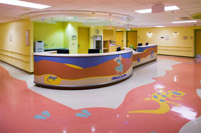
Freestanding pediatric facilities and children’s hospitals that specialize in treating patients ages zero through 18 have operational and physical characteristics that differ from those of adult facilities. The design of pediatric facilities can carry throughout the entire building, creating a united, consistent theme.
This is not necessarily the case when it comes to designing a floor or a wing dedicated to children’s care in a general or university hospital. This “layer cake” design must succeed in integrating pediatric and adult medical services, while recognizing the important differences between the two patient populations. It also must differentiate between various age groups within the pediatric population, providing a comforting—and safe—environment for patients, their families, and staff members.
Caring for Children’s safety
The additional safety and security measures required for pediatric patients begin with the layout of the entire hospital. Pediatric services in a hospital should be located as high as possible for security purposes. The higher the floor, the more difficult it is for someone—even a disgruntled parent or family member—to abduct a child, and the more protective measures that can be put in place between the child’s room and the hospital exit. Placing a children’s floor at the top of a hospital is also a great opportunity for secure outdoor access, such as a rooftop garden play area.
Within the hospital, visitor protocols should be in place to ensure safety throughout the pediatric area. Because the family is a vital part of a pediatric patient’s care team, most children will have visitors at all hours of the day, and even overnight. Regulations must be in place to ensure all visitors are accounted for. In many instances, one parent will be given 24/7 access to the child’s floor to provide the necessary companionship.
To guarantee the best possible medical care for pediatric patients, staff should be trained to treat patients of all ages. Hospitals with pediatric units should have a pharmacist who specializes in pediatric medications and dosing. Radiology technicians should be trained to calibrate machines for children’s small bodies, as an adult X-ray dosage delivers approximately 300 times more radiation than a child’s body needs.
Disease and injuries present differently in children than in adults. Emergency rooms need a pediatric specialist on call at all times to treat injuries and help identify child-specific diseases that ER physicians who treat adults may not be familiar with. These specialists should be familiar with child-specific diagnoses and protocols. Injuries or burns could be signs of abuse. Conditions such as congenital heart disease and cystic fibrosis are more common in children and may be overlooked by adult ER caregivers.
If round-the-clock staffing of these experts is not possible, technology allows doctors to communicate remotely via a video conferencing service. Doctors can complete bedside pediatric evaluations from miles away.
Child life specialists, usually only found in freestanding children’s hospitals, can be assets to general hospitals, as they specialize in providing whole-person healing to children and families facing stressful medical situations. These specialists provide strategies and positive distraction techniques to help families cope with hospitalization. They can also assist with everyday living needs, schoolwork coordination, home care instructions for caregivers, and helping the child understand the medical treatment and recovery process.
In surgical areas, induction rooms outside the OR and diagnostic imaging areas allow young patients to undergo anesthesia before entering the procedure room. This allows children to fall asleep with their family at their bedside without the shock and fear of seeing the machines and equipment associated with surgery. Waking up from anesthesia can be a traumatic experience for a child, so a private recovery space should also be provided for families when the child comes out of a sedated state.
Designing for Children of All Ages
Within the pediatric patient population, there is a wide range of ages which must be accounted for in the design of the facility. In treating the family as the patient, we are designing spaces to soothe the minds and reduce the stress of children and adults.
Interior designs with bright colors or childish themes can come off as condescending to older children or teenagers. While some themes may seem like a good choice for pediatrics, there needs to be a balance between fun and calming. The design should avoid being dreary and clinical but does not need an excess of whimsy.
Colors also impact the mood of patients and staff. Bright purples and oranges may seem appealing to young children but may agitate a nurse in the middle of an 18-hour shift. Artwork in care areas should be designed with storytelling in mind – allowing the family or caregiver to positively distract a young patient from their fears for a while.
Nature-based themes and color palettes are incredibly appealing to all ages. Colors should also be full-spectrum but used in careful proportions, mixing warm neutrals that represent the earth with calming blues and greens inspired by the sky and grass and subtle pops of color indicative of flowers. Designers must also be sensitive to context; a nature-based color palette that comforts a patient in Phoenix may have the opposite effect on a patient in Columbus, Ohio.
Designs that represent the community in which the hospital is located also contribute to sustainability. What is considered cool or trendy in the eyes of children may change over the years, but the natural landscape and culture of the area is timeless.
Putting the design in context can make the children and their families feel like part of a larger community by being in the hospital, and can be a positive element of the healing process. Treating the campus holistically with appropriate architectural character and style, design details, focal points for wayfinding, use of indigenous finishes, and a diversity of artwork that mirrors the socioeconomic vocabulary of the community can help make any hospital environment familiar and comforting. These elements create a common thread that ties both the adult and pediatric care environments together so that the brand and message of services are aligned.
Linda M. Gabel, AAHID, IIDA, is a facilities planner at OSU Wexner Medical Center in Columbus, Ohio. Gabel has more than 29 years of professional design experience, with the last 24 dedicated to pediatric and adult acute healthcare, memory care, and senior living environments. As the 2005-2009 IIDA Healthcare Forum Advisor and 2010-2013 Credentialing Regent on the board of the American Academy of Healthcare Interior Designers, Gabel provides active leadership in the design of healthcare environments on an international level. Gabel has presented healthcare environment white papers on healthcare design for pediatric, bariatric, and aging populations at major conferences and universities: Healthcare Design, Health Facilities Institute, National Association of Children’s Hospital and Related Institutions (NACHRI), NEOCON, Stephen F. Austin State University, Western Carolinas University, and The Ohio State University.
Related Stories
| Feb 11, 2011
RS Means Cost Comparison Chart: Office Buildings
This month's RS Means Cost Comparison Chart focuses on office building construction.
| Feb 11, 2011
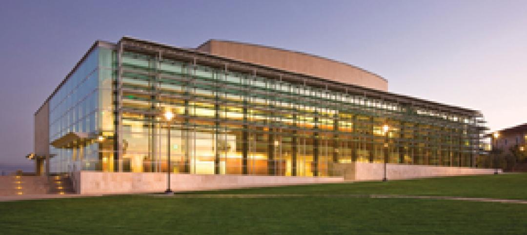
Sustainable features on the bill for dual-building performing arts center at Soka University of America
The $73 million Soka University of America’s new performing arts center and academic complex recently opened on the school’s Aliso Viejo, Calif., campus. McCarthy Building Companies and Zimmer Gunsul Frasca Architects collaborated on the two-building project. One is a three-story, 47,836-sf facility with a grand reception lobby, a 1,200-seat auditorium, and supports spaces. The other is a four-story, 48,974-sf facility with 11 classrooms, 29 faculty offices, a 150-seat black box theater, rehearsal/dance studio, and support spaces. The project, which has a green roof, solar panels, operable windows, and sun-shading devices, is going for LEED Silver.
| Feb 11, 2011
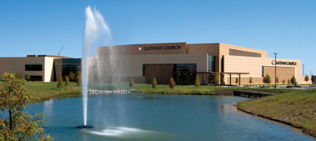
BIM-enabled Texas church complex can broadcast services in high-def
After two years of design and construction, members of the Gateway Church in Southland, Texas, were able to attend services in their new 4,000-seat facility in late 2010. Located on a 180-acre site, the 205,000-sf complex has six auditoriums, including a massive 200,000-sf Worship Center, complete with catwalks, top-end audio and video system, and high-definition broadcast capabilities. BIM played a significant role in the building’s design and construction. Balfour Beatty Construction and Beck Architecture formed the nucleus of the Building Team.
| Feb 11, 2011
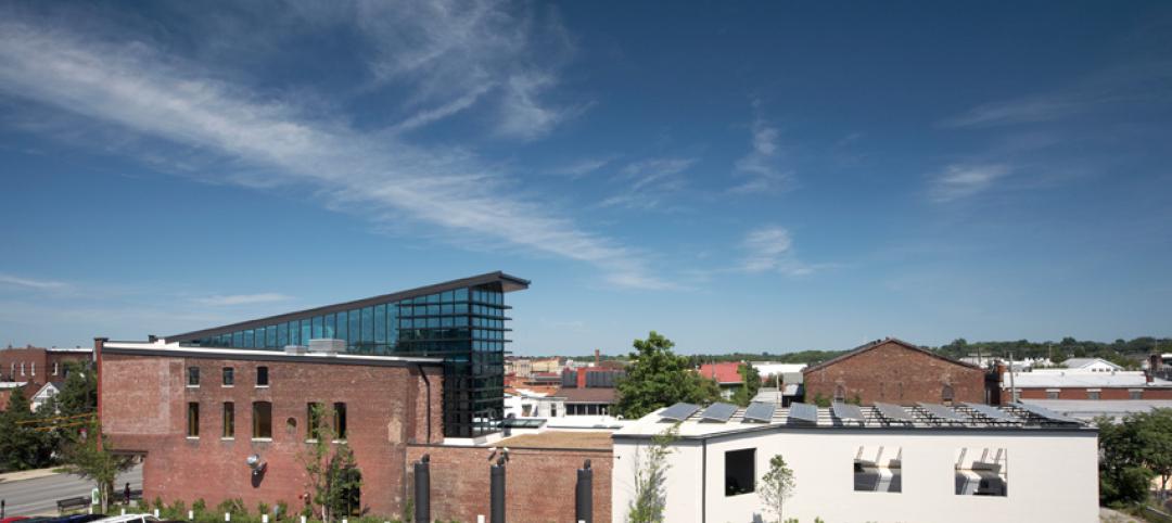
Kentucky’s first green adaptive reuse project earns Platinum
(FER) studio, Inglewood, Calif., converted a 115-year-old former dry goods store in Louisville, Ky., into a 10,175-sf mixed-use commercial building earned LEED Platinum and holds the distinction of being the state’s first adaptive reuse project to earn any LEED rating. The facility, located in the East Market District, houses a gallery, event space, offices, conference space, and a restaurant. Sustainable elements that helped the building reach its top LEED rating include xeriscaping, a green roof, rainwater collection and reuse, 12 geothermal wells, 81 solar panels, a 1,100-gallon ice storage system (off-grid energy efficiency is 68%) and the reuse and recycling of construction materials. Local firm Peters Construction served as GC.
| Feb 11, 2011
Former Richardson Romanesque hotel now houses books, not beds
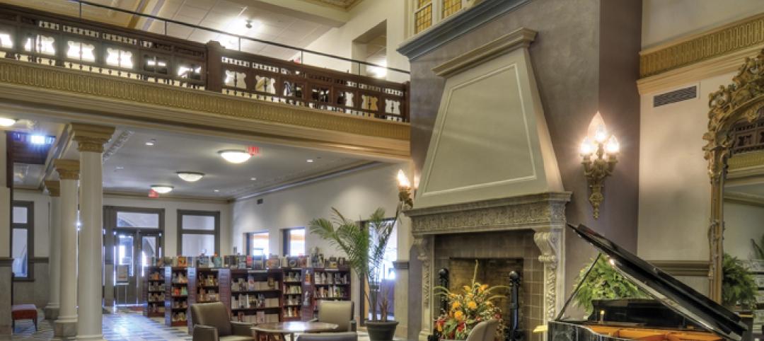
The Piqua (Ohio) Public Library was once a late 19th-century hotel that sat vacant and deteriorating for years before a $12.3 million adaptive reuse project revitalized the 1891 building. The design team of PSA-Dewberry, MKC Associates, and historic preservation specialist Jeff Wray Associates collaborated on the restoration of the 80,000-sf Richardson Romanesque building, once known as the Fort Piqua Hotel. The team restored a mezzanine above the lobby and repaired historic windows, skylight, massive fireplace, and other historic details. The basement, with its low ceiling and stacked stone walls, was turned into a castle-like children’s center. The Piqua Historical Museum is also located within the building.
| Feb 11, 2011
Justice center on Fall River harbor serves up daylight, sustainable elements, including eucalyptus millwork
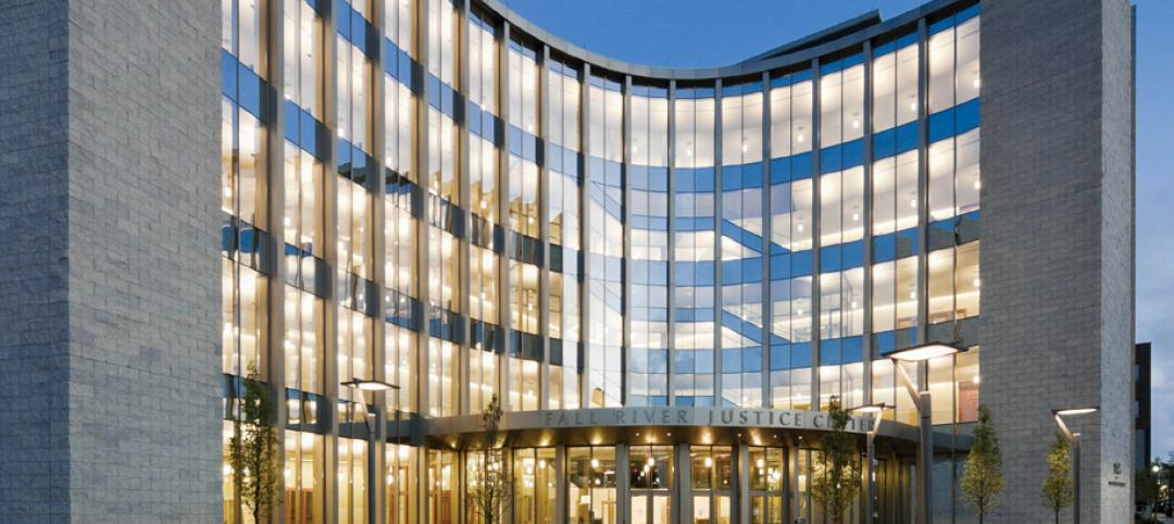
Located on historic South Main Street in Fall River, Mass., the Fall River Justice Center opened last fall to serve as the city’s Superior and District Courts building. The $85 million facility was designed by Boston-based Finegold Alexander + Associates Inc., with Dimeo Construction as CM and Arup as MEP. The 154,000-sf courthouse contains nine courtrooms, a law library, and a detention area. Most of the floors have the same ceiling height, which will makes them easier to reconfigure in the future as space needs change. Designed to achieve LEED Silver, the facility’s elliptical design offers abundant natural daylight and views of the harbor. Renewable eucalyptus millwork is one of the sustainable features.
| Feb 11, 2011
Research facility separates but also connects lab spaces
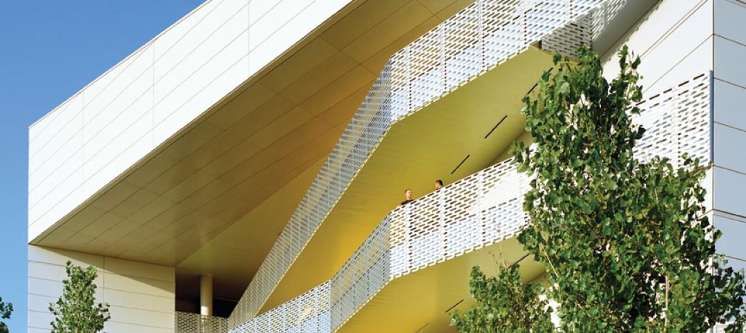
California State University, Northridge, consolidated its graduate and undergraduate biology and mathematics programs into one 90,000-sf research facility. Architect of record Cannon Design worked on the new Chaparral Hall, creating a four-story facility with two distinct spaces that separate research and teaching areas; these are linked by faculty offices to create collaborative spaces. The building houses wet research, teaching, and computational research labs, a 5,000-sf vivarium, classrooms, and administrative offices. A four-story outdoor lobby and plaza and an outdoor staircase provide orientation. A covered walkway links the new facility with the existing science complex. Saiful/Bouquet served as structural engineer, Bard, Rao + Athanas Consulting Engineers served as MEP, and Research Facilities Design was laboratory consultant.
| Feb 11, 2011
A feast of dining options at University of Colorado community center, but hold the buffalo stew
The University of Colorado, Boulder, cooked up something different with its new $84.4 million Center for Community building, whose 900-seat foodservice area consists of 12 micro-restaurants, each with its own food options and décor. Centerbrook Architects of Connecticut collaborated with Denver’s Davis Partnership Architects and foodservice designer Baker Group of Grand Rapids, Mich., on the 323,000-sf facility, which also includes space for a career center, international education, and counseling and psychological services. Exterior walls of rough-hewn, variegated sandstone and a terra cotta roof help the new facility blend with existing campus buildings. Target: LEED Gold.
| Feb 11, 2011
Chicago high-rise mixes condos with classrooms for Art Institute students
The Legacy at Millennium Park is a 72-story, mixed-use complex that rises high above Chicago’s Michigan Avenue. The glass tower, designed by Solomon Cordwell Buenz, is mostly residential, but also includes 41,000 sf of classroom space for the School of the Art Institute of Chicago and another 7,400 sf of retail space. The building’s 355 one-, two-, three-, and four-bedroom condominiums range from 875 sf to 9,300 sf, and there are seven levels of parking. Sky patios on the 15th, 42nd, and 60th floors give owners outdoor access and views of Lake Michigan.
| Feb 11, 2011
Iowa surgery center addresses both inpatient and outpatient care
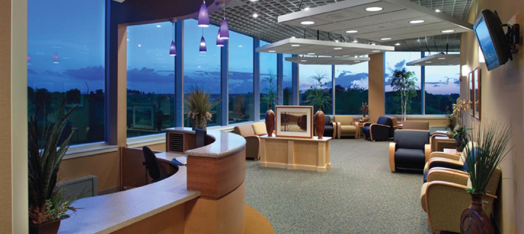
The 12,000-person community of Carroll, Iowa, has a new $28 million surgery center to provide both inpatient and outpatient care. Minneapolis-based healthcare design firm Horty Elving headed up the four-story, 120,000-sf project for St. Anthony’s Regional Hospital. The center’s layout is based on a circular process flow, and includes four 800-sf operating rooms with poured rubber floors to reduce leg fatigue for surgeons and support staff, two substerile rooms between each pair of operating rooms, and two endoscopy rooms adjacent to the outpatient prep and recovery rooms. Recovery rooms are clustered in groups of four. The large family lounge (left) has expansive windows with views of the countryside, and television monitors that display coded information on patient status so loved ones can follow a patient’s progress.


