Pediatric hospitals face many of the same concerns as their adult counterparts. The most consistent concern is change. Nationally, inpatient bed demand is declining, outpatient visits are soaring, and there is a higher level of focus on prevention and reduced readmissions.
The solution is not as simple as swapping inpatient space with outpatient care to meet the shifting demand. Many facilities have been operating 40% or more of their beds as semiprivates and—driven by reimbursement incentives for patient satisfaction and consumers’ penchant for choosing care based on public performance scores—hospital owners have no choice but to invest their limited capital dollars in new or renovated space to achieve 100% private-bed models.
In certificate of need (CON) states, owners are reluctant to reduce total bed counts due to the uncertainty in future bed demand. To effectively operate within this changing environment, owners look to the healthcare design and construction industry for creative facility solutions that offer highly flexible environments that promote healing.
Flexible Spaces, for Toddlers and Teens
Flexibility is key in helping owners address rapidly changing demands. While this is also true in adult care, children’s hospitals face a greater challenge due to the drastic difference in their patient dynamic. Caring for a patient in the NICU is significantly different than caring for a 16-year-old. Add the fact that pediatric inpatient volumes are sporadic at best, and you have an operational challenge in achieving ideal staff-to-patient ratios.
Children’s Medical Center Dallas has addressed uncertainty by designing patient rooms with a universal care model so they can be converted to ICU rooms with no construction impact. This will allow the hospital to flex with future trends.
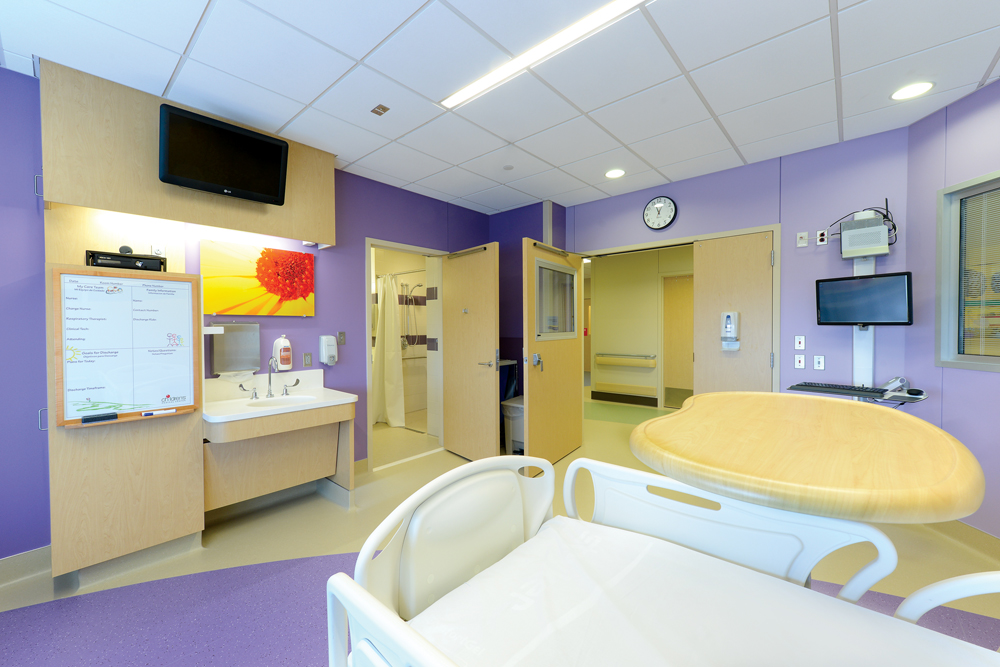
Another way pediatric facilities are creating greater flexibility is by developing inpatient units that are more appropriate for all ages instead of just focusing on babies. In doing this, not only does the physical environment need to be highly adaptable to accommodate pediatric patients—i.e., adjustable sink heights, grab bars, and so on—but the design aesthetic must also evolve. Interiors need to move away from cutesy baby motifs to ones more appropriate for a wider age spectrum, from toddlers to teens.
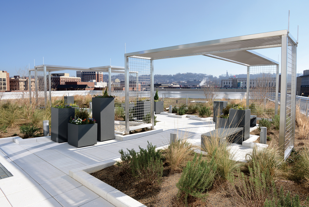
The rooftop garden provides a healing respite in an urban setting and is part of the LEED Gold-certified Benjamin Russell Hospital for Children’s environmentally friendly design.
Children’s of Alabama (COA) in Birmingham, Ala., was faced with these issues before opening its new facility, the Benjamin Russell Hospital for Children, in August 2013. To address these concerns, significant time was spent planning the design and “theme” for each floor. Wall surrounds and digital graphics portray wildlife, sports, nature, transportation, and other easy-to-remember themes. These were carried out in the hallways, common areas, and patient rooms. This strategy not only created a more inviting and comforting space for patients of all ages but also helped in the hospital’s wayfinding efforts. While a parent or child may not remember their room number, they would remember that they are in the “sports” tower, on the baseball floor, with a glove and ball by their room.
Tailoring the Healing Environment
Pediatric hospitals are not alone in their journey to becoming more patient-centered and family-focused, but the creative environments found in today’s children’s facilities puts them light years ahead of their adult-hospital peers. By engaging patients and their families in the design process, leaders are identifying what is most important for comfort and satisfaction.
Customization is increasingly popular. For example, integrating LED lights can enable patients to select their own wall and ceiling colors, giving them ultimate control over the look of their rooms. To further accommodate a broad age span, each patient room at COA is outfitted with an Xbox game console. These systems are tied into the hospital’s Patient Entertainment and Information System to provide an added layer of comfort. Patients, and more importantly their parents, are able to use the systems to research an illness, identify hospital services, and communicate with staff. One patient even commented, “Honestly, the hospital felt more like a hotel than a hospital.”
For larger pediatric units, playrooms for toddlers and teen rooms equipped with Wii stations offer on-unit destinations that allow patients a respite, inviting them to explore and to meet other children. Rooftop gardens are becoming more popular, making a bit of the outdoors accessible. COA’s rooftop garden, near the NICU, is designed to be a healing garden. The Building Team situated the “Quarterback” (West) Tower so that the end caps on each floor overlook Regions Field, home of the Birmingham Barons baseball team. On Friday nights, children can congregate at the end of the hall or in the garden to enjoy the weekly fireworks display.
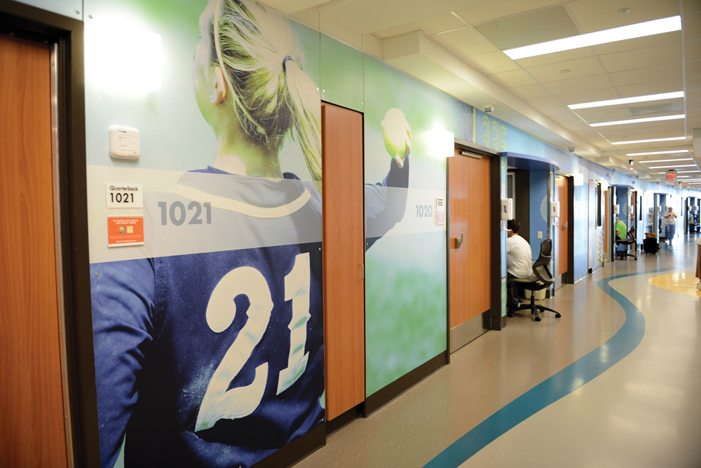
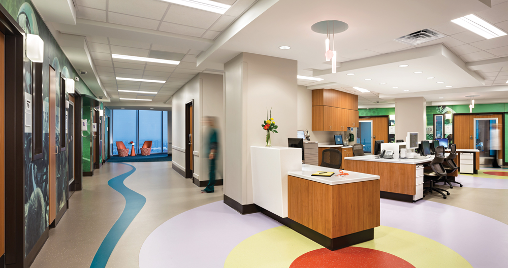
Family friendly themed wall-surrounds, vibrant colors, and a bold room numbering system combine with a wavy “blue river” pattern in the flooring at the Benjamin Russell Hospital for Children help patients and families with wayfinding.
Dedicated family space has also become very popular for children’s hospitals. “Family” zones, in patient rooms and in common areas, are designed to keep family members closer to their children, allowing for some privacy and comfort. The concept focuses on the family’s interaction with the hospital staff and their child to ensure a desirable flow. At design meetings, nursing staff often stress the importance of having a specific zone to accommodate parents within the patient room. In some instances, patient floors have been fitted with a family waiting area equipped with a kitchenette. This feature allows families to feel more at home during lengthy stays by giving them access to a refrigerator, sink, and microwave. Guest laundry areas may also be located on the unit for parent use.
Staff Space: Allow for Decompression
The distinctiveness of a children’s hospital transcends facility design. Staff play a critical role in the care and comfort of the children and their families. Staff often use the term “frequent flyers” to describe parents and children who must come to the hospital regularly for care. Even the security officers stationed at the door become very involved in the lives of these families and children. Staff at all levels, not just the caregivers, get to know the families and will go the extra mile to make their experience as pleasant and stress-free as possible.
Because the work is demanding, Building Teams should give special attention to the caregiver and staff areas of a pediatric facility. Make opportunities for staff to be “offstage” by providing inviting break areas, dining facilities, and outdoor spaces. These features enable staff to decompress during their workday, resulting in improved clinical performance when staff members are “onstage” caring for kids.
Hospitals are not typically envisioned as warm and inviting places. However, changes in design and care standards are creating spaces that provide patients and their families with much more comfort. From the outside “curb appeal” to the internal operations and systems, children’s hospitals are striving to achieve low-stress environments that aid in the healing and wellness of our smallest patients.
Staff spaces are open and comfortable, providing easy access to patient rooms. Glass end caps and sub-waiting areas at the end of each hallway provide expansive views of the city and Birmingham’s Regions Field at Children’s of Alabama.
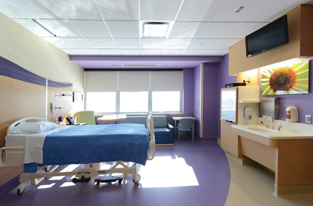
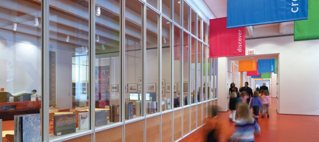
Spacious accommodations, warm aesthetics, and stimulating amenities aim to promote a relaxing environment for patients and their families throughout the healing process at Children’s Medical Center.
ABOUT THE AUTHORS
The authors of this article are affiliated with healthcare consulting firm CBRE Healthcare, based in Richmond, Va. They are Lora Schwartz, AIA, LEED AP, Principal; Stephen Powell, Consultant; Brad Durham, MBA, Principal; Magnus Nilsson, RA, Senior Consultant; Steven Donnelly, Vice President; and Curtis Skolnick, MHA, Vice President.
Related Stories
| Feb 11, 2011
Grocery store anchors shopping center in Miami arts/entertainment district
18Biscayne is a 57,200-sf urban retail center being developed in downtown Miami by commercial real estate firm Stiles. Construction on the three-story center is being fast-tracked for completion in early 2012. The project is anchored by a 49,200-sf Publix market with bakery, pharmacy, and café with outdoor seating. An additional 8,000 sf of retail space will front Biscayne Boulevard. The complex is in close proximity to the Adrienne Arsht Center for the Performing Arts, the downtown Miami entertainment district, and the Omni neighborhood, one of the city’s fast-growing residential areas.
| Feb 11, 2011
Chicago architecture firm planning one of China’s tallest towers
Chicago-based Goettsch Partners was commissioned by developer Guangzhou R&F Properties Co. Ltd. to design a new 294,570-sm mixed-use tower in Tianjin, China. The Tianjin R&F Guangdong Tower will be located within the city’s newly planned business district, and at 439 meters it will be one of China’s tallest buildings. The massive complex will feature 134,900 sm of Class A office space, a 400-key, five-star hotel, 55 condominiums, and 8,550 sm of retail space. The architects are designing the tower with multi-story atriums and a high-performance curtain wall to bring daylight deep into the building, thereby creating deeper lease spans. The project is currently finishing design.
| Feb 11, 2011
Two projects seek to reinvigorate Los Angeles County medical center
HMC Architects designed two new buildings for the Los Angeles County Martin Luther King, Jr., Medical Center as part of a $360 million plan to reinvigorate the campus. The buildings include a 120-bed hospital, which involves renovation of an existing tower and several support buildings, and the construction of a new multi-service ambulatory care center. The new facilities will have large expanses of glass at all waiting and public areas for unobstructed views of downtown Los Angeles. A curved glass entrance canopy will unite the two buildings. When both projects are completed—the hospital in 2012 and the ambulatory care center in 2013—the campus will have added more than 460,000 sf of space. The hospital will seek LEED certification, while the ambulatory care center is targeting LEED Silver.
| Feb 11, 2011
Sustainable community center to serve Angelinos in need
Harbor Interfaith Services, a nonprofit serving the homeless and working poor in the Harbor Area and South Bay communities of Los Angeles, engaged Withee Malcolm Architects to design a new 15,000-sf family resource center. The architects, who are working pro bono for the initial phase, created a family-centered design that consolidates all programs into a single building. The new three-story space will house a resource center, food pantry, nursery and pre-school, and administrative offices, plus indoor and outdoor play spaces and underground parking. The building’s scale and setbacks will help it blend with its residential neighbors, while its low-flow fixtures, low-VOC and recycled materials, and energy-efficient mechanical equipment and appliances will help it earn LEED certification.
| Feb 11, 2011
Texas megachurch inspired by yesteryear’s materials, today’s design vocabulary
The third phase of The First Baptist Church of Pasadena, Texas, involves construction of a new 115,000-sf worship center addition. Currently in design by Zeigler Cooper, the project will include a 2,500-seat worship center (with circular layout and space for a 50-person orchestra and 200-person choir), a 500-seat chapel (for weddings, funerals, and special events), and a prayer room. The addition will connect to the existing church and create a Christian Commons for education, administration, music, and fellowship. The church asked for a modern design that uses traditional materials, such as stone, brick, and stained glass. Construction is scheduled to begin this summer.
| Feb 11, 2011
Apartment complex caters to University of Minnesota students
Twin Cities firm Elness Swenson Graham Architects designed the new Stadium Village Flats, in the University of Minnesota’s East Bank Campus, with students in mind. The $30 million, six-story residential/retail complex will include 120 furnished apartments with fitness rooms and lounges on each floor. More than 5,000 sf of first-floor retail space and two levels of below-ground parking will complete the complex. Opus AE Group Inc., based in Minneapolis, will provide structural engineering services.
| Feb 11, 2011
Four-story library at Salem State will hold half a million—get this—books!
Salem State University in Massachusetts broke ground on a new library and learning center in December. The new four-story library will include instructional labs, group study rooms, and a testing center. The modern, 124,000-sf design by Boston-based Shepley Bulfinch includes space for 500,000 books and study space for up to a thousand students. Sustainable features include geothermal heating and cooling, rainwater harvesting, and low-flow plumbing fixtures.
| Feb 11, 2011
Green design, white snow at Egyptian desert retail complex
The Mall of Egypt will be a 135,000-sm retail and entertainment complex in Cairo’s modern 6th of October district. The two-story center is divided into three themed zones—The City, which is arranged as a series of streets lined with retail and public spaces; The Desert Valley, which contains upscale department stores, international retailers, and a central courtyard for music and other cultural events; and The Crystal, which will include leisure and entertainment venues, including a cinema and indoor snow park. RTKL is designing the massive complex to LEED Silver standards.
| Feb 10, 2011
7 Things to Know About Impact Glazing and Fire-rated Glass
Back-to-basics answers to seven common questions about impact glazing and fire-rated glass.
| Feb 10, 2011
Medical Data Center Sets High Bar for BIM Design Team
The construction of a new data center becomes a test case for BIM’s ability to enhance project delivery across an entire medical campus.


