Over the past decade, the average size of offices has shrunk by 30%, to 175 sf per employee. That trend coincides with the growing popularity of interior glass for offices construction and renovation.
“Glass is being used to reduce space but still give the appearance of openness,” says Brett Shwery, IIDA, CID, LEED AP BD+C, Senior Vice President–Corporate Workplace and Design and Delivery Director at AECOM’s Los Angeles office.
In 2016, Gensler completed an 800,000-sf government project with thousands of offices, all with glass fronts, says Maurice Reid, an Associate and Project Architect in the firm’s Washington, D.C., office. That project is also distinguished by stacked conference rooms on floors six through 13 that look onto the building’s 13-story atrium.
Demountable interior glass provides owners and property managers with the flexibility to reconfigure office spaces quickly to accommodate manpower or tenant shifts, says Bill Bouchey, IIDA, Director of Interiors with HOK, based in the firm’s New York office. Some glass systems allow information to be written or projected onto them, further enhancing workplace connectivity. And interior glass is more durable and requires less maintenance than drywall.
Interior glass has become the material of choice for office spaces because of “the extremely large floor plates” in North American projects that strive to get more natural light deep into the office core, observes Michael Banman, LEED AP BD+C, Principal and Architecture Discipline Lead in Stantec’s Winnipeg, Man., office. Banman and his colleague Todd Littlefield, an Interior Designer and Associate with the firm, note that LEED points are earned when offices afford employees greater visibility to the outdoors and exposure to daylight.
“We’re trying to be as sustainable as possible,” says Alan Gerencer, LEED AP, Principal and Architect with ZGF Architects, Portland, Ore., about what’s driving the greater use of glass in offices.
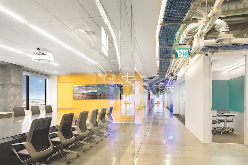 DirectTV’s 680,000-sf campus in El Segundo, Calif., is divided into four buildings and 37 floors. To create a high-energy work environment, AECOM interviewed 42 departments and 1,300-plus managers and employees about their work process. One of the key modifications was to replace high-paneled workstations and perimeter offices with open workstations along the windows with glass-faced offices at the core, and to increase the number of DirectTV’s collaborative spaces. The glass is also used to reinforce the company’s brand. The Building Team included AECOM (interior architect and workplace strategy), Nabih Youssef Associates (SE), ARC Engineering (MEP), Newsome Brown (acoustical engineer), and Clune Construction (GC). Photo: Rob Williamson/AECOM.
Minimizing sound bounce, leakage
Height generally isn’t an impediment when choosing interior glass for offices. Stantec has installed glass panels up to 15 feet tall, but thicker glass is needed for heights greater than nine feet.
Acoustical and privacy concerns also come into play when offices include an abundance of interior glass. For instance, when BD+C interviewed Banman and Littlefield from Stantec’s headquarters inside Winnipeg’s 13-story Centrepoint office tower, there was a perceptible echo over the phone. Banman and Littlefield suggested that this might have been the result of the glass-enclosed room they were in not being sufficiently outfitted with noise-absorbing materials, such as wall fabric, carpet tile, or area rugs.
“You need to pay attention to the surfaces, especially when the office design is ‘industrial,’” says Julie Farmer, Product Consultant with Modern Door, a glass installation subcontractor. She says Building Teams may also want to consider sound-masking technology to help with speech privacy and acoustics.
Margulies Perruzzi Architects “always” specifies half-inch glass “at a minimum,” and seals the joints to increase an office’s acoustical privacy, says Dianne Dunnell, IIDA, LEED AP, NCIDQ, the firm’s Interior Design Director.
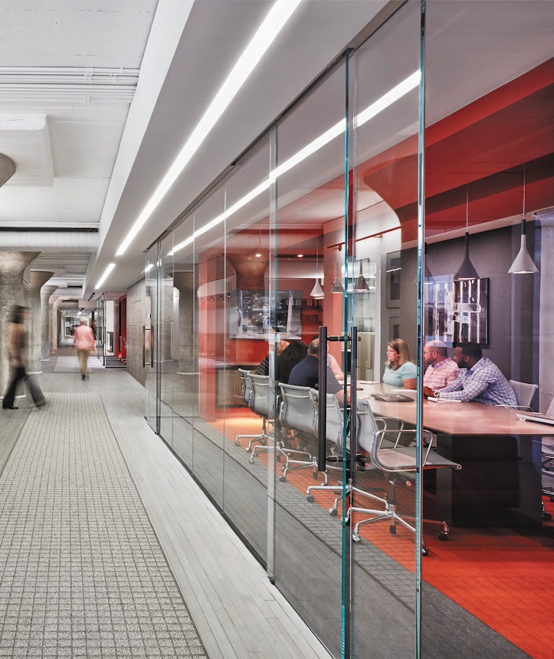 Jamestown, the real estate investment and development firm, transformed a former Sears building in Atlanta into the popular mixed-use Ponce City Market, which includes 64,000 sf of office space that comprises Jamestown’s headquarters. Within this space is a series of “workzones” (pictured), various-sized conference rooms strategically located off the main corridor that connects the large floorplate. Clean glass fronts reinforce the lux-loft feel and send a message of transparency. The Building Team included Gensler (architect and interior designer), Barrett Woodyard & Associates (MEP), and Humphries and Company (GC). Garrett Rowland/Courtesy of DORMA.
A new paradigm for privacy
Workplace privacy is definitely evolving. And the expanding use of interior glass is part and parcel of the move by companies to open up their workspaces to foment collaboration and camaraderie. Indeed, some companies are dispensing with offices altogether, preferring instead open and flexible floor plans, says Janel Fausti, IIDA, NCIDQ, Principal and Interior Designer at ZGF.
But most companies still need what one source calls “confidential sanctuaries” that offer greater privacy. And glass partitions and doors make some employees nervous because they feel like they’re in a fish bowl under the constant scrutiny of their bosses.
Privacy solutions often start—for owners, at least—with applying film over the glass, even though AEC firms aren’t keen on that option. Reid says Gensler advises its office clients to live with their spaces for a few months before making privacy-related changes, which ultimately might only mean moving workstations around. MPA makes the same recommendation. “In most cases, they don’t install film at all,” says Dunnell.
Several AEC sources, though, are intrigued about “cloaking” film, a new product from Designtex that, in essence, jumbles content: a person looking into a glass-enclosed room covered with cloaking film can see people but not information, such as numbers on computer screens or a projected slideshow presentation.
Costlier options include opaque laminated glass and so-called “switchable” glass, which electronically darkens the panes. “Switchable glass is good for giving conference rooms a ‘wow’ factor and privacy on demand,” says Dunnell. She notes, though, that it is “never really clear.”
Translucent glass is available in a variety of prints, patterns, and colors. And some companies are using this glass for branding purposes.
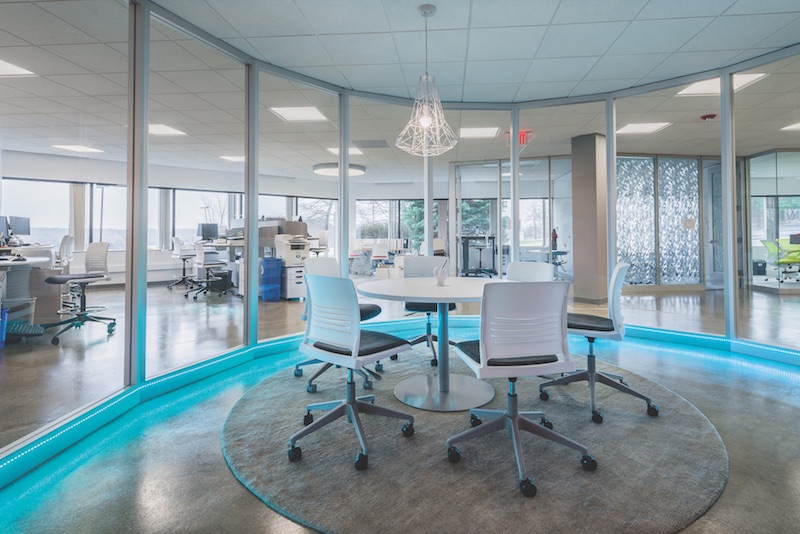 A central conference room illuminated with blue LED accent lighting is a core element of the new 21,000-sf corporate headquarters for business services firm The Predictive Index. The fit-out project used extensive interior glass walls and doors to create an open, flexible workspace within the 101 Station Drive building in Westwood, Mass. On the Building Team: National Development (developer), Margulies Perruzzi Architects (interior architect), Little Dragon Decor (interior designer), AHA Consulting Engineers (MEP), STV|DPM (owner’s project manager), and Commodore Builders (GC). Photo: Sabine Mueller Creative.
How much light is right?
Glare doesn’t seem to be a major issue when installing interior glass. Still, AEC firms say that more glass in office buildings needs to account for natural light coming into the space, as well as the office’s lighting design.
“They need to work in tandem,” says AECOM’s Shwery. Gensler uses artificial light to minimize the low and high light contrasts caused by daylight streaming into an office, says Reid. At its headquarters, Stantec installed perforated roller blinds on exterior windows and automated interior lighting controls, says Banman.
In some cases, glare must be addressed more directly. HOK recently worked on a 600,000-sf building in Manhattan whose south and west sides were exposed to significant sunlight during afternoon hours. Bouchey says his firm only realized how serious this problem could be when it built a 3,000-sf mockup of one of the offices.
HOK’s solution was to: eliminate all conference rooms along the perimeter of the building; install a shading system on the perimeter windows; apply four-foot-high film strips on the glass for interior rooms to cool “hot spots”; and move the interior lighting in the ceiling 12 inches farther away from the interior glass walls.
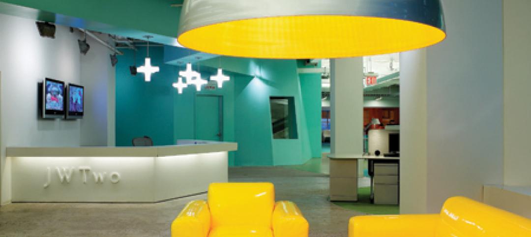
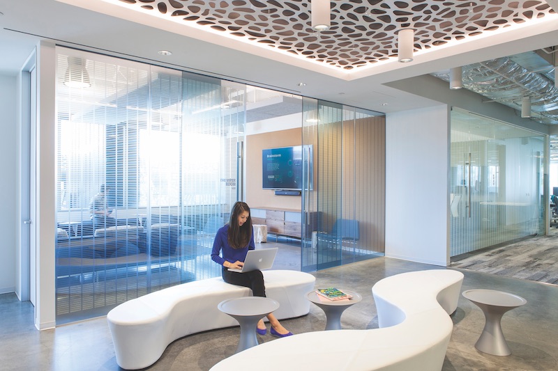 Mindshare’s 41,500-sf office, on 2½ floors in a building in Playa Vista, Calif., is a shared workspace for eight creative firms. Organized as a series of “neighborhoods,” the office employs an abundance of interior glass as part of a 100%-open environment. It features client and employee “public zones” such as this lounge (pictured), supported by collaborative spaces that express each firm’s personality. The Building Team included HOK (interior architect), ARC Engineering (engineer), TSP (project management), and Clune Construction (GC). Photo: Kim Rodgers.
Frameless glass looks great, but…
Modern Door recently completed the renovation of six Capitol One offices, all with frameless glass for conference and meeting rooms. “We’re seeing a lot more frameless applications with polycarbonate seals,” says Farmer.
Frameless “looks cleaner,” says Gensler’s Reid, and eliminates the need for opaque pieces to create a seamless wall. Virtually every manufacturer has an office-front system that includes frameless glass, says Bouchey.
But frameless glass has some limitations. Dunnell notes that any interior office structure that includes an opening of four to six feet “would need to be framed.” Framed systems provide much better acoustical privacy, according to experts who spoke with BD+C. And framed systems are easier to install than frameless if floors and ceilings are uneven, says Reid.
Frameless glass can also pose safety and liability problems because “people are going to walk into frameless walls and doors,” says Gerencer. “We wouldn’t install frameless in high-traffic areas.”
Fausti says the frameless/framed debate often comes down to what statement a company wants to make, and how much it’s willing to spend.
ZGF recently completed an office project for a law firm, Stoel Rives, which wanted timber trim framing around glass walls and doors to complement the office’s wood floors, walls, and ceilings.
On the other hand, ZGF converted an old warehouse in Portland, Ore., to office space for the children’s clothes retailer Hanna Andersson, which required floor-to-ceiling frameless glass partitions and sliding doors. ZGF saved money by lowering the top of the glass panel by about an inch from the ceiling, and capping the top and bottom of the glass with steel framing.
Related Stories
| Aug 11, 2010
U.S. firm designing massive Taiwan project
MulvannyG2 Architecture is designing one of Taipei, Taiwan's largest urban redevelopment projects. The Bellevue, Wash., firm is working with developer The Global Team Group to create Aquapearl, a mixed-use complex that's part of the Taipei government's "Good Looking Taipei 2010" initiative to spur redevelopment of the city's Songjian District.
| Aug 11, 2010
High-Performance Workplaces
Building Teams around the world are finding that the workplace is changing radically, leading owners and tenants to reinvent corporate office buildings to compete more effectively on a global scale. The good news is that this means more renovation and reconstruction work at a time when new construction has stalled to a dribble.
| Aug 11, 2010
Idea Center at Playhouse Square: A better idea
Through a unique partnership between a public media organization and a performing arts/education entity, a historic building in the heart of downtown Cleveland has been renovated as a model of sustainability and architectural innovation. Playhouse Square, which had been working for more than 30 years to revitalize the city's arts district, teamed up with ideastream, a newly formed media group t...
| Aug 11, 2010
200 East Brady
Until July 2004, 200 East Brady, a 40,000-sf, 1920s-era warehouse, had been an abandoned eyesore in Tulsa, Okla.'s Brady district. The building, which was once home to a grocery supplier, then a steel casting company, and finally a casket storage facility, was purchased by Tom Wallace, president and founder of Wallace Engineering, to be his firm's new headquarters.
| Aug 11, 2010
Two Rivers Marketing: Industrial connection
It was supposed to be the perfect new office. In July 2003, Two Rivers Marketing Group of Des Moines, Iowa, began working with Shiffler Associates Architects on a 14,000-sf building to house their rapidly growing marketing firm. Over the next six months they put together an innovative program that drew on unprecedented amounts of employee feedback.
| Aug 11, 2010
AIA Course: Enclosure strategies for better buildings
Sustainability and energy efficiency depend not only on the overall design but also on the building's enclosure system. Whether it's via better air-infiltration control, thermal insulation, and moisture control, or more advanced strategies such as active façades with automated shading and venting or novel enclosure types such as double walls, Building Teams are delivering more efficient, better performing, and healthier building enclosures.
| Aug 11, 2010
Glass Wall Systems Open Up Closed Spaces
Sectioning off large open spaces without making everything feel closed off was the challenge faced by two very different projects—one an upscale food market in Napa Valley, the other a corporate office in Southern California. Movable glass wall systems proved to be the solution in both projects.
| Aug 11, 2010
Silver Award: Pere Marquette Depot Bay City, Mich.
For 38 years, the Pere Marquette Depot sat boarded up, broken down, and fire damaged. The Prairie-style building, with its distinctive orange iron-brick walls, was once the elegant Bay City, Mich., train station. The facility, which opened in 1904, served the Flint and Pere Marquette Railroad Company when the area was the epicenter of lumber processing for the shipbuilding and kit homebuilding ...
| Aug 11, 2010
Special Recognition: Durrant Group Headquarters, Dubuque, Iowa
Architecture firm Durrant Group used the redesign of its $3.7 million headquarters building as a way to showcase the firm's creativity, design talent, and technical expertise as well as to create a laboratory for experimentation and education. The Dubuque, Iowa, firm's stated desire was to set a high sustainability standard for both itself and its clients by recycling a 22,890-sf downtown buil...
| Aug 11, 2010
Thrown For a Loop in China
While the Bird's Nest and Water Cube captured all the TV coverage during the Beijing Olympics in August, the Rem Koolhaas-designed CCTV Headquarters in Beijing—known as the “Drunken Towers” or “Big Shorts,” for its unusual shape—is certain to steal the show when it opens next year.


