Typically, banks are not the most open, airy, and inviting of spaces. Like a shirt and tie that are just a bit too small, they can sometimes feel a bit stuffy and suffocating. Finances already cause enough stress and gloom in people’s everyday lives, so why do financial institutions all have a shared aesthetic with a mortuary?
SmithGroupJJR, The Christman Company, and Lake Trust Credit Union were asking that same question. And with the help of some employee collaboration workshops, the new $26 million dollar Lake Trust Credit Union headquarters, located in Brighton, Mich., is anything but stuffy.
The new headquarters building, which is home to 240 employees and is designed to accommodate up to 325 employees, offers a 100% open work environment, bucking the trend of the dark, stuffy designs many financial institutions opt to go with.
The 100,000-sf headquarters sits on a diverse 16-acre site that features wetlands, woodlands, and rolling topography. In an effort to connect to the surrounding outdoors, the headquarters has a two-story front porch, a second floor balcony equipped with an outdoor dining area, and a terrace overlooking the wetlands located on the north side of the building. In addition, the front entry has a living wall serving as the backdrop.
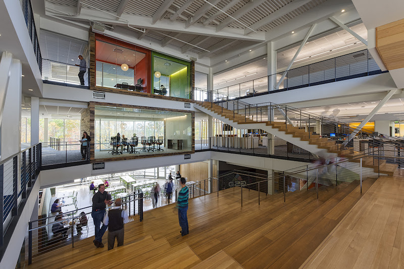
The interior of the building also has this “un-bank” theme carried throughout. The building’s three levels are connected with a grand stair and a large atrium that can double as an impromptu auditorium. Amenities include a full-service cafeteria and a dining space.
The new headquarters is targeting LEED certification with the use of sustainable design features such as large expanses of efficient, low-e glass for ample natural light and improved insulation, refurbished wood paneling from demolished Detroit buildings, and bioswales restored with native vegetation to help with storm water management.
The president and CEO of Lake Trust Credit Union, David Snodgrass, described the building as “very un-corporate like” and said it looks more like something you would find at a company like Facebook or Google, rather than a financial institution.
SmithGroupJJR provided the design services such as programming, architecture, interior design, and all of the engineering. The Christman Company provided a wide array of development, program management, and construction management services. Finally, Interior Environments helped to furnish the building.
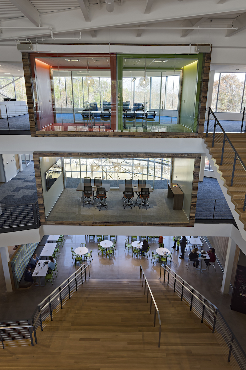 Photo Courtesy of SmithGroupJJR
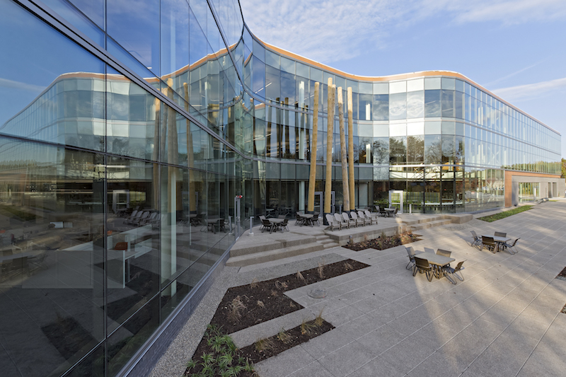 Photo Courtesy of SmithGroupJJR
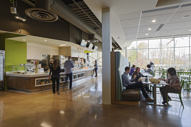 Photo Courtesy of SmithGroupJJR
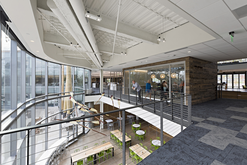 Photo Courtesy of SmithGroupJJR
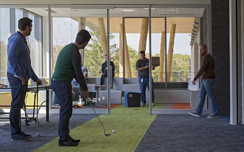 Photo Courtesy of SmithGroupJJR
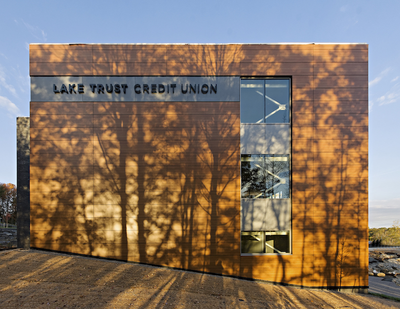 Photo Courtesy of SmithGroupJJR
Related Stories
| Aug 11, 2010
U.S. firm designing massive Taiwan project
MulvannyG2 Architecture is designing one of Taipei, Taiwan's largest urban redevelopment projects. The Bellevue, Wash., firm is working with developer The Global Team Group to create Aquapearl, a mixed-use complex that's part of the Taipei government's "Good Looking Taipei 2010" initiative to spur redevelopment of the city's Songjian District.
| Aug 11, 2010
High-Performance Workplaces
Building Teams around the world are finding that the workplace is changing radically, leading owners and tenants to reinvent corporate office buildings to compete more effectively on a global scale. The good news is that this means more renovation and reconstruction work at a time when new construction has stalled to a dribble.
| Aug 11, 2010
Idea Center at Playhouse Square: A better idea
Through a unique partnership between a public media organization and a performing arts/education entity, a historic building in the heart of downtown Cleveland has been renovated as a model of sustainability and architectural innovation. Playhouse Square, which had been working for more than 30 years to revitalize the city's arts district, teamed up with ideastream, a newly formed media group t...
| Aug 11, 2010
200 East Brady
Until July 2004, 200 East Brady, a 40,000-sf, 1920s-era warehouse, had been an abandoned eyesore in Tulsa, Okla.'s Brady district. The building, which was once home to a grocery supplier, then a steel casting company, and finally a casket storage facility, was purchased by Tom Wallace, president and founder of Wallace Engineering, to be his firm's new headquarters.
| Aug 11, 2010
Two Rivers Marketing: Industrial connection
It was supposed to be the perfect new office. In July 2003, Two Rivers Marketing Group of Des Moines, Iowa, began working with Shiffler Associates Architects on a 14,000-sf building to house their rapidly growing marketing firm. Over the next six months they put together an innovative program that drew on unprecedented amounts of employee feedback.
| Aug 11, 2010
AIA Course: Enclosure strategies for better buildings
Sustainability and energy efficiency depend not only on the overall design but also on the building's enclosure system. Whether it's via better air-infiltration control, thermal insulation, and moisture control, or more advanced strategies such as active façades with automated shading and venting or novel enclosure types such as double walls, Building Teams are delivering more efficient, better performing, and healthier building enclosures.
| Aug 11, 2010
Glass Wall Systems Open Up Closed Spaces
Sectioning off large open spaces without making everything feel closed off was the challenge faced by two very different projects—one an upscale food market in Napa Valley, the other a corporate office in Southern California. Movable glass wall systems proved to be the solution in both projects.
| Aug 11, 2010
Silver Award: Pere Marquette Depot Bay City, Mich.
For 38 years, the Pere Marquette Depot sat boarded up, broken down, and fire damaged. The Prairie-style building, with its distinctive orange iron-brick walls, was once the elegant Bay City, Mich., train station. The facility, which opened in 1904, served the Flint and Pere Marquette Railroad Company when the area was the epicenter of lumber processing for the shipbuilding and kit homebuilding ...
| Aug 11, 2010
Special Recognition: Durrant Group Headquarters, Dubuque, Iowa
Architecture firm Durrant Group used the redesign of its $3.7 million headquarters building as a way to showcase the firm's creativity, design talent, and technical expertise as well as to create a laboratory for experimentation and education. The Dubuque, Iowa, firm's stated desire was to set a high sustainability standard for both itself and its clients by recycling a 22,890-sf downtown buil...
| Aug 11, 2010
Thrown For a Loop in China
While the Bird's Nest and Water Cube captured all the TV coverage during the Beijing Olympics in August, the Rem Koolhaas-designed CCTV Headquarters in Beijing—known as the “Drunken Towers” or “Big Shorts,” for its unusual shape—is certain to steal the show when it opens next year.


