The more you know about human behavior, the better you can design for it.” That’s the idea put forth by Ann Sussman and Justin B. Hollander, in their book, “Cognitive Architecture: Designing for How We Respond to the Built Environment.”
It’s a fairly simple idea: The various tools, technologies, and spaces humans use on a daily basis should be designed for—and adapt to—us, not the other way around. Many industries recognize the benefits of this people-first approach and have sunk research dollars into trying to better understand how humans function on a daily basis.
Netflix and Hulu have dabbled in eye-tracking technology to improve their user interfaces, and Dolby Laboratories uses eye-tracking, electroencephalography (EEG), and galvanic skin response (GSR) technology to better understand how audiences respond on a neurological level to different aspects of a movie, such as specific colors and unique sounds.
The architecture industry, however, has lagged behind on this front.
![]() This illustration from eye-tracking hardware/software provider Tobii explains the basics of computer-based eye-tracking technology.
This illustration from eye-tracking hardware/software provider Tobii explains the basics of computer-based eye-tracking technology.
“Traditionally, car designers pay attention to users,” says Ming Tang, RA, NCARB, LEED AP BD+C, Associate Professor at the School of Architecture and Interior Design, University of Cincinnati. “Architects focus more on the building, but we should care about the user.”
Too often, however, they don’t.
Why have architecture and design firms been so slow compared to other industries to adopt behavioral and biometric techniques to better understand how building occupants actually use buildings and spaces?
“It just isn’t a sexy kind of research,” says Chris Auffrey, Associate Professor, Bachelor of Urban Planning Coordinator, University of Cincinnati. “It is kind of like code research. It doesn’t have the appeal of actual building modeling.”
It may not be as sexy as designing a bold new addition to a city skyline, but using technologies and tactics that track how end users react to a given space can create buildings perfectly tailored to the individuals that will use them.
Current research technologies include eye tracking, which maps where and for how long users look at a given point of interest; facial expression analysis, which tracks a person’s 43 facial muscles and allows a researcher to determine a user’s emotional experience before they are aware of it; GSR, which measures electrical impulses on the hands and feet that change depending on levels of arousal or stress; and EEG, which tracks brain waves to deduce approach and avoidance responses
Tang has conducted research that combines eye-tracking tools with virtual reality technology in an effort to make signage placement and wayfinding techniques more precise, especially during emergency situations. He uses this technology combination to place people into curated virtual scenarios to deduce where they look in a given space and for how long.
In one instance, Tang created a VR model with smoke or haze to simulate a fire emergency. The eye-tracking technology was then used to develop a heat map that showed where the individual looked—and for how long—in order to determine if the egress signage that may be effective under ordinary circumstances was still useful in emergency situations.
While there are some universals in regards to egress signage, such as illumination and the use of either green or red text, there are many variables that can determine the best position for the sign: the shape of the space, the length of the corridor, the number of people in the space at a given time, or, in this case, the intrusion of smoke. Combining the eye-tracking software with virtual reality allows for these different simulations to be run to determine the best overall sign placement for a building project.
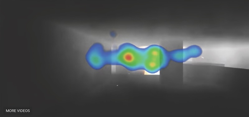
Researchers at the University of Cincinnati have conducted studies that combine eye-tracking tools with virtual reality technology in an effort to make signage placement and wayfinding techniques more precise. Here, the team placed smoke or haze in the VR model to simulate a fire emergency and then tracked the users’ response via heat mapping of their eye movements. University of Cincinnati.
Architects must learn to kill their darlings
Some architecture firms are taking a more ethnographic observation approach to determine how people best use a given space. Certain rooms in a building may have been designed with specific purposes in mind, but if the building users are not using the space as intended, then the room is not functioning as efficiently as it should be.
The problem, according to Auffrey, is that firms don’t like to look back on their projects and realize a multi-million-dollar building might not be functioning as intended; the perfectly designed plans may not be so perfect after all.
What it boils down to is this: Are spaces functioning as intended? If not, why not? In some instances, it may be a simple scheduling or logistical issue that can be easily rectified. But in other situations, it may turn out that the architect’s great vision for how a space should be used might not fit with the end users’ reality.
Gensler, for example, partnered with Steelcase to track how often Gensler employees were using conference rooms in the company’s Houston office. Sensors were placed within the conference rooms to record when a room was occupied. It is fairly rudimentary information, but the conclusions that can be drawn from it are anything but.
![]() An example of an eye-tracking headset. Tobii.
An example of an eye-tracking headset. Tobii.
“Even at that level, it helps companies to understand whether the conference rooms are utilized as much as people claim they are,” says Dean Strombom, FAIA, LEED AP BD+C, Principal with Gensler. “We have seen a lot of research where end users will voice a concern that they can never find a conference room, only to find that typically there is a lot of open meeting space and it is really a scheduling issue more than anything else.”
On some occasions, however, a space simply may not be living up to its intended purpose. After all, life is filled with things that are good in theory but not in practice (discussing politics with family members, or anything that comes after saying, “Hold my beer”). Architecture is no different. But if architects move on to the next building as soon as the current one is built, they may propagate a flawed design approach for years.
“Unless we go back after the fact to see if spaces are being utilized, we run the risk of going on with the assumption that they are being used as designed and continue down the wrong path, only to find that what we thought was a great space that would be highly utilized, isn’t at all,” says Strombom.
 Tobii technology ocmbined with a VR headset.
Interpretation is everything
Data is only useful insofar as it can be interpreted, and an incorrect interpretation can be just as nocent as no interpretation at all. “One thing to be very careful about is how you interpret the data’s message,” says Tang. A heat map may show what people are looking at most, but it is up to the designers to determine if they are drawn to that spot for good or bad reasons.
There is an abundance of information that can be collected regarding how humans use a building, but the trick is to mine the data for new ways to increase employee productivity through design, according to Strombom. “There is a tendency to jump to conclusions based on some data that may or may not be accurate,” Strombom says.
One technique to get the most out of the data is to combine it with surveys of actual end users and then use the data in tandem with the survey responses to draw more accurate conclusions. But nothing is bulletproof and, unfortunately, it is a complex issue that is only growing more complex.
According to some of the tip-of-the-spear architects using biometrics and studying human behavior in relation to design, in order to simplify and solve this complex issue, more architects are going to need to shift some of their focus from the buildings they design, to the people they are designing them for.
Related Stories
| Feb 11, 2011
RS Means Cost Comparison Chart: Office Buildings
This month's RS Means Cost Comparison Chart focuses on office building construction.
| Feb 11, 2011
Sustainable features on the bill for dual-building performing arts center at Soka University of America
The $73 million Soka University of America’s new performing arts center and academic complex recently opened on the school’s Aliso Viejo, Calif., campus. McCarthy Building Companies and Zimmer Gunsul Frasca Architects collaborated on the two-building project. One is a three-story, 47,836-sf facility with a grand reception lobby, a 1,200-seat auditorium, and supports spaces. The other is a four-story, 48,974-sf facility with 11 classrooms, 29 faculty offices, a 150-seat black box theater, rehearsal/dance studio, and support spaces. The project, which has a green roof, solar panels, operable windows, and sun-shading devices, is going for LEED Silver.
| Feb 11, 2011
BIM-enabled Texas church complex can broadcast services in high-def
After two years of design and construction, members of the Gateway Church in Southland, Texas, were able to attend services in their new 4,000-seat facility in late 2010. Located on a 180-acre site, the 205,000-sf complex has six auditoriums, including a massive 200,000-sf Worship Center, complete with catwalks, top-end audio and video system, and high-definition broadcast capabilities. BIM played a significant role in the building’s design and construction. Balfour Beatty Construction and Beck Architecture formed the nucleus of the Building Team.
| Feb 11, 2011
Kentucky’s first green adaptive reuse project earns Platinum
(FER) studio, Inglewood, Calif., converted a 115-year-old former dry goods store in Louisville, Ky., into a 10,175-sf mixed-use commercial building earned LEED Platinum and holds the distinction of being the state’s first adaptive reuse project to earn any LEED rating. The facility, located in the East Market District, houses a gallery, event space, offices, conference space, and a restaurant. Sustainable elements that helped the building reach its top LEED rating include xeriscaping, a green roof, rainwater collection and reuse, 12 geothermal wells, 81 solar panels, a 1,100-gallon ice storage system (off-grid energy efficiency is 68%) and the reuse and recycling of construction materials. Local firm Peters Construction served as GC.
| Feb 11, 2011
Former Richardson Romanesque hotel now houses books, not beds
The Piqua (Ohio) Public Library was once a late 19th-century hotel that sat vacant and deteriorating for years before a $12.3 million adaptive reuse project revitalized the 1891 building. The design team of PSA-Dewberry, MKC Associates, and historic preservation specialist Jeff Wray Associates collaborated on the restoration of the 80,000-sf Richardson Romanesque building, once known as the Fort Piqua Hotel. The team restored a mezzanine above the lobby and repaired historic windows, skylight, massive fireplace, and other historic details. The basement, with its low ceiling and stacked stone walls, was turned into a castle-like children’s center. The Piqua Historical Museum is also located within the building.
| Feb 11, 2011
Justice center on Fall River harbor serves up daylight, sustainable elements, including eucalyptus millwork
Located on historic South Main Street in Fall River, Mass., the Fall River Justice Center opened last fall to serve as the city’s Superior and District Courts building. The $85 million facility was designed by Boston-based Finegold Alexander + Associates Inc., with Dimeo Construction as CM and Arup as MEP. The 154,000-sf courthouse contains nine courtrooms, a law library, and a detention area. Most of the floors have the same ceiling height, which will makes them easier to reconfigure in the future as space needs change. Designed to achieve LEED Silver, the facility’s elliptical design offers abundant natural daylight and views of the harbor. Renewable eucalyptus millwork is one of the sustainable features.
| Feb 11, 2011
Research facility separates but also connects lab spaces
California State University, Northridge, consolidated its graduate and undergraduate biology and mathematics programs into one 90,000-sf research facility. Architect of record Cannon Design worked on the new Chaparral Hall, creating a four-story facility with two distinct spaces that separate research and teaching areas; these are linked by faculty offices to create collaborative spaces. The building houses wet research, teaching, and computational research labs, a 5,000-sf vivarium, classrooms, and administrative offices. A four-story outdoor lobby and plaza and an outdoor staircase provide orientation. A covered walkway links the new facility with the existing science complex. Saiful/Bouquet served as structural engineer, Bard, Rao + Athanas Consulting Engineers served as MEP, and Research Facilities Design was laboratory consultant.
| Feb 11, 2011
A feast of dining options at University of Colorado community center, but hold the buffalo stew
The University of Colorado, Boulder, cooked up something different with its new $84.4 million Center for Community building, whose 900-seat foodservice area consists of 12 micro-restaurants, each with its own food options and décor. Centerbrook Architects of Connecticut collaborated with Denver’s Davis Partnership Architects and foodservice designer Baker Group of Grand Rapids, Mich., on the 323,000-sf facility, which also includes space for a career center, international education, and counseling and psychological services. Exterior walls of rough-hewn, variegated sandstone and a terra cotta roof help the new facility blend with existing campus buildings. Target: LEED Gold.
| Feb 11, 2011
Chicago high-rise mixes condos with classrooms for Art Institute students
The Legacy at Millennium Park is a 72-story, mixed-use complex that rises high above Chicago’s Michigan Avenue. The glass tower, designed by Solomon Cordwell Buenz, is mostly residential, but also includes 41,000 sf of classroom space for the School of the Art Institute of Chicago and another 7,400 sf of retail space. The building’s 355 one-, two-, three-, and four-bedroom condominiums range from 875 sf to 9,300 sf, and there are seven levels of parking. Sky patios on the 15th, 42nd, and 60th floors give owners outdoor access and views of Lake Michigan.
| Feb 11, 2011
Iowa surgery center addresses both inpatient and outpatient care
The 12,000-person community of Carroll, Iowa, has a new $28 million surgery center to provide both inpatient and outpatient care. Minneapolis-based healthcare design firm Horty Elving headed up the four-story, 120,000-sf project for St. Anthony’s Regional Hospital. The center’s layout is based on a circular process flow, and includes four 800-sf operating rooms with poured rubber floors to reduce leg fatigue for surgeons and support staff, two substerile rooms between each pair of operating rooms, and two endoscopy rooms adjacent to the outpatient prep and recovery rooms. Recovery rooms are clustered in groups of four. The large family lounge (left) has expansive windows with views of the countryside, and television monitors that display coded information on patient status so loved ones can follow a patient’s progress.


