Securus Technologies tagline, “Connecting what matters,” was the inspiration behind the lauckgroup-designed renovation of its 154,000-sf North Texas headquarters building. The redesigned space infuses elements of company culture into the design.
The unique H-shape of the building allows for an abundance of daylighting and greenery to reach all interior viewpoints, something that was considered a vital component for the building that is used around the clock.
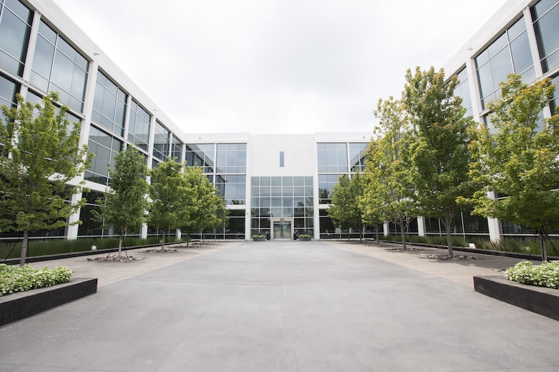 Photo: Justin Clemmons.
The main entrance features a two-story atrium space with a large display of Securus patents, a branded graphic, an employee comment wall, and a wood veneer with digital screens. Moving through to the west wing of the building, employees will see displays of customer experiences that line the walls to the warehouse space and the large employee breakroom and training center. The east wing takes occupants toward the auditorium and customer call center.
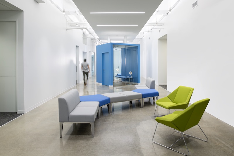
An active core zone with collaborative areas, additional breakrooms, wellness rooms, phone rooms, and enclosed conference and training spaces occupy the second and third floors. Instead of cubicles, lauckgroup created this core zone to foster ease of knowledge transfer between departments, remind employees of the company’s mission, and provide a respite from the typical office layout. The zones feature high ceilings, concrete floors, and graphic walls.
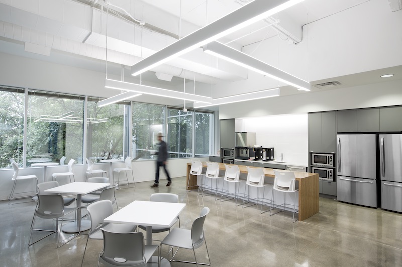 Photo: Justin Clemmons.
Employees move north and south from the central core into the “arms” of the H-shape to enter the work areas. The work areas are grouped by department and include private offices, open workstations, and breakout teaming spaces. Eco-conscious materials, such as low VOC paint, sustainably forested countertop wood, and ceiling tiles made of stone wool containing 42% recycled content, were incorporated into the work spaces.
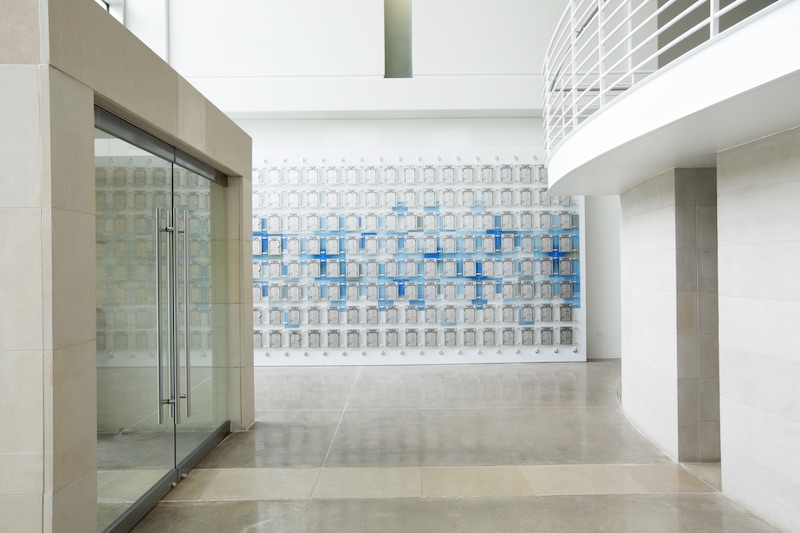 Photo: Justin Clemmons.
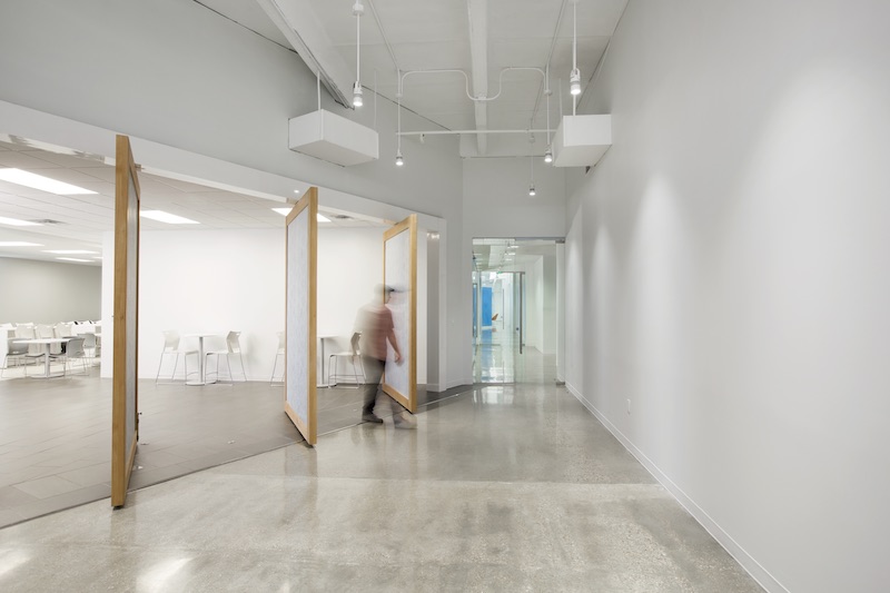 Photo: Justin Clemmons.
Related Stories
Codes and Standards | Feb 12, 2015
New Appraisal Institute form aids in analysis of green commercial building features
The Institute’s Commercial Green and Energy Efficient Addendum offers a communication tool that lenders can use as part of the scope of work.
Office Buildings | Feb 12, 2015
Is Houston headed for an office glut?
More than 13 million sf could be completed this year, adding to this metro’s double-digit vacancy woes.
Architects | Feb 11, 2015
Shortlist for 2015 Mies van der Rohe Award announced
Copenhagen, Berlin, and Rotterdam are the cities where most of the shortlisted works have been built.
Office Buildings | Feb 6, 2015
6 factors steering workplace design at financial services firms
Grossly underutilized space and a lack of a mobility strategy are among the trends identified by HOK based on its research of 11 top-tier financial services firms.
Contractors | Feb 6, 2015
Census Bureau: Capital spending by U.S. businesses increased 4.5%
Of the 19 industry sectors covered in the report, only one had a statistically significant year-to-year decrease in capital spending: the utilities sector.
Office Buildings | Feb 3, 2015
5 trends transforming workplace design
RTKL's workplace design expert Jodi Williams foresees healthier and more technologically enabled offices that allow productive worker interaction, wherever they happen to be.
Office Buildings | Feb 3, 2015
Bjarke Ingels' BIG proposes canopied, vertical village for Middle East media company
The tensile canopy shades a relaxation plaza from the desert sun.
Office Buildings | Feb 2, 2015
Study shows modern workers struggle to leave work at the office
Study findings indicate that more than half the respondents holds tight to their smartphones, checking and responding to email and taking phone calls, all or most of the time.
Office Buildings | Jan 28, 2015
Sustainability’s missed opportunity: small commercial buildings
The real opportunity for shrinking the nation’s energy footprint lies in the mundane world of small commercial buildings, writes BD+C's David Barista.
Office Buildings | Jan 27, 2015
London plans to build Foggo Associates' 'can of ham' building
The much delayed high-rise development at London’s 60-70 St. Mary Axe resembles a can of ham, and the project's architects are embracing the playful sobriquet.


