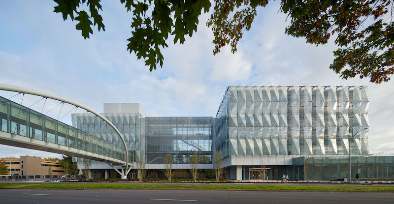
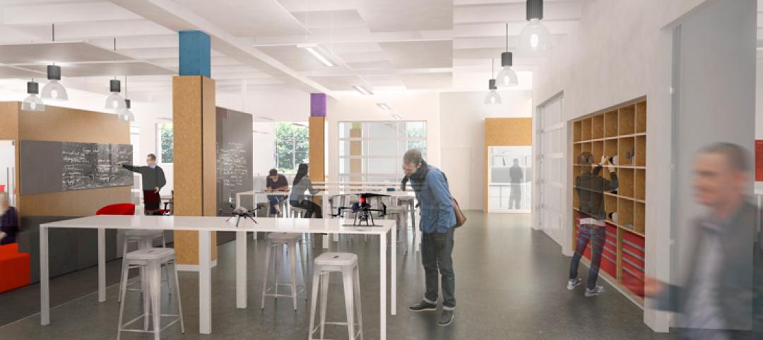
Earlier this month, the University of Oregon in Eugene opened the Phil and Penny Knight Campus for Accelerating Scientific Impact. The 160,000-sf complex, which consists of two facing L-shaped towers, supports a mission to shorten the timeline between discovery, development, and deployment by bringing together engineering, applied science, business innovations, and culture. Its environment priorities revolve around wellness, human performance, and community. (The Campus’s tagline is “Science Advancing Society.“)
Phil Knight, co-founder and chairman emeritus of Nike, donated $500 million for this project. “Phil was most interested in the mission” of acceleration, Todd Schliemann, FAIA, Design Partner at Ennead Architects, tells BD+C. The Campus’s current focus is bioengineering, and OU partners with Oregon State University to offer a PhD program in that discipline.
Ennead Architects was this project’s design architect, Portland, Ore.-based Bora Architecture & Interiors was its AOR and designed some of the interiors, and Hoffman Construction built the campus.
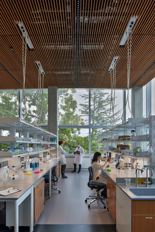
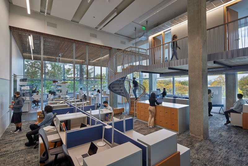
Lab space (above) and work space (below) intersect in the campus's buildings. Mass timber was applied throughout the Campus, including the labs' ceiling.
Built on land where a Domino’s Pizza, a mini-mall and parking lot once stood, the Knight Campus is situated between the University of Oregon’s main campus and parkland straddling the Willamette River. A 190-ft-long, 48-ft-wide enclosed bridge, stretching 35 ft above street traffic, connects Knight Campus to Oregon’s existing campus.
Schliemann says the university is positioning the Knight Campus—which he calls a “humanistic research machine”— as a “gateway building” to a possible future research complex.
During the design process, the university hadn’t decided what disciplines these towers would house. So before designing the Knight Campus, representatives from the design team visited several other universities, including MIT’s Media Lab, Harvard, Stanford, and University of California at San Francisco. What they all have in common, says Schliemann, are collaborative spaces where knowledge can be shared. Stanford’s engineering complex, he adds, is noteworthy for how much natural light it lets inside.
‘NEIGHBORHOODS’ BRING RESEARCHERS TOGETHER
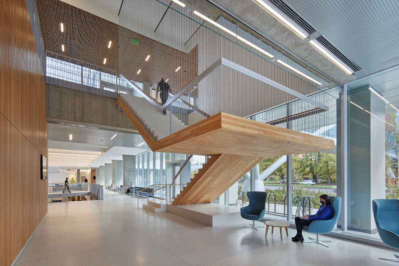
Staircases made from cross-laminated timber connect the floors.
The Knight Campus has several distinguishing characteristics:
•Its two upper floors include four research “neighborhoods” that each has a wet bench area, computational space, and offices where Principal Investigators work. Schliemann contends that this is one of the first lab buildings in the U.S. where PIs are this visible to other research teammates.
•The Campus’s double-skinned façade showcases an outer wall consisting of 650 glass panels and designed to resemble water flowing over rocks. This cascading wall is stabilized by an inner curtainwall made up of 900 glass panels. Schliemann says that this design and materials were chosen to let more natural light and panoramic exterior views into the building (which, he contends, improves working conditions), and for passive energy performance (the inner wall of the façade never gets exceedingly warm).

The Campus's double-skinned facade lets more natural light into the buildings and keeps heat from penetrating the inner curtainwall.
The wall structure was light enough to be hung from the roof component.
•Mass timber is prevalent throughout the Knight Campus, whose construction used 20,500 sf of cross-laminated timber that includes 180 CLT panels and 4,000 lbs of wood for each of the building’s staircases. The 21-foot floor-to-floor height allows for suspended mezzanine structures of mass timber containing offices for faculty, creating a new level of connectivity to their labs and graduate students.
Mass timber “is one of the most sustainable ways to construct a building” says Schliemann. (The Knight Campus is targeting LEED Gold certification.) Using mass timber also supports Oregon’s local economy. While vibration prevents a lab space from being made entirely with mass timber, “we could use it for offices, stairs, ceilings and bridges. Plus, we didn’t have to sheetrock the ceilings, as fire codes have finally caught up with mass timber” as a fireproofing agent.
Also see: Researchers use U. of Arkansas buildings as testbed for CLT panels.
SPACES FOR FORMAL OR RELAXED INNOVATION AND INTERACTION
Among the Knight Campus’s amenities are a 6,000-sf Innovation Center and 1,000-sf Wellness Center. While the Innovation Center might seem small when compared to other university research facilities, Schliemann counters that its scale is deceptive. “It gets innovators out into the real world.” He adds that all Knight Campus labs are leasable and tenant-adaptable.
The Wellness Center started out as a locker room with showers. Then spaces for yoga and other exercise regimens were included. Schliemann says the campus has a program where students can take bike rides with researchers.
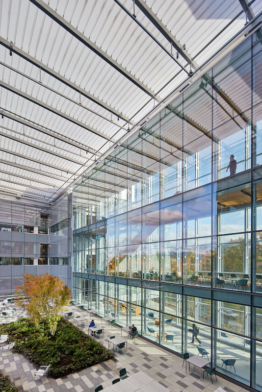
An elevated terrace and courtyard between the Campus's two buildings is covered with a canopy made from ETFE.
Between the Campus’s two buildings is an elevated terrace and courtyard, protected by a transparent plastic canopy, where students and faculty can relax, socialize, and connect with nature, as the terrace overlooks landscaping and the tree-covered Coburg Hills.
Related Stories
University Buildings | Oct 16, 2015
Competency-based learning: A glimpse into the future of higher education?
For better or worse, the higher education experience for many young Millennials and Gen Zers will not resemble the four-year, life-altering experience that we enjoyed—it’s just too costly.
University Buildings | Sep 21, 2015
Vietnamese university to turn campus into ‘terraced forest’
Pockets of plantings will be dispersed throughout the staggered floors of the building, framing the expansive courtyard at its center.
University Buildings | Sep 21, 2015
6 lessons in campus planning
For campus planning, focus typically falls on repairing the bricks and mortar without consideration of program priorities. Gensler's Pamela Delphenich offers helpful tips and advice.
Mixed-Use | Aug 26, 2015
Innovation districts + tech clusters: How the ‘open innovation’ era is revitalizing urban cores
In the race for highly coveted tech companies and startups, cities, institutions, and developers are teaming to form innovation hot pockets.
University Buildings | Aug 13, 2015
Best of Education Design: 9 projects named AIA Education Facility Design Award winners
Georgia Tech's Clough Commons, Boston's Berklee Tower, and seven other facilities were honored for aiding learning and demonstrating excellent architectural design.
Giants 400 | Aug 7, 2015
UNIVERSITY SECTOR GIANTS: Collaboration, creativity, technology—hallmarks of today’s campus facilities
At a time when competition for the cream of the student/faculty crop is intensifying, colleges and universities must recognize that students and parents are coming to expect an education environment that foments collaboration, according to BD+C's 2015 Giants 300 report.
Contractors | Jul 29, 2015
Consensus Construction Forecast: Double-digit growth expected for commercial sector in 2015, 2016
Despite the adverse weather conditions that curtailed design and construction activity in the first quarter of the year, the overall construction market has performed extremely well to date, according to AIA's latest Consensus Construction Forecast.
University Buildings | Jul 28, 2015
OMA designs terraced sports center for UK's Brighton College
Designs for what will be the biggest construction project in the school’s 170-year history feature a rectangular building at the edge of the school’s playing field. A running track is planned for the building’s roof, while sports facilities will be kept underneath.
University Buildings | Jul 21, 2015
Maker spaces: Designing places to test, break, and rebuild
Gensler's Kenneth Fisher and Keller Roughton highlight recent maker space projects at MIT and the University of Nebraska that provide just the right mix of equipment, tools, spaces, and disciplines to spark innovation.
University Buildings | Jul 2, 2015
Design for new pavilion in Toronto includes a ‘peel-away’ façade
An architect's proposal for a renovation of the main office building at the Ontario College of Art and Design features a façade that fans out from the edges of the building, like it’s opening up to visitors.


