Creating a tall facility on a constrained city site always presents special difficulties for Building Teams. Make the program unusually diverse—in this case, combining residential, classroom, laboratory, office, conference, dining, and recreational functions—and the complexity level increases. Now throw in the need to link the facility to a landmark 1880s structure with different floor-to-floor heights. Finally, have the city of Chicago “orange tag” one of two existing buildings on your site, derailing your plans for a complete demolition.
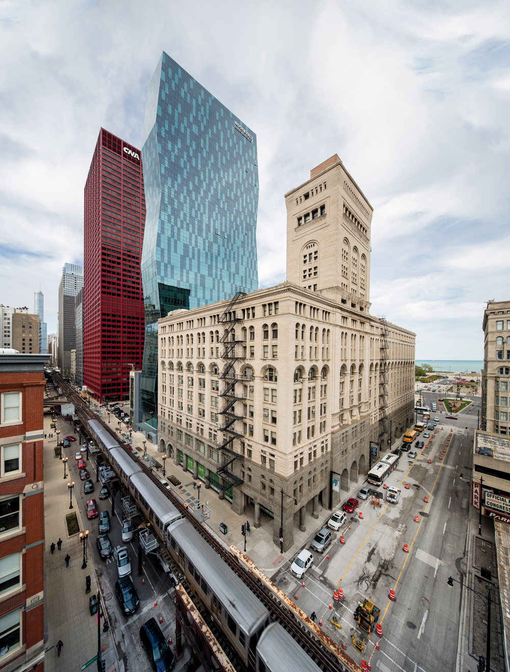
The Building Team for Roosevelt University’s new Wabash Building successfully navigated this minefield, producing a distinctive addition to the South Loop skyline and an appealing new home for the school. Architect VOA Associates, owner’s rep Jones Lang LaSalle, development advisor The John Buck Company, and Power Construction spearheaded a successful functional and aesthetic collaboration that also achieved LEED Gold. The resulting project, at 469 feet in height, is the second-tallest university facility in the U.S. and the sixth-tallest in the world.
From the start, the project was vastly more complex than anything the client had ever attempted. Roosevelt was already occupying the Auditorium Building, a Michigan Avenue icon designed by Adler and Sullivan, as well as a suburban extension campus. To support enrollment growth and program expansion, the university decided to create a tall building that would consolidate many functions while integrating well with the Auditorium.
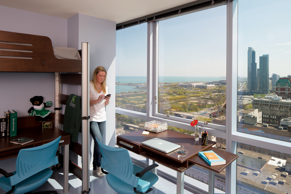
Student residences include 633 beds on 17 floors, mostly in four- and five-person suites consisting of single and double bedrooms sharing a bathroom. Laundry facilities on the 15th floor feature Internet tracking so students can make sure washers and dryers are available before making the trek. Each residential floor has a large study room with breathtaking lake and city views.
With a footprint of only 17,300 sf, the tight site would need to accommodate a program of ~420,000 sf. A nondescript ’70s high-rise Roosevelt had once used for a dorm was demolished. The attractive façade of the adjacent Fine Arts Annex, a slender six-story structure built in the 1920s, was saved to become the front of a student bookstore.
The design solution created a “servant-served” spatial relationship, placing core and support (“servant”) spaces on the north elevation behind a fairly plain precast concrete façade, with unglazed lower floors giving way to a checkerboard window grid higher up. The functional (“served”) spaces are situated on the south side, featuring blue glass and dramatic canted faces inspired by Brancusi’s famed Endless Column sculpture, as well as the faceted façade of the nearby Spertus Institute of Jewish Studies. The servant-served arrangement maximizes spectacular views to the south, east, and west.
Common areas are clustered in the five lowest floors, including a two-story atrium lobby, student services offices, a student union, a dining hall, and a recreation facility. Classroom and lab spaces and a mechanical floor occupy the midsection, topped by 17 stories of residences.
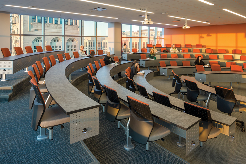
The servant-served organization maximizes clear spans for the large classrooms and labs, including seven classrooms with a capacity of 36 students each, four tiered classrooms seating 60 to 80, and three auditorium classrooms seating 78 to 180. Judiciously placed prefunction spaces serve as interior “quads” for student interaction.
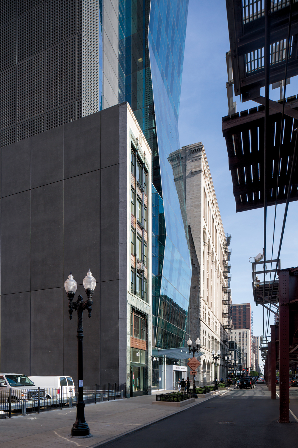
The façade of the slender 1920s building in the foreground was preserved as the front of a new bookstore. The dark, plain north elevation of the new tower, which faces another tall building, delineates the service functions on this side.
Three stories of science labs support instruction and research in biology, chemistry, and physics, as well as office space for science faculty. Roosevelt’s Heller College of Business was also moved to the new skyscraper from a different Loop facility; its students now benefit from a simulated financial trading room and retail store.
Vertical and horizontal circulation within the Roosevelt campus is necessarily complex. Round-the-clock security check-in is required at Floor 14 before students can proceed to the higher levels via dedicated elevators. Hooking the tower onto the Auditorium Building to the south was also tricky but crucial; the older building is still heavily used for classrooms and offices, as well as performances in beautifully restored ArtNouveau theater spaces. Gently sloping hallways now connect the buildings at four points, with generous signage provided to ease wayfinding.
Getting to LEED Gold required an imaginative mix of strategies, from the typical— high-efficiency HVAC, low-flow plumbing, green roofs—to the less common. In the latter category: removable pillow-tops to maximize mattress life cycle, façade patterning intended to deter bird collisions, a food pulper that allows dining hall waste to be hauled off and composted, and a complex network of recycling chutes with an anti-microbial washdown system.
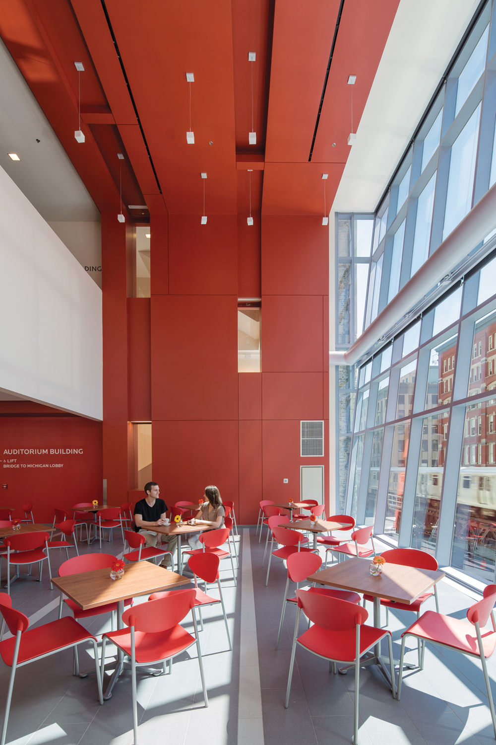
The second-floor dining center seats 300 and offers a mini-mart for snacks and sundries, as well as cold carryout items, hot food, pizza, a deli, a grill station, and a coffee shop.
Structural and logistical issues demanded creative solutions as well, particularly with respect to crane deployment. Many projects on tight urban sites are built around a central crane, resulting in the need to finish the resulting “dead zone” after the crane is dismantled near the end of the job. Engineering-intensive lab spaces in the Wabash Building’s midsection made this scenario particularly unpalatable. Instead, the Building Team devised a method for mounting the crane outside the building footprint, using counterbalance weights and a crane elevator that hugged the façade.
Today, the Wabash Building is a lively, 24/7 community that brings the school’s social justice mission to life, hosting students from 34 states and more than a dozen countries. Chicago Tribune architecture critic Blair Kamin is among the admirers of Roosevelt’s bold experiment: “It achieves a genuine, artful dialogue between past and present … a building of considerable promise.”
This tiered classroom is one of several large, general instructional spaces provided in the building’s middle floors. Thoughtfully planned daylighting is a hallmark of the project.
Project summary
GOLD AWARD
Roosevelt University Wabash Building
Chicago
BUILDING TEAM
Submitting firms: VOA Associates (architect) and Jones Lang Lasalle (owner’s rep)
Development advisor: The John Buck Company
Associate architect: Johnson & Lee Ltd.
Structural: Magnusson Klemencic Associates
MEP: WMA Consulting Engineers
Contractor: Power Construction
GENERAL INFORMATION
Project size: 420,000 sf
Construction cost: $123 million
Construction time: November 2009 (demolition) to March 2012 (completion)
Delivery method: Design/bid/build
Related Stories
| Feb 11, 2011
Grocery store anchors shopping center in Miami arts/entertainment district
18Biscayne is a 57,200-sf urban retail center being developed in downtown Miami by commercial real estate firm Stiles. Construction on the three-story center is being fast-tracked for completion in early 2012. The project is anchored by a 49,200-sf Publix market with bakery, pharmacy, and café with outdoor seating. An additional 8,000 sf of retail space will front Biscayne Boulevard. The complex is in close proximity to the Adrienne Arsht Center for the Performing Arts, the downtown Miami entertainment district, and the Omni neighborhood, one of the city’s fast-growing residential areas.
| Feb 11, 2011
Chicago architecture firm planning one of China’s tallest towers
Chicago-based Goettsch Partners was commissioned by developer Guangzhou R&F Properties Co. Ltd. to design a new 294,570-sm mixed-use tower in Tianjin, China. The Tianjin R&F Guangdong Tower will be located within the city’s newly planned business district, and at 439 meters it will be one of China’s tallest buildings. The massive complex will feature 134,900 sm of Class A office space, a 400-key, five-star hotel, 55 condominiums, and 8,550 sm of retail space. The architects are designing the tower with multi-story atriums and a high-performance curtain wall to bring daylight deep into the building, thereby creating deeper lease spans. The project is currently finishing design.
| Feb 11, 2011
Two projects seek to reinvigorate Los Angeles County medical center
HMC Architects designed two new buildings for the Los Angeles County Martin Luther King, Jr., Medical Center as part of a $360 million plan to reinvigorate the campus. The buildings include a 120-bed hospital, which involves renovation of an existing tower and several support buildings, and the construction of a new multi-service ambulatory care center. The new facilities will have large expanses of glass at all waiting and public areas for unobstructed views of downtown Los Angeles. A curved glass entrance canopy will unite the two buildings. When both projects are completed—the hospital in 2012 and the ambulatory care center in 2013—the campus will have added more than 460,000 sf of space. The hospital will seek LEED certification, while the ambulatory care center is targeting LEED Silver.
| Feb 11, 2011
Sustainable community center to serve Angelinos in need
Harbor Interfaith Services, a nonprofit serving the homeless and working poor in the Harbor Area and South Bay communities of Los Angeles, engaged Withee Malcolm Architects to design a new 15,000-sf family resource center. The architects, who are working pro bono for the initial phase, created a family-centered design that consolidates all programs into a single building. The new three-story space will house a resource center, food pantry, nursery and pre-school, and administrative offices, plus indoor and outdoor play spaces and underground parking. The building’s scale and setbacks will help it blend with its residential neighbors, while its low-flow fixtures, low-VOC and recycled materials, and energy-efficient mechanical equipment and appliances will help it earn LEED certification.
| Feb 11, 2011
Texas megachurch inspired by yesteryear’s materials, today’s design vocabulary
The third phase of The First Baptist Church of Pasadena, Texas, involves construction of a new 115,000-sf worship center addition. Currently in design by Zeigler Cooper, the project will include a 2,500-seat worship center (with circular layout and space for a 50-person orchestra and 200-person choir), a 500-seat chapel (for weddings, funerals, and special events), and a prayer room. The addition will connect to the existing church and create a Christian Commons for education, administration, music, and fellowship. The church asked for a modern design that uses traditional materials, such as stone, brick, and stained glass. Construction is scheduled to begin this summer.
| Feb 11, 2011
Apartment complex caters to University of Minnesota students
Twin Cities firm Elness Swenson Graham Architects designed the new Stadium Village Flats, in the University of Minnesota’s East Bank Campus, with students in mind. The $30 million, six-story residential/retail complex will include 120 furnished apartments with fitness rooms and lounges on each floor. More than 5,000 sf of first-floor retail space and two levels of below-ground parking will complete the complex. Opus AE Group Inc., based in Minneapolis, will provide structural engineering services.
| Feb 11, 2011
Four-story library at Salem State will hold half a million—get this—books!
Salem State University in Massachusetts broke ground on a new library and learning center in December. The new four-story library will include instructional labs, group study rooms, and a testing center. The modern, 124,000-sf design by Boston-based Shepley Bulfinch includes space for 500,000 books and study space for up to a thousand students. Sustainable features include geothermal heating and cooling, rainwater harvesting, and low-flow plumbing fixtures.
| Feb 11, 2011
Green design, white snow at Egyptian desert retail complex
The Mall of Egypt will be a 135,000-sm retail and entertainment complex in Cairo’s modern 6th of October district. The two-story center is divided into three themed zones—The City, which is arranged as a series of streets lined with retail and public spaces; The Desert Valley, which contains upscale department stores, international retailers, and a central courtyard for music and other cultural events; and The Crystal, which will include leisure and entertainment venues, including a cinema and indoor snow park. RTKL is designing the massive complex to LEED Silver standards.
| Feb 10, 2011
7 Things to Know About Impact Glazing and Fire-rated Glass
Back-to-basics answers to seven common questions about impact glazing and fire-rated glass.
| Feb 10, 2011
Medical Data Center Sets High Bar for BIM Design Team
The construction of a new data center becomes a test case for BIM’s ability to enhance project delivery across an entire medical campus.


