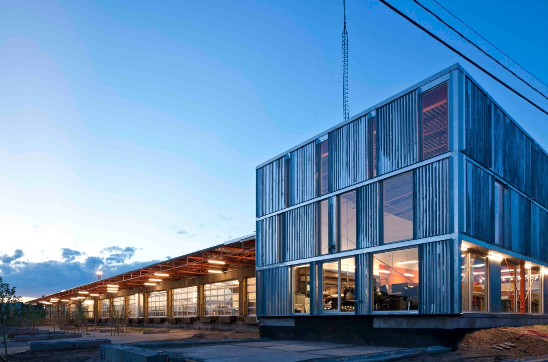
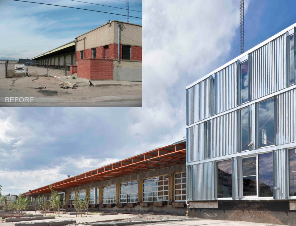
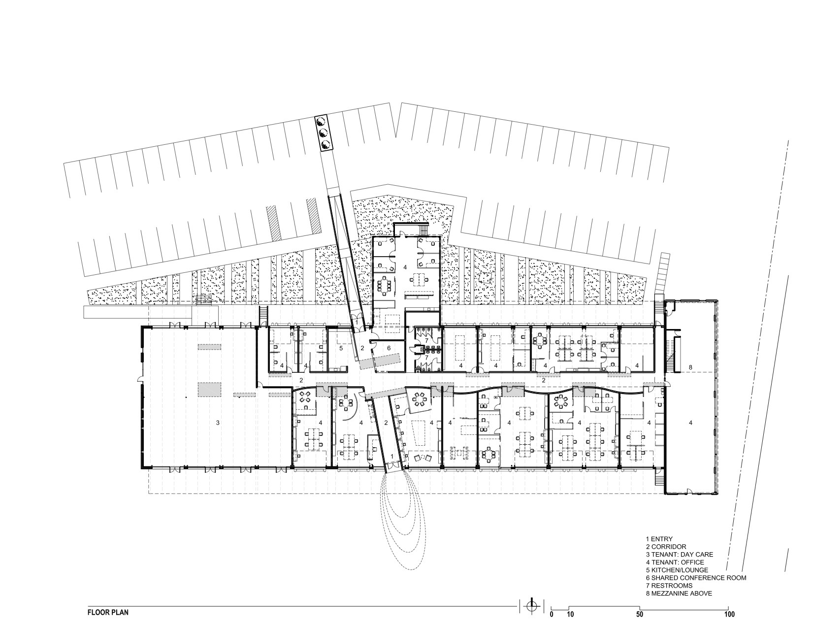
The new Freight development in Denver infuses a 29,000-sf, mid-century shipping terminal with the next evolution of TAXI creative work spaces. Flexible and filled with natural light, Freight is designed with unique and customizable spaces to suit the needs of modern businesses. Common spaces and amenities promote collaboration.
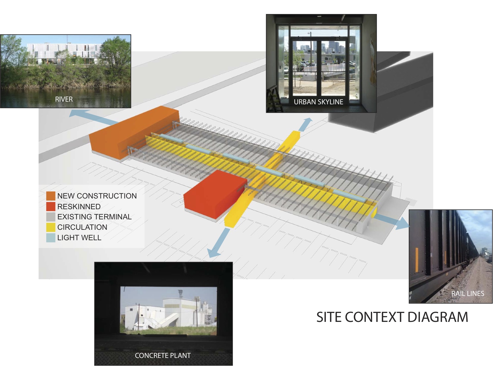
The goal of this transformation of a derelict freight terminal was to provide flexible tenant space with amenities such as common social spaces to lure “new economy” businesses to an abandoned industrial zone north of downtown Denver. The Denver warehouse redevelopment project, located between river and rail lines, is the most recent phase of a development that includes new and renovated structures that look to create a new workplace that uses architecture to foster interaction and create a culture of innovation.
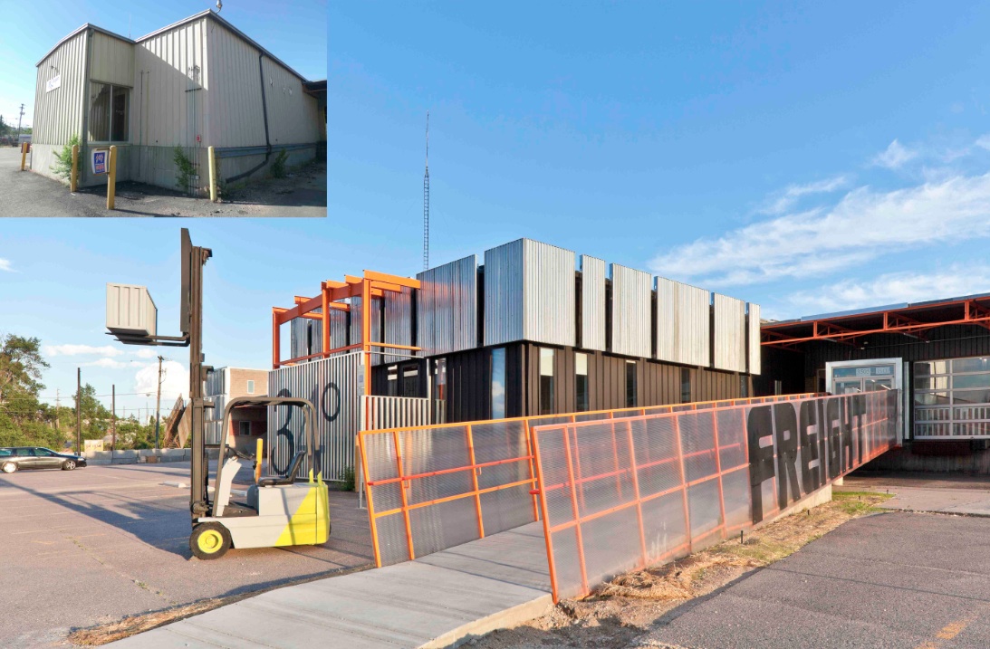
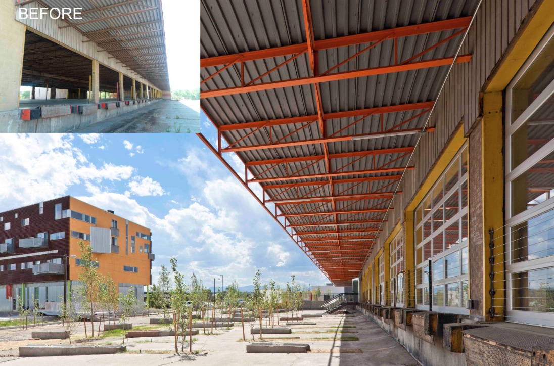
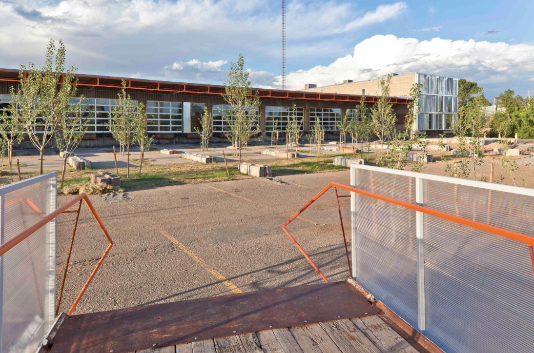
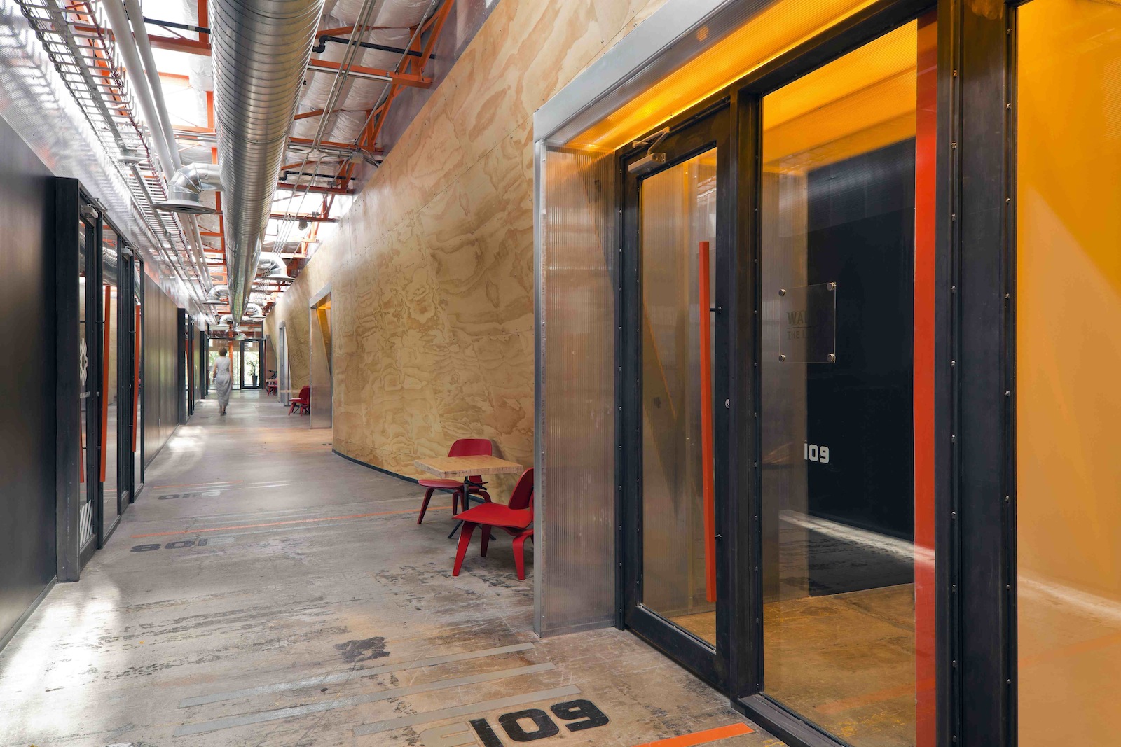
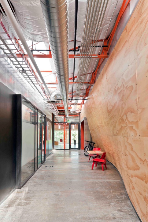
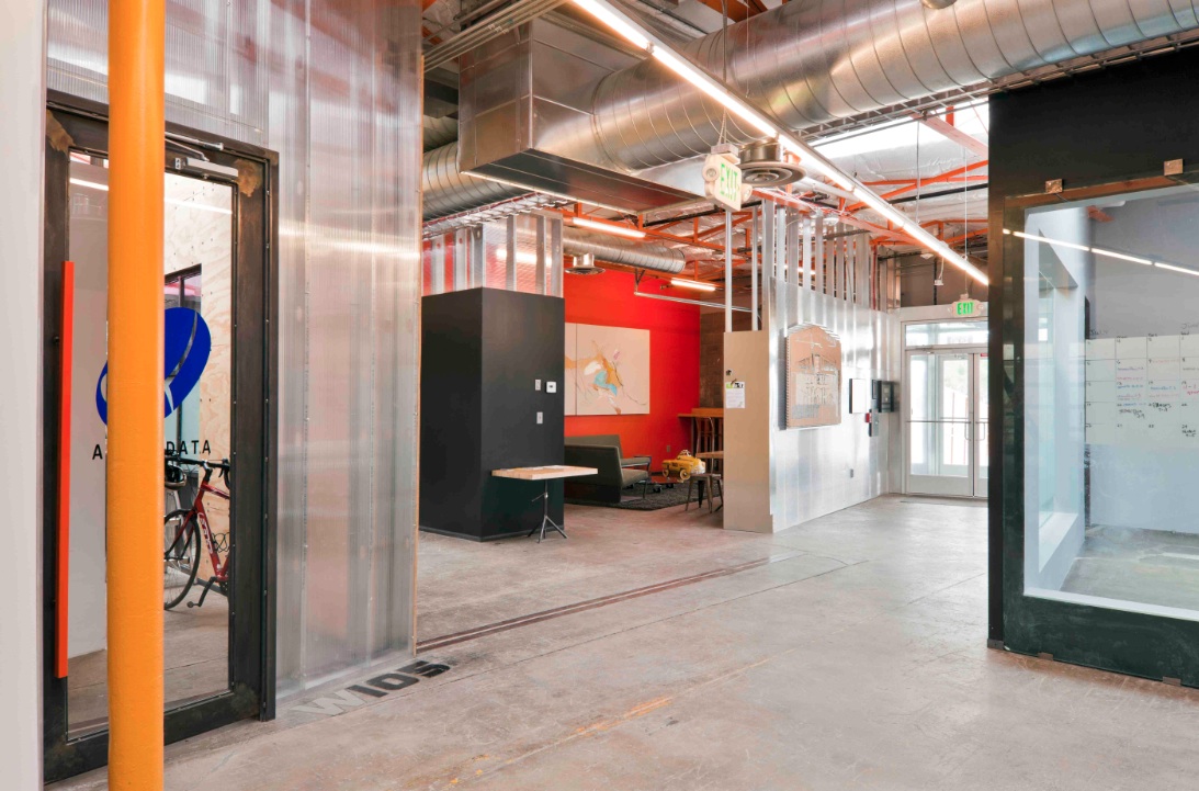
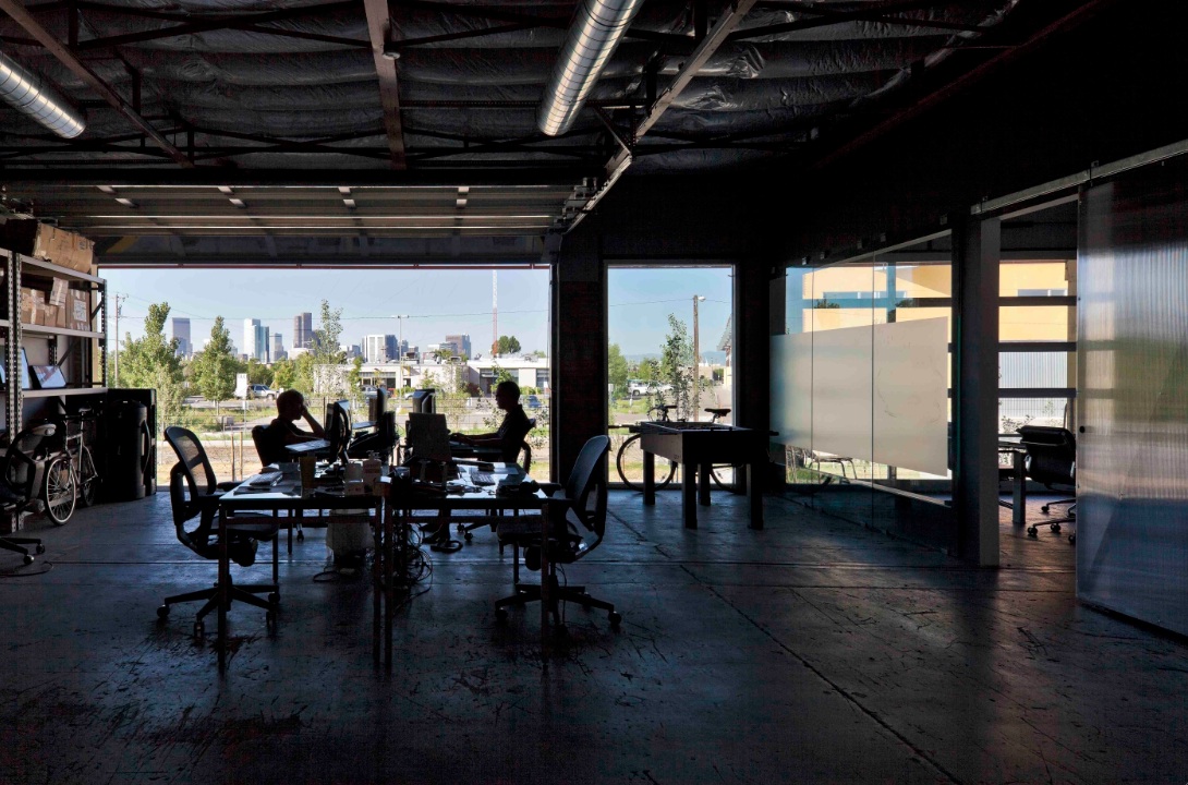
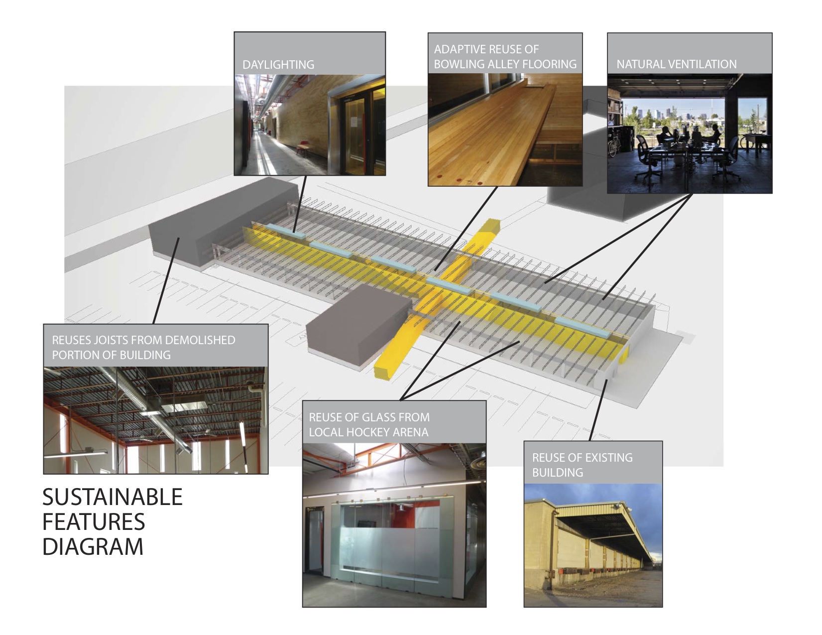
The reuse preserves the carcass of the freight terminal, with its deep overhangs and garage bay openings, and inserts new elements to contrast old. Original paint and markings are left intact with new glass overhead doors that allow offices to open to the landscape. An internal skylit “street” and sculptural plywood ribbon wall punctuated with luminous entries provides internal circulation. The main entrance slices through the building, axially connecting the entry experience to the larger site and the urban skyline beyond.
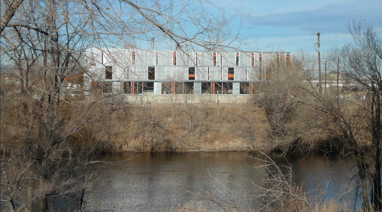
Outside, an existing metal shed projecting north was re-imaged. The new portion of the building along the river took inspiration from the movement of rail and containers, and uses trusses from the traditional administrative component at the head of the terminal that had been razed. A ghosting of the former truck dock pattern extends as adjacent landscape pattern.
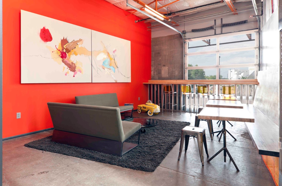
Tenant spaces were arranged from a kit of industrial components and materials included reused glass panels from a hockey rink as internal partitions, salvaged bowling alley floors for benches, tables and counters, and industrial shelves in a variety of configurations to conform to a challenging budget. “International Orange” enlivens structural components throughout.
Client: Zeppelin Places
Architect: Stephen Dynia Architects
Site area: 4 acres
Gross Floor area: 29,000 sf
Location: Denver
Photos: Ron Johnson
Related Stories
| Oct 5, 2011
GREENBUILD 2011: Brick offers growing options for sustainable building design
Brick exteriors, interiors and landscaping options can increase sustainability that also helps earn LEED certification.
| Oct 5, 2011
GREENBUILD 2011: Roof hatch designed for energy efficiency
The cover features a specially designed EPDM finger-type gasket that ensures a positive seal with the curb to reduce air permeability and ensure energy performance.
| Oct 4, 2011
GREENBUILD 2011
Click here for the latest news and products from Greenbuild 2011, Oct. 4-7, in Toronto.
| Oct 4, 2011
GREENBUILD 2011: Methods, impacts, and opportunities in the concrete building life cycle
Researchers at the Massachusetts Institute of Technology’s (MIT) Concrete Sustainability Hub conducted a life-cycle assessment (LCA) study to evaluate and improve the environmental impact and study how the “dual use” aspect of concrete.
| Oct 4, 2011
GREENBUILD 2011: Johnsonite features sustainable products
Products include rubber flooring tiles, treads, wall bases, and more.
| Oct 4, 2011
GREENBUILD 2011: Nearly seamless highly insulated glass curtain-wall system introduced
Low insulation value reflects value of entire curtain-wall system.
| Oct 4, 2011
GREENBUILD 2011: Ready-to-use wood primer unveiled
Maintains strong UV protection, clarity even with application of lighter, natural wood tones.
| Oct 4, 2011
GREENBUILD 2011: Two new recycled glass products announced
The two collections offer both larger and smaller particulates.
| Oct 4, 2011
GREENBUILD 2011: Mythic Paint launches two new paint products
A high performance paint, and a combination paint and primer now available.


