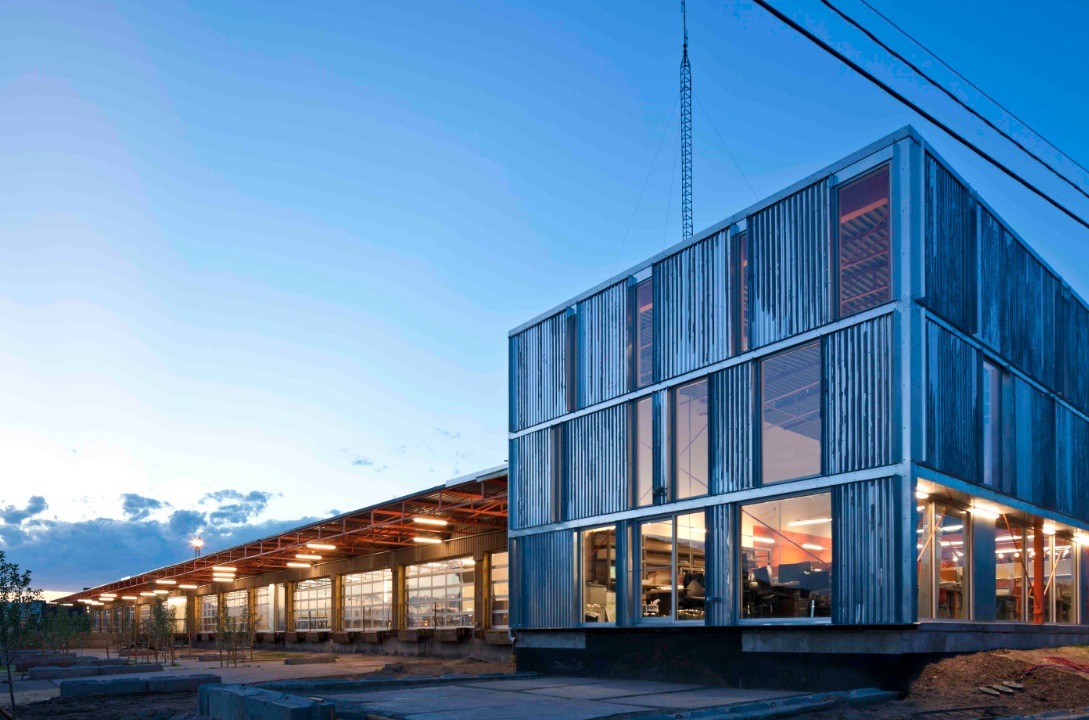
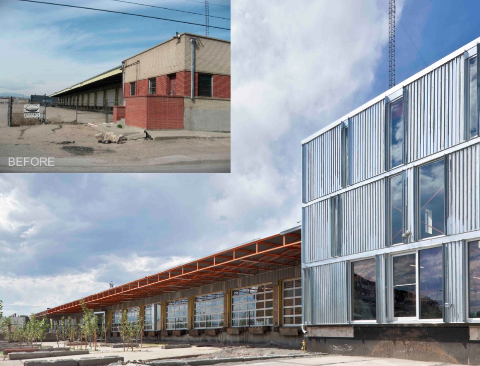
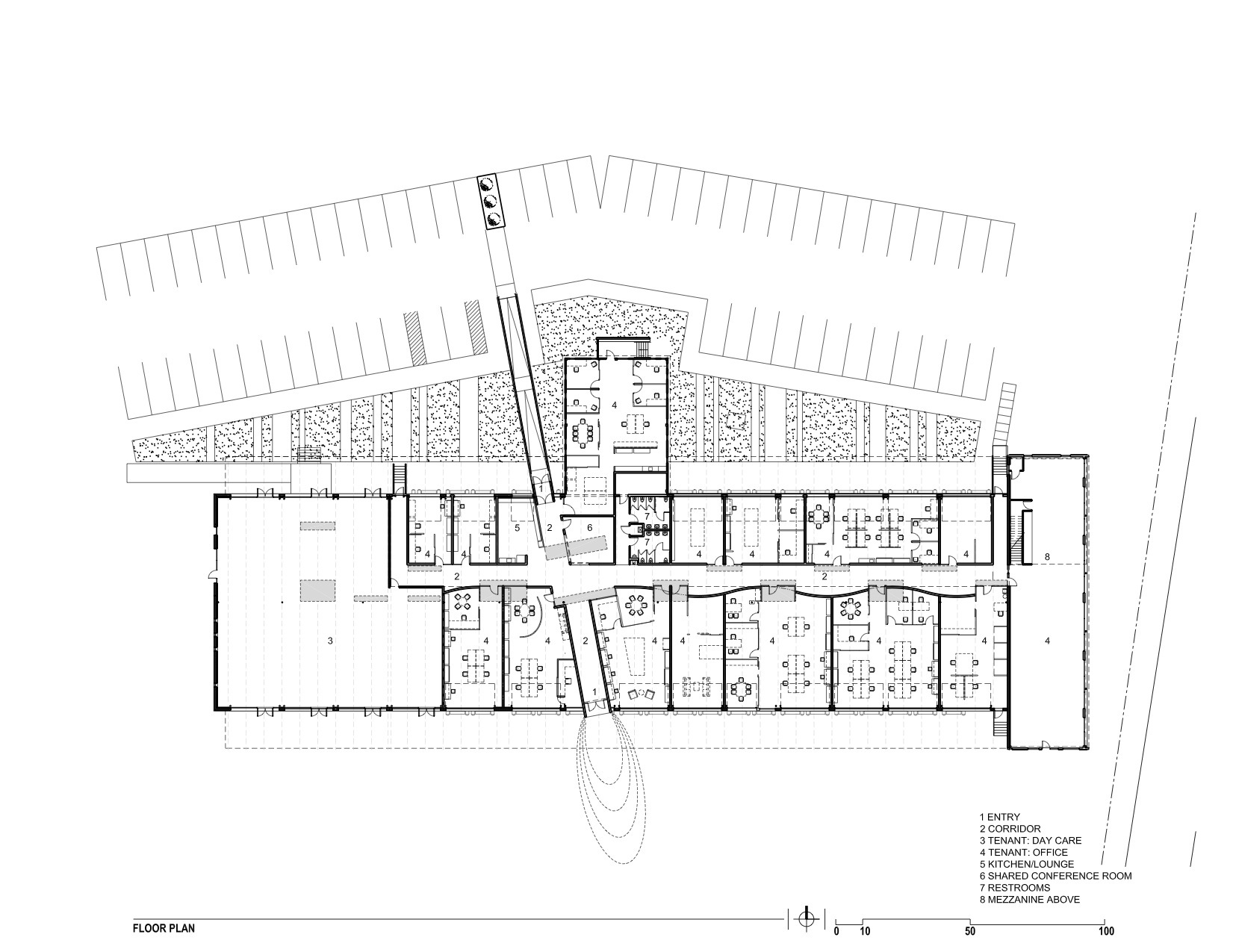
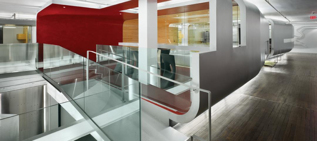
The new Freight development in Denver infuses a 29,000-sf, mid-century shipping terminal with the next evolution of TAXI creative work spaces. Flexible and filled with natural light, Freight is designed with unique and customizable spaces to suit the needs of modern businesses. Common spaces and amenities promote collaboration.
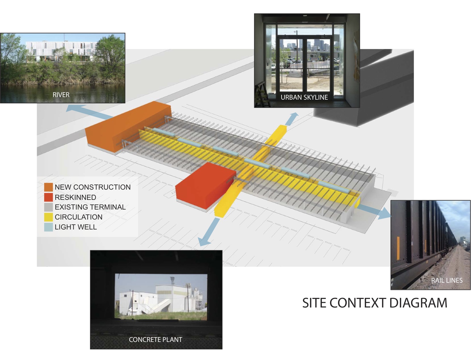
The goal of this transformation of a derelict freight terminal was to provide flexible tenant space with amenities such as common social spaces to lure “new economy” businesses to an abandoned industrial zone north of downtown Denver. The Denver warehouse redevelopment project, located between river and rail lines, is the most recent phase of a development that includes new and renovated structures that look to create a new workplace that uses architecture to foster interaction and create a culture of innovation.
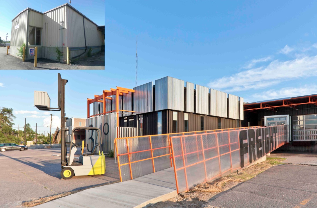
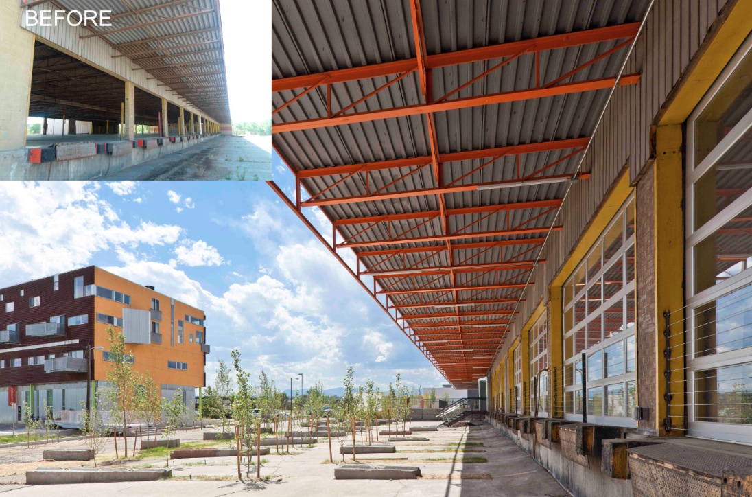
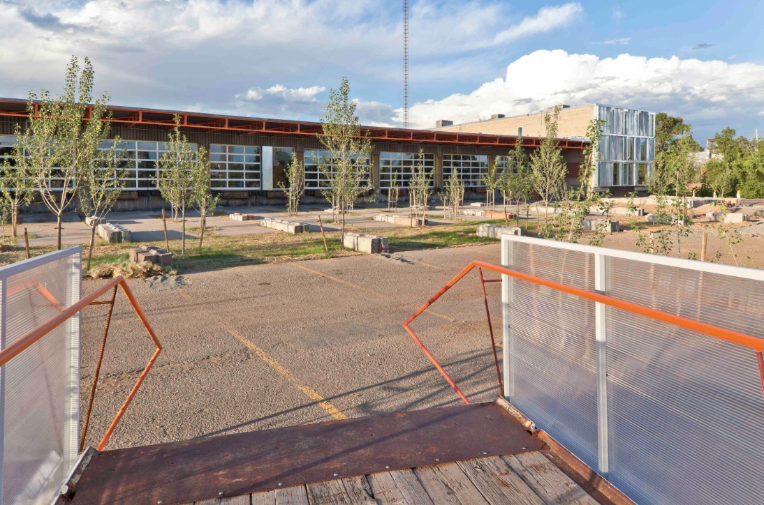
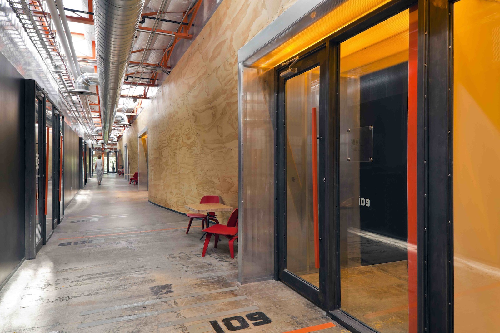
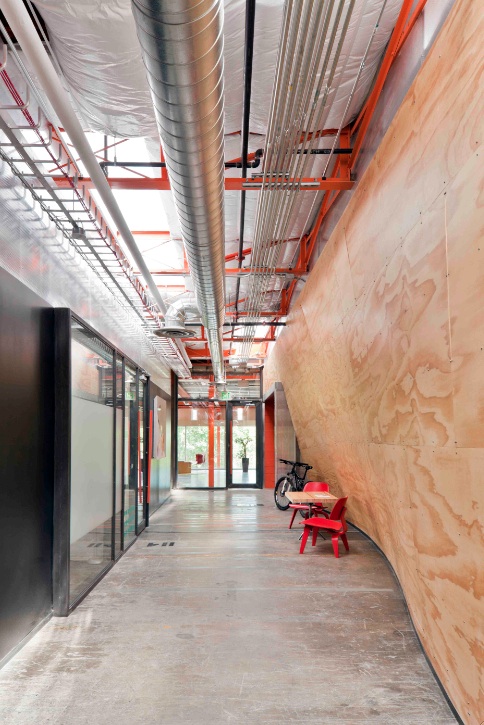
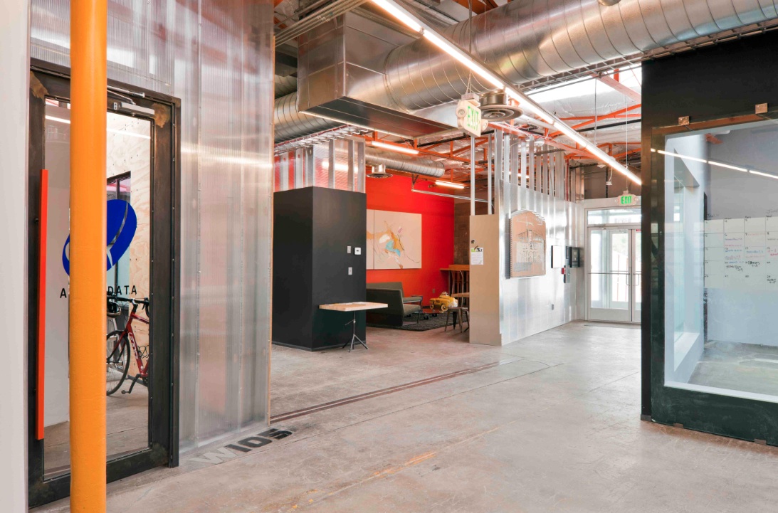
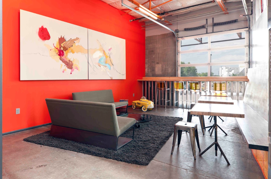
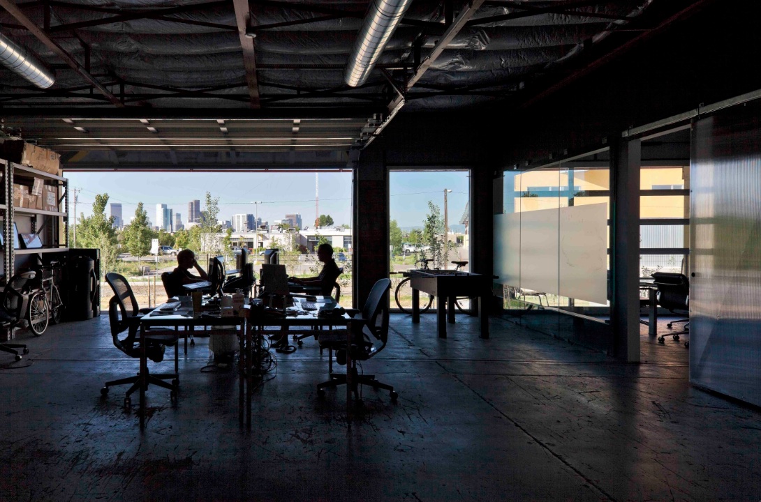
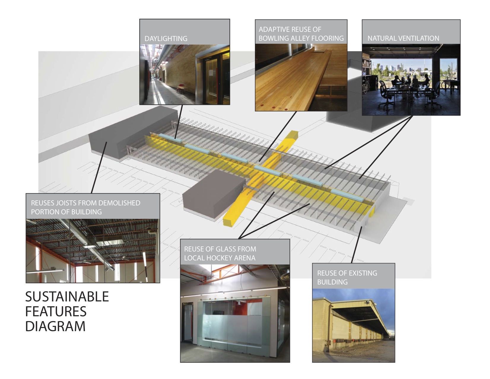
The reuse preserves the carcass of the freight terminal, with its deep overhangs and garage bay openings, and inserts new elements to contrast old. Original paint and markings are left intact with new glass overhead doors that allow offices to open to the landscape. An internal skylit “street” and sculptural plywood ribbon wall punctuated with luminous entries provides internal circulation. The main entrance slices through the building, axially connecting the entry experience to the larger site and the urban skyline beyond.
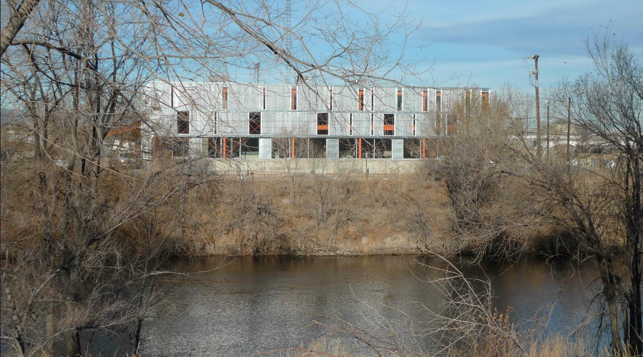
Outside, an existing metal shed projecting north was re-imaged. The new portion of the building along the river took inspiration from the movement of rail and containers, and uses trusses from the traditional administrative component at the head of the terminal that had been razed. A ghosting of the former truck dock pattern extends as adjacent landscape pattern.
Tenant spaces were arranged from a kit of industrial components and materials included reused glass panels from a hockey rink as internal partitions, salvaged bowling alley floors for benches, tables and counters, and industrial shelves in a variety of configurations to conform to a challenging budget. “International Orange” enlivens structural components throughout.
Client: Zeppelin Places
Architect: Stephen Dynia Architects
Site area: 4 acres
Gross Floor area: 29,000 sf
Location: Denver
Photos: Ron Johnson
Related Stories
| Apr 14, 2011
USGBC debuts LEED for Healthcare
The U.S. Green Building Council (USGBC) introduces its latest green building rating system, LEED for Healthcare. The rating system guides the design and construction of both new buildings and major renovations of existing buildings, and can be applied to inpatient, outpatient and licensed long-term care facilities, medical offices, assisted living facilities and medical education and research centers.
| Apr 13, 2011
National Roofing Contractors Association revises R-value of polyisocyanurate (ISO) insulation
NRCA has updated their R-value recommendation for polyisocyanurate roof insulation with the publication of the 2011 The NRCA Roofing Manual: Membrane Roof Systems.
| Apr 13, 2011
Professor Edward Glaeser, PhD, on how cities are mankind’s greatest invention
Edward Glaeser, PhD, the Fred and Eleanor Glimp Professor of Economics at Harvard University and director of the Taubman Center for State and Local Government and the Rappaport Institute for Greater Boston, as well as the author of Triumph of the City: How Our Greatest Invention Makes Us Richer, Smarter, Healthier, and Happier, on how cities are mankind’s greatest invention.
| Apr 13, 2011
Southern Illinois park pavilion earns LEED Platinum
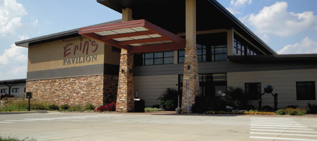
Erin’s Pavilion, a welcome and visitors center at the 80-acre Edwin Watts Southwind Park in Springfield, Ill., earned LEED Platinum. The new 16,000-sf facility, a joint project between local firm Walton and Associates Architects and the sustainability consulting firm Vertegy, based in St. Louis, serves as a community center and special needs education center, and is named for Erin Elzea, who struggled with disabilities during her life.
| Apr 13, 2011
Virginia hospital’s prescription for green construction: LEED Gold
Rockingham Memorial Hospital in Harrisonburg, Va., is the commonwealth’s first inpatient healthcare facility to earn LEED Gold. The 630,000-sf facility was designed by Earl Swensson Associates, with commissioning consultant SSRCx, both of Nashville.
| Apr 13, 2011
Office interaction was the critical element to Boston buildout
Margulies Perruzzi Architects, Boston, designed the new 11,460-sf offices for consultant Interaction Associates and its nonprofit sister organization, The Interaction Institute for Social Change, inside an old warehouse near Boston’s Seaport Center.
| Apr 13, 2011
Expanded Museum of the Moving Image provides a treat for the eyes
The expansion and renovation of the Museum of the Moving Image in the Astoria section of Queens, N.Y., involved a complete redesign of its first floor and the construction of a three-story 47,000-sf addition.
| Apr 13, 2011
Duke University parking garage driven to LEED certification
People parking their cars inside the new Research Drive garage at Duke University are making history—they’re utilizing the country’s first freestanding LEED-certified parking structure.
| Apr 13, 2011
Red Bull Canada HQ a mix of fluid spaces and high-energy design
The Toronto architecture firm Johnson Chou likes to put a twist on its pared-down interiors, and its work on the headquarters for Red Bull Canada is no exception. The energy drink maker occupies 12,300 sf on the top two floors of a three-story industrial building in Toronto, and the design strategy for its space called for leaving the base building virtually untouched while attention was turned to the interior architecture.
| Apr 13, 2011
Former department store gets new lease on life as MaineHealth HQ
The long-vacant Sears Roebuck building in Portland, Maine, was redeveloped into the corporate headquarters for MaineHealth. Consigli Construction and local firm Harriman Architects + Engineers handled the 14-month fast-track project, transforming the 89,000-sf, four-story facility for just $100/sf.


