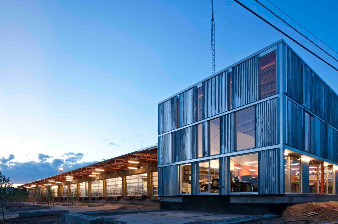
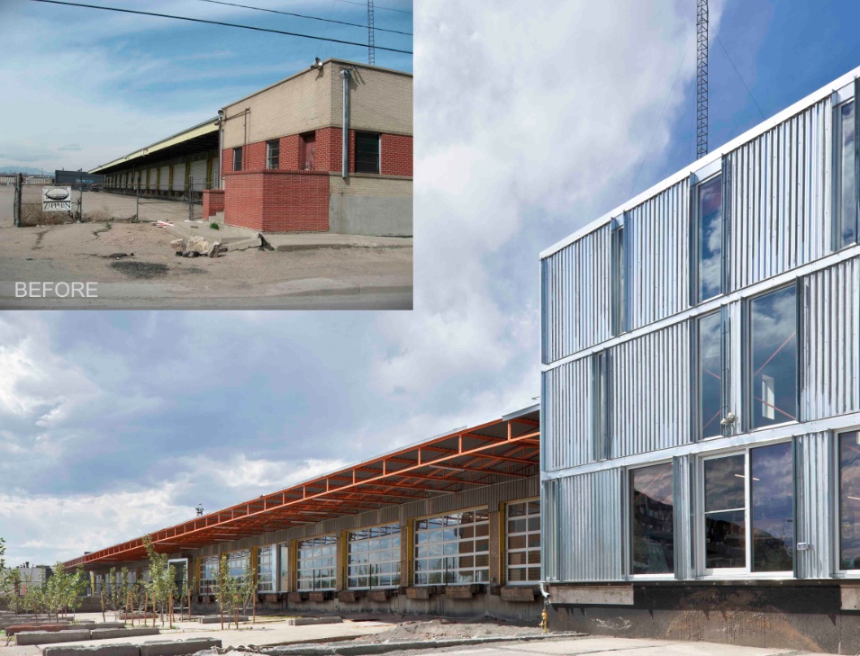
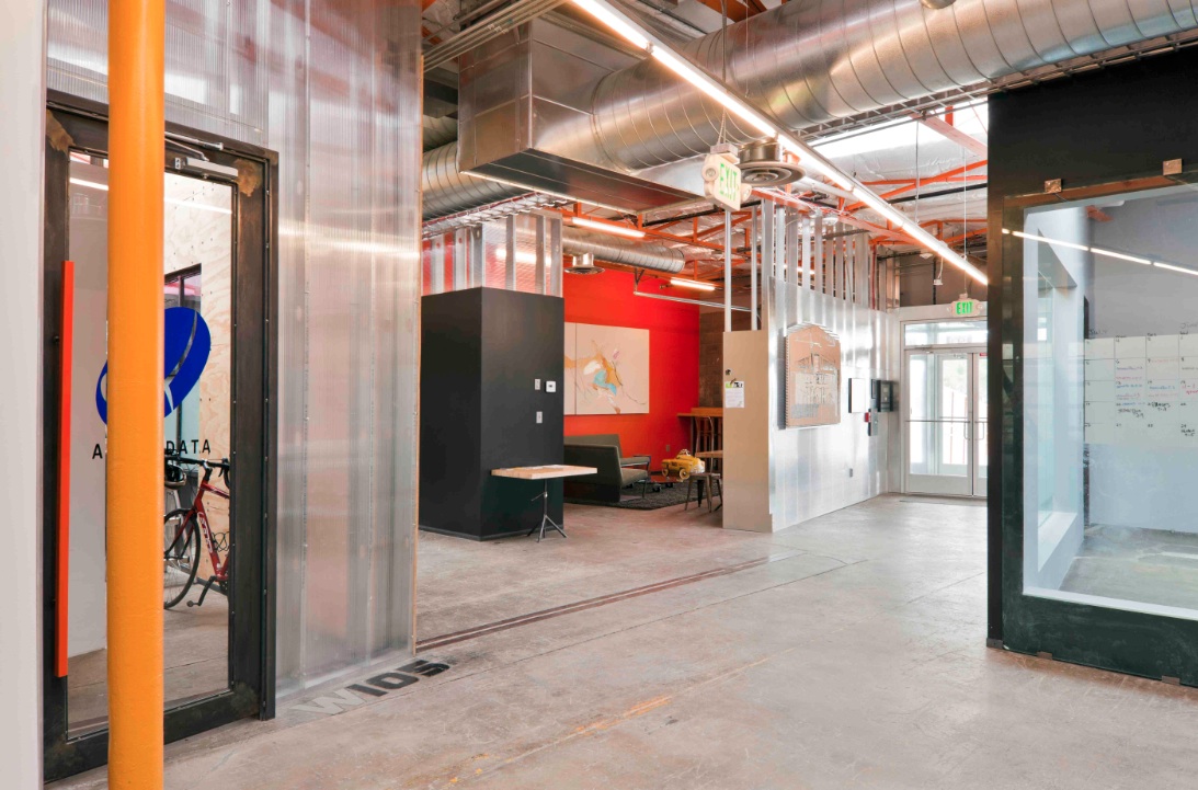
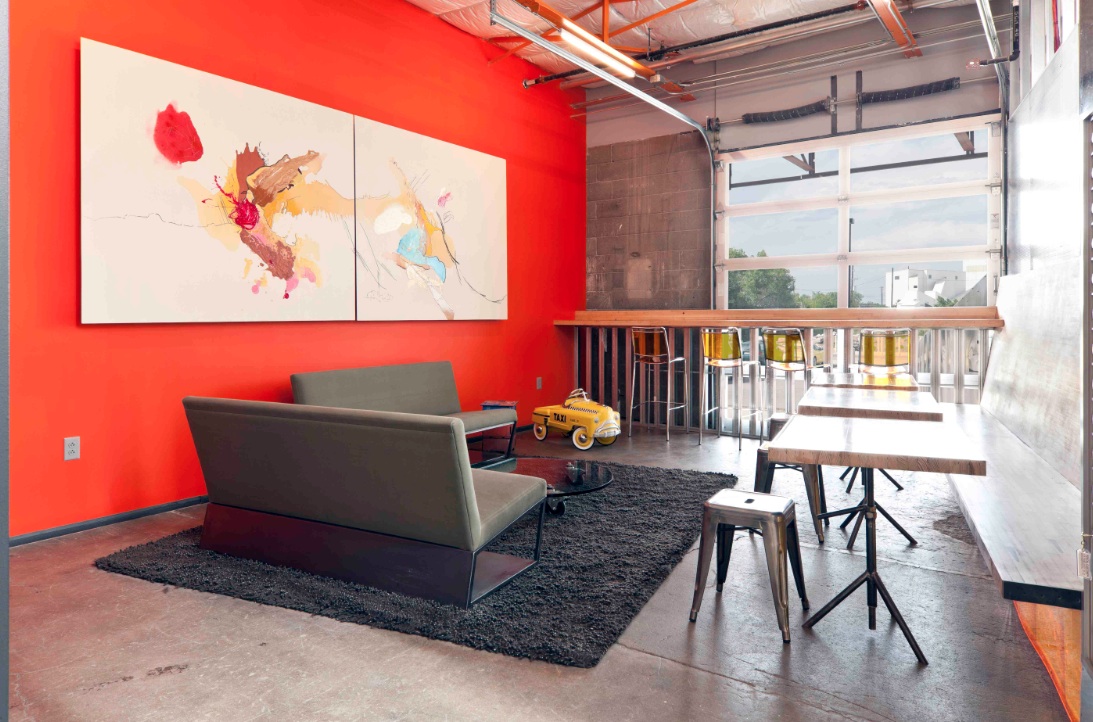
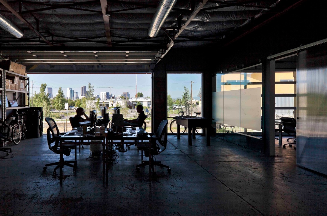
The new Freight development in Denver infuses a 29,000-sf, mid-century shipping terminal with the next evolution of TAXI creative work spaces. Flexible and filled with natural light, Freight is designed with unique and customizable spaces to suit the needs of modern businesses. Common spaces and amenities promote collaboration.
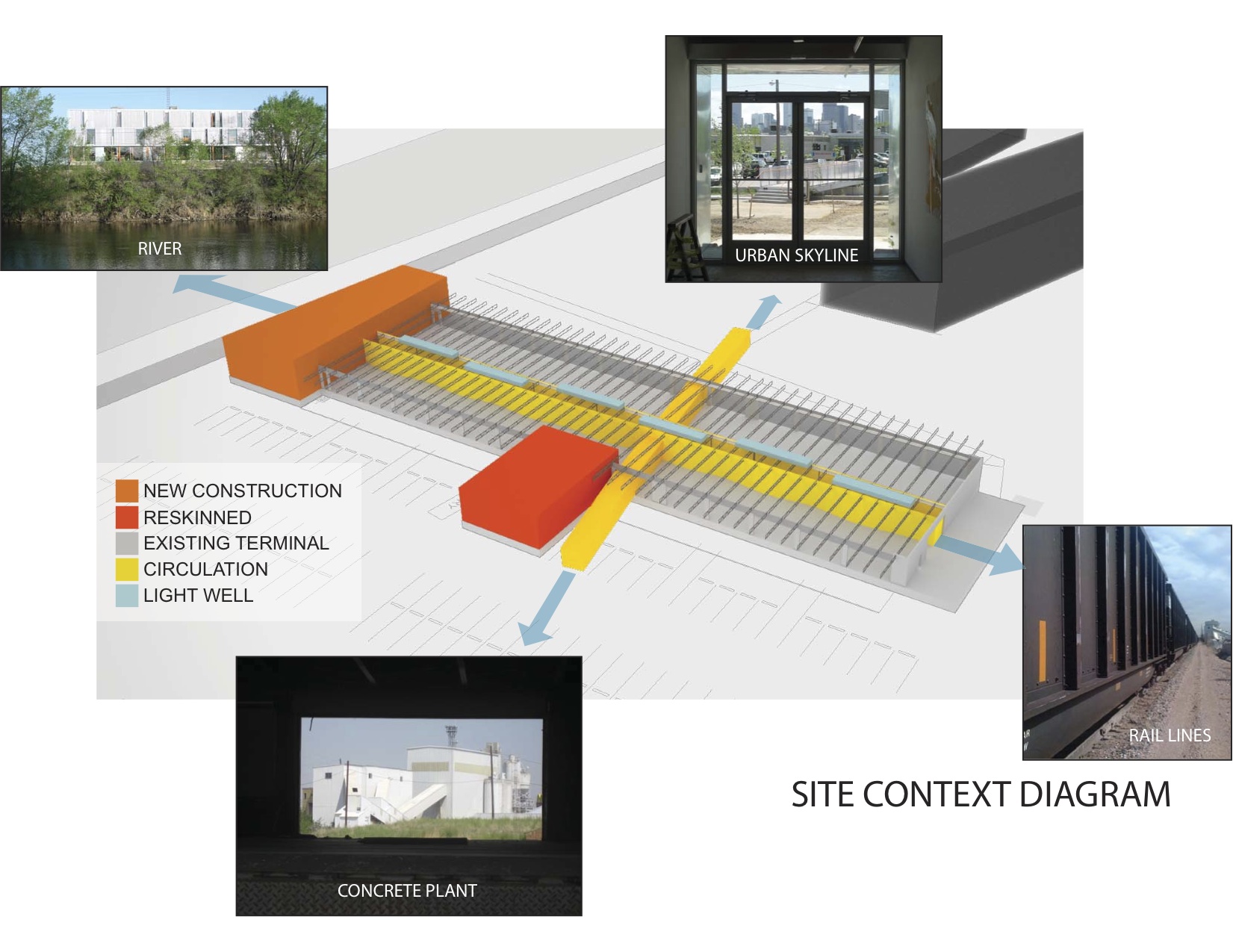
The goal of this transformation of a derelict freight terminal was to provide flexible tenant space with amenities such as common social spaces to lure “new economy” businesses to an abandoned industrial zone north of downtown Denver. The Denver warehouse redevelopment project, located between river and rail lines, is the most recent phase of a development that includes new and renovated structures that look to create a new workplace that uses architecture to foster interaction and create a culture of innovation.
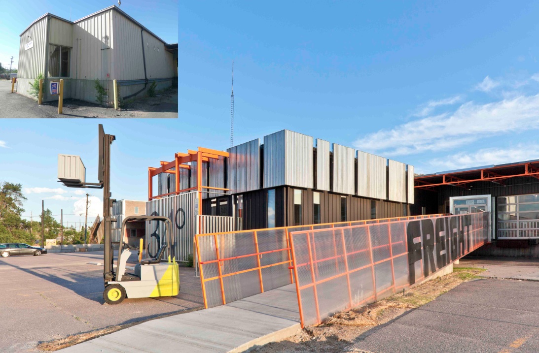
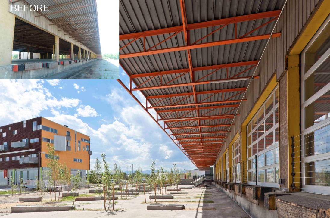
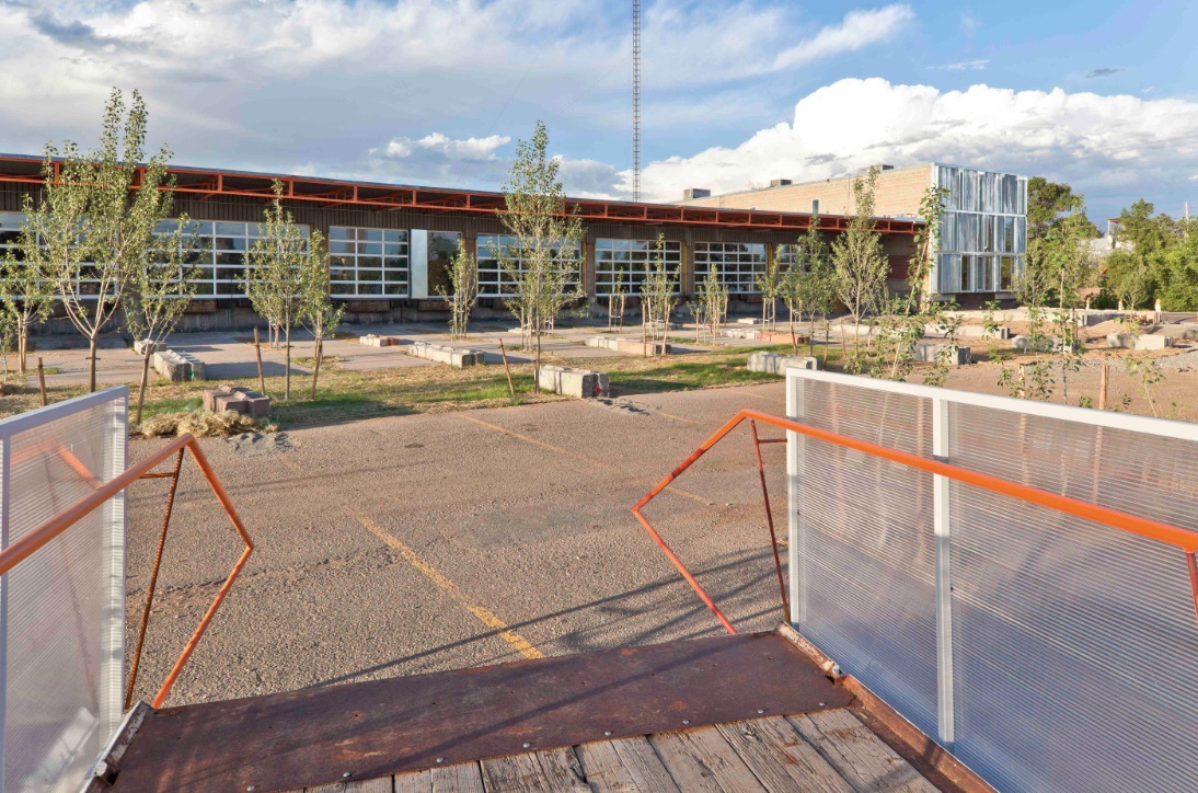
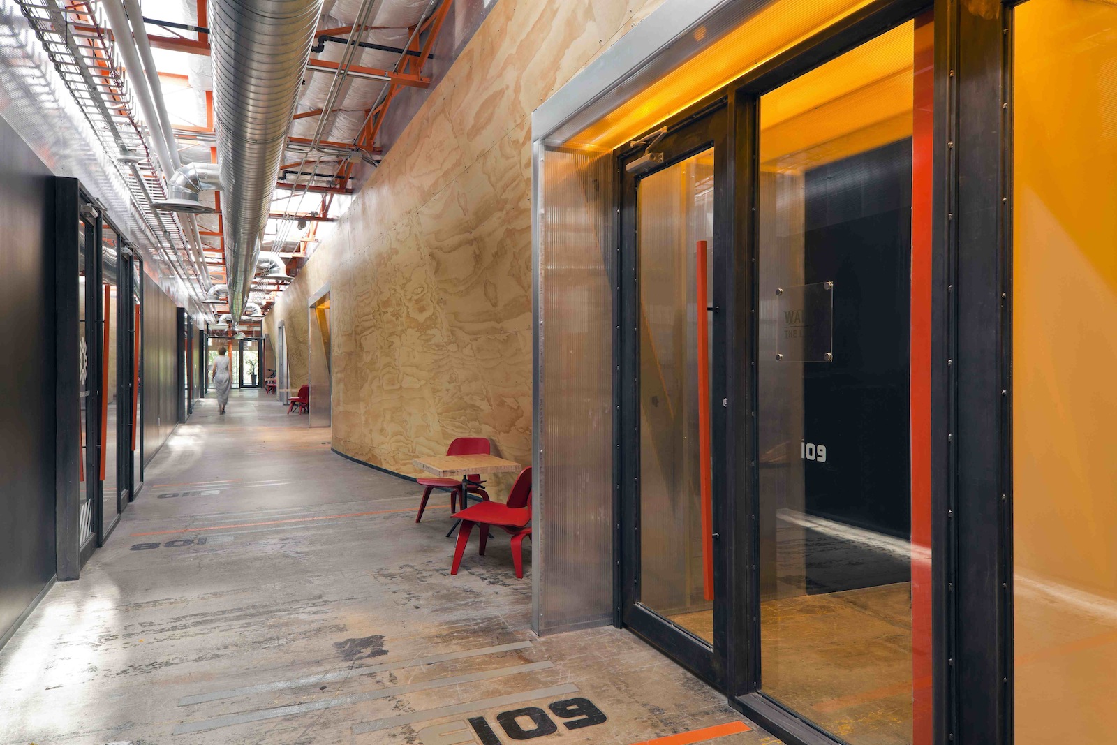
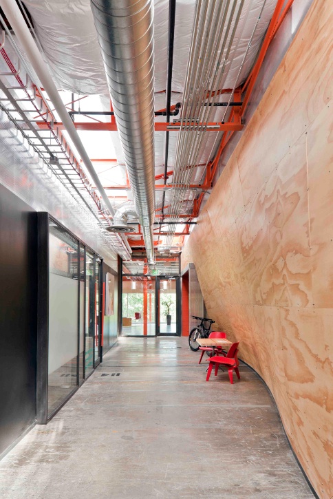
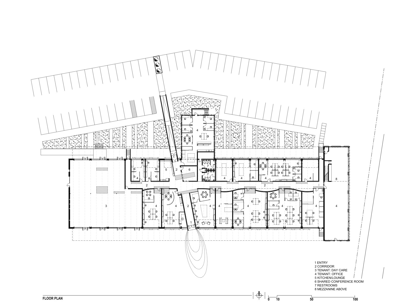
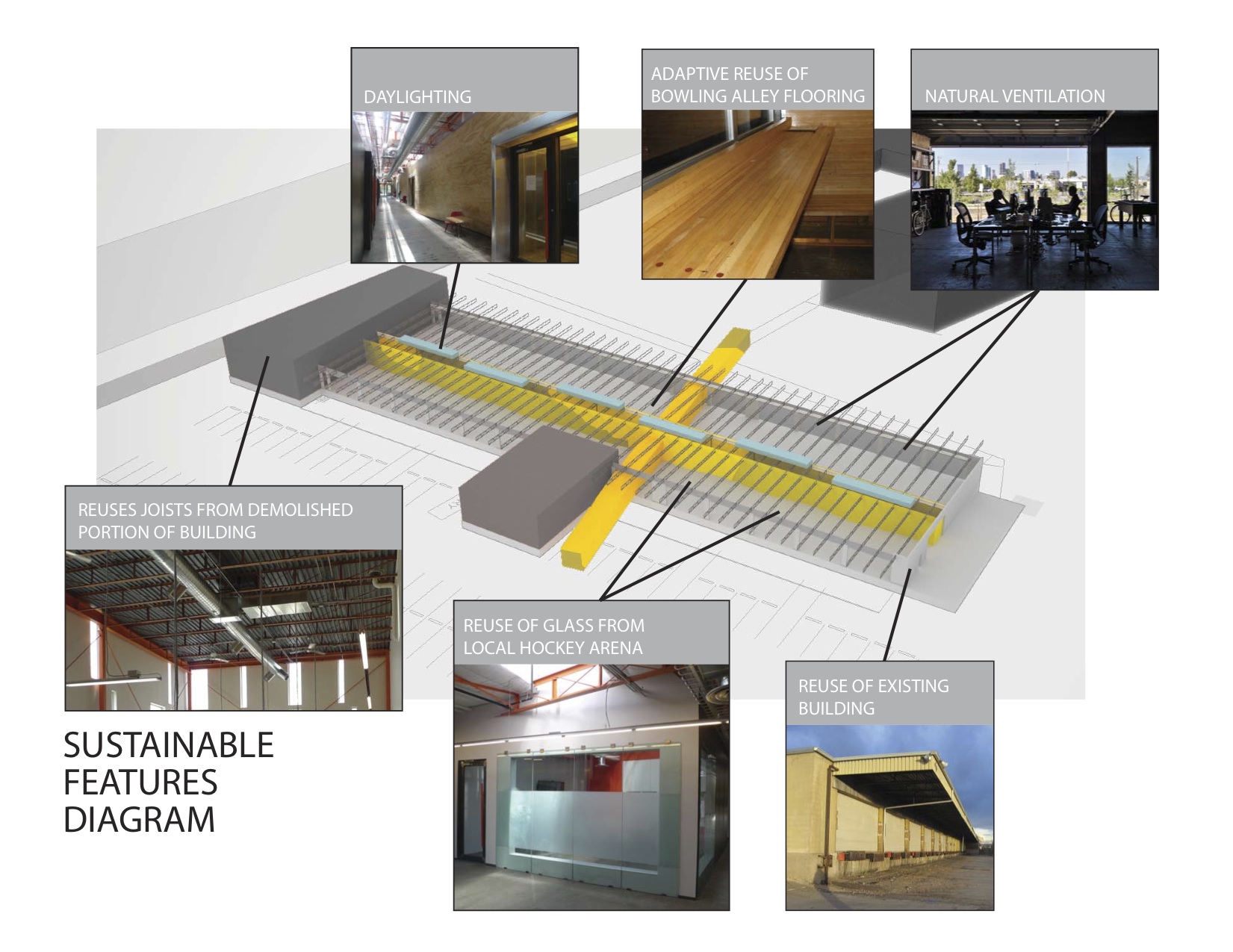
The reuse preserves the carcass of the freight terminal, with its deep overhangs and garage bay openings, and inserts new elements to contrast old. Original paint and markings are left intact with new glass overhead doors that allow offices to open to the landscape. An internal skylit “street” and sculptural plywood ribbon wall punctuated with luminous entries provides internal circulation. The main entrance slices through the building, axially connecting the entry experience to the larger site and the urban skyline beyond.
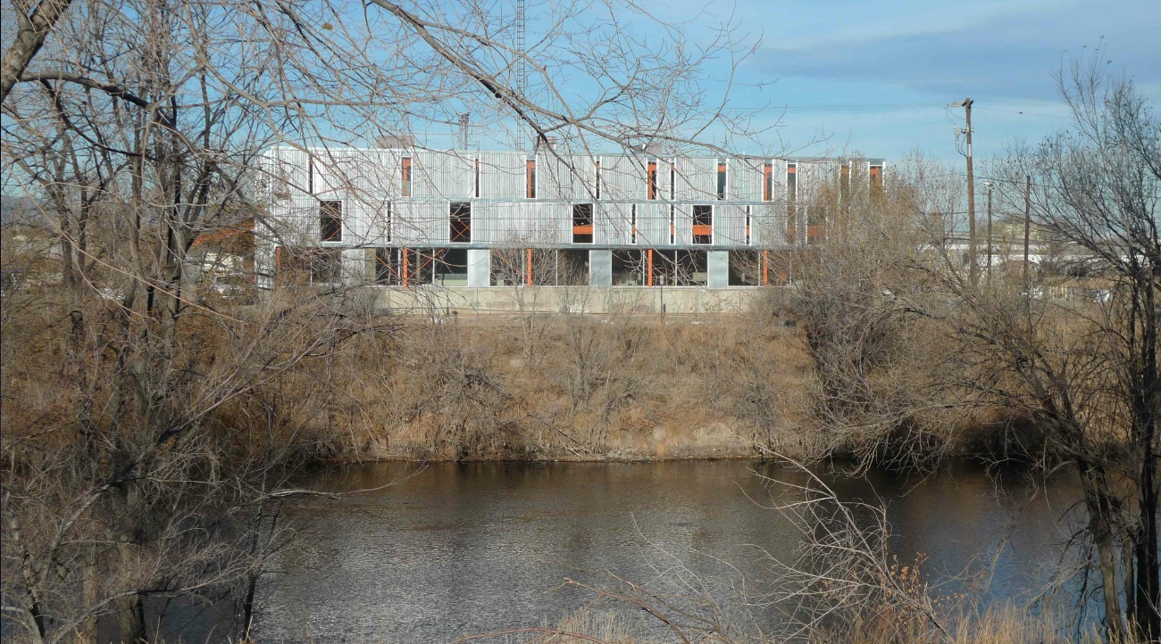
Outside, an existing metal shed projecting north was re-imaged. The new portion of the building along the river took inspiration from the movement of rail and containers, and uses trusses from the traditional administrative component at the head of the terminal that had been razed. A ghosting of the former truck dock pattern extends as adjacent landscape pattern.
Tenant spaces were arranged from a kit of industrial components and materials included reused glass panels from a hockey rink as internal partitions, salvaged bowling alley floors for benches, tables and counters, and industrial shelves in a variety of configurations to conform to a challenging budget. “International Orange” enlivens structural components throughout.
Client: Zeppelin Places
Architect: Stephen Dynia Architects
Site area: 4 acres
Gross Floor area: 29,000 sf
Location: Denver
Photos: Ron Johnson
Related Stories
| Apr 12, 2011
American Institute of Architects announces Guide for Sustainable Projects
AIA Guide for Sustainable Projects to provide design and construction industries with roadmap for working on sustainable projects.
| Apr 11, 2011
Wind turbines to generate power for new UNT football stadium
The University of North Texas has received a $2 million grant from the State Energy Conservation Office to install three wind turbines that will feed the electrical grid and provide power to UNT’s new football stadium.
| Apr 8, 2011
SHW Group appoints Marjorie K. Simmons as CEO
Chairman of the Board Marjorie K. Simmons assumes CEO position, making SHW Group the only firm in the AIA Large Firm Roundtable to appoint a woman to this leadership position
| Apr 5, 2011
Zaha Hadid’s civic center design divides California city
Architect Zaha Hadid is in high demand these days, designing projects in Hong Kong, Milan, and Seoul, not to mention the London Aquatics Center, the swimming arena for the 2012 Olympics. But one of the firm’s smaller clients, the city of Elk Grove, Calif., recently conjured far different kinds of aquatic life when members of the City Council and the public chose words like “squid,” “octopus,” and “starfish” to describe the latest renderings for a proposed civic center.
| Apr 5, 2011
Are architects falling behind on BIM?
A study by the National Building Specification arm of RIBA Enterprises showed that 43% of architects and others in the industry had still not heard of BIM, let alone started using it. It also found that of the 13% of respondents who were using BIM only a third thought they would be using it for most of their projects in a year’s time.


