In an environment where the chief task is to heal the sick and injured, color matters for both patients and healthcare personnel. In the report, “The Application of Color in Healthcare Settings,” by the Center for Health Design (CHD), healthcare design experts point to the influence of color in a variety of environments within healthcare facilities. From bright, open-air lobbies to neutral-toned operating rooms, there are many spaces where carefully selecting color can maximize comfort for occupants.
About the Report
“The Application of Color in Healthcare Settings” serves as a reference for architects and designers with regards to the application of color to healthcare spaces. Released October 2012 by The Center for Health Design, the report looks at studies of color in a variety of healthcare settings and offers insight on applicable color topics.
Authors:
Sheila J. Bosch, LEED AP, EDAC, Director of Research at Gresham, Smith, and Partners;
Rosalyn Cama, FASID, EDAC, President and Principal of CAMA Inc.
Eve Edelstein, Assoc. AIA, EDAC, F-AAA, President of Innovative Design Science
Jain Malkin, CID, AAHID, EDAC, President of Jain Malkin Inc.
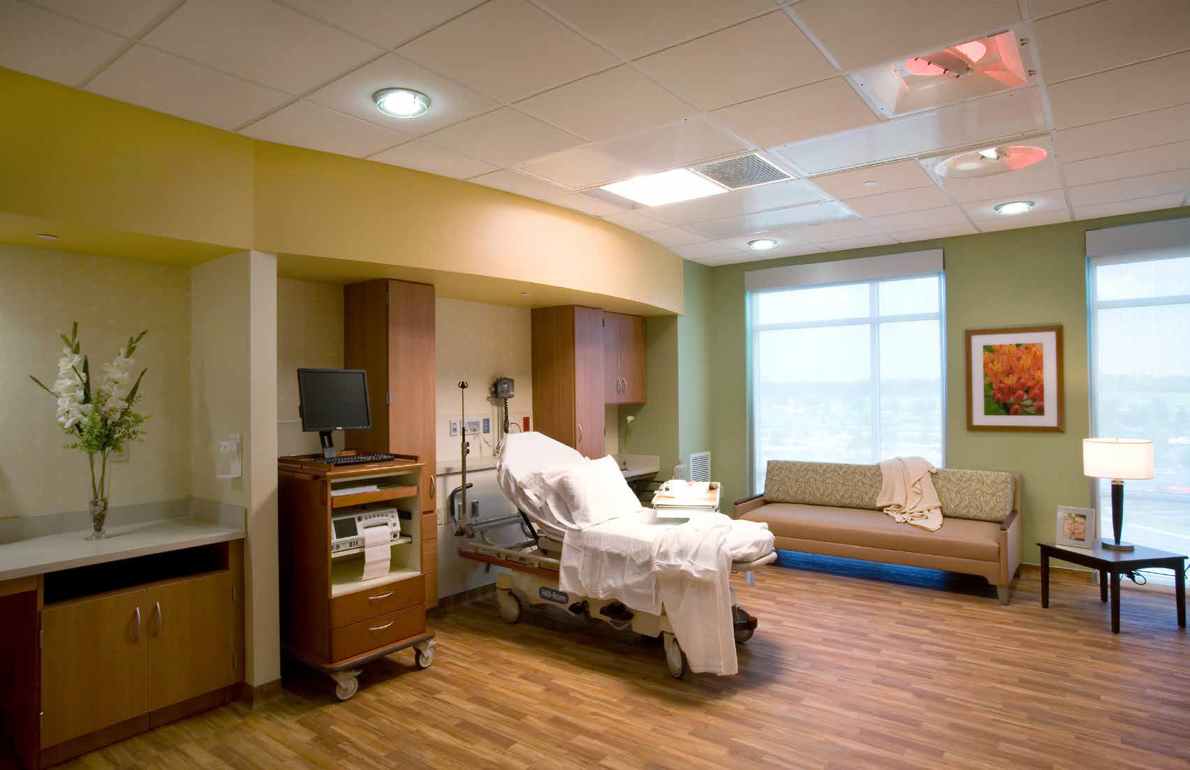
1. Patient rooms: Make patients feel at home
There lacks a universally accepted consensus that colors can actually “help” patients heal, according to the study’s authors. Nevertheless, colors will be used to evoke certain emotions or moods. In a 1994 study of 68 subjects, all patients indicated a preference for lighter hues for their rooms—from the ceilings and floors to the furniture and linens.
Neutral palettes with soft natural tones work best for patient rooms and can have a hand in calming patients and their family members faced with the stress of having an ill loved one, according to the study. Avoid using palettes with strongly contrasting colors in these spaces, as they are known to cause strain for occupants.
Similar design considerations should be made where patients and their family members will spend time, such as waiting areas in emergency departments.
2. Employee spaces: Increase comfort for doctors and nurses
Professionals providing the care in healthcare environments are known for working long, stressful shifts, standing for hours on end. They need places of respite to rest and recharge. Brightly lit rooms with stronger color palettes can help those needing a quick break to stay fresh and lively. Darker, subtler break rooms with softer lighting are preferred by many workers looking to rest for longer periods of time.
3. Operating rooms: Neutralize the reds
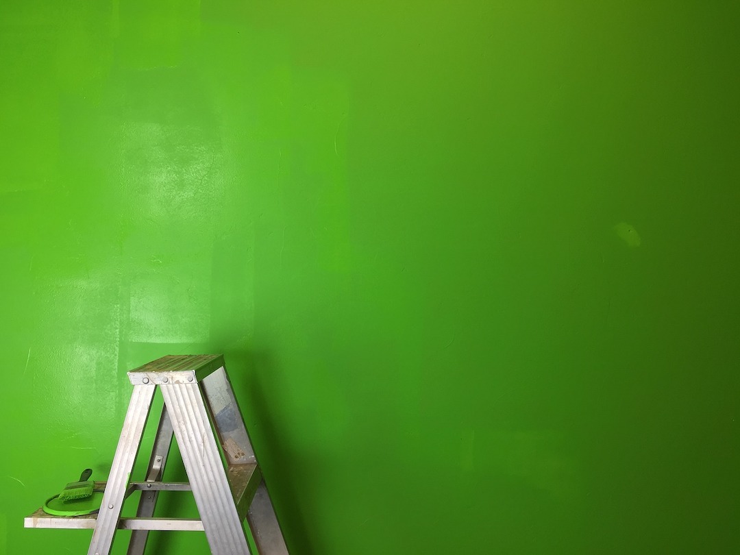
In the operating room, surgeons and surgical nurses are focused on one color: blood red. While white is traditionally seen as the institutional color of choice, more often than not operating rooms will require the use of blue or green on the walls to contrast against the red. (There’s a reason hospital scrubs are commonly colored blue or green.) Viewing one color for a specific amount of time will produce an image of a complementary color afterward (called afterimages), so it is best to avoid stark white backgrounds, say the authors. With white walls, surgeons would constantly see blue-green spots when looking away from the operating table.
4. Accommodations: Consider patient conditions and age
Children’s hospitals are often colorful and bright in their design to help pediatric patients feel at home during their stay. In contrast, nursing homes are softer and more neutral. With elderly populations, vision is changing and deteriorating, so greater contrast is needed to help guide patients through their rooms. Consider saturated colors over pastels, which can blur together in patients with poorer eyesight.
Take into account the medical conditions of certain patients. One example in the CHD report is jaundice, or yellowing of the skin. Doctors and nurses treating those with the condition may find difficulty while assessing patients if yellow and blue walls or surfaces are dominant.
5. Color psychology: Apply colors to different spaces
While there is no concrete scientific evidence supporting its effects, the use of color psychology can help enhance the function of a space or room. Natural colors, such as green, blue, or brown, are seen as calming, and can signal the designation of a room. Red, while a stimulating color especially for creative types, is often avoided in facilities that treat neurological conditions or patients suffering from ailments such as post-traumatic stress disorder.
Related Stories
| Aug 11, 2010
Walmart establishes sustainable product index to evaluate 'greeness' of products
Walmart today announced plans to develop a worldwide sustainable product index during a meeting with 1,500 of its suppliers, associates and sustainability leaders at its home office. The index will establish a single source of data for evaluating the sustainability of products.
| Aug 11, 2010
Manitoba Hydro Place, Tornado Tower among world's 'best tall buildings,' according to the Council on Tall Buildings and Urban Habitat
The Council on Tall Buildings and Urban Habitat last week announced the winners of its annual “Best Tall Building” awards for 2009, recognizing one outstanding tall building from each of four geographical regions: Americas, Asia & Australia, Europe, and Middle East & Africa. This year’s winners are: Manitoba Hydro Place, Winnipeg, Canada; Linked Hybrid, Beijing, China; The Broadgate Tower, London, UK; Tornado Tower, Doha, Qatar.
| Aug 11, 2010
Clark Group, Mortenson among nation's busiest state/local government contractors, according to BD+C's Giants 300 report
A ranking of the Top 40 State/Local Government Contractors based on Building Design+Construction's 2009 Giants 300 survey. For more Giants 300 rankings, visit /giants
| Aug 11, 2010
Report: Building codes and regulations impede progress toward uber-green buildings
The enthusiasm for super green Living Buildings continues unabated, but a key stumbling block to the growth of this highest level of green building performance is an existing set of codes and regulations. A new report by the Cascadia Region Green Building Council entitled "Code, Regulatory and Systemic Barriers Affecting Living Building Projects" presents a case for fundamental reassessment of building codes.
| Aug 11, 2010
Portland Cement Association offers blast resistant design guide for reinforced concrete structures
Developed for designers and engineers, "Blast Resistant Design Guide for Reinforced Concrete Structures" provides a practical treatment of the design of cast-in-place reinforced concrete structures to resist the effects of blast loads. It explains the principles of blast-resistant design, and how to determine the kind and degree of resistance a structure needs as well as how to specify the required materials and details.
| Aug 11, 2010
Jacobs, CH2M Hill, AECOM top BD+C's ranking of the 75 largest federal government design firms
A ranking of the Top 75 Federal Government Design Firms based on Building Design+Construction's 2009 Giants 300 survey. For more Giants 300 rankings, visit http://www.BDCnetwork.com/Giants
| Aug 11, 2010
AGC: Construction employment declines in 47 states in July
Few states were immune from construction employment declines this July based on an analysis of federal employment data released today by the Associated General Contractors of America. That analysis found that 47 states saw declines in construction employment, while only two states saw increases and one saw no change in construction employment between July 2008 and July 2009.
| Aug 11, 2010
New website highlights government tax incentives for large commercial buildings
Energy Retrofit Group (ERG), the subsidiary of 40-year-old, award-winning Adache Group Architects, Inc., has announced the creation of their new energy conservation web site: www.energy-rg.com.
| Aug 11, 2010
AGC: Construction unemployment reaches 19.2%
Unemployment in the construction sector climbed to a “horrendous” 19.2 percent (not-seasonally adjusted) as an additional 59,000 construction workers lost their jobs in May according to new federal data, said construction economist Ken Simonson today.


