Today, more than 40 million American adults suffer from a mental-health condition, and half of all chronic mental illness begins by the age of 14. Despite these overwhelming statistics, the negative stigmas associated with mental illness, combined with a scarcity of clinicians and facilities, resulted in over half of those with behavioral health conditions forgoing treatment last year.
This population is among the most marginalized in the U.S. healthcare system, but we are seeing more and better in- and out-patient and research facilities coming on line every day. What we know from recent post-occupancy evaluations and working closely with clinical staff is the critical role that design plays in removing the stigma associated with psychiatric care, normalizing the care environment, and improving patient outcomes.
Here are five ways design is transforming behavioral healthcare:
1. Transparency fosters de-stigmatization. Behavioral health clinics and institutions have long been shrouded in secrecy, perpetuating a notion that it’s shameful to receive psychiatric care.
‘The negative stigmas associated with mental illness, combined with a scarcity of clinicians and facilities, resulted in over half of behavioral health conditions forgoing treatment last year.’
— Kari Thorsen, NCIDQ, LEED AP, ZGF
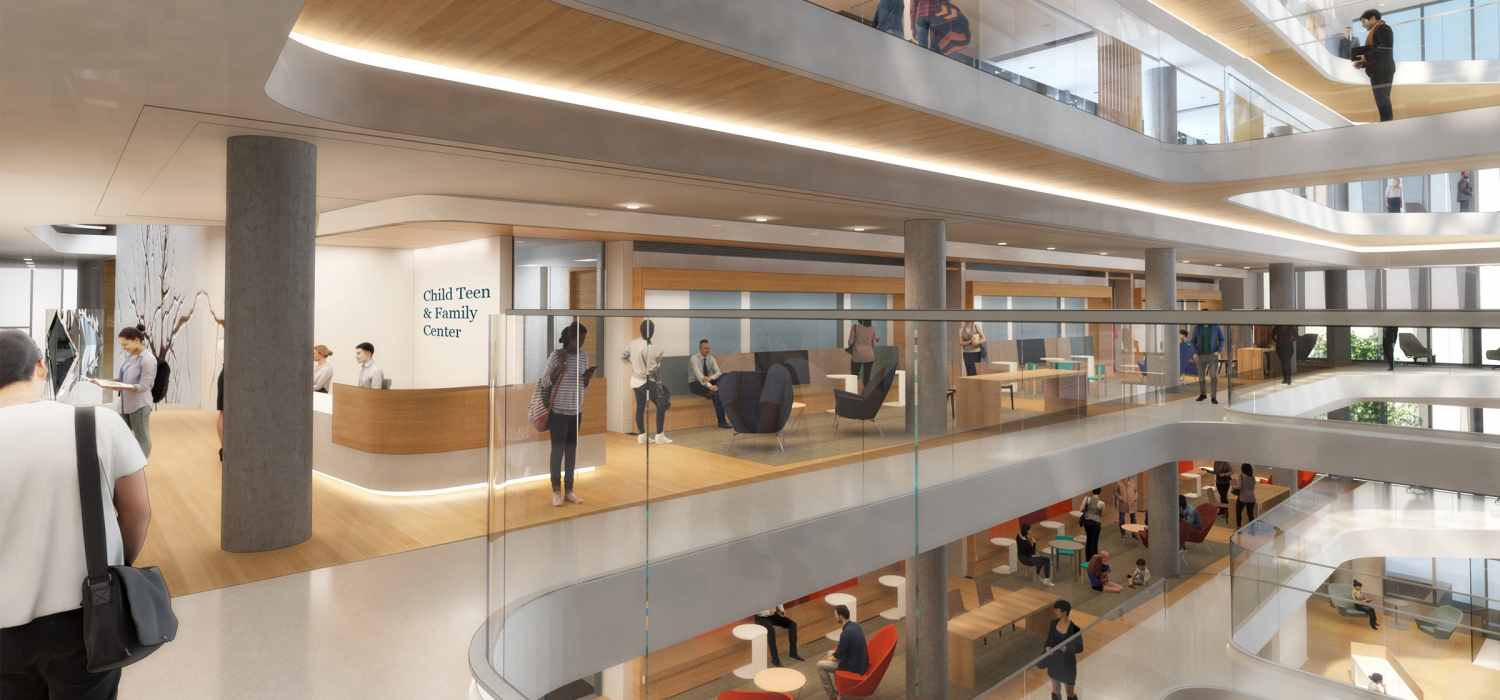
For outpatients, design changes like locating the waiting room in a central corridor can send a strong message that the patient is valued and that there’s no difference between walking into a psychiatric building and any other medical building where patients are at the center of the care experience.
For example, at the University of California, San Francisco (UCSF) Child, Teen & Family Center and Department of Psychiatry Building, patient waiting rooms are located adjacent to the central atrium in a highly visible corridor.
2. Materials that evoke comfort. Behavioral and mental health facilities are often associated with institutional elements such as sterile white walls, endless linoleum hallways, and glass partitions. Conjuring images of “One Flew Over the Cuckoo’s Nest” is not uncommon.
A recent post-occupancy evaluation at the renovated Swedish Medical Center-Ballard’s Behavioral Health Unit (BHU) in Seattle found that the use of engaging colors and textures in the communal spaces are perceived as soothing and linked to positive patient experiences.
To further de-stigmatize the unit’s physical environment, existing structural columns were transformed with glass tile that feature colors and textures evoking the natural environment of the Pacific Northwest. This marks a departure from the design of older behavioral units, where columns were often wrapped in concrete and painted, leaving grooves, steel housings, and fixtures exposed.
Incorporating the use of wood, fabrics, wall coverings, and even ceramic tile—all familiar materials found in homes—into the design of inpatient and outpatient facilities can support feelings of comfort and sophistication.
3. Circadian lighting regulates calming. A growing body of research shows that tunable LED lighting—also known as circadian lighting—can support positive behaviors outcomes in settings ranging from healthcare to education. The POE findings at BHU revealed that circadian lighting in the unit’s common areas had a calming effect on patients.
This is particularly noteworthy because the unit was built within two existing hospital floors that receive little natural daylight. The circadian lighting helps synchronize patients’ natural sleep-wake rhythms, marking the passage of time and providing a sense of calm as the day winds down.
4. Naturescapes reduce anxiety. Design interventions that expose occupants to natural daylight and nature themes can reduce anxiety while also supporting an environment of safety and normalcy. At UCSF, environmental graphics referencing tree roots that grow and intertwine like neurons in the brain are intended to spur optimism and curiosity in patients that range from child to adult.
5. Design supports safety. Unlike other inpatient settings, behavioral health patients spend considerable time in commons areas with other patients and staff. Designing for visibility in corridors, common areas, group rooms, and activity rooms supports safety—as can designing for interventions that place barriers between patients and staff. At Swedish Ballard, a custom-milled, solid-surface reception desk functions as an art installation, but doubles as a barrier between patients and staff when needed.
Related Stories
| Oct 30, 2013
11 hot BIM/VDC topics for 2013
If you like to geek out on building information modeling and virtual design and construction, you should enjoy this overview of the top BIM/VDC topics.
| Oct 28, 2013
Urban growth doesn’t have to destroy nature—it can work with it
Our collective desire to live in cities has never been stronger. According to the World Health Organization, 60% of the world’s population will live in a city by 2030. As urban populations swell, what people demand from their cities is evolving.
| Oct 18, 2013
Meet the winners of BD+C's $5,000 Vision U40 Competition
Fifteen teams competed last week in the first annual Vision U40 Competition at BD+C's Under 40 Leadership Summit in San Francisco. Here are the five winning teams, including the $3,000 grand prize honorees.
| Oct 18, 2013
Researchers discover tension-fusing properties of metal
When a group of MIT researchers recently discovered that stress can cause metal alloy to fuse rather than break apart, they assumed it must be a mistake. It wasn't. The surprising finding could lead to self-healing materials that repair early damage before it has a chance to spread.
| Oct 14, 2013
The next level of Lean process for healthcare
Most hospitals have begun the Lean process improvement stage to eliminate waste, reduce travel distances, and minimize inventory, with varying levels of success. Here are three keys to creating a prosperous Lean program.
| Sep 24, 2013
8 grand green roofs (and walls)
A dramatic interior green wall at Drexel University and a massive, 4.4-acre vegetated roof at the Kauffman Performing Arts Center in Kansas City are among the projects honored in the 2013 Green Roof and Wall Awards of Excellence.
Sponsored | | Sep 23, 2013
Nichiha USA panels provide cost savings for community project
When tasked with the design and development of a newly constructed Gateway Rehabilitation Center, architects at Rothschild Doyno Collaborative first designed the new center to include metal panels. When the numbers came back, they were challenged with finding a product that would help cut costs and keep them within the construction budget. Nichiha’s fiber cement panels come in a half or less of the metal panel cost.
Sponsored | | Sep 23, 2013
HKS leverages Revu and Bluebeam Studio for IPD on the Banner Health MD Anderson Health Center project
Read how HKS is working collaboratively with all project partners and streamlining information flow using Bluebeam Revu and Bluebeam Studio to digitize communication and deliver the facility using IPD.
| Sep 19, 2013
What we can learn from the world’s greenest buildings
Renowned green building author, Jerry Yudelson, offers five valuable lessons for designers, contractors, and building owners, based on a study of 55 high-performance projects from around the world.
| Sep 19, 2013
6 emerging energy-management glazing technologies
Phase-change materials, electrochromic glass, and building-integrated PVs are among the breakthrough glazing technologies that are taking energy performance to a new level.


