As more time and money is devoted to neonatal and pediatric research, evidence-based design is playing an increasingly crucial role in the development of healthcare facilities for children. The Center for Health Design’s Knowledge Repository is an excellent storehouse of relevant research and resources on pediatric and neonatal topics.
The Facility Guidelines Institute has updated its hospital and outpatient facilities guidelines for 2014, adding the Safety Risk Assessment, as well as additional and updated design guidance that reflects the impact of lighting and acoustics on healthcare environments. The Guidelines for Design and Construction of Health Care and Outpatient Facilities are due out in early 2014 and available at www.fgiguidelines.org.
For the children and families who will be occupying these spaces, creating facilities that promote healing while offering a safe, comfortable environment is vital. The following are six important factors Provider, Design, and Construction Teams should consider when designing pediatric healthcare facilities:
1. Lighting + Acoustics—Tone it down
From neonates to teenagers, pediatric patients are different from adults in that their bodies are constantly growing and adapting to the world around them. For a child spending much of his or her days in a hospital setting, the constant exposure to indoor lighting is not healthy for still-developing eyes.
In pediatric design, it’s important to consider the user of the space. What may seem ideal from an engineering standpoint may not be practical for young patients and their families. An older eye is going to perceive light differently than a younger eye when rendering color and pattern. Allowing the patient to control lighting levels is crucial to patient-centered care.
Researchers have found that potential damage can result from children not being able to acclimate to the natural day/night cycle. Pediatric facilities now employ cycled lighting to account for the development of circadian rhythms (the biological change from day to night).
The Rady Children’s Hospital in San Diego is an example of a facility on the cutting edge of pediatric design. At night, stars appear on the ceiling—a decorative lighting element used to make the unit feel like a nighttime space.
As for acoustics, the noises associated with hospitals (especially at night) can disrupt the sleep of younger patients, hindering the healing process. Noisy hospital environments have also been known to lead to medical errors (such as incorrect medication dosages), by clinical staff.
Some hospitals utilize a “Yacker Tracker,” which was originally developed for use in educational settings. It looks like a stoplight: red, yellow, and green. When noise levels raise too high, reaching yellow or red, it is an indication to the nurse manager that voices and activity (particularly at night) need to be reduced.
2. Privacy—Options for companionship
Privacy and acoustics are closely related, as noise levels can vary based on the number of people in a room. Research in this area shows that patients, parents, and caregivers are more likely to be forthcoming to medical staff when they know others cannot overhear them.
The benefits of private rooms tend to vary based on a number of factors. Pediatric cancer patients, for example, might benefit from and desire the companionship of a roommate with a similar diagnosis and care plan. Patients recovering from an injury, on the other hand, may prefer healing alone. This should be taken into account when designing patient rooms for potential flexible and adaptable configurations, based on the care population and care model.
3. Positive Distraction—Not just pretty pictures
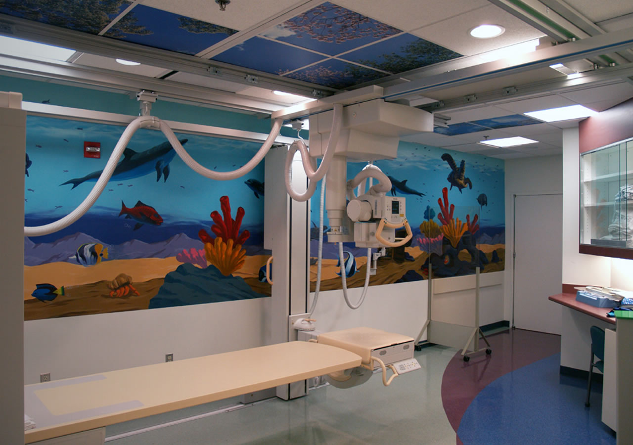
The concept of positive distraction extends beyond artwork to broader design themes that incorporate wayfinding and healing elements.
Simplifying the navigation around a hospital can help relieve some of the anxiety that accompanies a medical visit. Using clear wayfinding devices that incorporate “big person” and “little person” versions of the same element can be fun for children while alleviating stress for their parents.
For example, providing animal characters at a child’s height that are tactile, recognizable, and consistent from space to space on the same floor assists children in finding their way in a fun and entertaining way. Graphics, themes, and landmarks—like an indoor tree or a magical mobile or sculpture—are other ways to add a sense of wonder to what can often be a scary environment.
Creating a connection between indoor spaces and the outdoor environment can also be a successful positive distraction. Windows provide a view to the outdoors but also help remove patients from the often-clinical feeling of the hospital environment. This helps to restore homeostasis by providing the horizon as a reference and also has a positive impact on the healing process.
Common play areas for patients and families to interact can be a source of healing and distraction for children and their families. Siblings have something to do while parents are participating in the care of the patient.
4. Infection Control—Clean where it counts
Provider, Design, and Construction Teams need to think through how infection control measures shall be included during construction, as well as how to integrate them into maintenance procedures. It is recommended to clean using “touch points” as part of the protocol, such as a light switch, door handles, bed rails, chair arms, and other surfaces that come into contact with hands. From cell phone and tablet screens to bed controls and call buttons, the many devices being used in today’s healthcare units are primarily controlled by touch, which is the easiest way to transmit infection. Hand washing is still the most effective way to control the spread of infection.
The Dr. Carling Method includes the utilization of UV markers on touch points, which allowed the cleaning of touch points to be tracked with the use of a black light. Once staff was retrained to clean touch points, infection rates decreased.
5. Furnishings—Maximizing flexibility
When planning healthcare units, space is always at a premium, trying to accomplish multiple zones within patient rooms while minimizing square footage and cost. For that reason, furnishings must be compact, yet flexible enough to serve a number of purposes. They also must adapt to the needs of each particular patient.
Pediatric units must be fit to serve children of all ages. The care plan for a five-year-old will be different from that of a 15-year-old. Provider, Design, and Construction Teams must take the varying treatment scenarios into consideration when specifying furnishings for a unit. Creating a space that is adaptable to a variety of circumstances can help save costs and precious floor space.
Pediatric patients often have visitors at all hours of the day and at least one parent spending the night. To address this problem, one manufacturer offers a couch that can convert into two chairs and a table and can be easily made into a bed for overnight visitors. Talk about flexibility!
6. Surfaces—Seamless is best
In specifying floor materials, seamless surfaces are best, particularly where infection risk is highest, such as surgical areas. For sinks, solid surfaces with integral sink bowls minimize seams, contributing to infection control measures. Infection risk can also be minimized through careful selection of furnishings and materials. The less porous a surface, the easier it is to clean and maintain.
The common misconception among maintenance staff is that if something is shiny, it is clean. However, shiny does not equate with clean, as a non-waxed surface takes less water, chemicals, and down time than a highly polished waxed surface. Shiny floors create glare that can be distracting and contribute to falls, as shiny spots are often mistaken for wet areas. Design professionals should evaluate matte surfaces with a high coefficient of friction to reduce fall risk.
ABOUT THE AUTHOR
Jane Rohde, AIA, FIIDA, ACHA, AAHID, LEED AP, champions a widespread global cultural shift toward de-institutionalized senior living facilities through her consulting, sustainable approach, research, and advocacy, which provides services to nonprofit and for-profit developers, government agencies, and senior living and healthcare providers. She also provides education to providers, regulators, and peers on senior living and healthcare trends, programming, and design that supports and improves the lives of elders and patients.
Rohde’s consulting practice includes the promotion of person-centered environments, sustainability, and universal design solutions. She sits on the Environmental Standards Council, part of The Center for Health Design, and is the former AAHID Board of Regents VP. Her leadership has garnered the creation of the Facility Guidelines Institute’s Guidelines for Design and Construction of Residential Health, Care, and Support Facilities, a guideline utilized as code for the licensing of long-term care and related facility types.
This groundbreaking document includes guidance on not only traditional models but provides guidance for designers, regulators, and providers for creating person-centered environments. Rohde founded and chairs the Senior Living Sustainability Guide committee, a committed group of volunteers that created a sustainability guide for senior living projects that has been accessed for utilization in more than 10 countries, including China Senior Care, the first residential aged-care facility in China that focuses on skilled nursing and adult day care. Rohde speaks internationally on senior living, aging, healthcare, evidence-based design, and sustainability.
Related Stories
AEC Tech Innovation | Apr 27, 2023
Does your firm use ChatGPT?
Is your firm having success utilizing ChatGPT (or other AI chat tools) on your building projects or as part of your business operations? If so, we want to hear from you.
Concrete Technology | Apr 24, 2023
A housing complex outside Paris is touted as the world’s first fully recycled concrete building
Outside Paris, Holcim, a Swiss-based provider of innovative and sustainable building solutions, and Seqens, a social housing provider in France, are partnering to build Recygénie—a 220-unit housing complex, including 70 social housing units. Holcim is calling the project the world’s first fully recycled concrete building.
Multifamily Housing | Apr 21, 2023
Arlington County, Va., eliminates single-family-only zoning
Arlington County, a Washington, D.C., community that took shape in the 1950s, when single-family homes were the rule in suburbia, recently became one of the first locations on the East Coast to eliminate single-family-only zoning.
Architects | Apr 21, 2023
Architecture billings improve slightly in March
Architecture firms reported a modest increase in March billings. This positive news was tempered by a slight decrease in new design contracts according to a new report released today from The American Institute of Architects (AIA). March was the first time since last September in which billings improved.
Green | Apr 21, 2023
Top 10 green building projects for 2023
The Harvard University Science and Engineering Complex in Boston and the Westwood Hills Nature Center in St. Louis are among the AIA COTE Top Ten Awards honorees for 2023.
Multifamily Housing | Apr 19, 2023
Austin’s historic Rainey Street welcomes a new neighbor: a 48-story mixed-used residential tower
Austin’s historic Rainey Street is welcoming a new neighbor. The Paseo, a 48-story mixed-used residential tower, will bring 557 apartments and two levels of retail to the popular Austin entertainment district, known for houses that have been converted into bungalow bars and restaurants.
Design Innovation Report | Apr 19, 2023
Reinforced concrete walls and fins stiffen and shade the National Bank of Kuwait skyscraper
When the National Bank of Kuwait first conceived its new headquarters more than a decade ago, it wanted to make a statement about passive design with a soaring tower that could withstand the extreme heat of Kuwait City, the country’s desert capital.
Design Innovation Report | Apr 19, 2023
HDR uses artificial intelligence tools to help design a vital health clinic in India
Architects from HDR worked pro bono with iKure, a technology-centric healthcare provider, to build a healthcare clinic in rural India.
Design Innovation Report | Apr 19, 2023
Meet The Hithe: A demountable building for transient startups
The Hithe, near London, is designed to be demountable and reusable. The 2,153-sf building provides 12 units of business incubator workspace for startups.
Metals | Apr 19, 2023
Sherwin-Williams Coil Coatings releases new color forecast for architectural metal coatings
The Coil Coatings division of Sherwin-Williams has released its latest color forecast, FUSE, for architectural metal coatings. The report aims to inspire architects, product manufacturers and original equipment manufacturers (OEMs) in the coil and extrusion market over the next 3-5 years and beyond.


