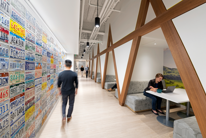
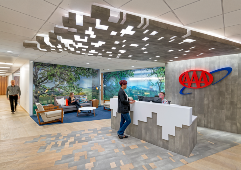
The new interior design of the 50,000-sf space for the American Automobile Association’s (AAA) Northern California, Nevada, and Utah headquarters includes collaborative spaces and attempts to embrace the atmosphere of a classic American road trip.
The building’s redesign, which was handled by HGA, includes the addition of custom Knoll workstations, a conference center, a café area with meeting areas, and a high-impact entryway. The theme of the “American road trip” was incorporated throughout the space.
The boardroom, for example, features a wood treatment that resembles tire tracks and a table with vintage hubcaps. Additionally, headlight light fixtures are found in the conference room and meeting nooks are inspired by 1970s rest areas. Commissioned photography featuring Northern California, Nevada, and Utah environments was made into window film to create the sensation of looking through a car window.
 Photo: HGA.
AAA wanted to new space to attract a younger clientele and workforce, while also retaining the employees they currently have. HGA found that many of the meetings that occur in the office involve four or fewer people, so the firm was able to save AAA substantial square footage and allot significantly more space for meetings by reducing the size of typical conference rooms that previously seated eight to 10 employees.
See Also: Telecommunications company’s remodeled headquarters makes use of its unique H shape
“We spent a significant amount of time upfront with AAA to find out what was working really well and what things could be improved,” says Melissa Pesci, Principal and Vice President at HGA, in a release. ““AAA had previously established a work environment that was incredibly supportive of focused work, but in an effort to attract a millennial workforce as well as better support and inspire the current employees, AAA wanted a space that was more balanced between offering this focused space in addition to a variety of dynamic collaboration spaces.”
Related Stories
| Aug 11, 2010
Top of the rock—Observation deck at Rockefeller Center
Opened in 1933, the observation deck at Rockefeller Center was designed to evoke the elegant promenades found on the period's luxury transatlantic liners—only with views of the city's skyline instead of the ocean. In 1986 this cultural landmark was closed to the public and sat unused for almost two decades.
| Aug 11, 2010
200 Fillmore
Built in 1963, the 32,000-sf 200 Fillmore building in Denver housed office and retail in a drab, outdated, and energy-splurging shell—a “style” made doubly disastrous by 200 Fillmore's function as the backdrop for a popular public plaza and outdoor café called “The Beach.
| Aug 11, 2010
Integrated Project Delivery builds a brave, new BIM world
Three-dimensional information, such as that provided by building information modeling, allows all members of the Building Team to visualize the many components of a project and how they work together. BIM and other 3D tools convey the idea and intent of the designer to the entire Building Team and lay the groundwork for integrated project delivery.
| Aug 11, 2010
Inspiring Offices: Office Design That Drives Creativity
Office design has always been linked to productivity—how many workers can be reasonably squeezed into a given space—but why isn’t it more frequently linked to creativity? “In general, I don’t think enough people link the design of space to business outcome,” says Janice Linster, partner with the Minneapolis design firm Studio Hive.
| Aug 11, 2010
Great Solutions: Products
14. Mod Pod A Nod to Flex Biz Designed by the British firm Tate + Hindle, the OfficePOD is a flexible office space that can be installed, well, just about anywhere, indoors or out. The self-contained modular units measure about seven feet square and are designed to serve as dedicated space for employees who work from home or other remote locations.


