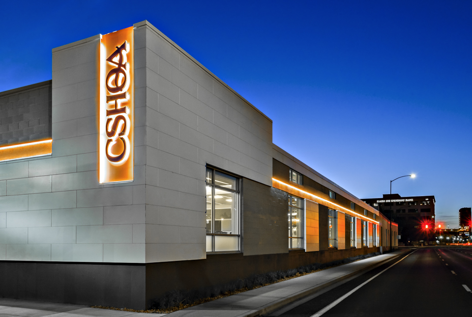
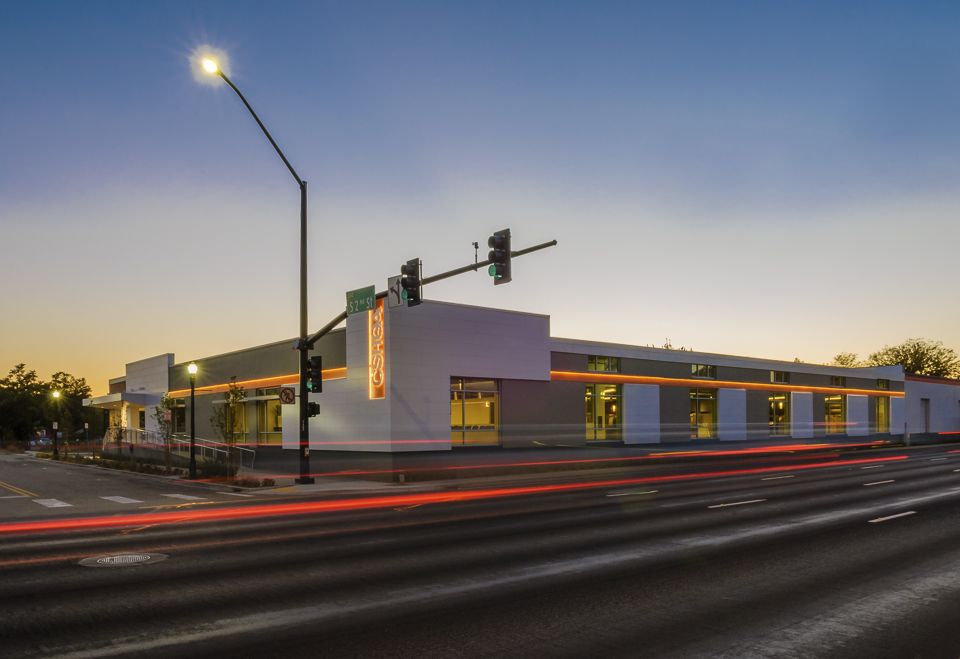
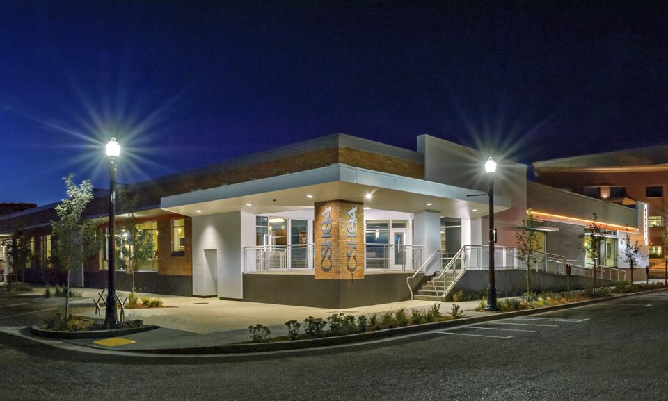
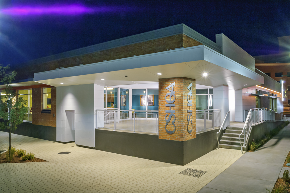
When it came time for CSHQA, an award-winning, full-service architecture and engineering firm, to move office locations, they didn’t need to look far. The 20,000-square-foot warehouse was not only a mere three blocks away, its renovation would be an ideal demonstration piece to show existing and potential clients how a building can be updated without changing its historic nature and while respecting the surrounding area architecturally.
Built in 1959, the building was originally used as storage for the rail lines that once ran along Front Street adjacent to the building. The interior space, although smaller, occupies only one floor—unlike the three floors in their previous location—allowing for closer collaboration of employees. The interior design philosophy was to expose the original wood ceiling composed of 10x26 solid timber beams and joists, and and to add 14 new skylights to create uniform interior light levels and reduce energy use. The existing interior columns, 10” diameter concrete, were refurbished and many were left exposed. In keeping with the vintage feel, reclaimed timber was used for some of the interior woodwork as well as frames for artwork.
In addition, the design takes into account several building efficiencies, including the connection to the city’s geothermal system for radiant floor heating throughout the space. The same radiant system is used to cool the space in the summer. Other sustainability upgrades include extensive daylight harvesting with integrated automated lighting and dimming systems, the use of LED fixtures, sustainable landscaping and on-site storm water management, low-use water fixtures, covered bicycle storage, and preferred parking for fuel-efficient vehicles. The building is targeting LEED Platinum and Green Globes certifications. If achieved, the CSHQA office will be the first LEED Platinum office renovation in Idaho.
CHALLENGE
Find an exterior technology that understood the design and aesthetic goals while also contributing to the building’s LEED Platinum certification.SOLUTION
The Illumination Series Panels, in a custom cool white color, and Smooth NichiBoard to ensure a clean, flawless exterior look.RESULT
The Nichiha panels provided the client design flexibility to modernize the historic building and the first large-scale use of fiber cement panels in the area.
Like many urban areas, Boise is seeing quite a bit of transition in its downtown core. Amidst the tear-downs and new structures, this warehouse renovation was a chance for CSHQA to showcase something new out of something old. With that in mind, the team specified Nichiha’s Illumination Series panels and Smooth NichiBoard to ensure a clean, flawless look on the exterior. The building called for a specific color match, a cool white, to match the sheet metal coping at the top of the new walls.
Another selling point: a built-in ventilated rainscreen system, unique to Nichiha panels, that eliminates the threat of trapped moisture.
“One of the many goals of the building renovation was to explore different technologies and showcase them within and on the building,” says Ted Isbell, AIA, LEED AP BD+C, a senior associate at CSHQA. “We looked at several exterior wall cladding systems, including metal, wood, ACP panels, phenolic resin panels, and fiber cement. Nichiha worked with us to understand our goals.”
Nichiha panels on the CSHQA warehouse were the first large-scale use of fiber cement panels in the Boise area. The panels provided flexibility to work with different design decisions, while modernizing the historic building.
“It completely changed the look of the building,” said Mandie Brozo, project manager at CSHQA, noting that the clean look of the panels has attracted the attention of the real estate community. “Before the renovation, the building was anonymous, no one ever remembered it, and now people are noticing; it’s like a new building.”
For more information about Illumination and other Nichiha products, please visit: www.nichiha.com.
Architect: CSHQA
Location: Boise, Idaho
Project type: Historic remodel
Product: Illumination Series
Project features:
- Smooth, satin finish
- Virtually limitless color palette
- Easy installation
- Low maintenance
- 40% recycled content
Related Stories
| May 11, 2011
DOE releases guide for 50% more energy-efficient office buildings
The U.S. Department of Energy today announced the release of the first in a new series of Advanced Energy Design Guides to aid in the design of highly energy efficient office buildings. The 50% AEDG series will provide a practical approach to commercial buildings designed to achieve 50% energy savings compared to the commercial building energy code used in many areas of the country.
| May 10, 2011
Google hires Ingenhoven Architects to design new Mountain View office
The current Googleplex is straining at the seams and yet the company is preparing its biggest hiring surge ever, so Google decided now’s the time to build its own office space—a first for the Internet giant. The company hired Ingenhoven Architects, a German firm that specializes in sustainable architecture, to create plans for what could be a 600,000-sf office.
| Apr 13, 2011
Office interaction was the critical element to Boston buildout
Margulies Perruzzi Architects, Boston, designed the new 11,460-sf offices for consultant Interaction Associates and its nonprofit sister organization, The Interaction Institute for Social Change, inside an old warehouse near Boston’s Seaport Center.
| Apr 13, 2011
Red Bull Canada HQ a mix of fluid spaces and high-energy design
The Toronto architecture firm Johnson Chou likes to put a twist on its pared-down interiors, and its work on the headquarters for Red Bull Canada is no exception. The energy drink maker occupies 12,300 sf on the top two floors of a three-story industrial building in Toronto, and the design strategy for its space called for leaving the base building virtually untouched while attention was turned to the interior architecture.
| Apr 13, 2011
Former department store gets new lease on life as MaineHealth HQ
The long-vacant Sears Roebuck building in Portland, Maine, was redeveloped into the corporate headquarters for MaineHealth. Consigli Construction and local firm Harriman Architects + Engineers handled the 14-month fast-track project, transforming the 89,000-sf, four-story facility for just $100/sf.
| Mar 29, 2011
Chicago’s Willis Tower to become a vertical solar farm
Chicago’s iconic Willis Tower (formerly the Sears Tower) is set to become a massive solar electric plant with the installation of a pilot solar electric glass project.
| Mar 29, 2011
Read up on Amazon.com's new green HQ
Phase IV of Amazon’s new headquarters in Seattle is nearly complete. The company has built 10 of the 11 buildings planned for its new campus in the South Lake Union neighborhood, and is on-track for a 2013 grand opening.
| Mar 11, 2011
Blockbuster remodel transforms Omaha video store into a bank
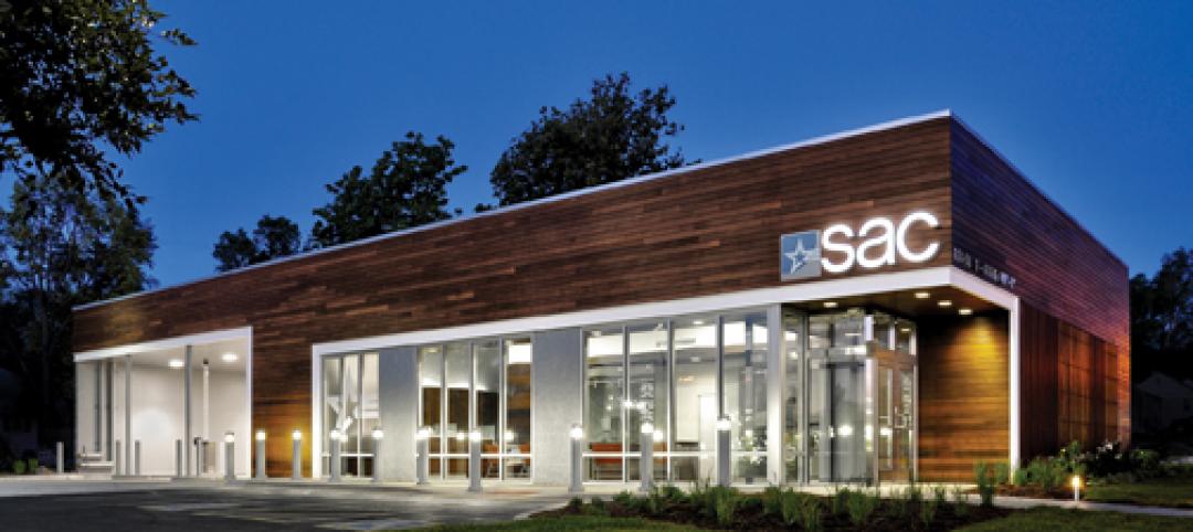
A former Hollywood Video store in Omaha, Neb., was renovated and repurposed as the SAC Federal Credit Union, Ames Branch. Architects at Leo A Daly transformed the outdated 5,000-sf retail space into a modern facility by wrapping the exterior in poplar siding and adding a new glass storefront that floods the interior with natural light.
| Mar 11, 2011
Chicago office building will serve tenants and historic church
The Alter Group is partnering with White Oak Realty Partners to develop a 490,000-sf high-performance office building in Chicago’s West Loop. The tower will be located on land owned by Old St. Patrick’s Church (a neighborhood landmark that survived the Chicago Fire of 1871) that’s currently being used as a parking lot.
| Mar 9, 2011
Hoping to win over a community, Facebook scraps its fortress architecture
Facebook is moving from its tony Palo Alto, Calif., locale to blue-collar Belle Haven, and the social network want to woo residents with community-oriented design.


