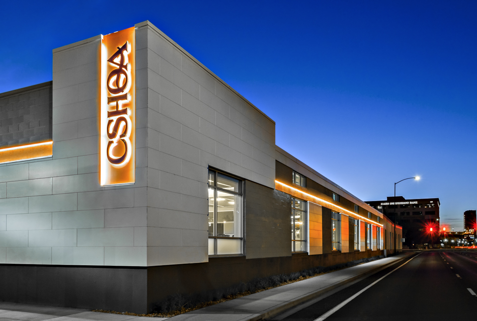
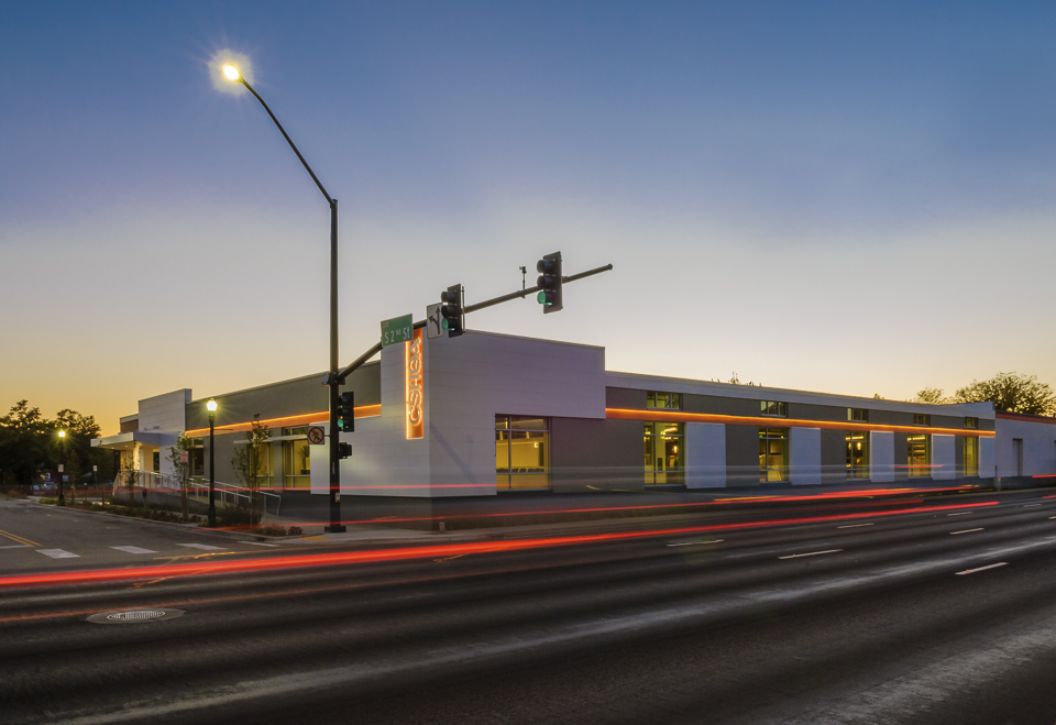
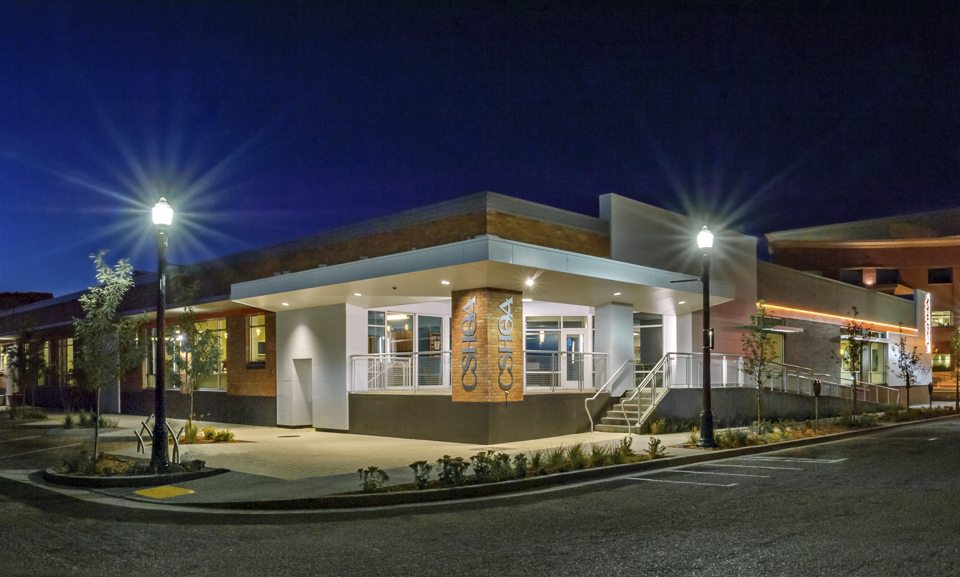
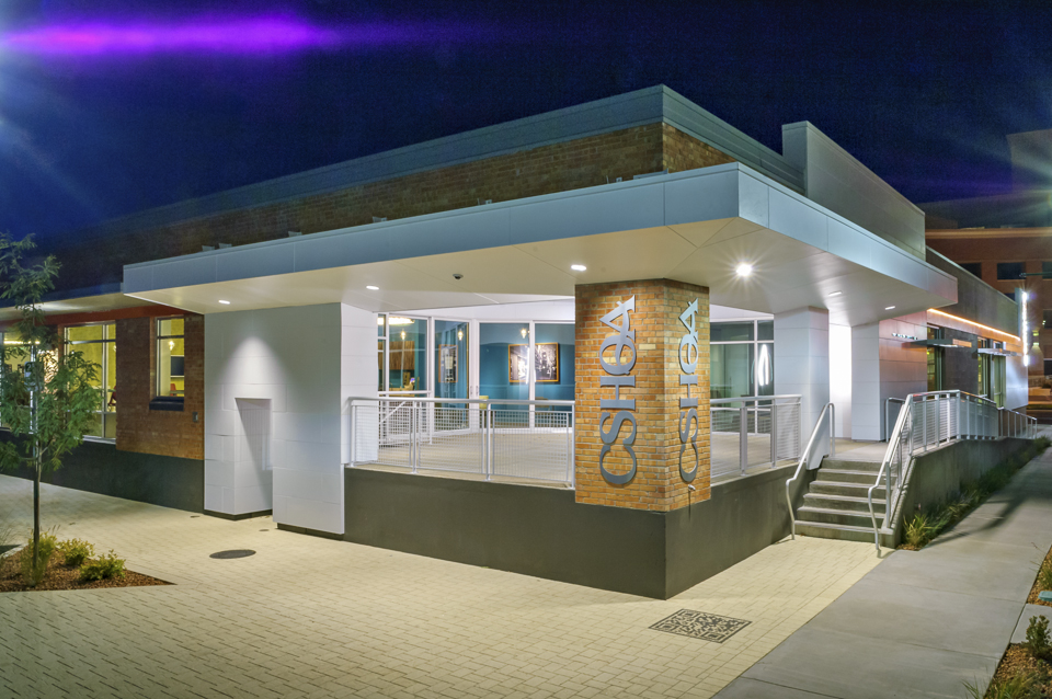
When it came time for CSHQA, an award-winning, full-service architecture and engineering firm, to move office locations, they didn’t need to look far. The 20,000-square-foot warehouse was not only a mere three blocks away, its renovation would be an ideal demonstration piece to show existing and potential clients how a building can be updated without changing its historic nature and while respecting the surrounding area architecturally.
Built in 1959, the building was originally used as storage for the rail lines that once ran along Front Street adjacent to the building. The interior space, although smaller, occupies only one floor—unlike the three floors in their previous location—allowing for closer collaboration of employees. The interior design philosophy was to expose the original wood ceiling composed of 10x26 solid timber beams and joists, and and to add 14 new skylights to create uniform interior light levels and reduce energy use. The existing interior columns, 10” diameter concrete, were refurbished and many were left exposed. In keeping with the vintage feel, reclaimed timber was used for some of the interior woodwork as well as frames for artwork.
In addition, the design takes into account several building efficiencies, including the connection to the city’s geothermal system for radiant floor heating throughout the space. The same radiant system is used to cool the space in the summer. Other sustainability upgrades include extensive daylight harvesting with integrated automated lighting and dimming systems, the use of LED fixtures, sustainable landscaping and on-site storm water management, low-use water fixtures, covered bicycle storage, and preferred parking for fuel-efficient vehicles. The building is targeting LEED Platinum and Green Globes certifications. If achieved, the CSHQA office will be the first LEED Platinum office renovation in Idaho.
CHALLENGE
Find an exterior technology that understood the design and aesthetic goals while also contributing to the building’s LEED Platinum certification.SOLUTION
The Illumination Series Panels, in a custom cool white color, and Smooth NichiBoard to ensure a clean, flawless exterior look.RESULT
The Nichiha panels provided the client design flexibility to modernize the historic building and the first large-scale use of fiber cement panels in the area.
Like many urban areas, Boise is seeing quite a bit of transition in its downtown core. Amidst the tear-downs and new structures, this warehouse renovation was a chance for CSHQA to showcase something new out of something old. With that in mind, the team specified Nichiha’s Illumination Series panels and Smooth NichiBoard to ensure a clean, flawless look on the exterior. The building called for a specific color match, a cool white, to match the sheet metal coping at the top of the new walls.
Another selling point: a built-in ventilated rainscreen system, unique to Nichiha panels, that eliminates the threat of trapped moisture.
“One of the many goals of the building renovation was to explore different technologies and showcase them within and on the building,” says Ted Isbell, AIA, LEED AP BD+C, a senior associate at CSHQA. “We looked at several exterior wall cladding systems, including metal, wood, ACP panels, phenolic resin panels, and fiber cement. Nichiha worked with us to understand our goals.”
Nichiha panels on the CSHQA warehouse were the first large-scale use of fiber cement panels in the Boise area. The panels provided flexibility to work with different design decisions, while modernizing the historic building.
“It completely changed the look of the building,” said Mandie Brozo, project manager at CSHQA, noting that the clean look of the panels has attracted the attention of the real estate community. “Before the renovation, the building was anonymous, no one ever remembered it, and now people are noticing; it’s like a new building.”
For more information about Illumination and other Nichiha products, please visit: www.nichiha.com.
Architect: CSHQA
Location: Boise, Idaho
Project type: Historic remodel
Product: Illumination Series
Project features:
- Smooth, satin finish
- Virtually limitless color palette
- Easy installation
- Low maintenance
- 40% recycled content
Related Stories
Office Buildings | Jan 26, 2022
BlackRock’s Innovation Hub in Atlanta showcases its global design guidelines
The two-story space harkens to the city’s culture and past.
Coronavirus | Jan 20, 2022
Advances and challenges in improving indoor air quality in commercial buildings
Michael Dreidger, CEO of IAQ tech startup Airsset speaks with BD+C's John Caulfield about how building owners and property managers can improve their buildings' air quality.
3D Printing | Jan 12, 2022
Using 3D-printed molds to create unitized window forms
COOKFOX designer Pam Campbell and Gate Precast's Mo Wright discuss the use of 3D-printed molds from Oak Ridge National Lab to create unitized window panels for One South First, a residential-commercial high-rise in Brooklyn, N.Y.
Headquarters | Oct 28, 2021
Florida’s Seagate Development Group tackles design-build projects from a developer’s vantage
A “single point of contact” for clients, says its CEO.
Office Buildings | Oct 26, 2021
A massive office reno project in Detroit sought to create destination spaces for returning workers
The interior design firm Pophouse relied heavily on employee input for a pilot remodel.
Cladding and Facade Systems | Oct 26, 2021
14 projects recognized by DOE for high-performance building envelope design
The inaugural class of DOE’s Better Buildings Building Envelope Campaign includes a medical office building that uses hybrid vacuum-insulated glass and a net-zero concrete-and-timber community center.
Office Buildings | Oct 21, 2021
Swinerton opens new regional headquarters in Charlotte
Redline Design Group designed the adaptive reuse project.
Office Buildings | Oct 18, 2021
Henning Larsen designs new headquarters building for KAB
The project is located in Copenhagen.
Glass and Glazing | Sep 30, 2021
Plans move forward on Central Place Sydney, duel towers with an AI-driven façade system
SOM and Fender Katsalidis are designing the project.
Office Buildings | Sep 29, 2021
Walmart’s new Home Office is the largest mass timber campus project in the U.S.
The project will occupy approximately 350 acres.


