When client finish standards come into play, there’s no cause for a meltdown. In fact, we believe great design can come from finish standards when they’re approached creatively.
Recently, my colleague Lauren Andrysiak and I presented on finish standards at the annual NeoCon in Chicago. In our presentation we debunked myths about client finish standards and examined various design case studies in health care in which finish standards played a major role. Lauren had previously introduced the topic in her blog posts on ‘Finish standards without the panic.’ Now that we understand what finish standards are and have dispelled some of the myths about standards, it’s a natural next step to take a look at approaches to standards that produce great design.
Here are five things we keep in mind when creating unique spaces for clients employing finish standards.
1. Don’t abandon all creativity
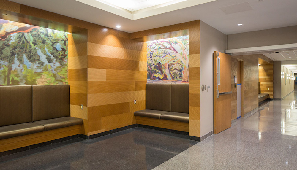
• Having a preset finish palette doesn’t mean that design can’t be creative. It can be more challenging to be creative when your choices are limited, but often I find these limitations can be inspiring.
• Just because the finishes have been selected does not mean it has been determined where and how each finish should be applied.
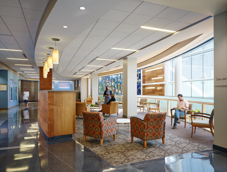
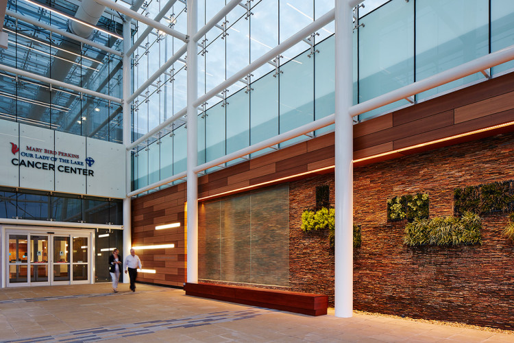 Mary Bird Perkins Cancer Center, Our Lady of the Lake
2. Don’t fight the standards
• You may not prefer the colors or finishes chosen, but they are important to your client’s business and its brand, so in general it’s best to accept them and move on to designing with them in mind.
• Your time and energy is better directed towards unique application of the standards rather than trying to change them.
• Case study: At Mary Bird Perkins Our Lady of the Lake Cancer Center, two different standards were carefully combined and applied to create a cohesive look for the new building on an existing campus.
3. Remember that standards are an expression of the brand.
• Organizations develop standards for practical reasons such as bulk purchasing, ease of maintenance, and reducing materials required for attic stock.
• Standards are selected because they define the client’s brand and mission. Buildings are an expression of the brand and what the company stands for.
• Architectural standards often correspond to brand standards, marketing materials and logos, such as the colors used or iconic elements. Understanding the visual elements of the brand makes it possible to bring it to life in the design.
• Case study: At La Rabida Children’s Hospital Outpatient Center, the Lake Michigan site and nautical brand inspired creative architectural and wayfinding solutions such as patient exam rooms themed with different Great-Lakes based characters. We used standards in a way that reinforced the brand message of fun and whimsy and a connection to nature for young people (but not babies) while achieving high durability in easy-to-clean surfaces.
 Mary Bird Perkins Cancer Center, Our Lady of the Lake
4. Don’t be afraid to offer better alternatives.
• While you shouldn’t try to fight the standards, if you know of a product that is superior to the preselected standard product, it may be worthwhile to present it to the client. There are constant improvements made to materials. If there’s a better product that works for the brand and the project, suggest it.
• Make sure you do your research and are able to present the pros and cons of the standard vs. alternative product so your client can make an educated decision.
5. Keep your intended users in mind.
• While a facility may have a selected palette, remember who your users are and what space you’re designing for. In healthcare, we select different finishes and colors for a pediatric unit than those we specify for an adult intensive care environment. In workplace, the finishes for the kitchenette and breakroom are different than the boardroom.
• Carefully consider the type of finish as well as the color for the best outcomes in defining the places within the project.
About the Author: Candace Small is an architect that focuses on healthcare and sustainability in VOA's Chicago office.
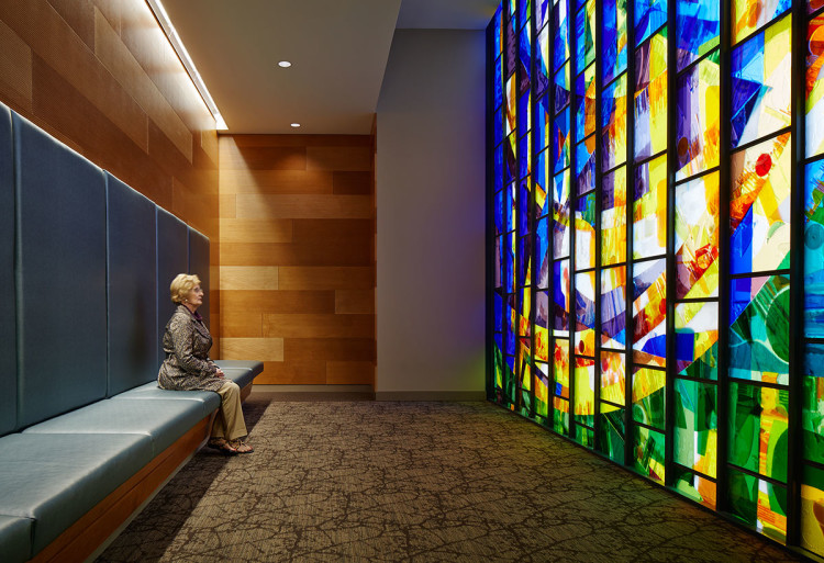 Mary Bird Perkins Cancer Center, Our Lady of the Lake
More from Author
Stantec | Jul 18, 2024
Why decarbonizing hospitals smartly is better than electrification for healthcare design
Driven by new laws, regulations, tariffs, ESG goals, and thought leaders in the industry itself, healthcare institutions are embracing decarbonization to meet 2050 goals for emissions reductions.
Stantec | Jun 18, 2024
Could ‘smart’ building facades heat and cool buildings?
A promising research project looks at the possibilities for thermoelectric systems to thermally condition buildings, writes Mahsa Farid Mohajer, Sustainable Building Analyst with Stantec.
Stantec | Jun 8, 2024
8 ways to cool a factory
Whichever way you look at it—from a workplace wellness point of view or from a competing for talent angle—there are good reasons to explore options for climate control in the factory workplace.
Stantec | Apr 18, 2024
The next destination: Passive design airports
Today, we can design airports that are climate resilient, durable, long-lasting, and healthy for occupants—we can design airports using Passive House standards.
Stantec | Mar 18, 2024
A modular construction solution to the mental healthcare crisis
Maria Ionescu, Senior Medical Planner, Stantec, shares a tested solution for the overburdened emergency department: Modular hub-and-spoke design.
Stantec | Nov 20, 2023
8 strategies for multifamily passive house design projects
Stantec's Brett Lambert, Principal of Architecture and Passive House Certified Consultant, uses the Northland Newton Development project to guide designers with eight tips for designing multifamily passive house projects.
Stantec | Apr 10, 2023
Implementing human-centric design in operations and maintenance facilities
Stantec's Ryan Odell suggests using the human experience to advance OMSF design that puts a focus on wellness and efficiency.
Stantec | Jul 6, 2022
5 approaches to a net zero strategy that communities can start right now
Whether your community has started on a plan or is still considering net zero, now is the time for all of us to start seriously addressing climate change.
Stantec | Feb 14, 2022
5 steps to remake suburbs into green communities where people want to live, work, and play
Stantec's John Bachmann offers proven tactic for retrofitting communities for success in the post-COVID era.
Stantec | Feb 8, 2022
How gaming technology is changing the way we design for acoustics
Adding 3D sound from gaming engines to VR allows designers to represent accurate acoustic conditions to clients during design.

