Many AEC industry leaders are working with websites that are 4–5 years old. What was once cutting edge and trendy (for the architects among us at least) may now be out of date.
Hinge’s research has shown that over 80% of professional service buyers check out a firm’s website during the business development process. And more than 20% of buyers referred to a firm rule out that firm based on an unimpressive website.
The lesson is clear: A website that’s behind the times is hurting your business.
Website Design Trends for 2017 and a look forward
We’ve examined a wide range of websites, from smaller boutique firms with highly focused areas of expertise, to large firms with international audiences and service offerings a mile wide. We see some common design trends among the most effective websites that may be worth adopting.
Trend #1: Video and Imagery
AEC firms already understand the importance of photography when it comes to showcasing projects. As we head into 2018, we see something more. We are seeing the consistent move away from stock imagery or uninhabited project photography to more contextual storytelling imagery. There is greater appreciation for the importance of showing these projects in relation to the audience they hope to attract.
Now take images a step further. Whether its a simple photo montage with annotations, aerial drone footage, or sophisticated 4D animations, videos are a growing and important media to include throughout an AEC firm’s website. In prior years, the trend had been to create service or team-related video elements. This year, we expect to see the broader adoption of video as a standard way to tell a more compelling project story and increase visibility by connection to external channels like YouTube (officially the second most popular search engine).
Whether it’s a community enjoying a beautifully designed space or a project team working together on site, imagery and video needs to be more clearly connected to overall content and messages. Although this requires an additional level of effort, it is a very powerful way to connect a firm’s story to a more real world experience.
We also see an improvement in profile and “about us” photography and video content. More polished environmental photography and footage is showing a firm’s team in the context of their workspace and often with other members of their team. This tells a story that goes beyond a resume or bio.
The best examples of compelling content reinforces credibility (with a polished and professional workspace), collaboration (with other team members and open workspaces) and, perhaps most importantly, a connection to their audiences. In addition, prospective clients and potential recruits are more likely to engage if they can see that the team looks like their kind of people.
Trend #2: Infographics
While AEC has not embraced illustrations the way B2C or B2B sites have, we do see an increase in the use of infographics or simple diagrams to help convey key messages. This is especially true in the engineering space. The move is toward more basic representations.
The next step will be to infuse more creative illustration and culture into these infographics, telling the story beyond the data. This follows the trend in imagery moving beyond the single project or person. This trend will reinforce reputation and image—as long as AEC firms don’t start having fun with infographics. That would be completely inappropriate (though we have seen a few rare exceptions out there)!
Trend #3: Color and Visual Structure
We also continue to see a consistent trend in overall color and visual structure.
- Open white space
- Monochromatic with one or two light accent colors
- Light typography
This trend often goes hand in hand with trends in overall brand design, but many AEC websites are becoming visually similar in this respect, with large dominant imagery, very light structural elements and a largely monochromatic color palette.
While this approach has benefits (including clarity and putting the focus on content), there may be opportunity to explore bolder color choices and messaging to differentiate.
We have also seen a positive move toward clearer calls to action and contact form placement, but there is still a lot of opportunity to integrate a more connected engagement model throughout most AEC websites.
Trend #4: The Influence of Google’s Material Design
Its only a matter of time before Google finds a way for us to sign up for a new direct-to-brain connection. Today, we will have to be content with the massive influence of Google’s material design that sprang from Android’s UI in 2014.
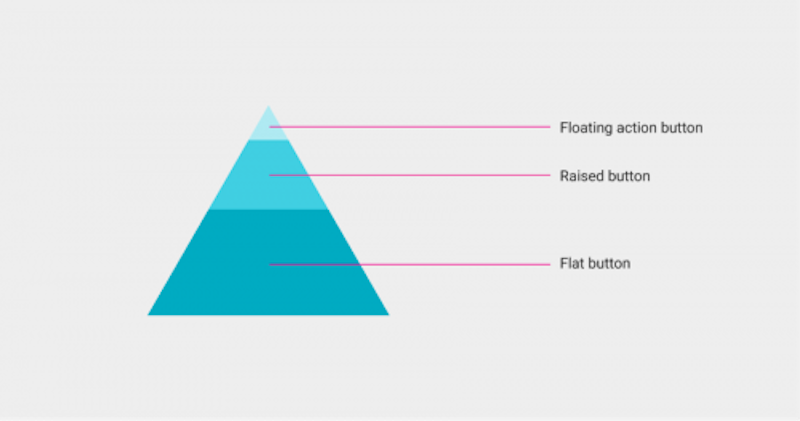
Google is looking to get ahead of the curve when it comes to the increasingly wide array of devices we use to consume information. Moving beyond the “flat” trend that preceded it, material design aims to provide layering and flexible elements to aid navigation.

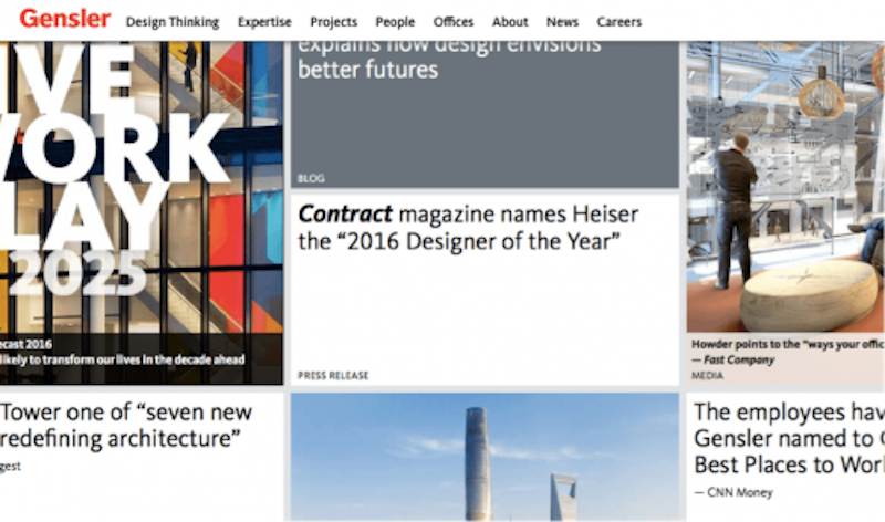
While we see the influence of material design in the latest crop of AEC websites, the majority do not use many elements beyond an adaptation of the “cards” approach to flexible content areas. These simple rectangular elements with images and text provide an easy way to “nest” content on a page or improve mobile responsiveness. Unfortunately, it’s easy to take it too far (too many cards or uneven arrangements) and end up with a layout that lacks clarity and makes it difficult to find specific content.
Material design concepts, such as responsive integration, re-prioritizing of mobile elements, and an emphasis on simple motion are less common design trends among AEC websites. But they are certainly worth considering in 2018.
Trend #5: Navigation and Mobile Friendliness
Navigation on AEC websites continues to move to a more straightforward approach. Engineering firms often must address a wide array of services and markets. This challenge is met with varying degrees of success. Unfortunately, firms sometimes fall victim to what we like to call the “Pac Man” dilemma: the need to chase overly complex nested sub-navigation across a screen (never mind a mobile device). Others suffer from overly long primary and secondary navigation or confusing multi-layered approaches. The most successful approach is to use simple trays and a clear discipline when describing practice areas and markets served.
Architecture websites are more likely to offer non-traditional navigation that has moved toward over-simplification (especially for smaller firms). One architectural website design trend that we’ve seen is the move toward a mobile style navigation, hiding menus behind the “hamburger” icon (three stacked lines). This may make sense on a space-constrained mobile device, because it supports a minimalist aesthetic, but it makes a user work harder and can be disorienting as a user moves through a website since it does not clearly indicate what section a user is currently in.
One 2017 website design trend appearing on many professional services websites, is the “pinned” primary navigation. As the user scrolls, the main navigation remains at the top of the browser. Sometimes a simple animation will collapse or condense the navigation so it does not take up valuable visual real estate, while still offering a way to move throughout the site without scrolling back to the top of long pages.

Mobile friendliness is a requirement in 2017. As one of the most mobile-connected industries, AEC should be leading the way on in this area. Basic responsive websites or, at minimum, a mobile friendly version of your website ticks the checkbox, but doesn’t make the most of the opportunity. We predict the leaders in AEC will recognize this fact and begin offering more mobile-specific website functionality in the form of streamlined communication, client and partner portals, and optimized educational content targeted for use in the field.
Trend #6: Portfolio, Our Work, Project Pages
I’ve saved the staple of our industry for last. Beyond the variations on standard galleries, narratives and project highlights, we’ve started to see some new elements and functionality take hold.
Connecting teams and expertise
One positive trend we have seen is the increased connection between projects, the teams and experts involved in them, and related educational content. For AEC firms in particular, these are crucial connections to make. While saying “our people make the difference” is certainly not a differentiator, proving it and creating increased visibility for a firm’s experts and their educational content supports overall credibility and reputation.
Advanced filtering
Users can have a difficult time finding project experience that matters to them, or to their project at hand. The last trend I’ll mention addresses that issue through the use of advanced filtering options.
More and more we find “our work” or “our projects” sections that rely on tag-driven filters to allow users to sort results by industry, project highlights or region. The best examples give just enough sorting functionality to be useful, while the overall selection is not so overwhelming that the tool becomes a necessity.
What’s the right mix for your firm?
We’ve explored many of the emerging AEC website design trends we expect for 2018, but what does that mean for your firm’s website plans? Every firm has a unique approach and a new website project creates the opportunity to forge more meaningful connections with a firm’s audience and provide practical insights on what is most important to them.
I hope you found this list helpful! Drop me a line in the comments below and let me know what you think. Are there any more specific trends you’re seeing in your market?
More from Author
Hinge | May 22, 2023
2023 High Growth Study shares tips for finding success in uncertain times
Lee Frederiksen, Managing Partner, Hinge, reveals key takeaways from the firm's recent High Growth study.
Hinge | Dec 15, 2022
4 ways buyer expectations have changed the AEC industry
The Hinge Research Institute has released its 4th edition of Inside the Buyer’s Brain: AEC Industry—detailing the perspectives of almost 300 buyers and more than 1,400 sellers of AEC services.
Hinge | Jun 8, 2020
A time for fearlessness: Lessons from high growth AEC firms
As it turns out, one of the High Grown firms’ superpower is digital marketing.
Hinge | Apr 11, 2019
Opportunities and challenges you may face in an M&A and how to tackle them
How do mergers and acquisitions impact a firm’s brand, marketing, and business development?
Hinge | Feb 19, 2019
Strategies and tools to help navigate a successful M&A
Based on Hinge’s industry research, smaller firms typically spend a higher percentage of revenue on marketing and business development efforts for the same return.
Hinge | Jan 23, 2019
7 AEC marketing trends to watch for in 2019
As we enter into the new year, I’d like to walk through seven marketing trends that will impact AEC firms in 2019 and beyond.
Hinge | Aug 20, 2018
Marketing for engineering firms: 3 reasons to embrace the revolution
Firms who still aren’t embracing the fundamental shift away from traditional marketing techniques stand to fall further and further behind the competition.
Hinge | Jul 10, 2018
AEC marketing fundamentals can still have a role in winning new business
In our Internet-fueled world, it’s easy to get distracted by the latest online tools. But the boring stuff is still important, and you don’t want to lose sight of old-school techniques that are just as persuasive now as they were a few decades ago.
Hinge | Jun 13, 2018
How your AEC firm's brand affects recruiting top talent
There is a major shift in workforce demographics as upwards of 80 million baby boomers retire over the next fifteen years.
Hinge | Apr 27, 2018
4 reasons to pursue speaking engagements
We found speaking engagements were among the top ten marketing techniques that AEC firms employ.


