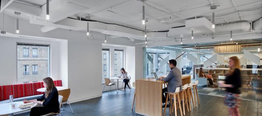
Some of my favorite designers—Charles Eames, Eero Saarinen, Alvar Aalto and Mies van der Rohe, among others—all subscribed to the idea that design is everything. These masters set standards of simplicity, honesty and functionality through their ideas and prototypes for furniture, products and architecture that still inspire great design to this day.
As Little Design as Possible
But what is it exactly about their work that makes it so lasting and impactful? Myriad studies, criticisms and accounts of their work highlight the key aspects of their respective portfolios that firmly plant these giants in the realm of true design innovators. Yet the thread of consistency and beauty in every project, no matter how large or small, might be best summed up by famed industrial designer Dieter Rams: good design is as little design as possible.
In other words, great design is born out of simplicity, purity, timelessness, unobtrusiveness and intuitiveness. This was his mantra when he created incredibly beautiful products for Braun that inspired generations of designers to come—a prime example being the influence his 1960s designs had on Apple, created a decade before Jobs and Wozniak would power up the Apple I in the garage of Jobs’s childhood home.
Poetry in Motion
Speaking of The Fruit, Apple’s new headquarters in Cupertino was a compelling collaboration between two design greats: Lord Norman Foster of Foster + Partners and Jony Ive, Apple’s Director of Design. In a Wall Street Journal article, Foster describes Ive as a “poet” in a world of architects and designers frequently labeled as “essay writers.” Ive’s long-time friend, Apple Watch collaborator and famed product designer Marc Newson also describes him as having an “absolute obsession with the idea that [the building] was built like a product, not a piece of architecture.” This highlights the intersection of two seemingly unrelated disciplines and the consequential impact: when poetry and product combine, you get functional art.
Yet the “functional” piece is not always so easy to quantify. In other design-focused industries, we see a movement toward digital analytics, intense focus on the user interface and experience and new strategies for accomplishing efficiencies in material usage, space and energy consumption. The automobile industry and product designers have always had to measure the value of their work by these metrics and deliver on their promises, or their products would fail.
What if architects were challenged to think more like product designers? How would our process change? What paradigms would we need to break, and how differently would buildings look, feel and perform as a result? What new set of metrics would apply to our work?
Simplicity, Honesty and Functionality
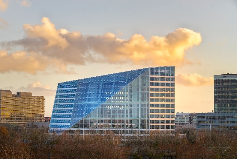 Photo Credit: Ronald Tilleman.
A few recent examples give us an idea of what this product-centric philosophy of design might look like. The first: The Edge, an office building in Amsterdam completed a few years ago by PLP Architecture, employs a network of digital sensors that provide streams of data and analysis to a central app in an effort to close the gap between inefficiencies and ideal occupant behavior. Deloitte occupies the building, which performs more like an Apple watch: monitoring user preferences, providing real-time feedback and data on daily work schedules, adjusting lights and HVAC automatically to increase occupant comfort, and even anticipating a user’s arrival into a space. Oh—and it’s surprisingly simple, honest, functional and beautiful in its form, to boot.
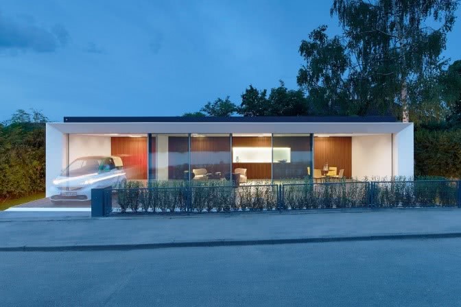 Photo Credit: Zooey Braun.
Aktivhaus is a pre-fab housing concept located in Stuttgart, Germany. Conceived by Werner Sobek, the house not only utilizes sustainable construction methodologies and materiality, but it generates twice as much energy as it requires. Fully modular and integrated, Aktivhaus comes with its own app that monitors and adapts conditions to the homeowner’s behavior and preferences. The concept can be dismantled and reassembled elsewhere and is fully recyclable toward the end of its useful life. Again: simple, honest, functional and beautiful.
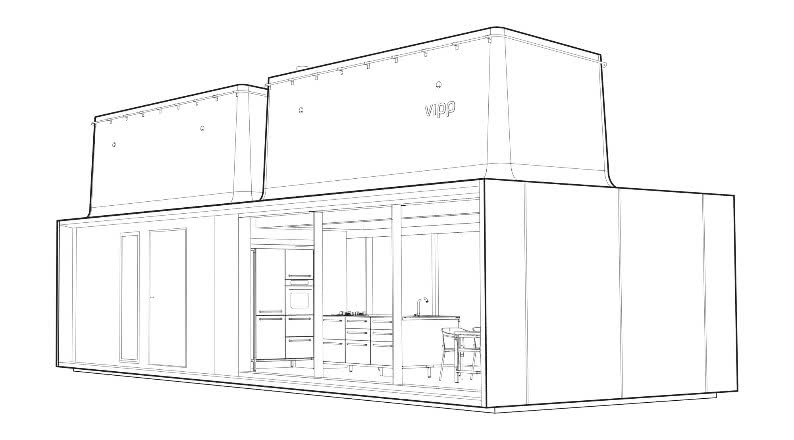 Photo Credit: Archdaily, Vipp Shelter Drawing
">
Vipp Shelter is a pre-fab, industrial design-driven modular retreat designed by an 80-year old home goods product design company best known for their legendary, and oft copied, trash bin. This turn-key retreat is an exemplary realization of total design and includes all mechanics, hardware, finishes, cabinetry, appliances, furnishings, lighting, and even a personal, branded flashlight. The house was conceived by the industrial design firm as a giant product, and every aspect was designed and detailed with that approach in mind. Simple, honest, functional, and beautiful.
The availability of unprecedented amounts of technology, data, and insight equips us with the tools to incite a design revolution: one in which our field is adaptable to and able to keep pace with rapid growth; where imaginative new ways of designing and delivering architecture mimic the intensity, attention to detail and laser-sharp focus of UI/UX that makes products successful. That type of conscientious use of technology coupled with a sense of honesty and integrity just might lead us on a fruitful quest for timeless, purposeful design worthy of the Aaltos and van der Rohes of the world.
More from Author
CallisonRTKL | Dec 20, 2021
Digital nomads are influencing design
As our spaces continue to adapt to our future needs, we’ll likely see more collaborative, communal zones where people can relax, shop, and work.
CallisonRTKL | Jun 30, 2020
The great reset and our new work life
As many countries begin to return to the office, it’s a chance to ask ourselves: what do we truly value?
CallisonRTKL | May 4, 2020
How working from home is influencing design
The lessons learned in the next few months can help shape how we work and design in the future. For now, remote work is different – and our new normal.
CallisonRTKL | Feb 26, 2020
Sustainability in a material world
The concepts of embodied carbon, zero waste, and deconstruction and reuse often run on parallel tracks.
CallisonRTKL | Jan 30, 2020
The complex dance of healthcare transitioning
Hospital employees, though excited about technological advancements, are expected to navigate a new workplace and care for their patients at the same time, all while training on new equipment and navigating a new building.
CallisonRTKL | Jan 6, 2020
Retail re-invention: Five questions to ask
Why have some malls survived their long-predicted demise, thriving and bumping with new generations of shoppers, while others have been relegated to the ash heap of deadmalls.com?
CallisonRTKL | Aug 6, 2019
Saving the American mall in 5 steps
CallisonRTKL Vice President Marc Fairbrother explains how struggling American malls can turn it all around.
CallisonRTKL | May 29, 2019
Smart buildings can optimize wellness
Employees want wellness initiatives built into their work experience, especially when they’re in spaces that can leave them feeling stiff, stressed, and sick.
CallisonRTKL | Apr 5, 2019
2019 trends in the workplace
From retention and career advancement to the ethics of inclusion and diversity, these five trends will play a major role this year in design, strategic planning and workplace development.
CallisonRTKL | Jan 28, 2019
9 tech trends to track in 2019
Innovations in voice recognition, cognitive neuroscience, and biometrics are among the trending tech topics for 2019, according to CallisonRTKL's Kristin Tilley.

