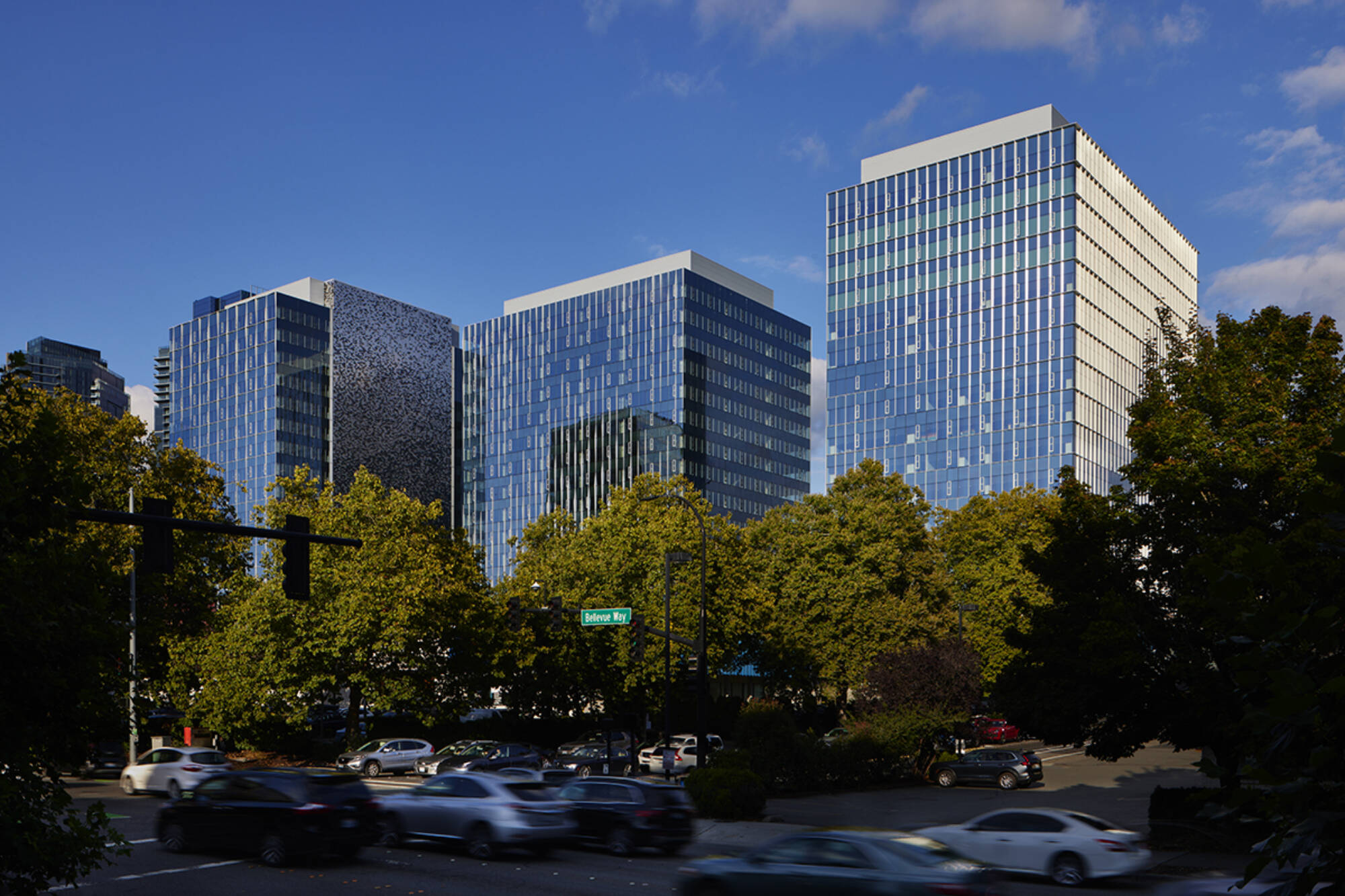
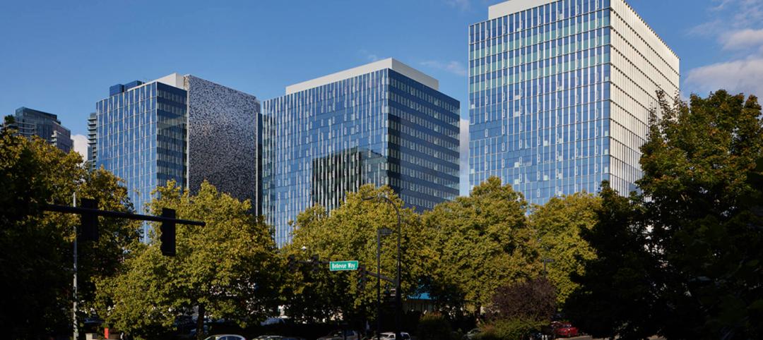
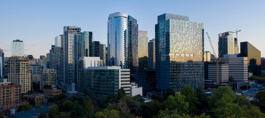
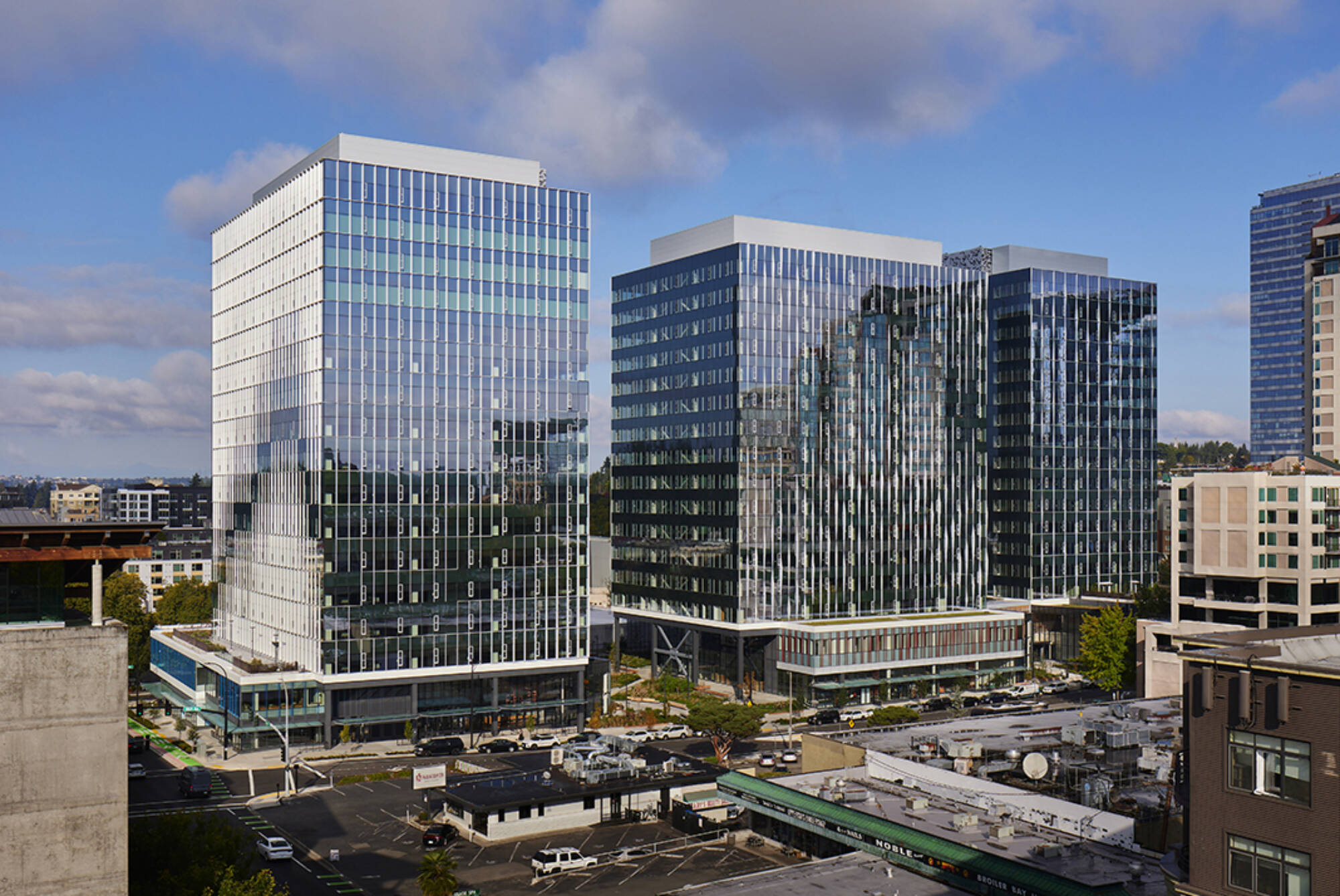
Situated in Bellevue, Seattle's vibrant neighboring city, West Main is reshaping the skyline and symbolizing the city's evolution. The three-tower 1,030,000-sf office and retail development designed by Graphite Design Group in collaboration with Compton Design Office for Vulcan Real Estate is attracting some of the world’s largest names in tech and hospitality.
“Welcoming the neighboring community onto and through the site was a priority from day one, emphasizing this as a true people place, whether you work in one of the towers, are frequenting the retail offerings, or just passing through,” said Peter Krech, Founding Principal of Graphite Design Group.
West Main Development Design in Bellevue, Wash.
The West Main landscape is intricately intertwined with the architectural structure itself. Guided by the expertise of award-winning landscape architecture firm GGN, the synergy between the surrounding environment and the buildings is meticulously crafted, resulting in a seamlessly blended and inviting atmosphere. This collaborative approach fosters a design that is cohesive, fluid, and engaging. Situated in a suburban area with an urban core, the landscape accommodates the building and neighborhood interactions at the street level.
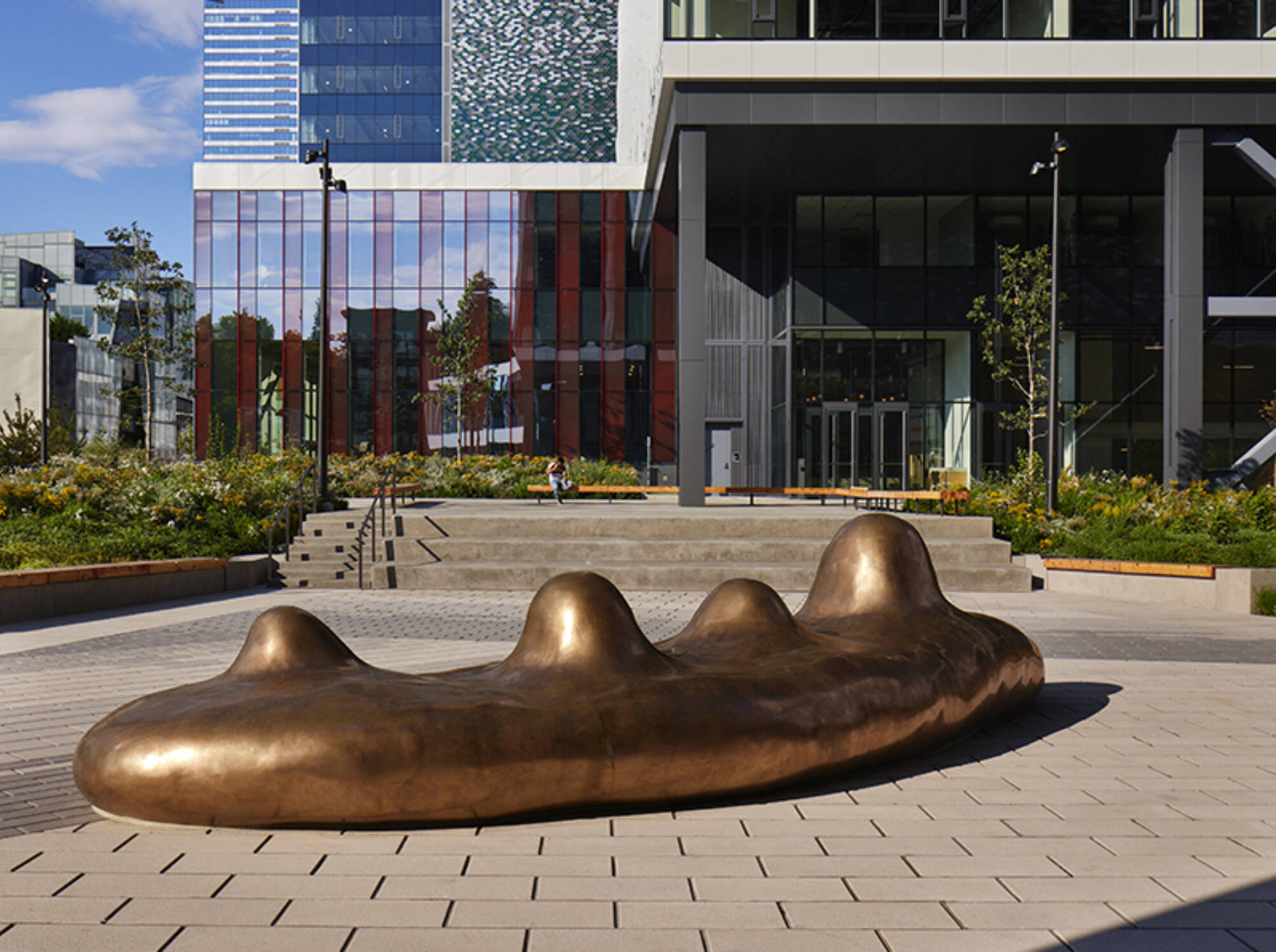
West Main integrates artwork throughout the development. Collaborating with local Pacific Northwest artists Julian Watts and Iván Carmona to integrate multi-piece artworks to enhance outdoor spaces. Guided by the buildings’ features, the soft, organic forms of the art pieces beautifully complement the crisp, angular architecture.
Early on, it was discovered that the project site was once the location of a seasonal streambed—Meydenbauer Creek—that flowed across the site en route to Lake Washington. This prompted exploring the concept of “flow” both in the site and tower designs. A subtle pattern was mapped across all outward-facing facades, a pattern that ebbs and flows from tower to tower. At podium levels, a similar flow pattern is mapped onto the glass itself, utilizing parametric modeling and digital printing technology to deploy a continuous pattern over individual glass panels on each street-facing façade.
The tower composition further emphasizes the cohesiveness of the site by utilizing two distinct façade languages that change depending on the relationship to the site. Those facing outward from the site were termed the “City Faces”, while those facing inward, towards the interior of the site, were termed “Inside Faces”.
Distinct Tower Curtain Wall Detailing
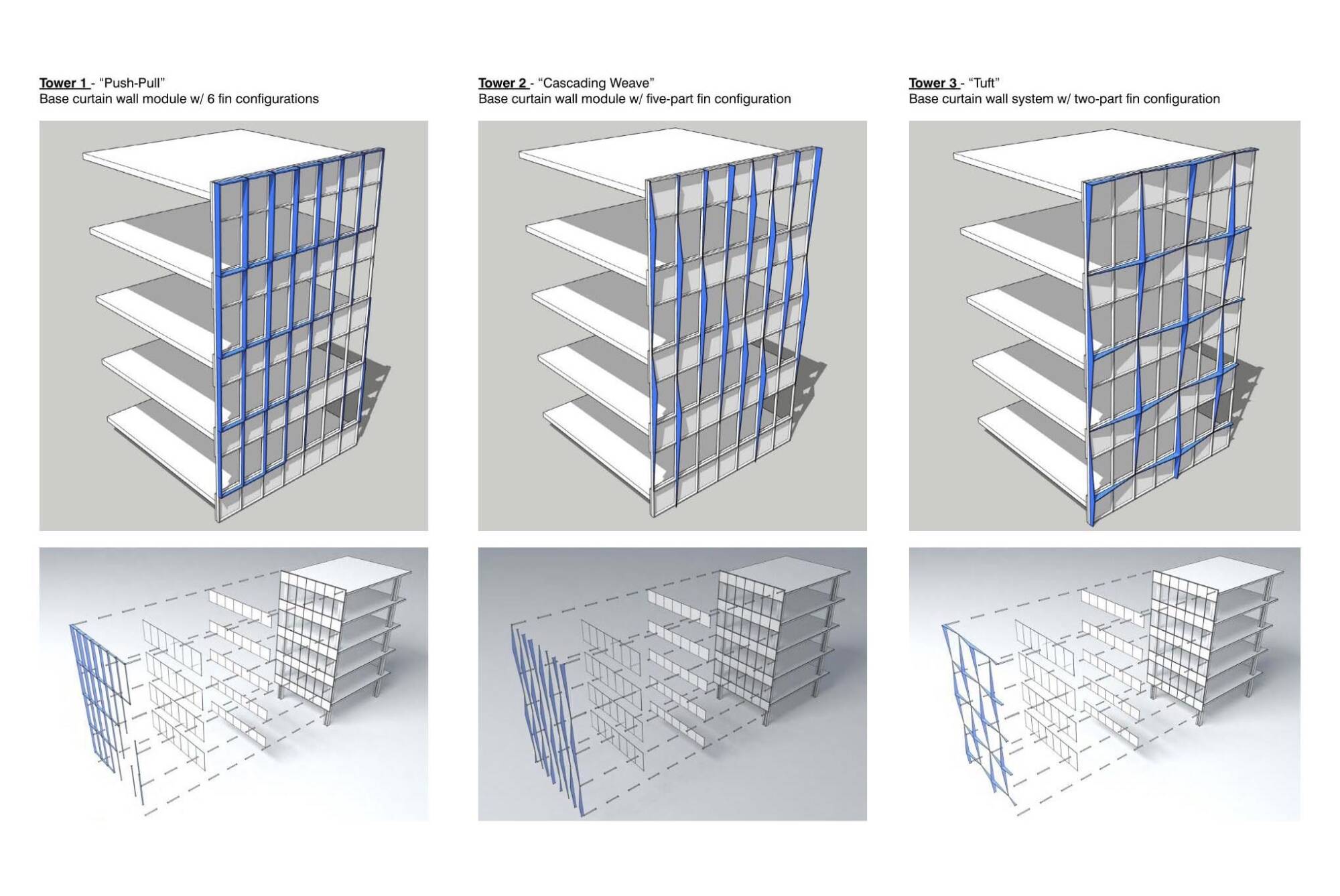
Each tower is further differentiated through exterior curtain wall detailing, each of the towers using a unique vocabulary of fins and projections, each identified by a unique name: “Push-Pull”, “Weave” and “Tuft” for towers 1, 2, and 3 respectively.
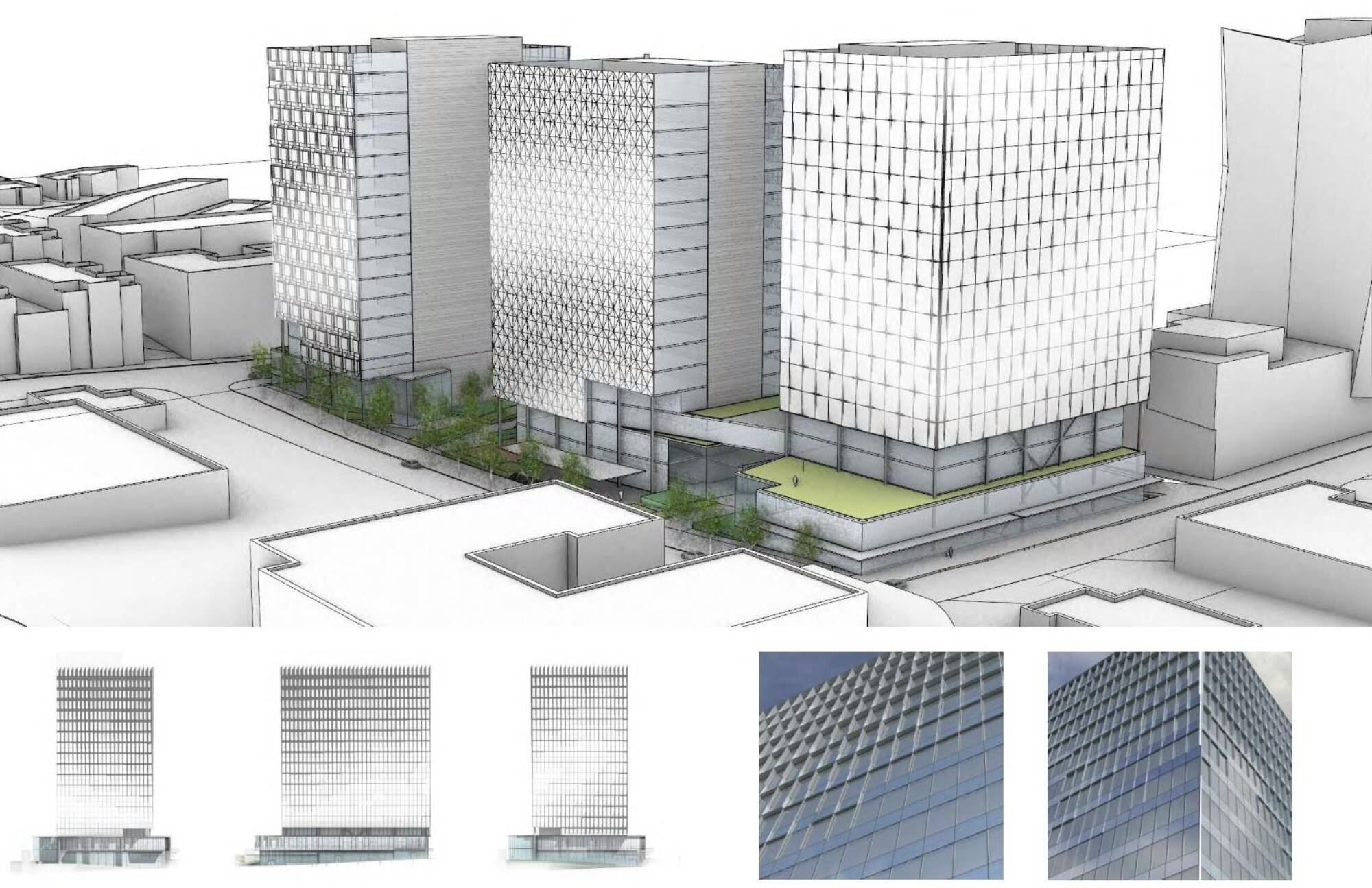
Tower 1: “Push Pull”
Fins of 8 varying depths are utilized in a graduated pattern, framing one side and the top of each unit, creating a fluid wave pattern across the City Faces. Fin depths change unit-to-unit by no more than 1”, providing a smooth transition of the flow pattern.
Tower 1 is the Blue tower, utilizing this color in the podium frit pattern and cool tones in the stainless steel core wall panels.
Tower 2: “Weave”
A range of 8 different vertical fins extends the full height of each floor, each with a slightly different depth and angular projection, cloak the City Faces of this tower. Like Tower, 1 transitions are stepped in 1” increments to ensure a fluid gesture.
Tower 2 is the Red tower
Tower 3: “Tuft”
Similar to Towers 1 and 2, a range of graduated, angular fin projections are utilized, but in this tower these projections are cruciform in their arrangement, each meeting at the high point to create a unique “peaked” pattern reminiscent of the sewing namesake “tuft”. Variation in depth, picking up on the flow concept, lends a dynamism to this otherwise rigorous composition.
Tower 3 is the Blue-Green tower.
The tower curtain wall materiality varies depending on location and how it contributes to the overall design concept. Inside Faces are a smooth, fully SSG system and utilize grey-tinted glazing. City Faces are highly articulated and receive the “flow” pattern mapping. City Faces also utilize a more reflective, silver-toned glazing that is common to all three towers. Podium glazing is clear to facilitate views into retail and promote visibility of the printed flow pattern. Curtain wall framing is a platinum color common to all towers. The podium curtain wall is graphite grey, and the tower fins are white so as to emphasize the varying pattern from tower to tower.
West Main has attracted esteemed hospitality and retail tenants including world-renowned restaurants and leaders in the tech space. The tenants are making Bellevue no longer a place to drive through, but rather a destination.
The West Main project serves as a transformative link, not just connecting Bellevue's Old Town to its Downtown, but significantly expanding the walkability of the entire city. Positioned as a central focal point in Bellevue's evolving urban landscape, the three buildings act as a conduit bridging the urban core with its suburban surroundings. This connection is skillfully facilitated through strategic street-level landscaping and the implementation of pedestrian-friendly exteriors.
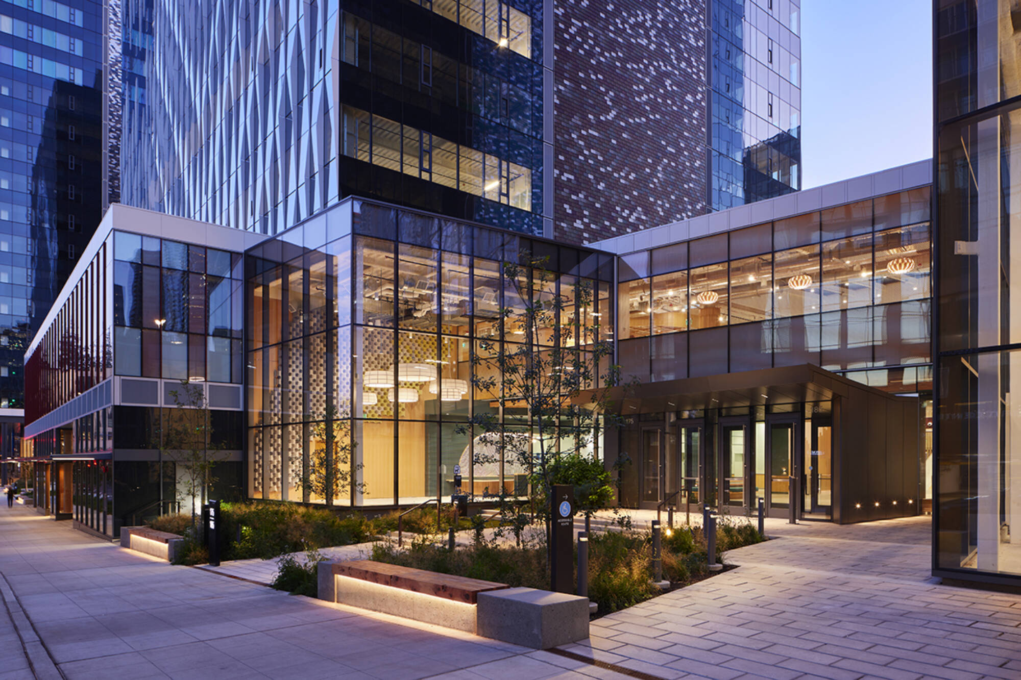
This landmark development demonstrates innovative design concepts to maximize light during the dark Pacific Northwest winters, a commitment to sustainability through the pursuit of LEED Gold certification, and the value of using art to activate a public plaza. As Bellevue's skyline evolves, West Main emerges as a symbol of architectural excellence, making it a focal point in the city's landscape.
“West Main represents a key development for Downtown Bellevue, filling the gap between Main Street, old Bellevue, and central transit hubs,” said Krech. “We believe the resulting whole creates a destination unique to Bellevue and the region, one that we believe will add value to the surrounding community for years to come.”
On the Building Team
Owner/Developer: Vulcan Real Estate
Architect: Graphite Design Group
Design Collaborator: Compton Design Office
Landscape: GGN
Artist: Julian Watts | Iván Carmona
General Contractor: GLY Construction
More from Author
Graphite Design Group | Oct 7, 2024
Pattern language: An exploration of digital printing on architectural glazing
Architectural Glazing has long been an important expressive tool which, when selected and detailed thoughtfully, can contribute to the successful transformation of architectural concepts to reality.
Graphite Design Group | Apr 4, 2024
Sustainable mixed-use districts: Crafting urban communities
As a part of the revitalization of a Seattle neighborhood, Graphite Design Group designed a sustainable mixed-use community that exemplifies resource conversation, transportation synergies, and long-term flexibility.
Graphite Design Group | Feb 23, 2024
Designing a new frontier in Seattle’s urban core
Graphite Design Group shares the design for Frontier, a 540,000-sf tower in a five-block master plan for Seattle-based tech leader Amazon.

