Visual contrast distinguishes elements of design. It is a prevalent consideration for architects as they envision their projects.
While visual contrast is a basic principle of modern design, its use changes based on the movements of the industry. In recent years, visual contrast in residential architecture has relied on dramatic, high-contrast color combinations, such as white siding with black roofs and trim. Yet as the architectural market at large prepares for years ahead, the definition – and implementation – of visual contrast is gradually shifting.
Visual contrast evolution
In an emerging development, architects and manufacturers are experimenting with sheens, glosses and textures – rather than drastic color differences alone – to create contrast.
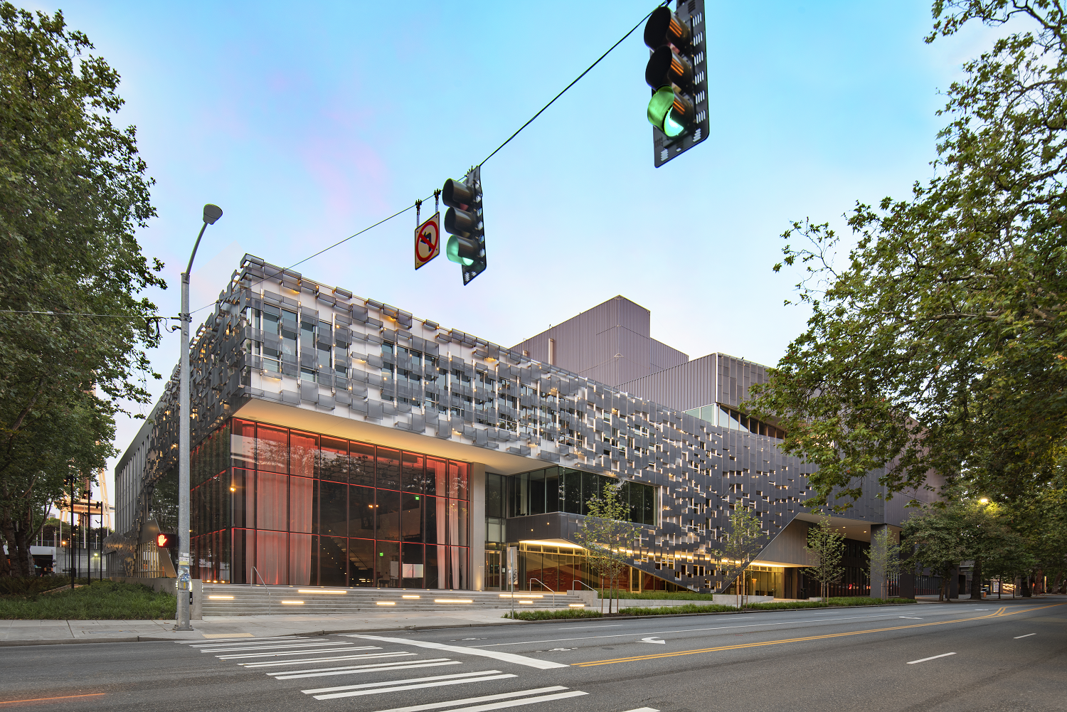
The distance between colors is narrowing. Popular high contrasts such as black and white or Warhol-inspired red and green are instead moving toward monochromes with added texture, often achieved through prints, textures and special effects. For example, Seattle’s Opera at the Center uses a Silversmith Metallic solid base coating for its exterior with perforated panels in Concord Blue Metallic layered over it. Though the panels are similar cool shades, the veiled outer layer provides dimension, creating an interesting visual contrast.
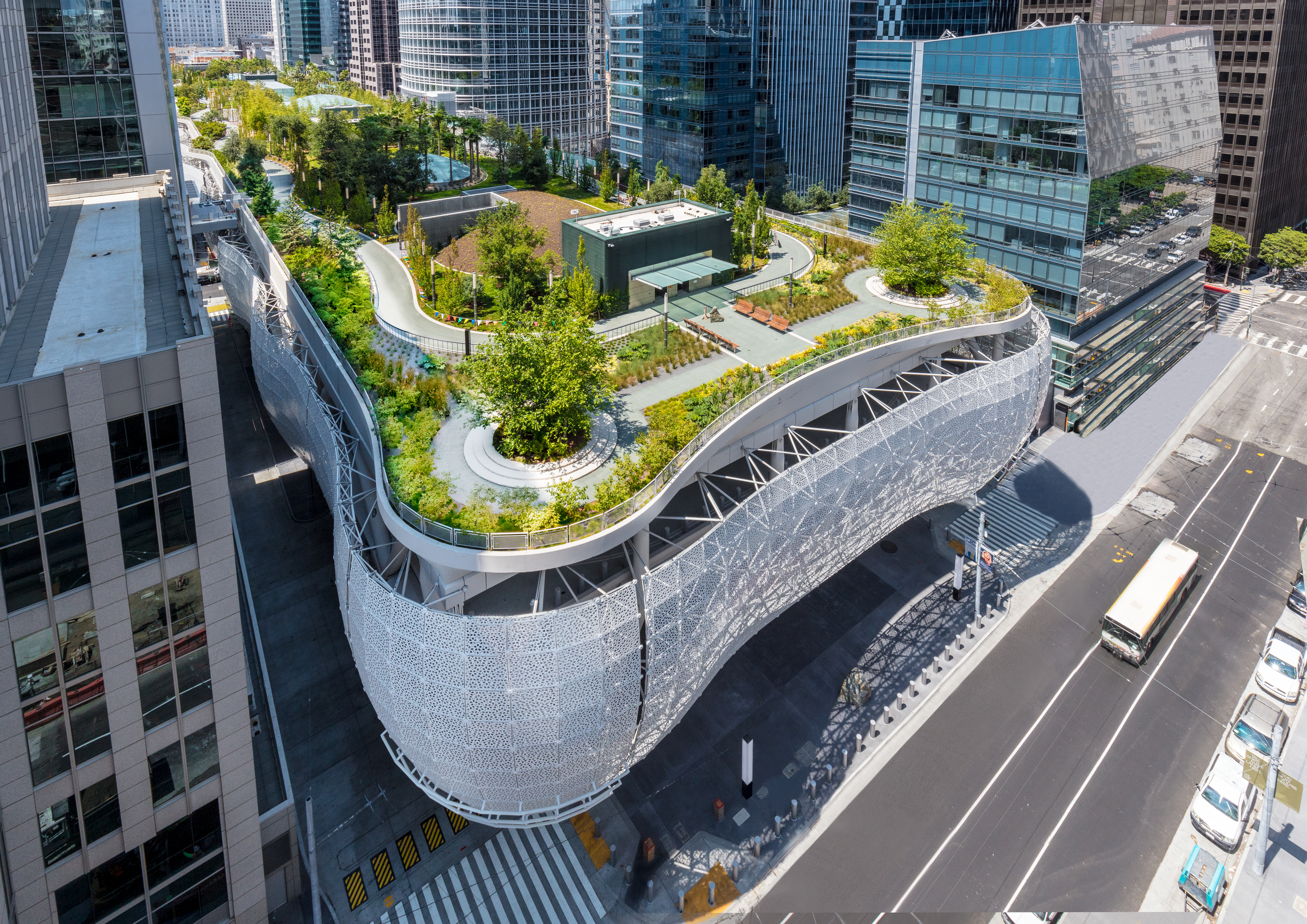
Effects, such as sparkle and color shift, can also elevate a design and provide contrast. Salesforce Transit Center chose a laser-etched, patterned facade with a pearlescent Fluropon® Nova finish. The shimmering effect of the finish adds depth to the substrate that achieves a stark contrast on a monochromatic color.

For designers, this opens a world of possibilities. Where color has primarily been used to create visual contrast, effects allow for subtler and more defined elements. In addition to the thousands of colors available, architects and manufacturers can specify sheen, gloss, mica/metallic, color shift, intense sparkle, print and texture. Organized as innovative effect technologies and deeply researched trends, special effects support designers in achieving new feats of visual contrast.
Solutions for designers
As architects and manufacturers push the boundaries of imagination in their designs, Sherwin-Williams offers a variety of tools to spark inspiration and make their creative visions a reality.
Advanced color collections provide color and effect solutions for various metal coating technologies. Additionally, our Building Products Color Lookbook forecasts the movements of the industry and provides strategic inspiration and color solutions narrowed down to a specific building product, market or region.
Contact a Sherwin-Williams color expert to learn more about our colors, effects and forecasting to serve your market and one-of-a-kind designs.


