In traditional architecture, a building’s exterior was often given visual interest through ornament that was added over the primary material of the building's skin. Contemporary architecture is characterized by clean lines and simple, strong shapes with distinctive textures, that integrate visual interest into the structure and its materials. The surfaces of these buildings may be concrete, stone, metal, brick, painted or fired panels, or glass, and are often combinations of several materials.
However, hard lines and hard surfaces can also be austere, even severe. Among all these hard, man-made surfaces, wood is the great contrasting element, an element of softness, flexibility, and visual warmth.
Designers love using wood to soften and humanize their exteriors, and often to help harmonize them with natural surroundings. Indeed, “softness” and “warmth” are the two terms they most commonly use to describe why they incorporate the look of wood into modern buildings.
However, owners are frequently wary of wood because of its burdensome maintenance issues and shorter service life. Ben Hudgins, principal at Atlanta-based Brock Hudgins Architects, describes the problem succinctly: “What we find with our national multifamily clients is that they’re looking for commercial grade materials. In our climate in the southeast, which is relatively hot and humid, naturally, wood products don’t hold up well. But wood products are nice because they bring some warmth and texture to the primarily urban sites where we work. It helps to start to ‘code’ those projects as residential by bringing in these softer, warmer wood tones. But it’s hard to do that in multifamily because the maintenance of a wood product doesn’t lend it self to the commercial scale.”
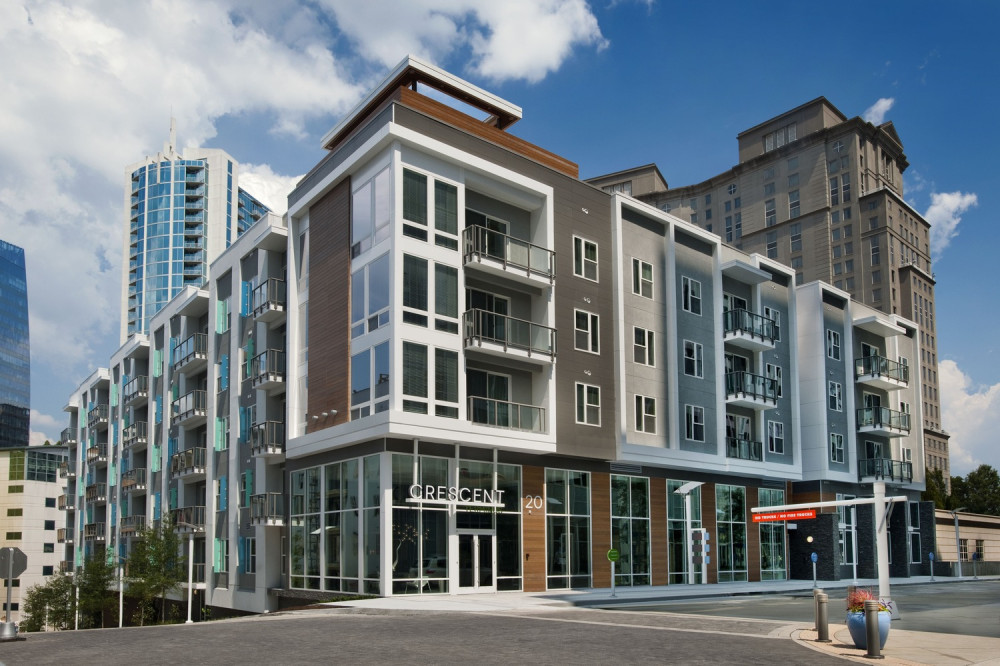
Hudgins found a solution to this dilemma using VintageWood rainscreen panels, a very convincing wood-like product in appearance that’s made of fiber cement. “In a more modern or contemporary building design, it provides a nice juxtaposition to very clean, modern, rigid lines; a little bit of relief from all the very modulated and sometimes monochromatic overall building composition,” he says.
Over the course of several projects, Hudgins has juxtaposed the wood look to a variety of other surfaces, including Illuminations, a fiber cement panel with bright, reflective color that resembles a metal panel.
One of Hudgins’ most significant selection criteria is durability. “VintageWood is a little more substantial in its thickness and durability than a lap siding or board-and-batten,” says Hudgins. “We feel more comfortable bringing the VintageWood down closer to the ground, where people can see it or touch it, and we’re not afraid to do that. Our Crescent Terminus project is a good example where you wouldn’t want to put a lap siding down low, to street level. Stucco, too, would likely get dirty and kicked, perhaps scratched up, and start to show signs of wear over time. VintageWood lets us introduce the material where we want an accent or have a distinctive feature, and we can run it [almost] to the ground.”
Jose Ho, an architect with Architects Orange on the other side of the country in southern California, also likes the look of wood for bringing warmth into modern designs. “We’ve been specifying the dark bark a lot,” he says. “It does have that feel of wood. It’s bringing a little bit of warmth and softness to it, specifically when we’re using it against porcelain cladding that looks like metal or stone. The wood pattern is little bit rough, but it really depends how it is used in the project in contrast to all the elements. We bring a lot metal panels and porcelain panels. The combination of metals, wood, and porcelain makes it feel more contemporary. Just by the colors, the materials, it updates the look.”
The availability of a high-quality, durable wood-like cladding has helped bring wood color and texture, and all the cultural contexts and psychological connections that go with it, back into the architect’s toolbox. No trees have to be harmed in the creation of someone’s next vision.
Related Stories
Sponsored | BD+C University Course | May 3, 2022
For glass openings, how big is too big?
Advances in glazing materials and glass building systems offer a seemingly unlimited horizon for not only glass performance, but also for the size and extent of these light, transparent forms. Both for enclosures and for indoor environments, novel products and assemblies allow for more glass and less opaque structure—often in places that previously limited their use.
Sponsored | BD+C University Course | Apr 10, 2022
Designing with commercial and industrial insulated metal wall panels
Discover the characteristics, benefits and design options for commercial/industrial buildings using insulated metal panels (IMPs). Recognize the factors affecting panel spans and the relationship of these to structural supports. Gain knowledge of IMP code compliance.
Sponsored | BD+C University Course | Jan 30, 2022
Optimized steel deck design
This course provides an overview of structural steel deck design and the ways to improve building performance and to reduce total-project costs.


