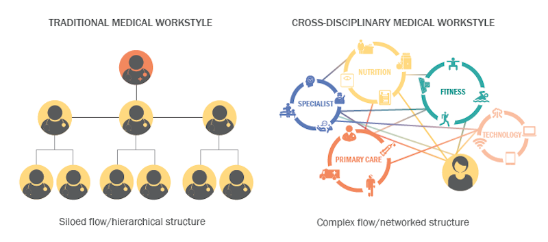
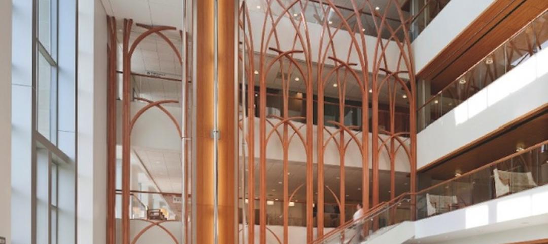
“Collaboration” has become an abiding design goal for many nonresidential building types, such as offices and educational institutions. But the medical field, with its hierarchical divisions and silo mentality among professionals, continues to resist a more collaborative workplace culture.
Perkins Eastman set out to find out why, and used one of its own projects—the 95,000-sf NYU Winthrop Hospital Research and Academic Center in Mineola, N.Y.—as a test case a year after it opened in 2015.
The firm's post-occupancy evaluation—whose findings it published in a recently released white paper “The Effectiveness of Collaborative Spaces in Healthcare and Research Environments”—focuses on the activities within a third-floor multi-use space in the facility that the firm designed specifically with employee interaction in mind.
The white paper touches on the evolution of collaborative design, and singles out two examples—Bell Labs’ headquarters in Murray Hill, N.J., in the 1960s, and Google’s national headquarters in Mountain View, Calif.—where cross-disciplinary collaboration took root and where “activity based” working is now on full display.
The paper notes that offices and education facilities are creating these kinds of environments by planning for collaboration early in the design process, “to include a variety of different kinds of areas to support one-on-one, individual, small group and large groupings.”
However, even the most thoughtfully designed space won’t lead to meaningful change in a workspace if it isn’t supported by policies and attitudes that foster collaboration. And that support is what Perkins Eastman found was missing at NYU Winthrop Research and Academic Center.
Its third-floor space was seen as a microcosm of Perkins Eastman’s design intent. Its programmatic elements include a pantry with small cook and prep area and two vending machines, a café dining space with tables and chairs, a break area with soft seating, a low four-person conference table and sit-up bar; a work room with a TV, tablet chairs and writable magnetic wall; a research area with a large writable wall, movable ottomans, and high-top tables and writing table tops; and a conference room with a large executive meeting table, digital projection capabilities, wet bar and seating banquette.
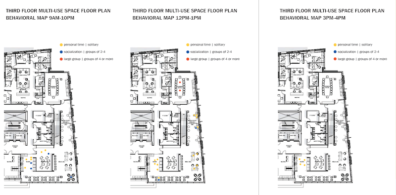
To assess employee engagement in a multi-use space within NYU Winthrop's Research and Academic Center, Perkins Eastman observed and place-mapped activities over a nine-hour period in several time intervals. It found scant indepartmental connectivity, and virtually no use of this space for work. Image: Perkins Eastman
Perkins Eastman observed and place-mapped employee interactions in that space over a nine-hour period in four intervals during the day. The firm tracked how long people spent in any one place, and what they were doing. It also noted whether people were alone or in groups.
“Very little interaction among users from different departments was observed,” Perkins Eastman found. Most people used to space to eat their lunches or talk on their phones. And they usually hung out with people from their own departments. “No spontaneous meetings of small or large groups were observed, and the amenities provided to support impromptu collaboration…went unused.”
Subsequent interviews with 17 user groups from various departments found that while employees generally like the space, they didn’t know how to use it other than to eat lunch or buy food from the vending machines.
None of the people interviewed used the space for work, primarily because their jobs require computers and other tools located at their designated workstations. More surprising, though, was the finding that many of the interviewees weren’t sure if they were even allowed to use the third-floor space for meetings or presentations. In fact, they were “simply uninformed about the potential uses of the third-floor space,” the white paper reports.
Perkins Eastman found that most doctors, researchers, nurses, and administrators within the user groups interviewed would like to collaborate. But a suggestive design wasn’t enough to instigate that interaction. “The faculty and staff needed to be shown how to use the third-floor in order to promote its use as a collaborative space.”
The white paper concedes that research often requires quiet, focused study supported by specialized workstations or lab equipment. And the need for privacy can be a barrier to collaborating in a healthcare environment.
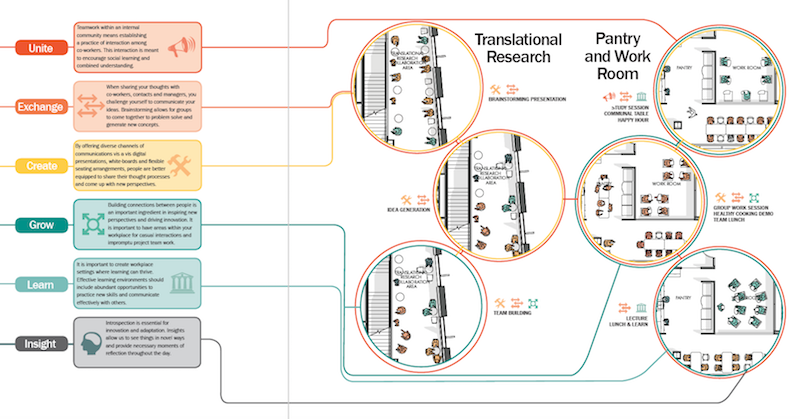
The white paper provides ways that medical centers could encourage collaborative use of their common spaces. The suggestions revolve around providing workers with more imformation about the potential uses of those areas. Image: Perkins Eastman
But there are “simple measures” that the Center could do to foment collaboration and communication, at least in the multi-use space with an open floor plan. These include:
•Create a schedule of programs and presentations for that space
•Assign an IT specialist to educate and assist users with technologies provided in the workroom and conference room
•Post information and signage that suggests how the space can be used
•Orient new employees about how to use the space, and
•Provide greater spatial variety, and the ability to close certain spaces for private meetings. (A number of interviewees said they didn’t conduct meetings on the third floor because none of the rooms could be closed off.)
In the final analysis, Perkins Eastman remains convinced that design, reinforced by programming, can support collaboration and employee engagement within a medical building. But the medical profession also needs to shift toward a more positive attitude about collaboration. “If users are uninformed about the potential uses of a space, it is difficult for a culture of collaboration to thrive.”
Related Stories
| May 1, 2013
Groups urge Congress: Keep energy conservation requirements for government buildings
More than 350 companies urge rejection of special interest efforts to gut key parts of Energy Independence and Security Act
| May 1, 2013
World’s tallest children’s hospital pushes BIM to the extreme
The Building Team for the 23-story Lurie Children’s Hospital in Chicago implements an integrated BIM/VDC workflow to execute a complex vertical program.
| Apr 30, 2013
Tips for designing with fire rated glass - AIA/CES course
Kate Steel of Steel Consulting Services offers tips and advice for choosing the correct code-compliant glazing product for every fire-rated application. This BD+C University class is worth 1.0 AIA LU/HSW.
| Apr 30, 2013
Healthcare lighting innovation: Overhead fixture uses UV to kill airborne pathogens
Designed specifically for hospitals, nursing homes, child care centers, and other healthcare facilities where infection control is a concern, the Arcalux Health Risk Management System (HRMS) is an energy-efficient lighting fixture that doubles as a germ-killing machine.
| Apr 24, 2013
North Carolina bill would ban green rating systems that put state lumber industry at disadvantage
North Carolina lawmakers have introduced state legislation that would restrict the use of national green building rating programs, including LEED, on public projects.
| Apr 24, 2013
Los Angeles may add cool roofs to its building code
Los Angeles Mayor Antonio Villaraigosa wants cool roofs added to the city’s building code. He is also asking the Department of Water and Power (LADWP) to create incentives that make it financially attractive for homeowners to install cool roofs.
| Apr 10, 2013
ASHRAE publishes second edition to HVAC manual for healthcare facilities
The American Society of Heating, Refrigerating and Air-Conditioning Engineers (ASHRAE) has published a second edition of its “HVAC Design Manual for Hospitals and Clinics.”
| Apr 2, 2013
6 lobby design tips
If you do hotels, schools, student unions, office buildings, performing arts centers, transportation facilities, or any structure with a lobby, here are six principles from healthcare lobby design that make for happier users—and more satisfied owners.
| Apr 2, 2013
4 hospital lobbies provide a healthy perspective
A carefully considered entry zone can put patients at ease while sending a powerful branding message for your healthcare client. Our experts show how to do it through four project case studies.


