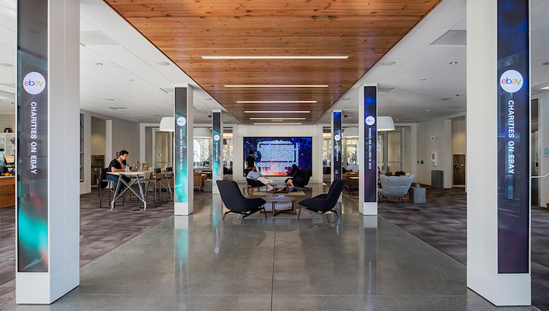
eBay has received, what the company is calling, a new ‘front door’ for its San Jose headquarters, and oh, what a front door it is. Officially named Main Street, the addition to the San Jose campus is a 20,000-sf interactive hub and welcome center designed by ESI Design. The center is meant to exemplify eBay’s platform via large-scale, interactive displays and dynamic media installations.
At the heart of Main Street is a 15-foot touchscreen wall that allows employees and visitors to tap icons representing cars, handbags, and many other goods sold on eBay to see how many items in that category were sold in the last few hours or days.
10-foot-tall LED columns line the Main Street entry and supplement the touchscreen display. These columns frame the wall at the end of the corridor and sync with the content it is displaying to turn the entire space into a dynamic canvas. An additional two interactive touchscreens are located near reception.
One of the largest aspects of Main Street is the 7,150-sf Main Hall. Main Hall is where meetings, conferences, events, and company-wide broadcasts will now take place. Main Hall is equipped with a huge multi-screen display for presentations and webcasts. When not being used for a meeting, the screens will play colorful ambient movies and display eBay data to offer a glimpse into how people are using the eBay platform in real-time.
Main Street also includes three executive conference rooms; an outside deck and exterior patio; a coffee bar and other informal spaces for small employee gatherings; and The Gallery, a shop for employees and partners to browse and purchase merchandise.
Through its use of glass walls and open views, Main Street ensures the setting always feels open, inviting, and filled with natural light.
Click here to watch a video detailing eBay's new Main Street.
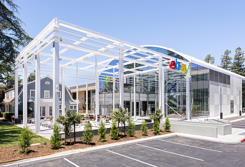 Photo courtesy of ESI Design
 Photo courtesy of ESI Design
 Photo courtesy of ESI Design
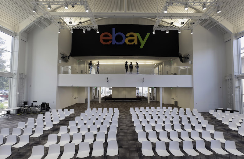 Photo courtesy of ESI Design
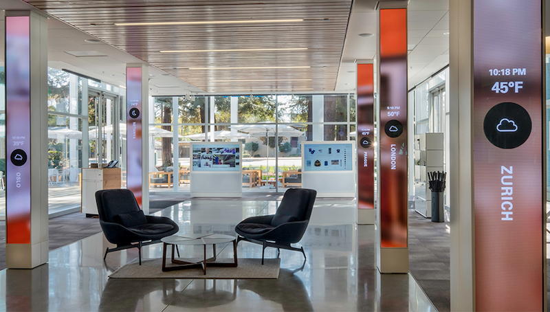 Photo courtesy of ESI Design
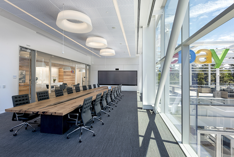 Photo courtesy of ESI Design
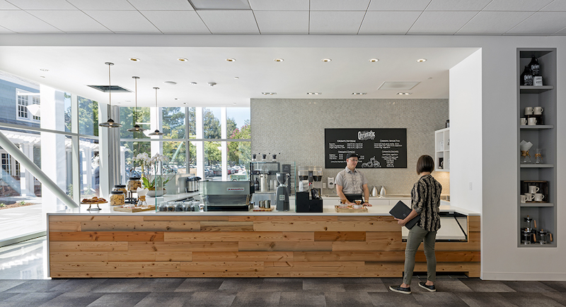 Photo courtesy of ESI Design
Related Stories
| Aug 11, 2010
Top of the rock—Observation deck at Rockefeller Center
Opened in 1933, the observation deck at Rockefeller Center was designed to evoke the elegant promenades found on the period's luxury transatlantic liners—only with views of the city's skyline instead of the ocean. In 1986 this cultural landmark was closed to the public and sat unused for almost two decades.
| Aug 11, 2010
200 Fillmore
Built in 1963, the 32,000-sf 200 Fillmore building in Denver housed office and retail in a drab, outdated, and energy-splurging shell—a “style” made doubly disastrous by 200 Fillmore's function as the backdrop for a popular public plaza and outdoor café called “The Beach.
| Aug 11, 2010
Integrated Project Delivery builds a brave, new BIM world
Three-dimensional information, such as that provided by building information modeling, allows all members of the Building Team to visualize the many components of a project and how they work together. BIM and other 3D tools convey the idea and intent of the designer to the entire Building Team and lay the groundwork for integrated project delivery.
| Aug 11, 2010
Inspiring Offices: Office Design That Drives Creativity
Office design has always been linked to productivity—how many workers can be reasonably squeezed into a given space—but why isn’t it more frequently linked to creativity? “In general, I don’t think enough people link the design of space to business outcome,” says Janice Linster, partner with the Minneapolis design firm Studio Hive.
| Aug 11, 2010
Great Solutions: Products
14. Mod Pod A Nod to Flex Biz Designed by the British firm Tate + Hindle, the OfficePOD is a flexible office space that can be installed, well, just about anywhere, indoors or out. The self-contained modular units measure about seven feet square and are designed to serve as dedicated space for employees who work from home or other remote locations.


